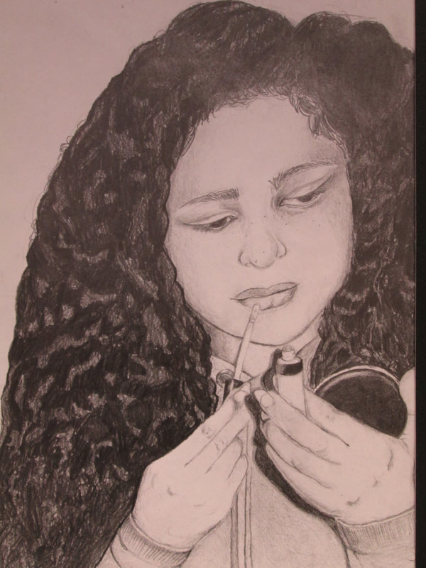
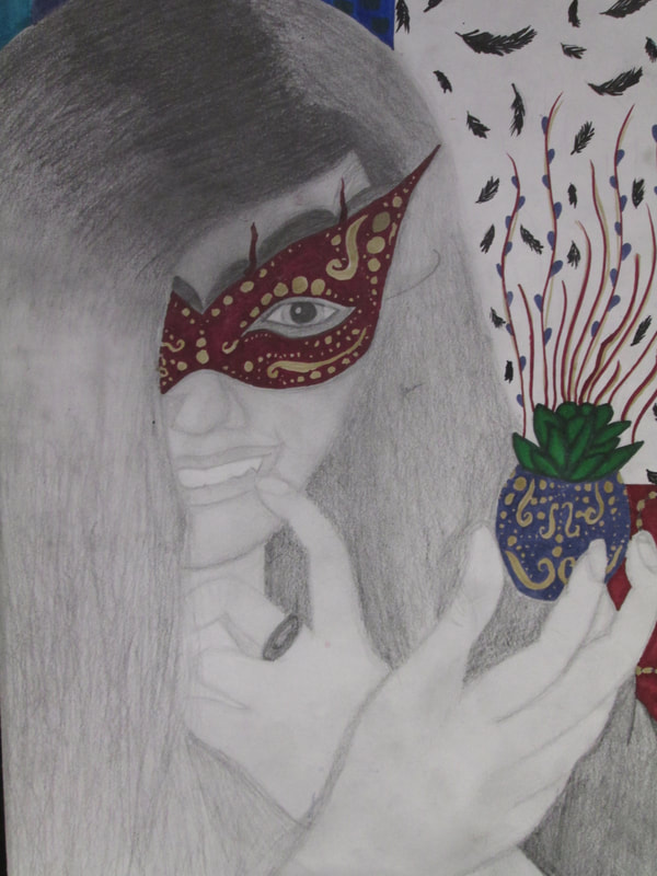
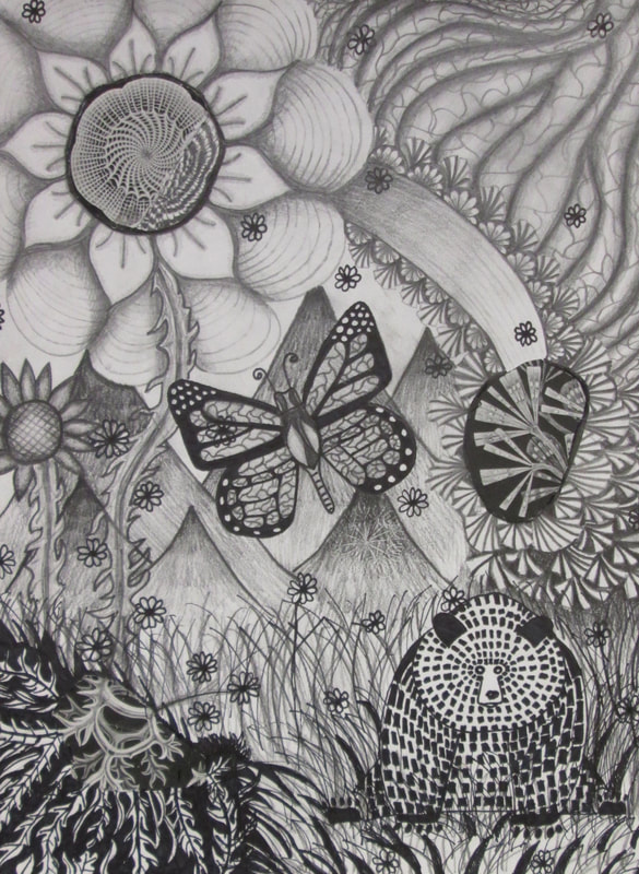
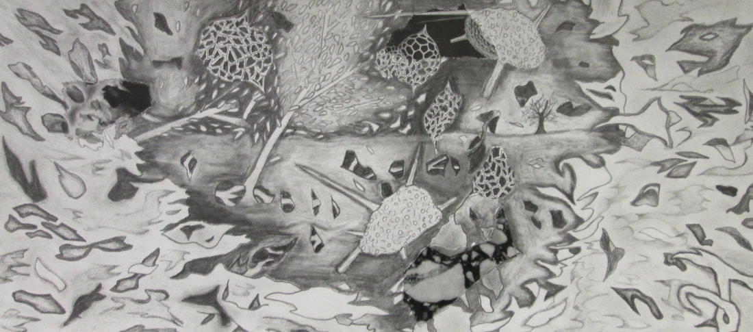
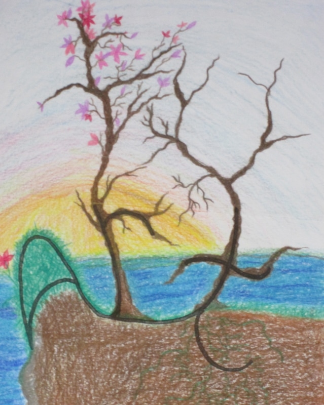
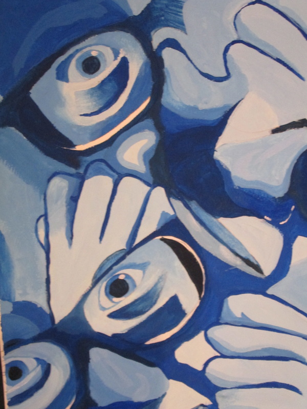
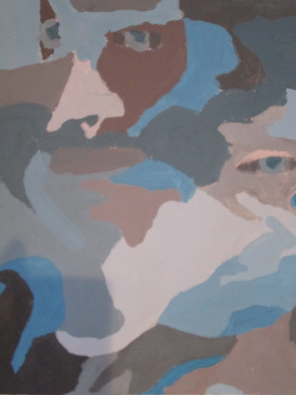
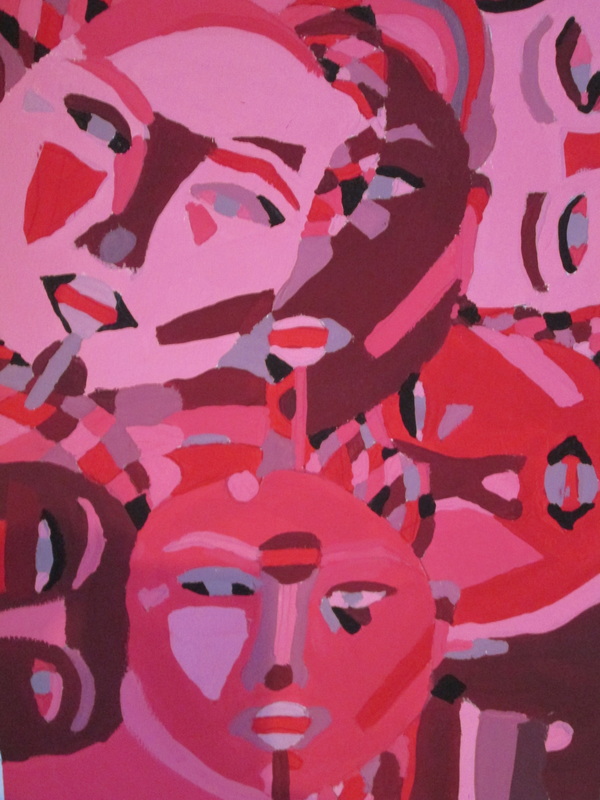
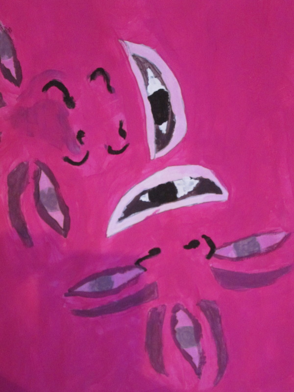
2020 COVID Sketch Challenge for students.. we all drew together!
"Drawing can turn fragile material into conceptual strength. It can record a fleeting movement with the sweep of the implement across the page. Drawing is as intimate as a hushed conversation; it is as personal as the artist's touch and as revelatory as an artist's signature. It extends both mind and spirit;it is an exciting activity that promotes a deep respect for looking and thinking.It has been called the most delectable of all the arts."
( Drawing A Contemporary Approach, Teel Sale Claudia Betti pg.3)
( Drawing A Contemporary Approach, Teel Sale Claudia Betti pg.3)
Class Fees: Pay here for your student's lab fees
eaglecresths.revtrak.net/class-fees2/visual-arts-class-fees/#/list
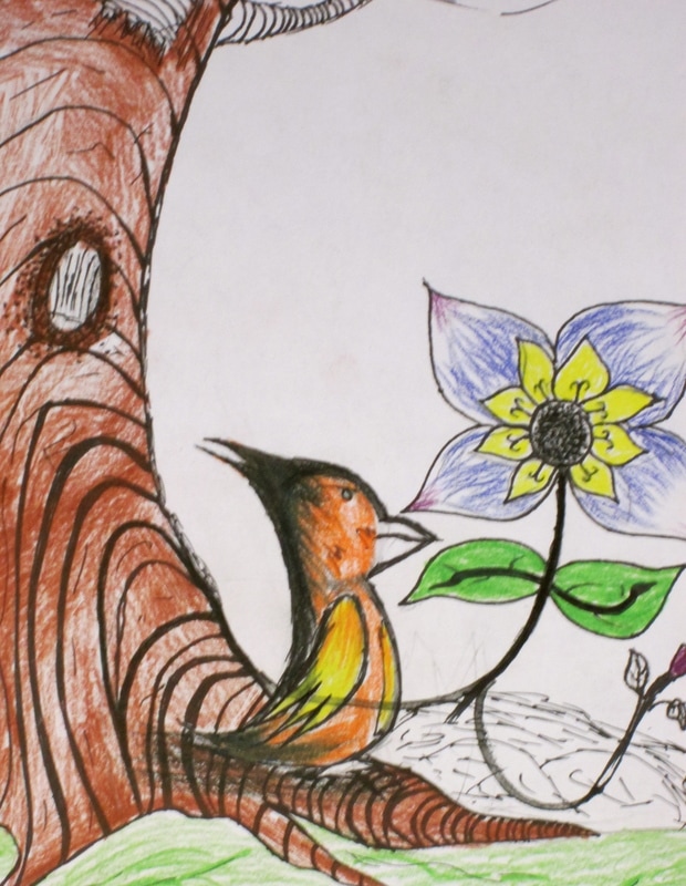
2019/20 Drawing/Painting 2 Portfolio of Student Work...
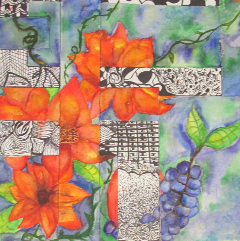
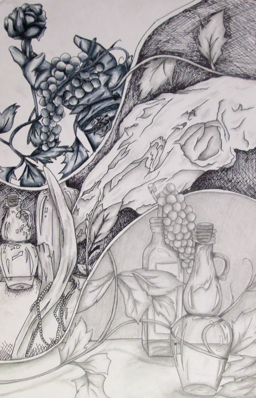
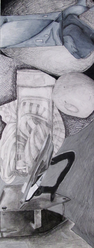
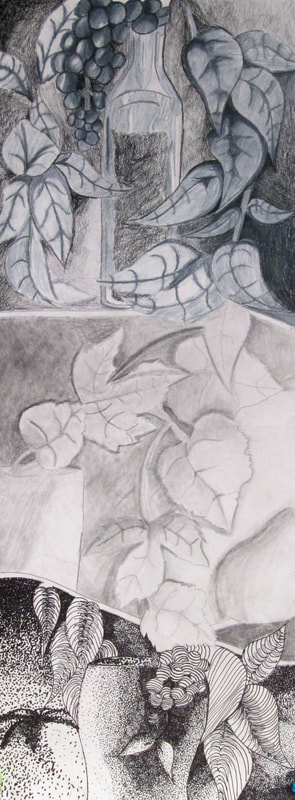
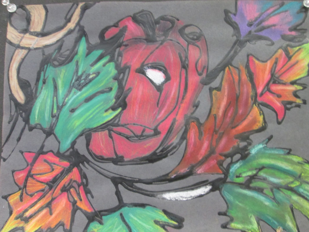
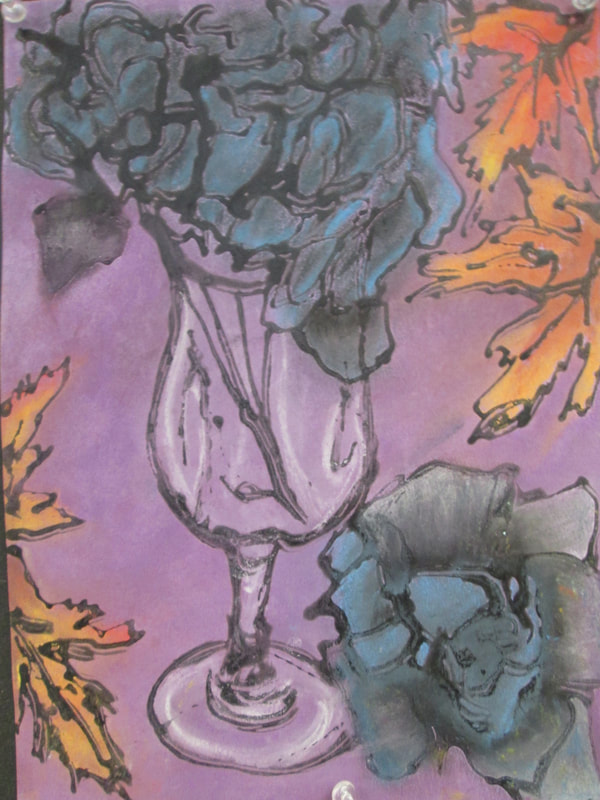
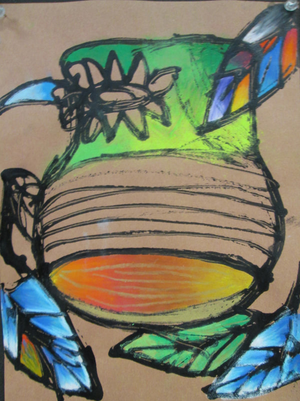
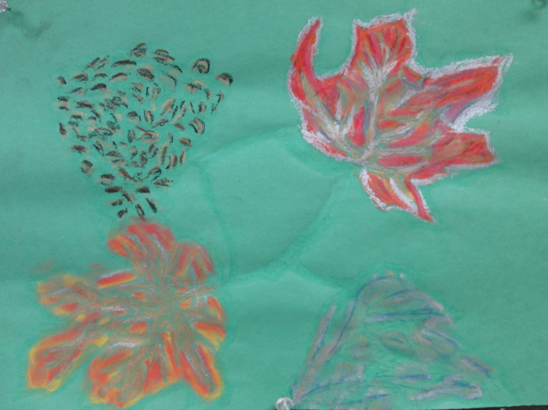
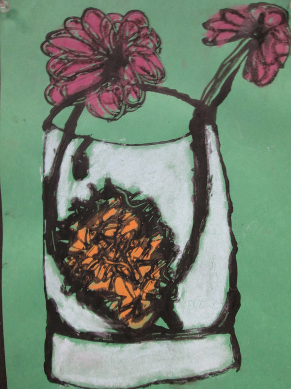
Student's were given still life objects to work with and they did life drawings of the stills that they set up. Then they transferred the drawing that they liked the best onto a surface that was sectioned off with both watercolor and drawing paper. They added watercolor to the appropriate section and then did pen & ink work on top of the drawing paper. Below are images of their efforts.
2018-19 Portfolio of Student Work
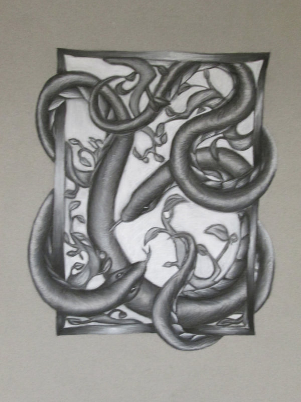
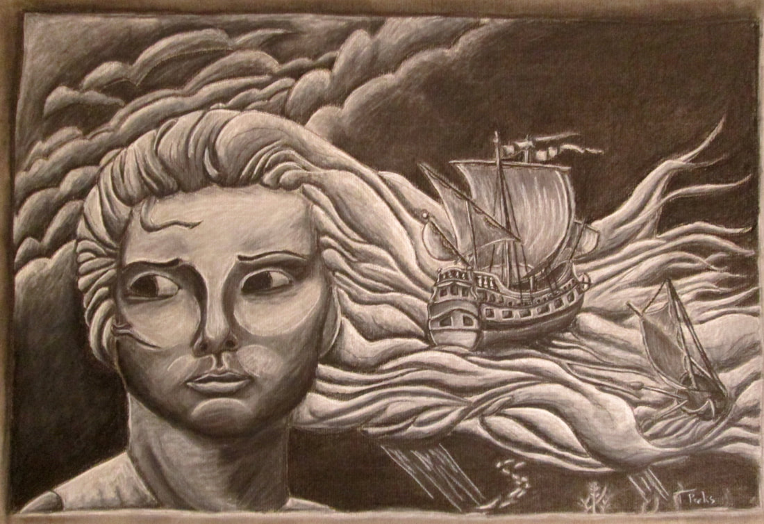
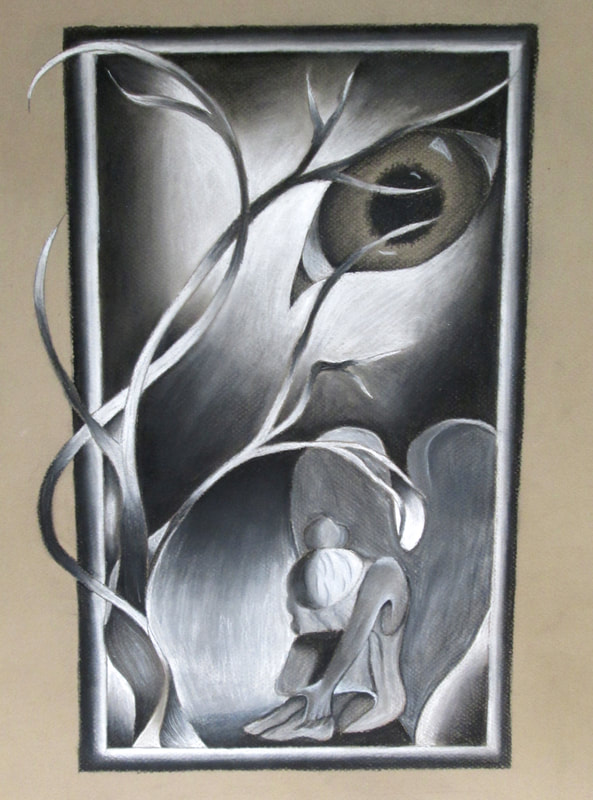
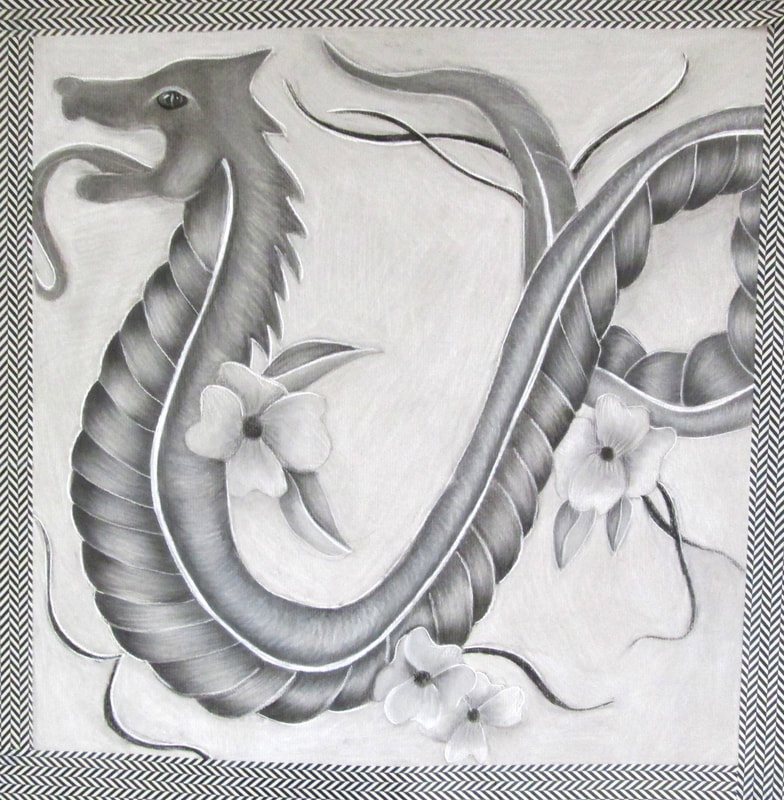
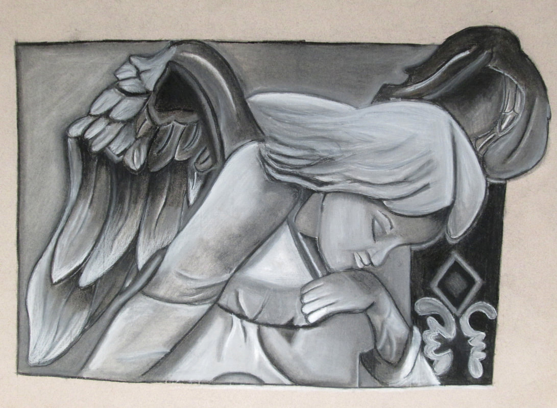
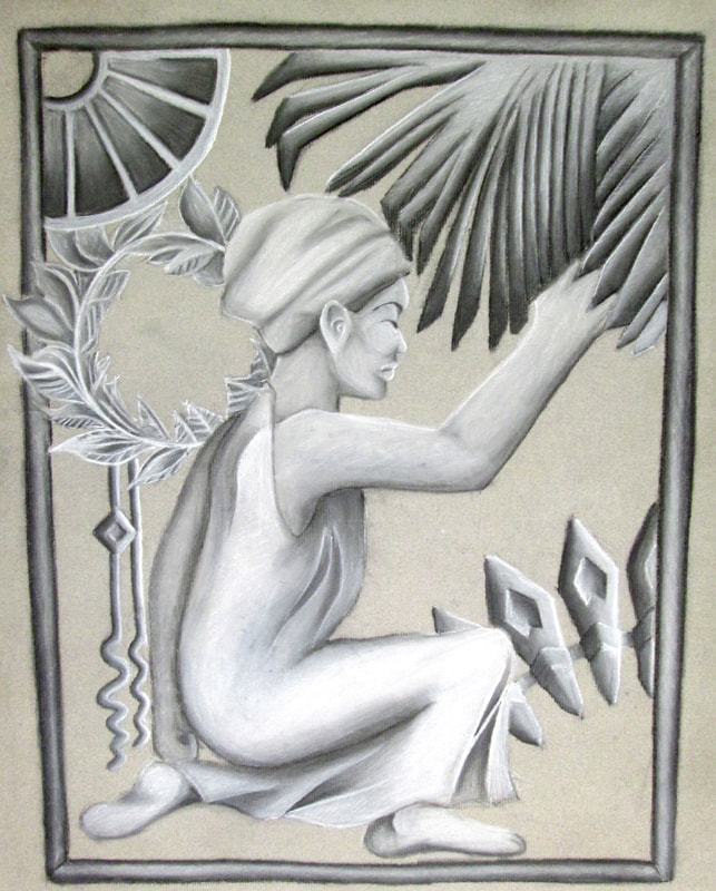
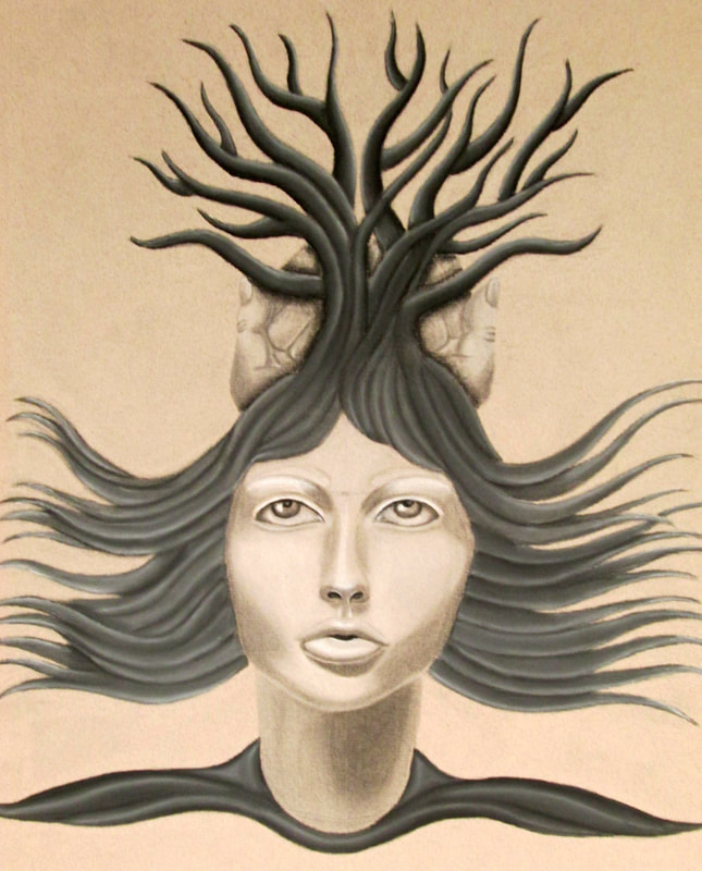
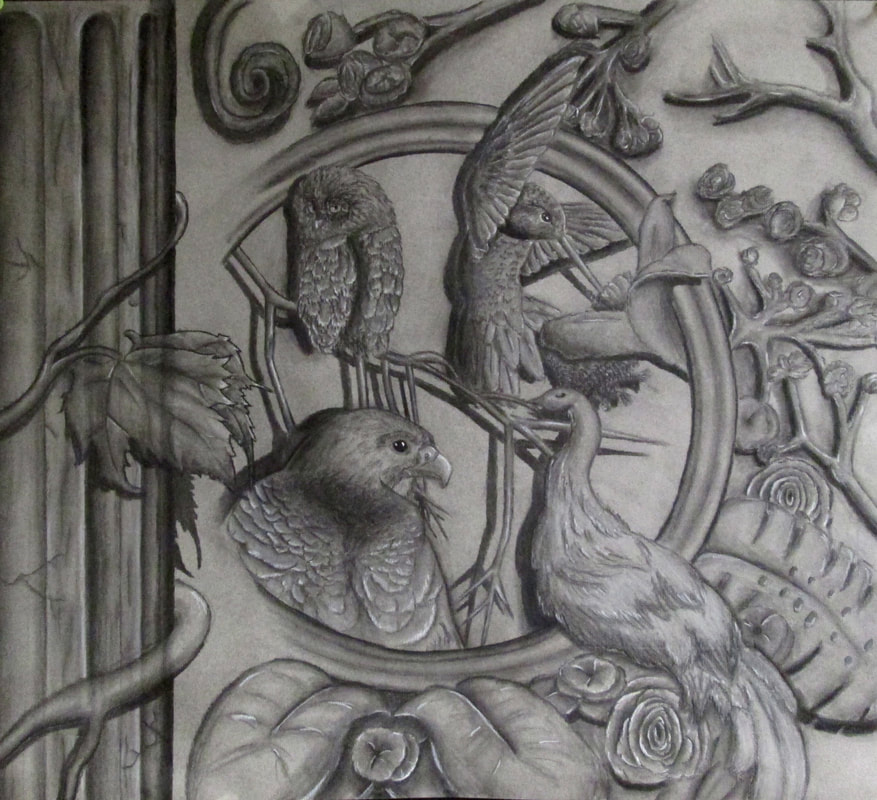
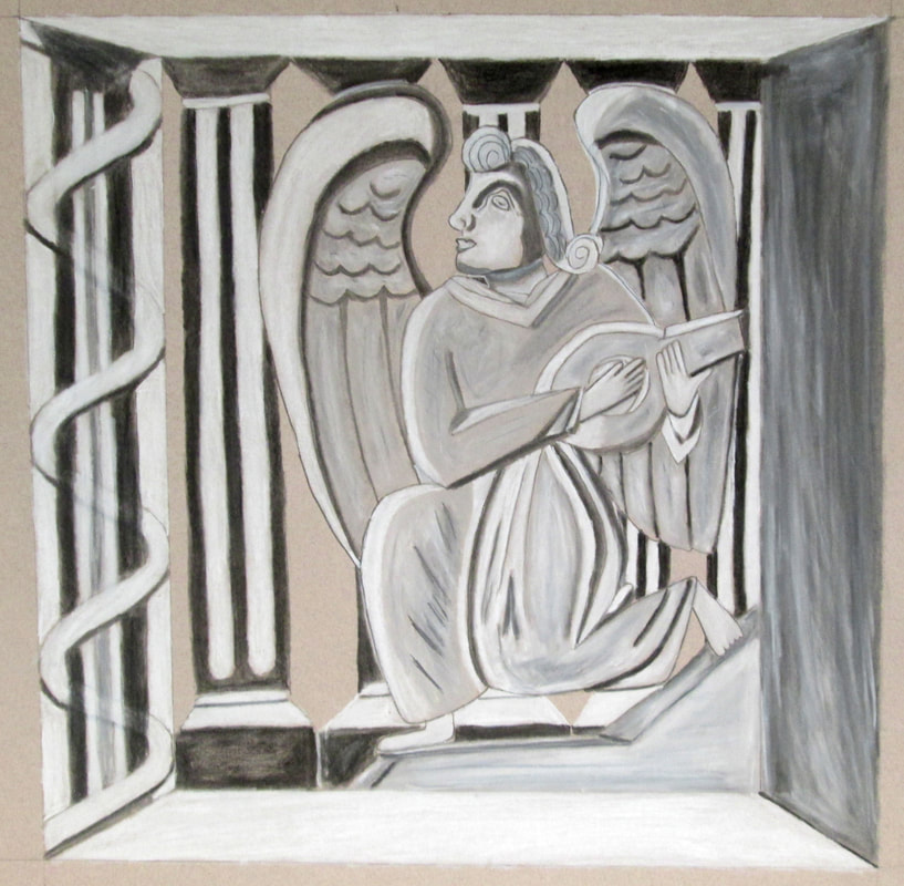
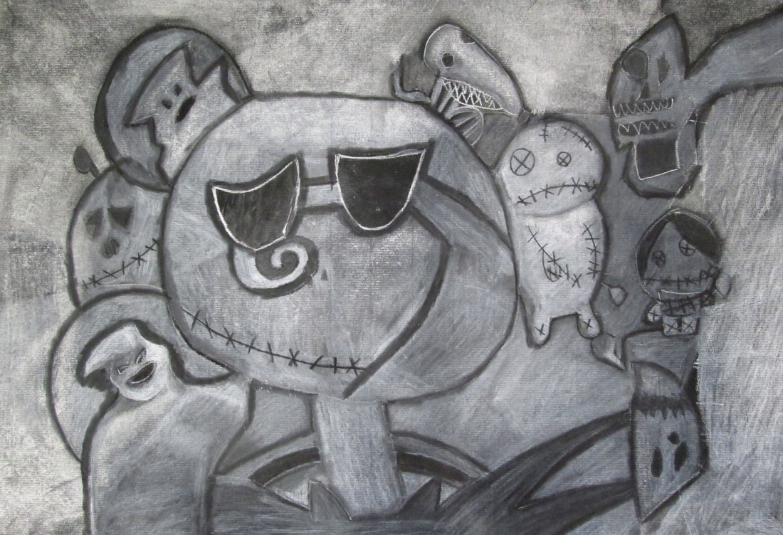
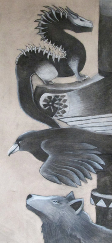
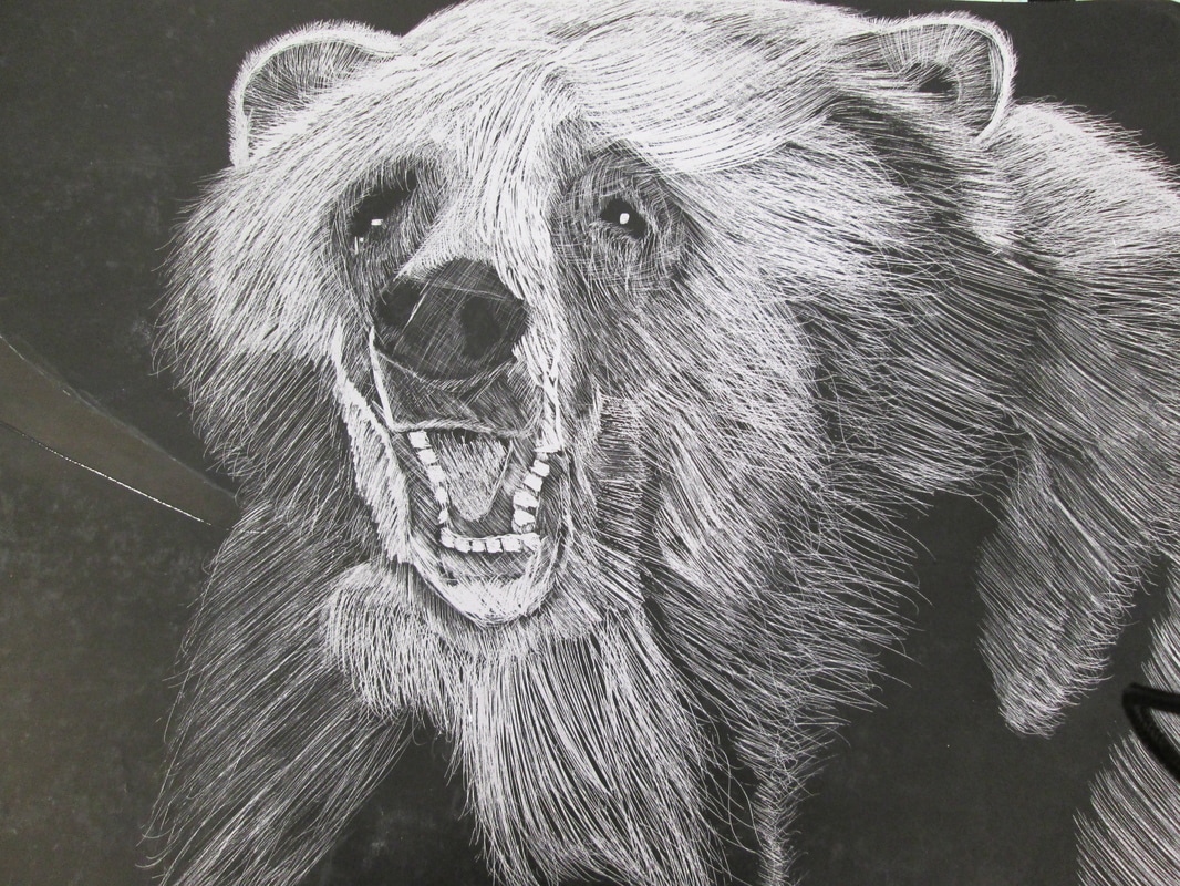
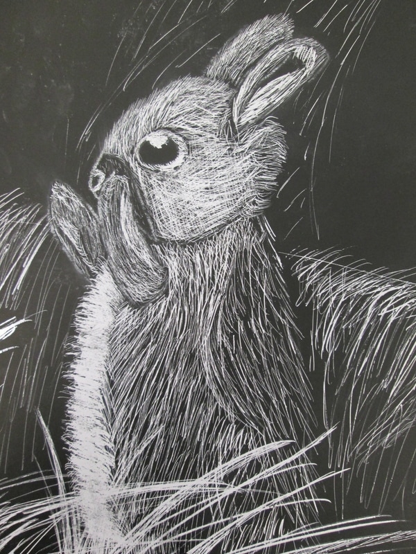
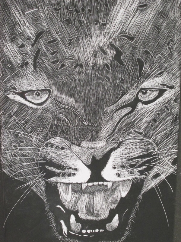
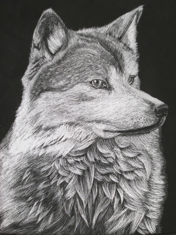
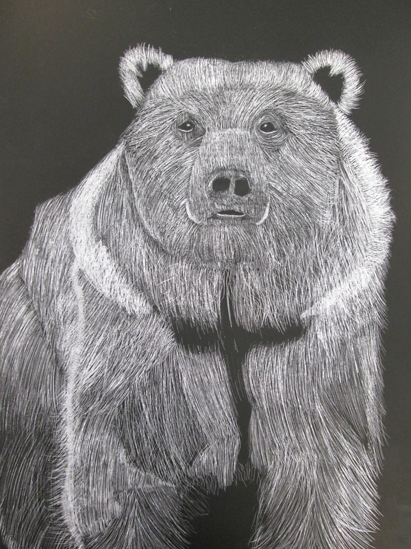
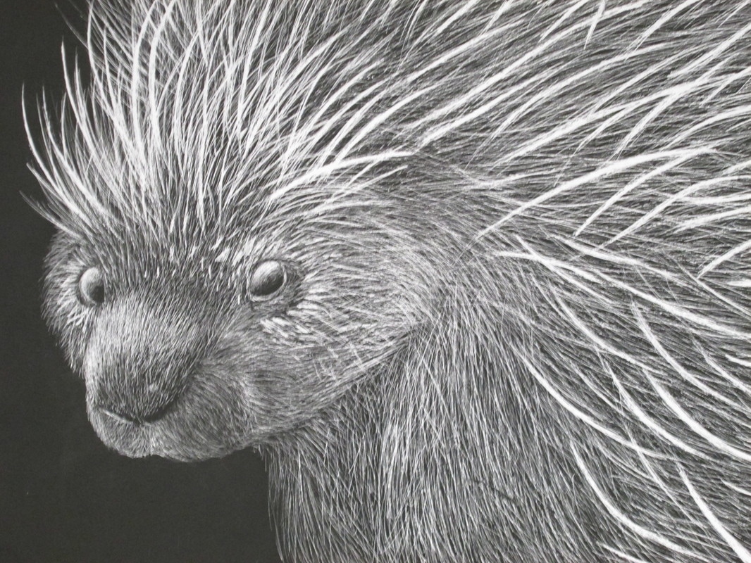
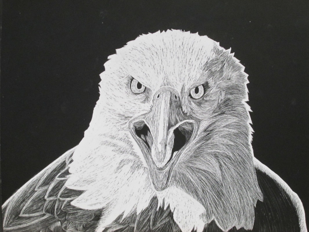
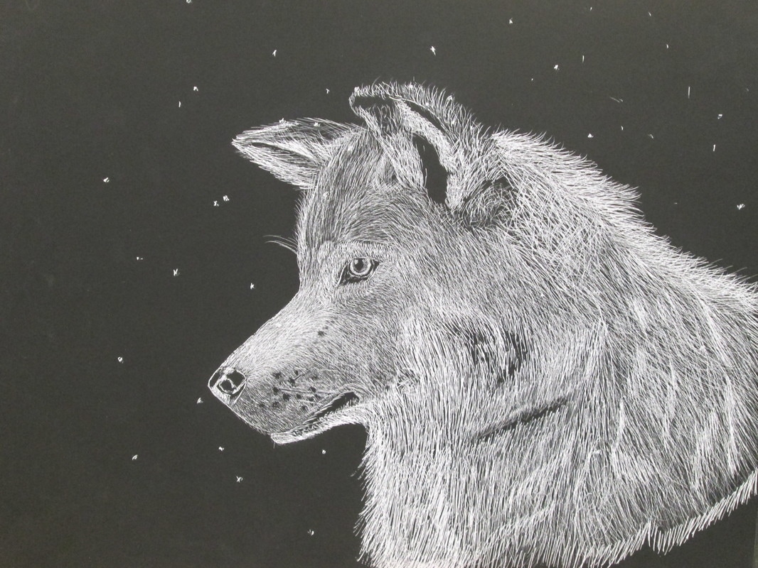
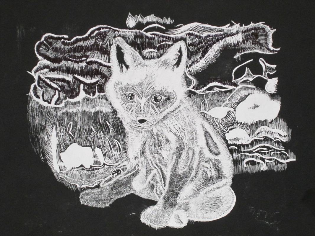
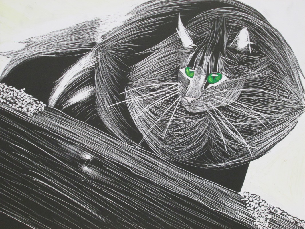
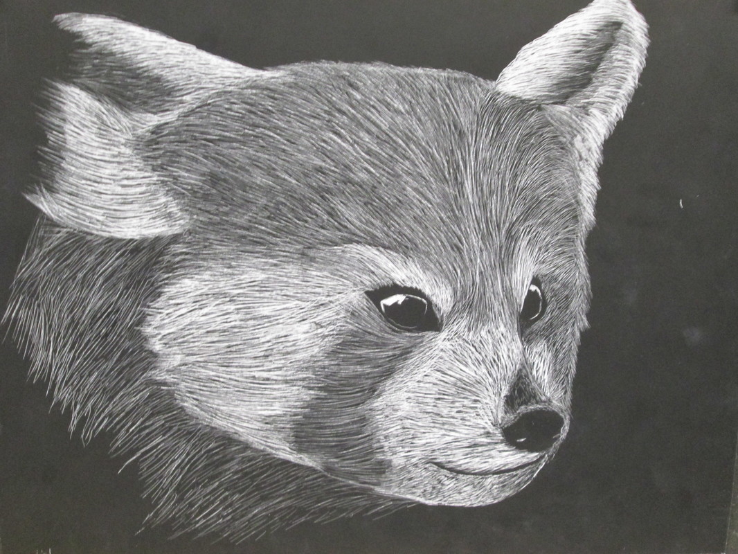
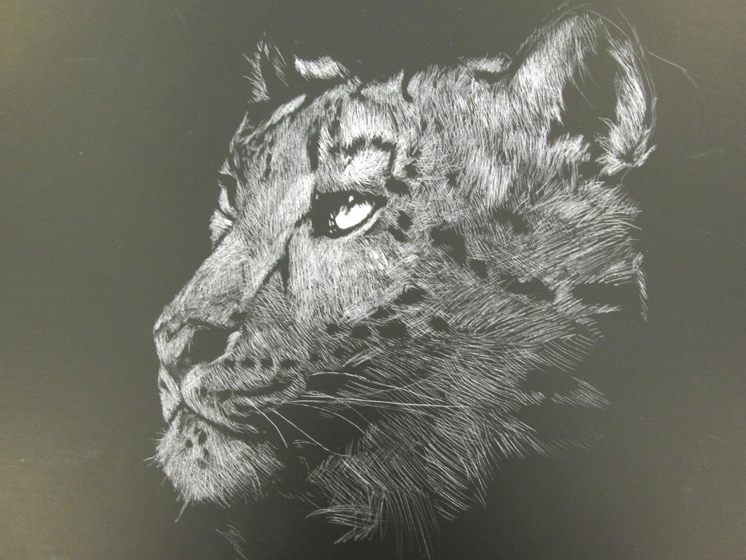
Relief. Frieze. Statues.
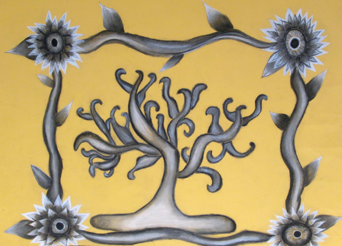
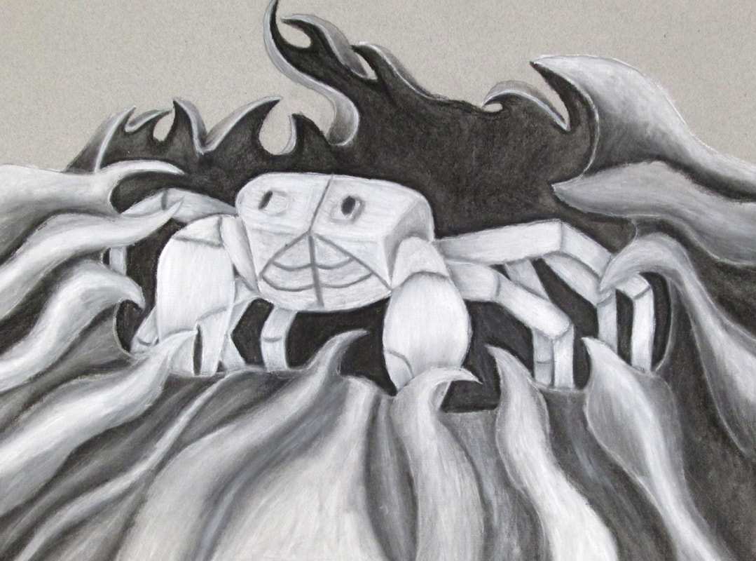
Students in Drawing 2 were asked to research Bas Relief, Friezes and Statues through-out history. They gathered images that resonated with them and were asked to create an original composition through combining different sculptural references. The inherent value and strong contrast that exists on these sculptural narratives helps the young artist with developing a deeper understanding of FORM; as well as the opportunity to work in charcoal while continuing to learn and master VALUE & CONTRAST. Below are the results of their efforts.
Extended Drawings
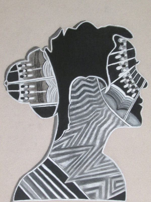
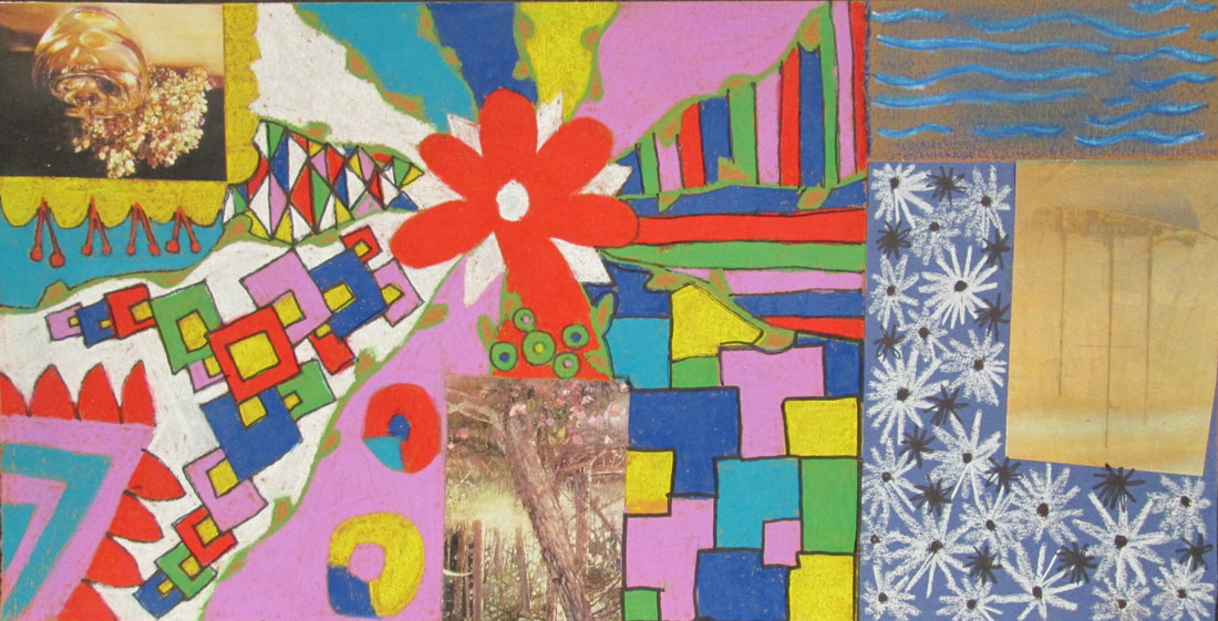
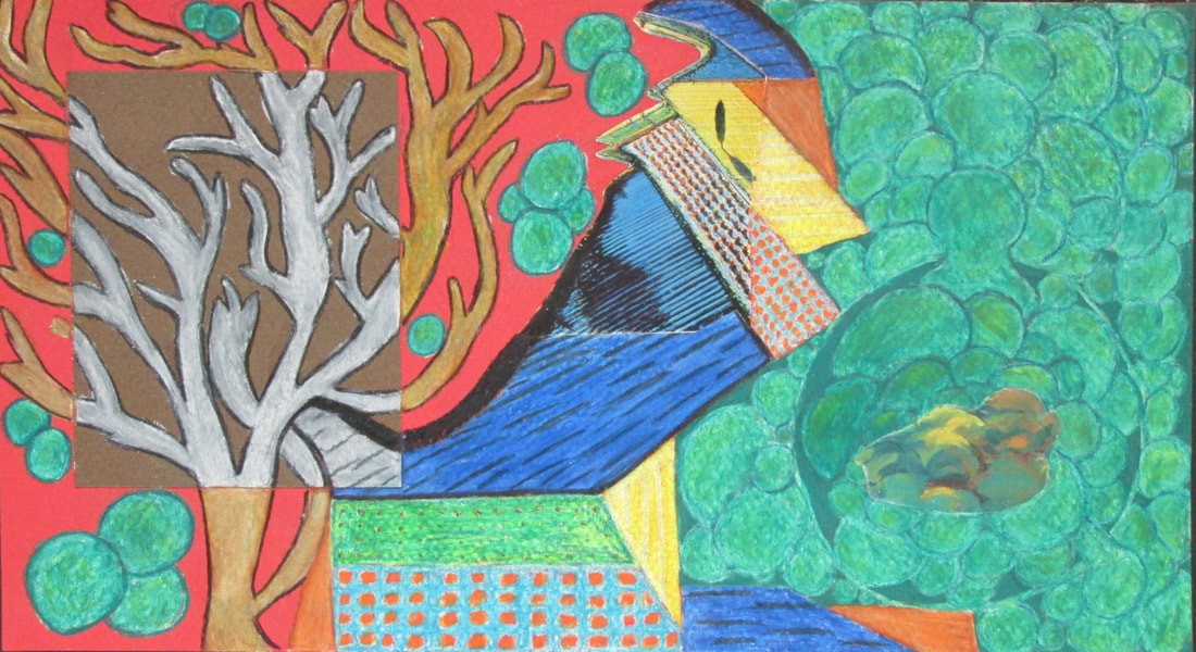
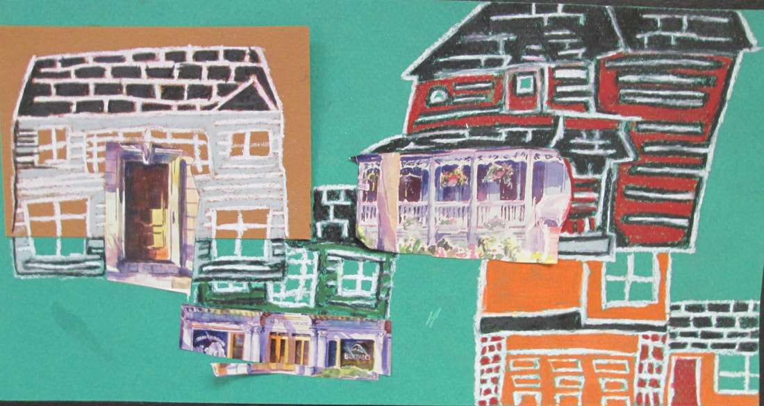
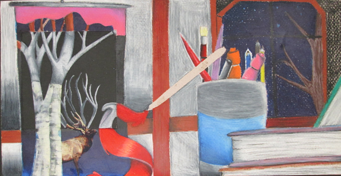
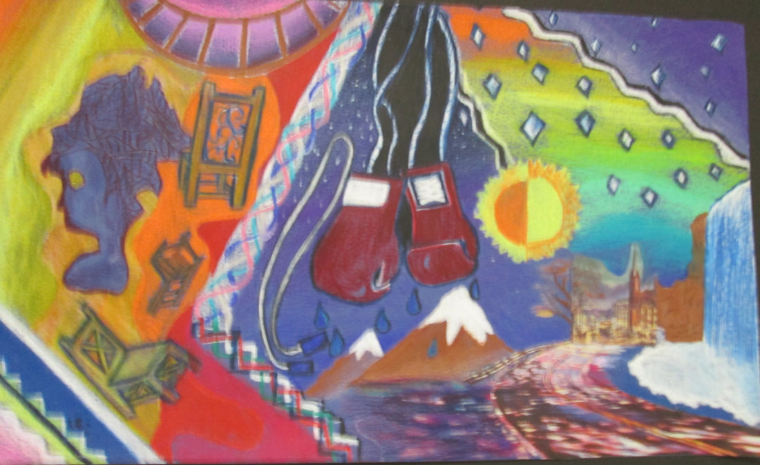
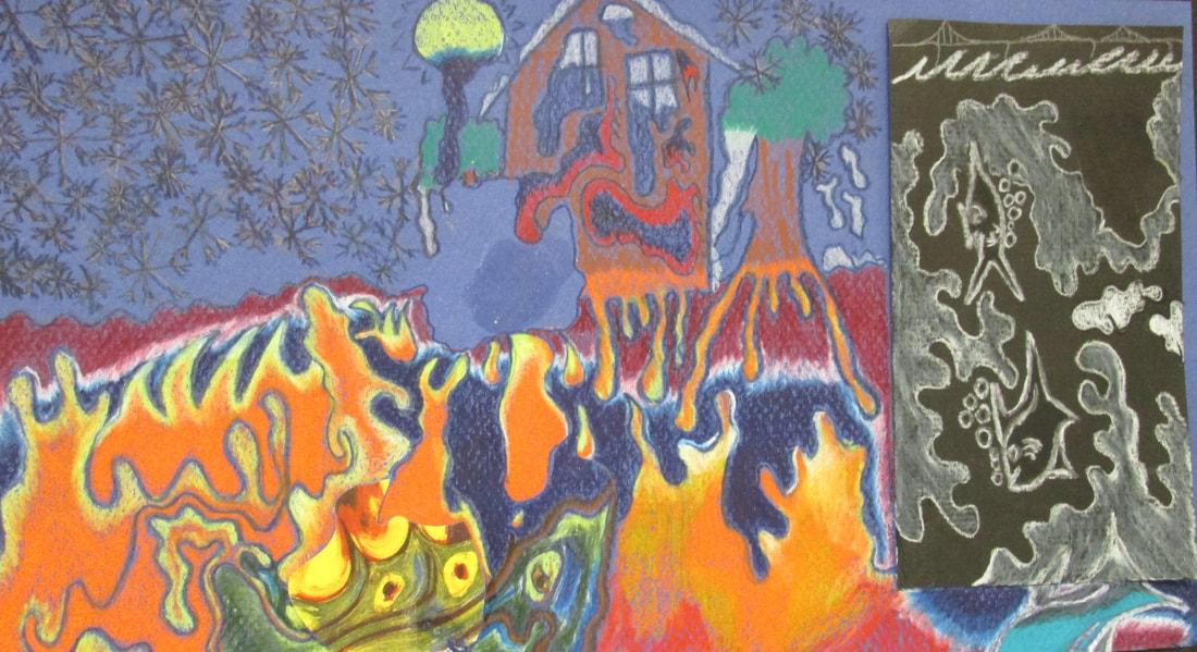
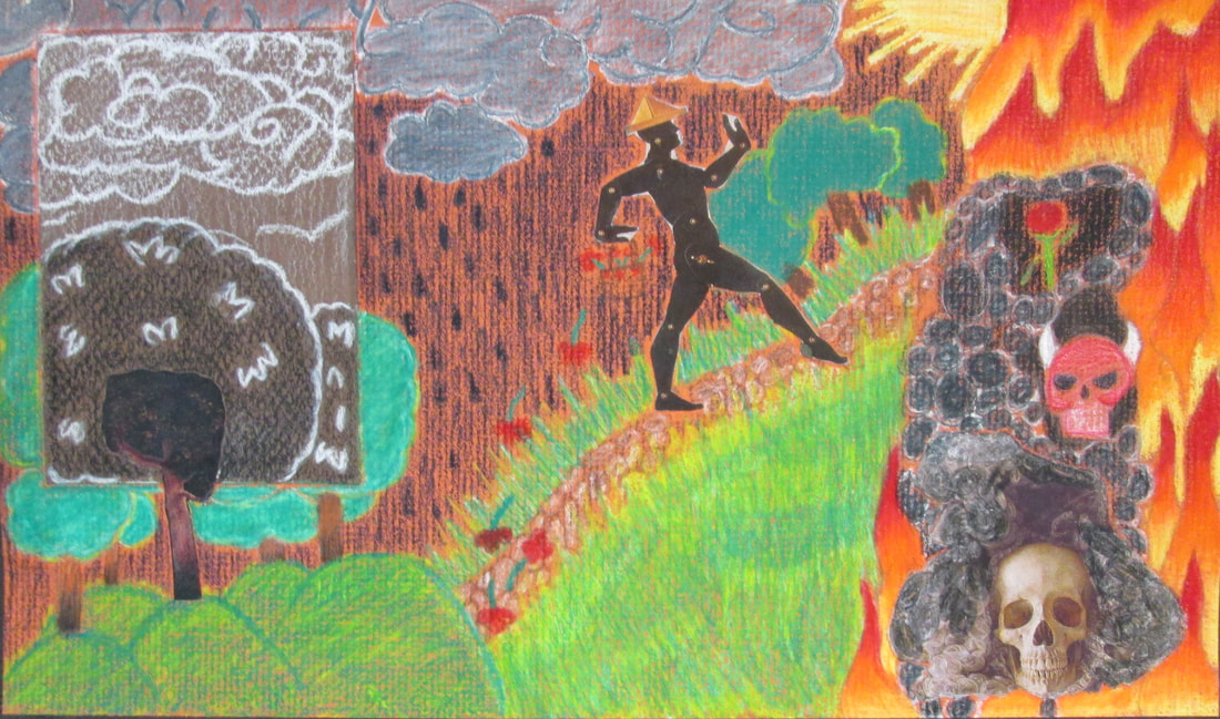
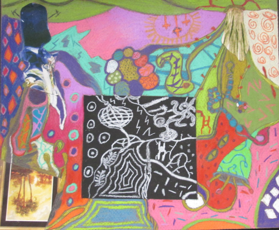
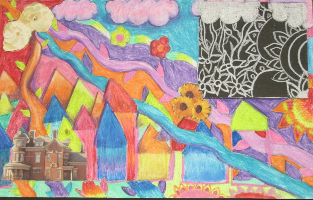
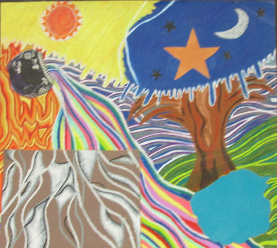
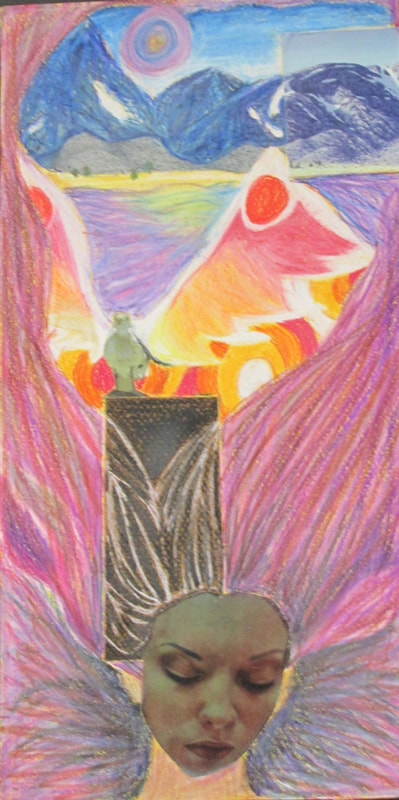
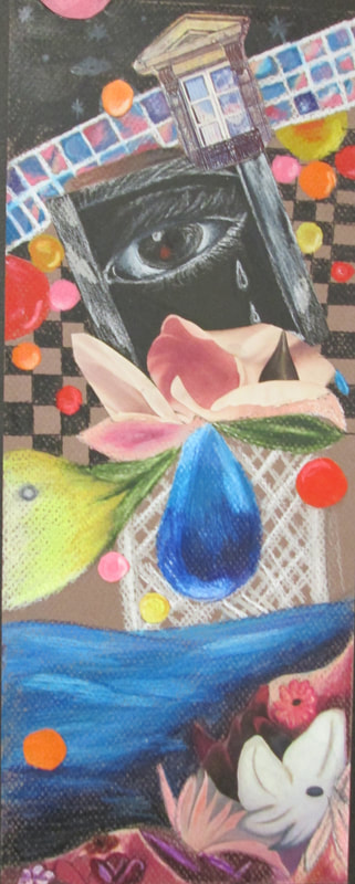
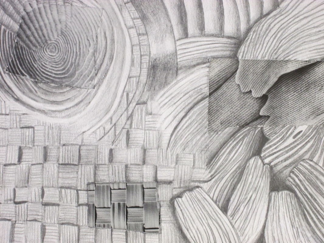
Student artists were given magazines, asked to respond to colors, shapes, patterns, designs or any visual element that appealed to them, cut or tear and lastly glue at least three down on a colored paper of their choice. Afterwards the artists visually connected through their own designs or narratives via colored pencil. Some of the students chose to remove their original pasted piece and continue with their own designs. A composition such as this allows students to avoid the "white paper", have a starting point and develop their own original illustration. As a teacher it allows me to see how they think, how they are putting and connecting things together
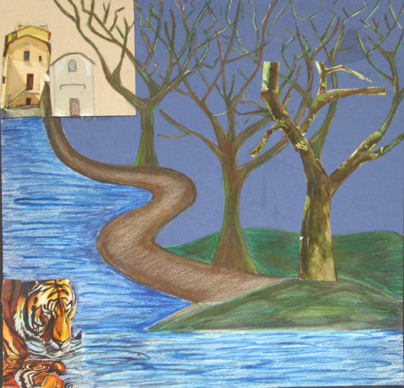
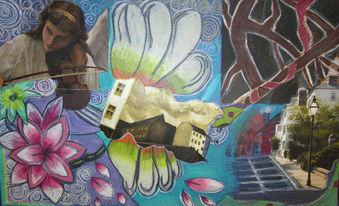
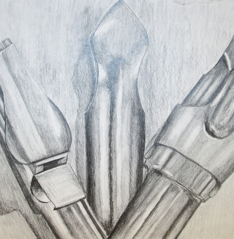
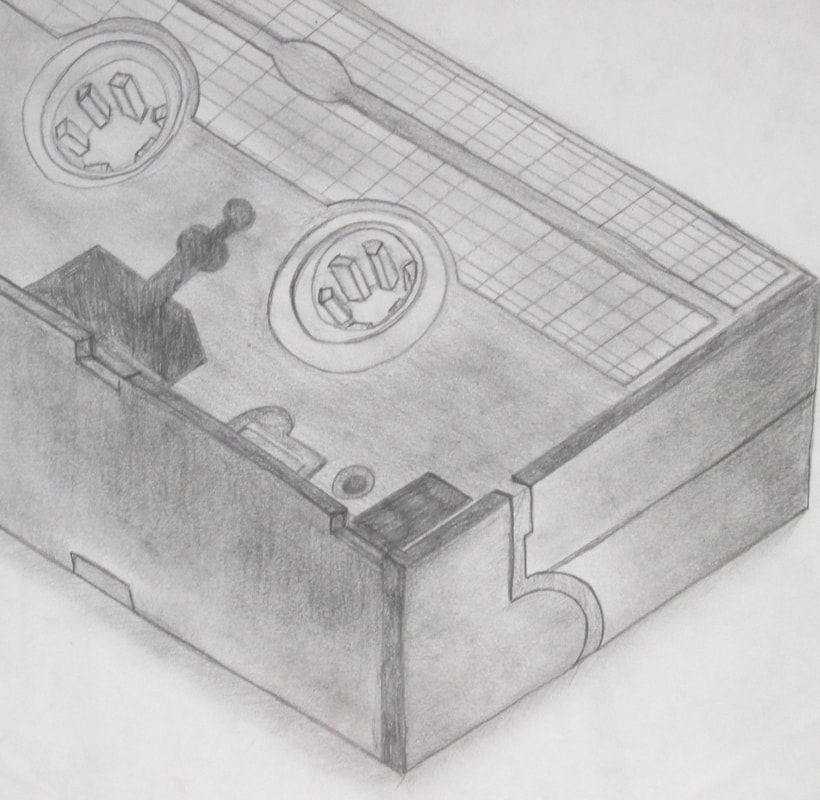
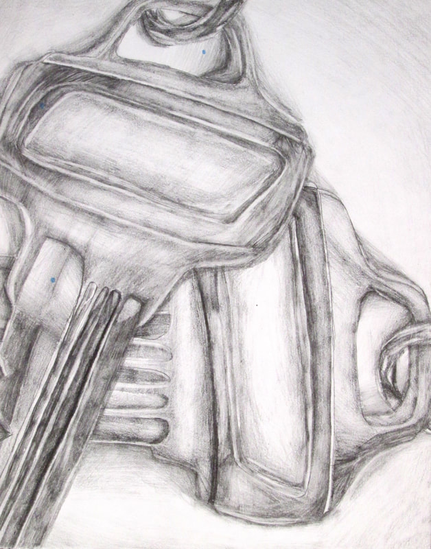
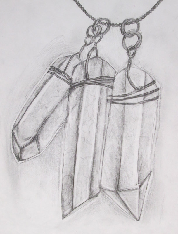
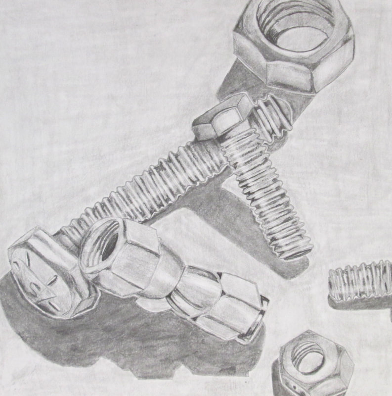
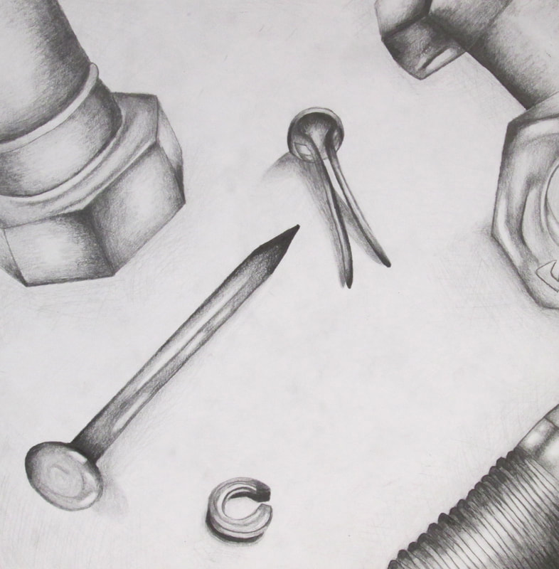
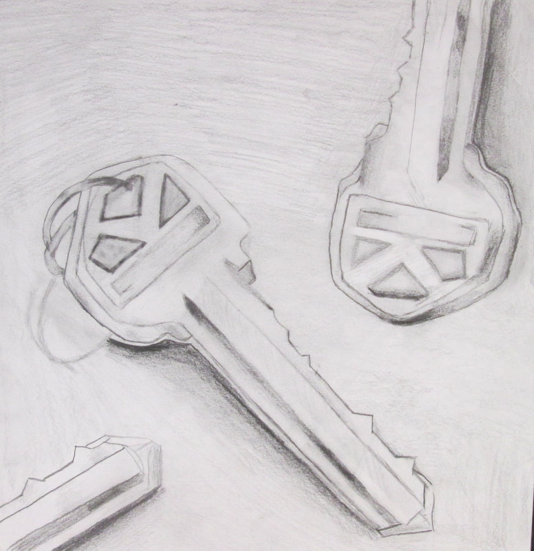
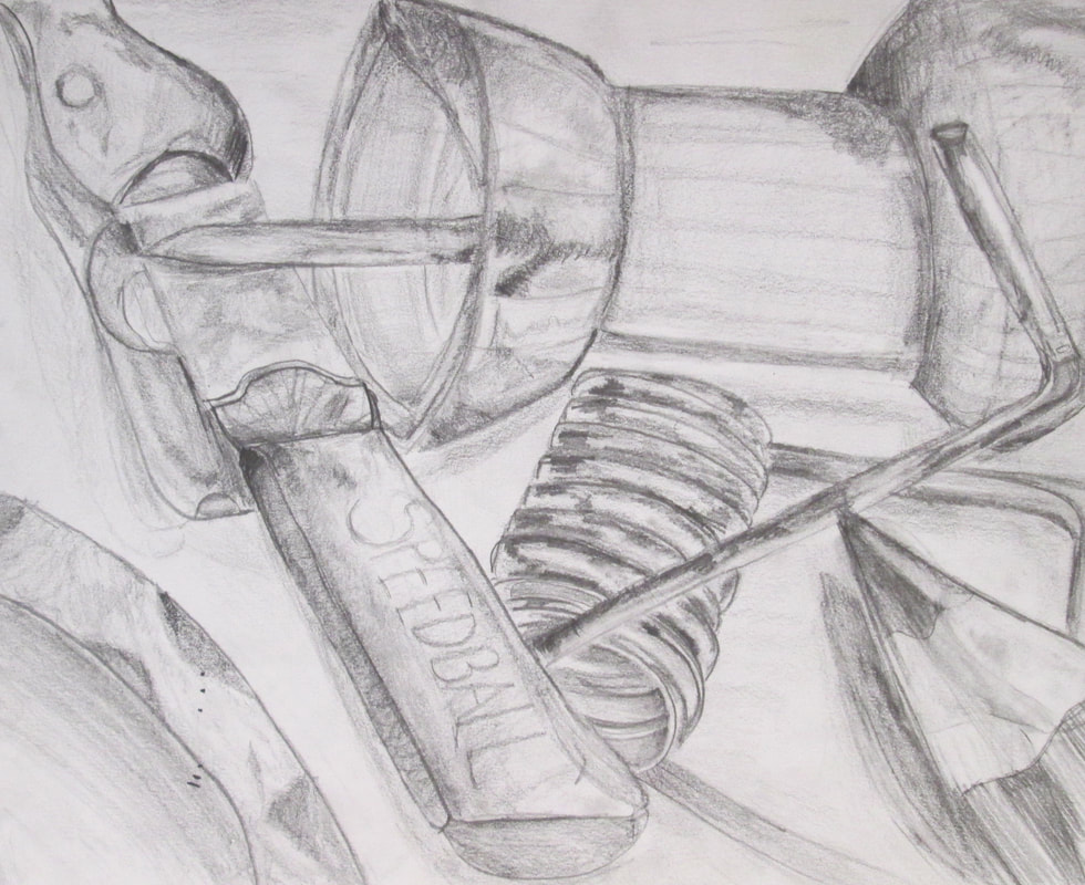
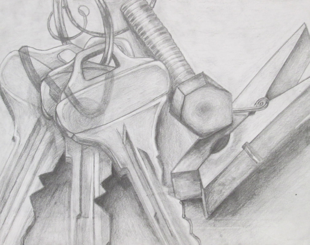
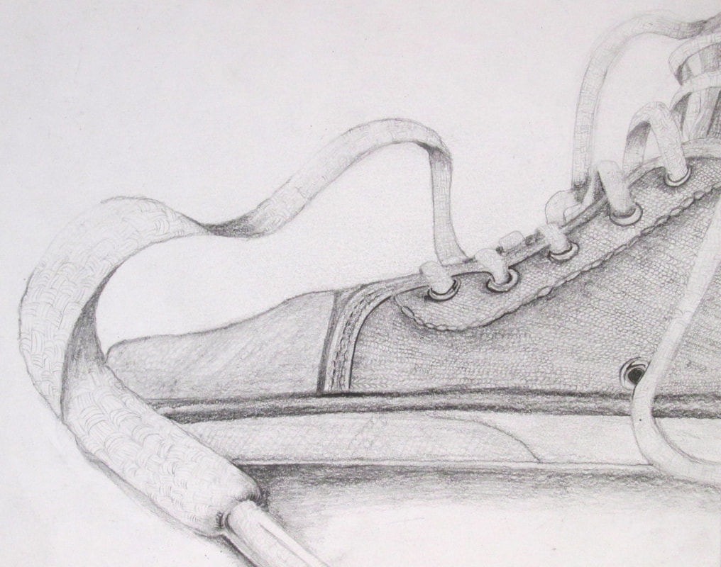
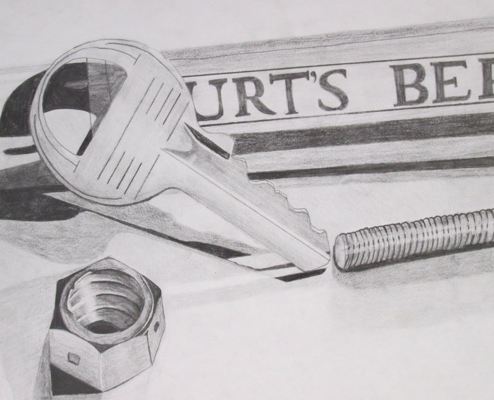
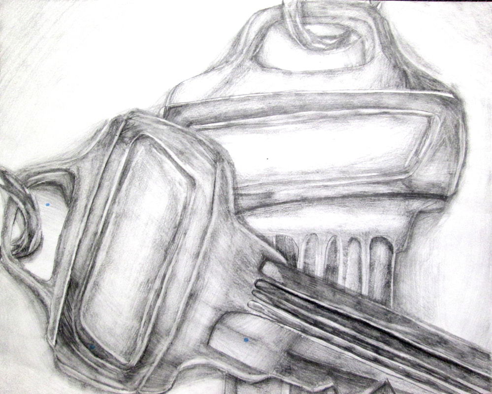
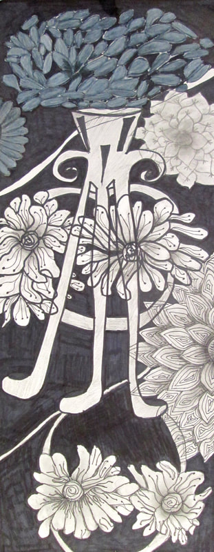
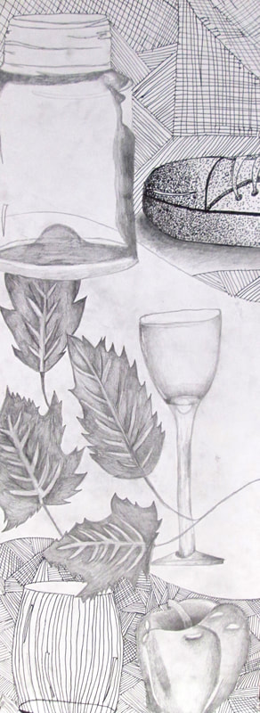
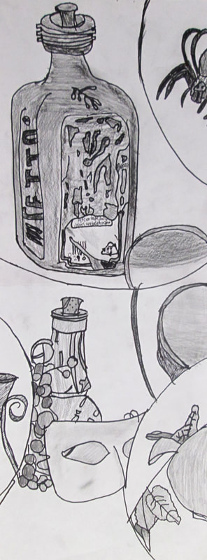
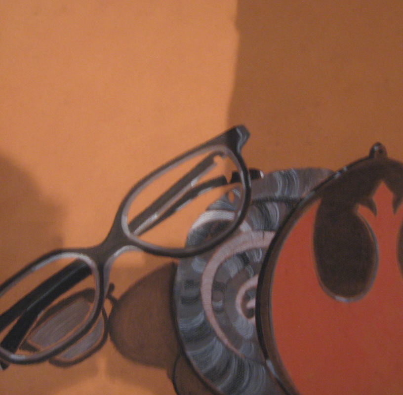
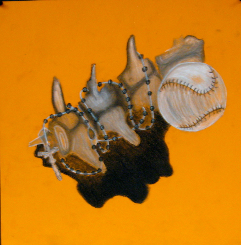
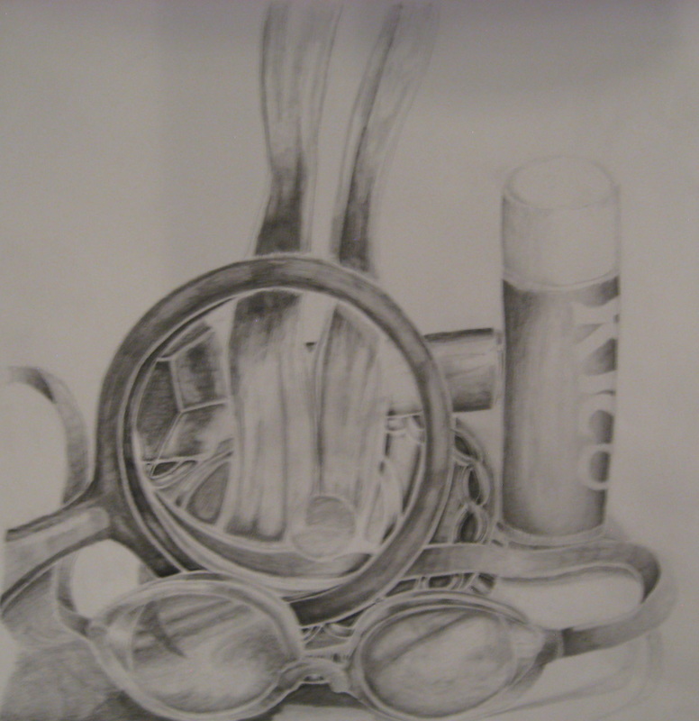
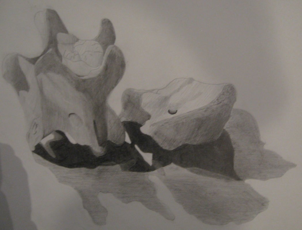
Observe. Own. Objects.

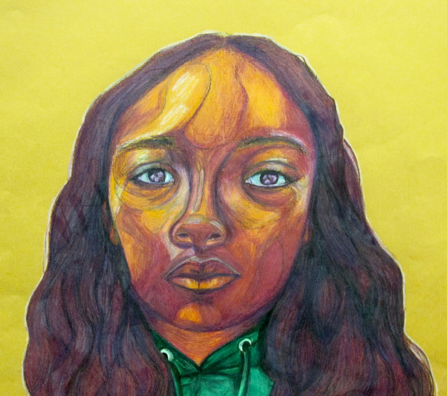
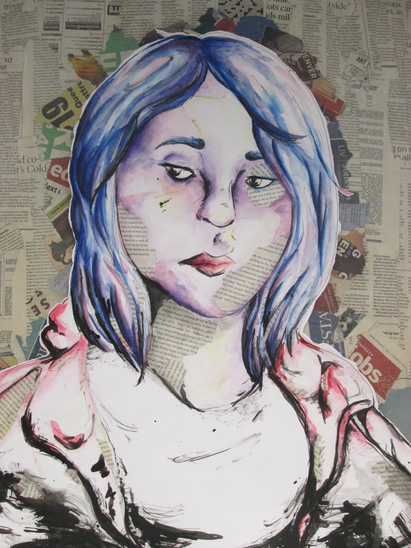
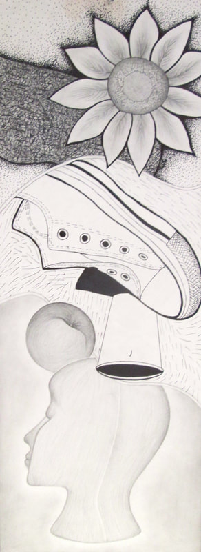
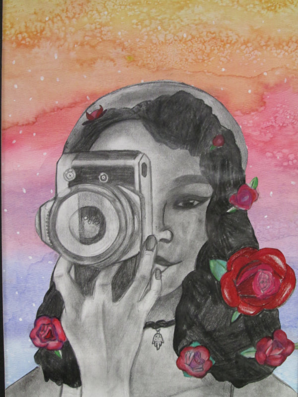
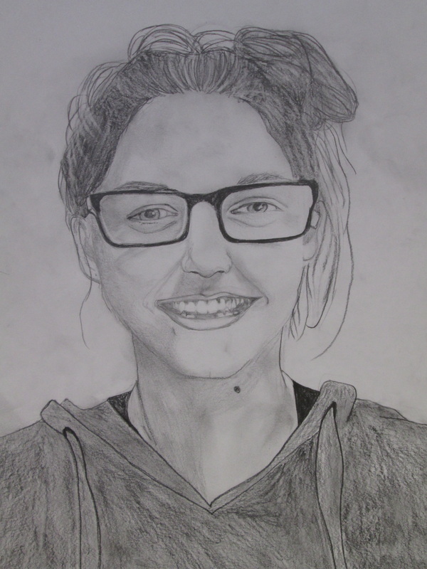
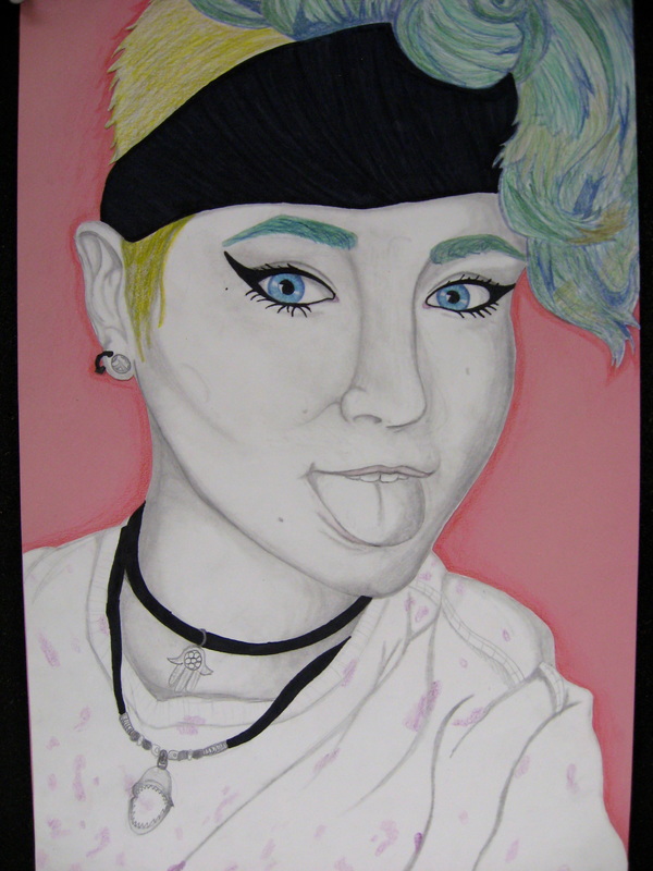
Spring 2018... Some surreal, some real selfies
ORIGINAL vs. CANNED
Many of us still remember the ORIGINAL IDEA…now clouded by Pinterest, Google, Instagram etc.
In today’s media filled culture we become reliant on other people’s ideas and have in some cases lost our confidence in our own original thoughts. My goodness… what on earth did we do before the internet?
To address this emerging CREATIVE ANCHOR… Art students were given 2 list of drawing prompts. They were asked to select at least 5 things/ideas or images to combine and create an original composition. They were not allowed to use resources, their phones and received no instruction from the teacher.
What you see here are the results. We as a class talked about how quickly they were able to draw from their own personal experiences and visual bevy to compose an original design without relying on outside references.That said it doe not mean that using resources available is a bad thing this was an opportunity for students to be reminded that they have a fantastic reserve within heir own imagination!
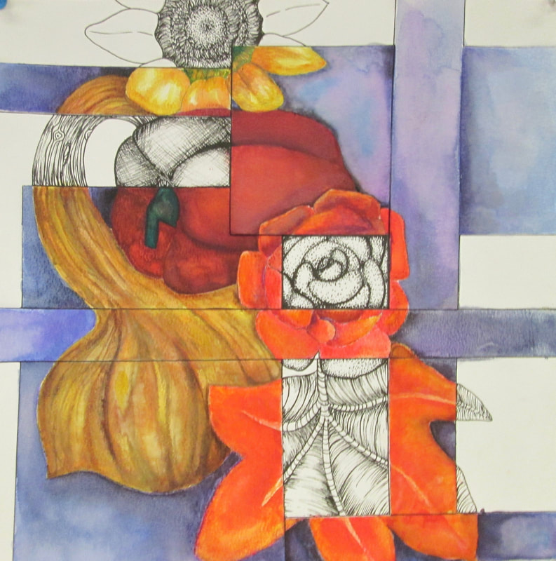
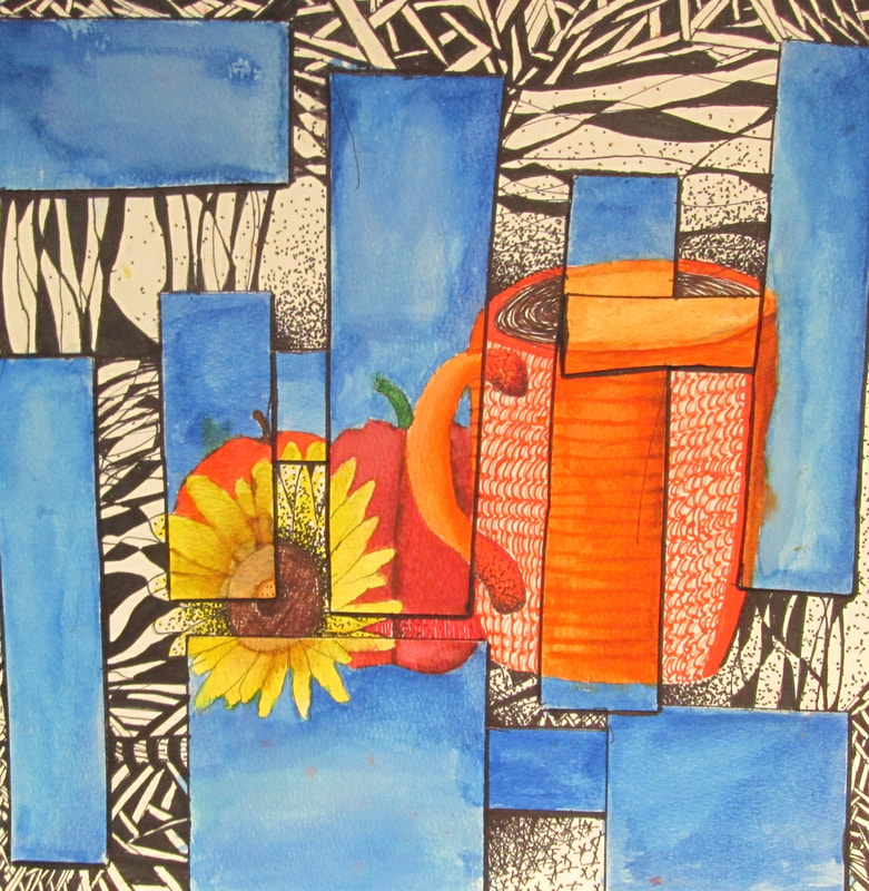
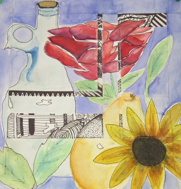
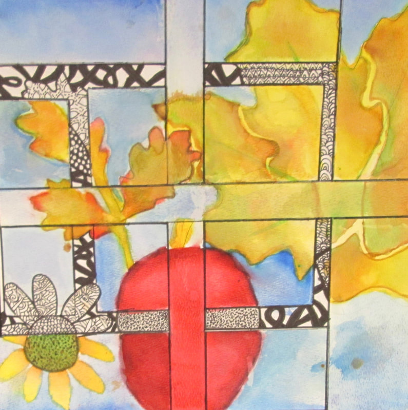
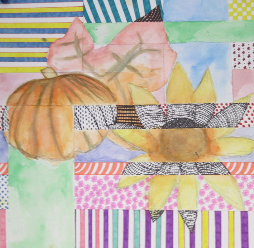
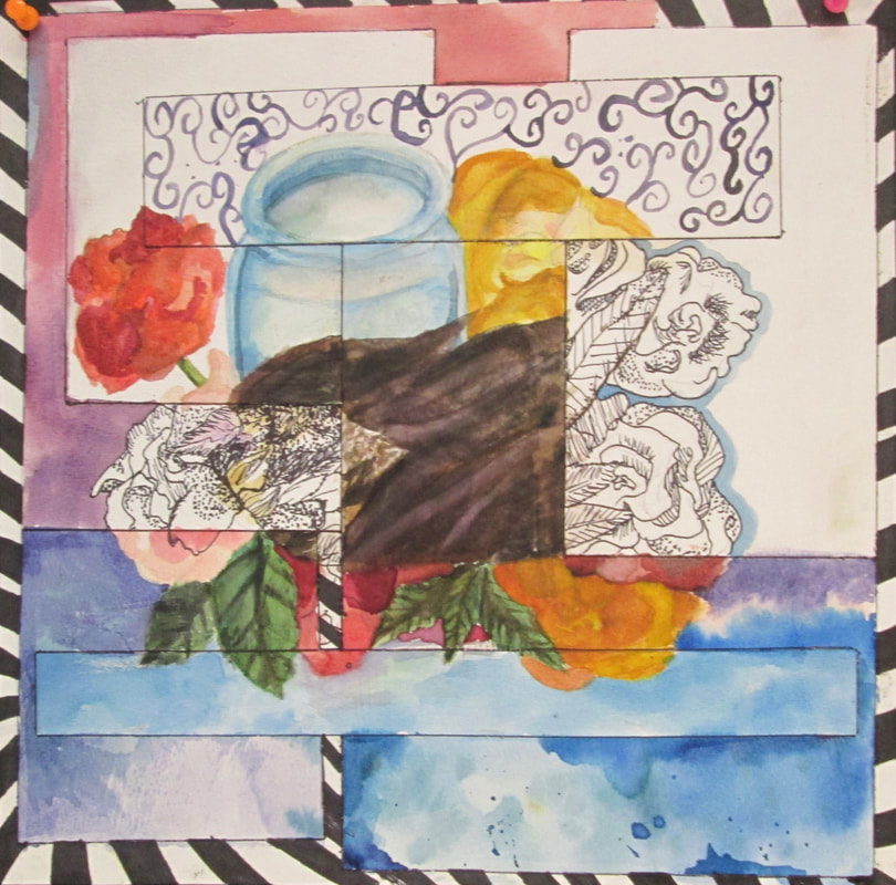
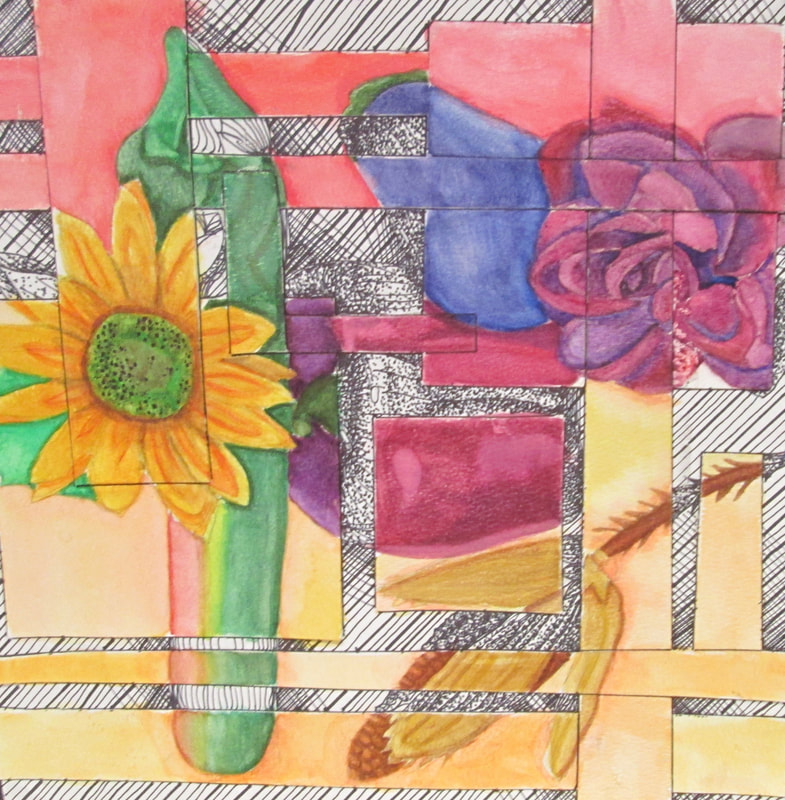
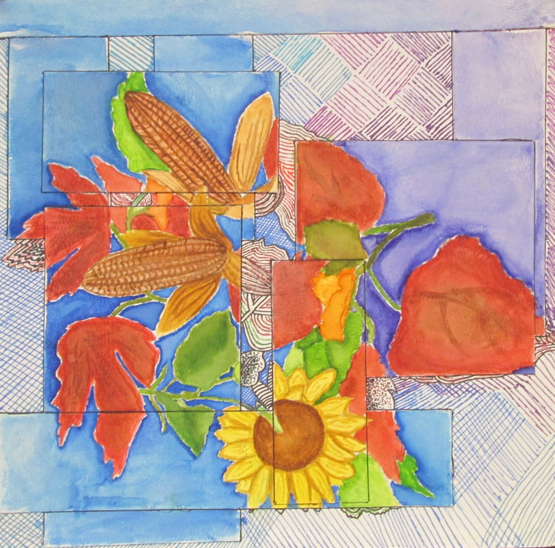
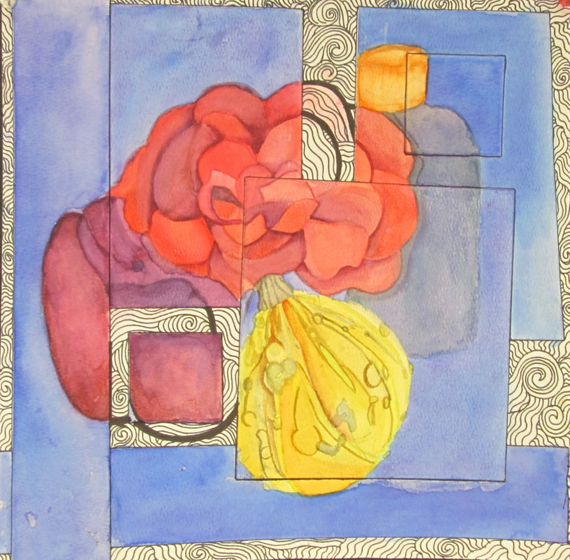
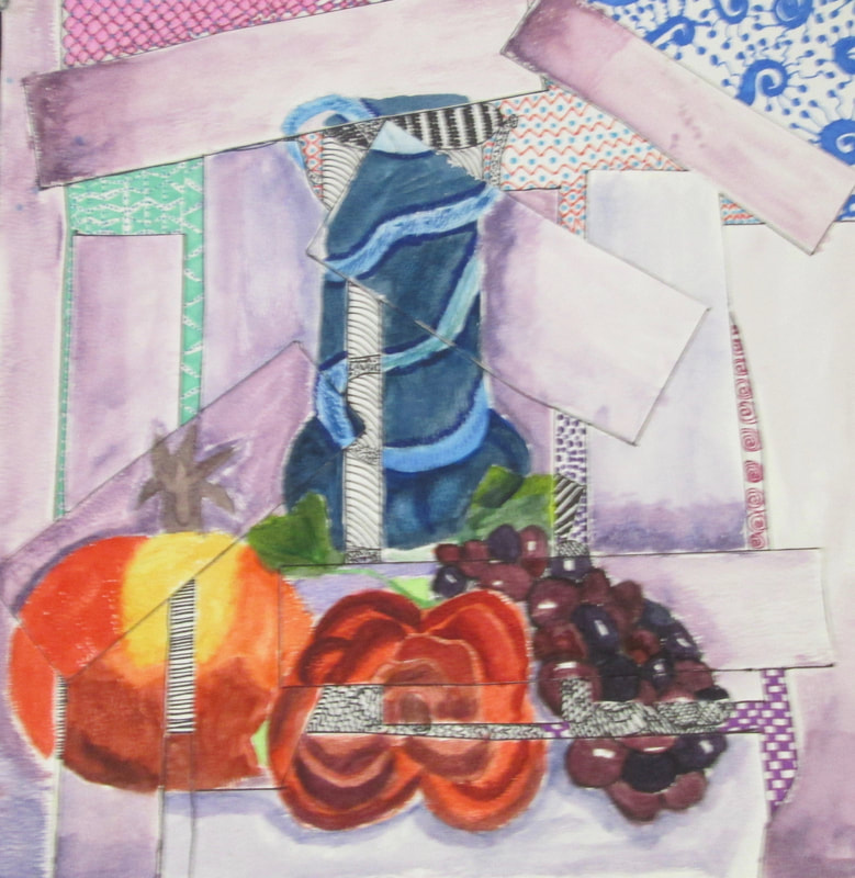
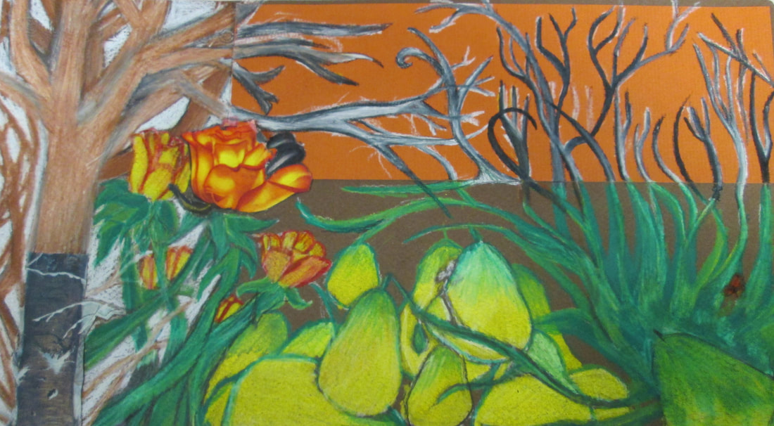
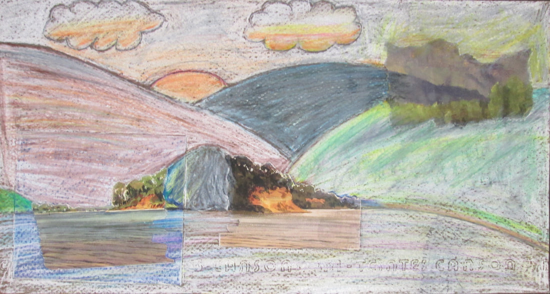
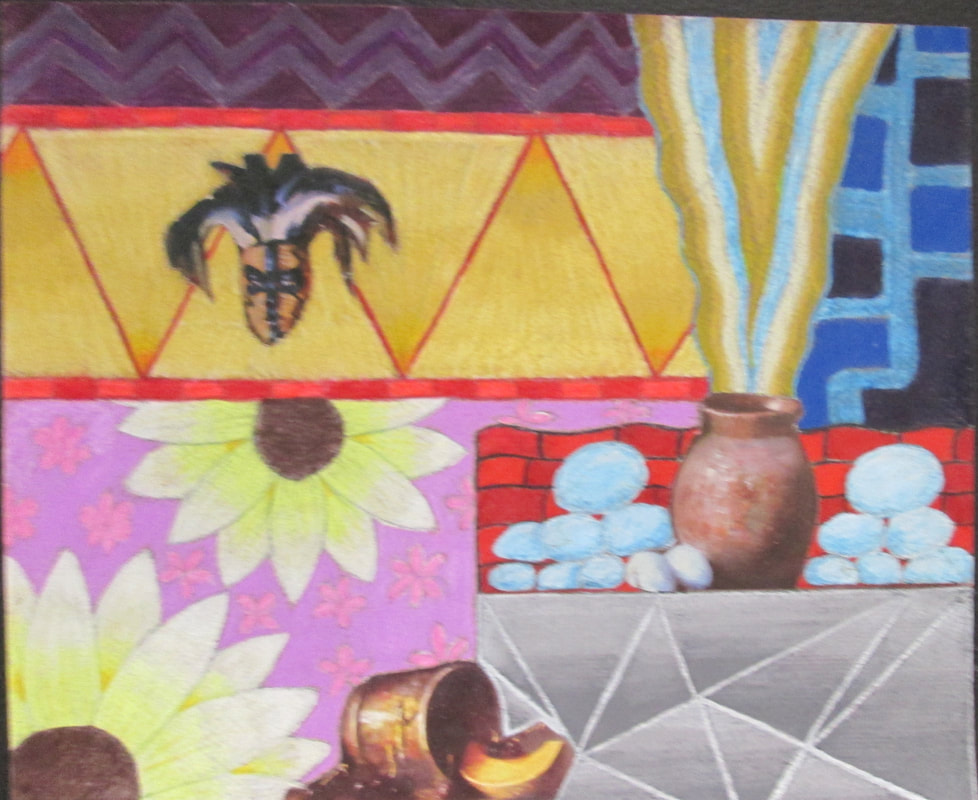
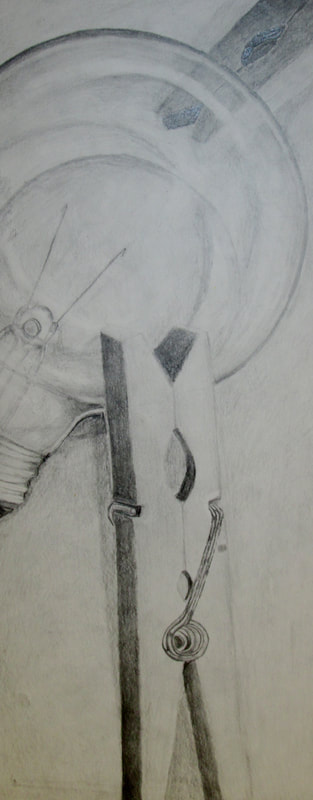
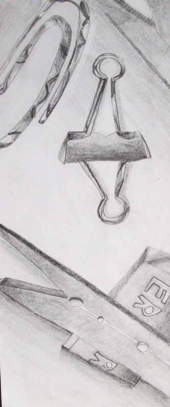
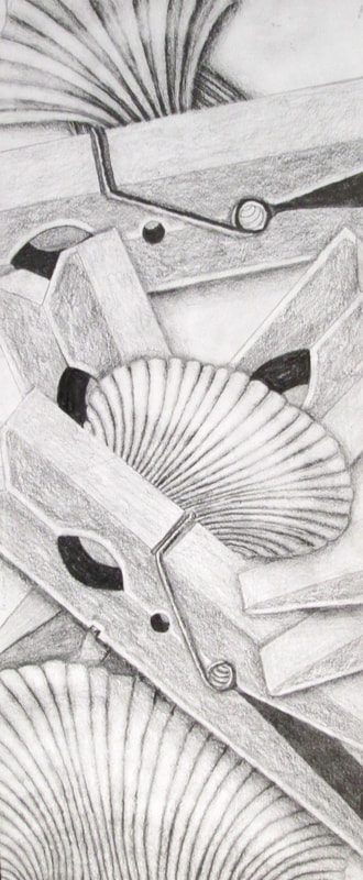
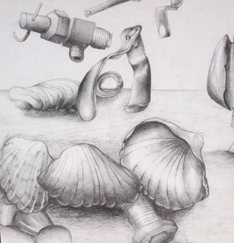
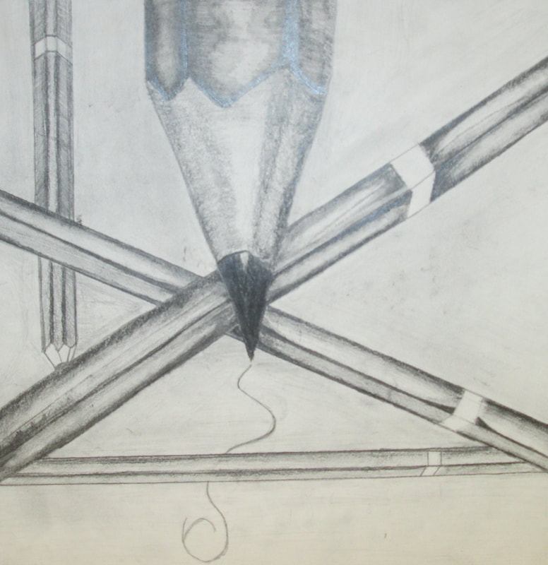
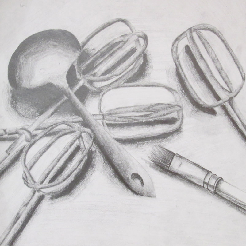
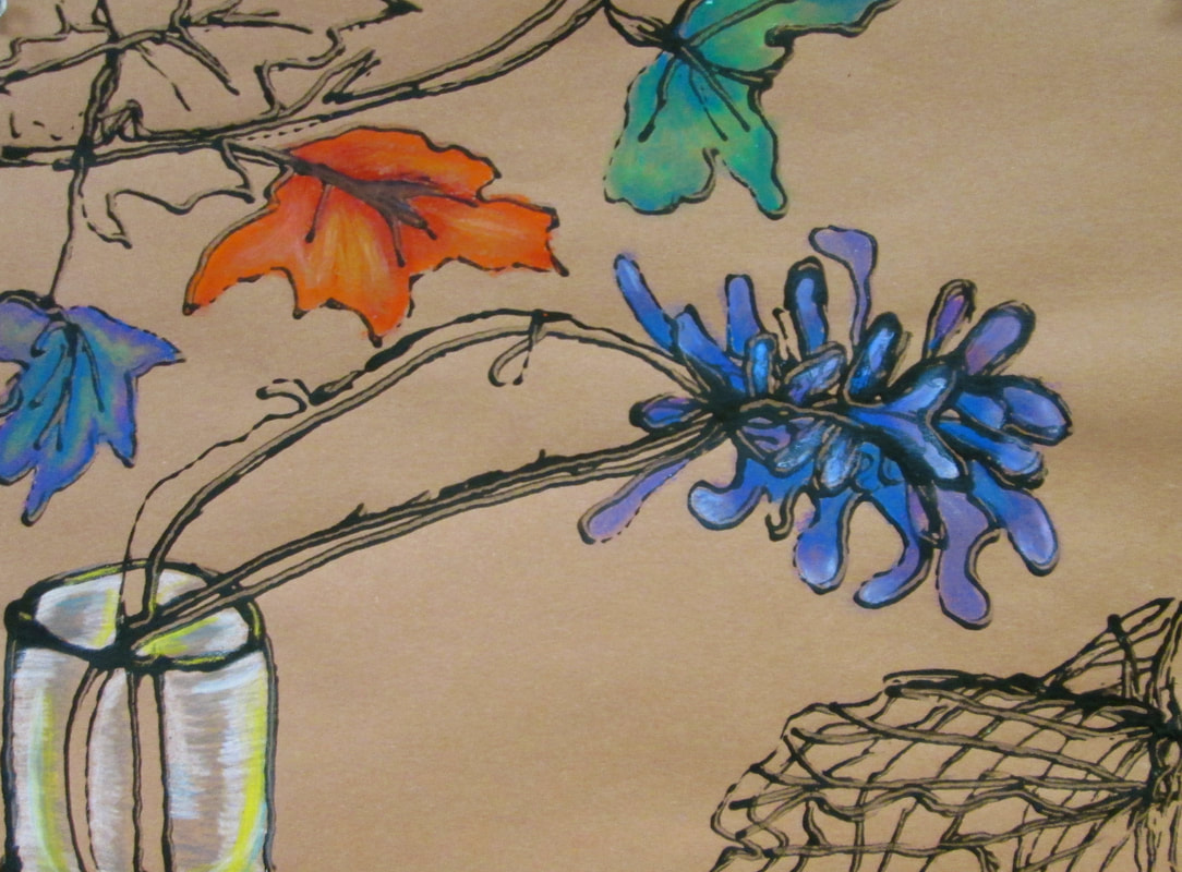
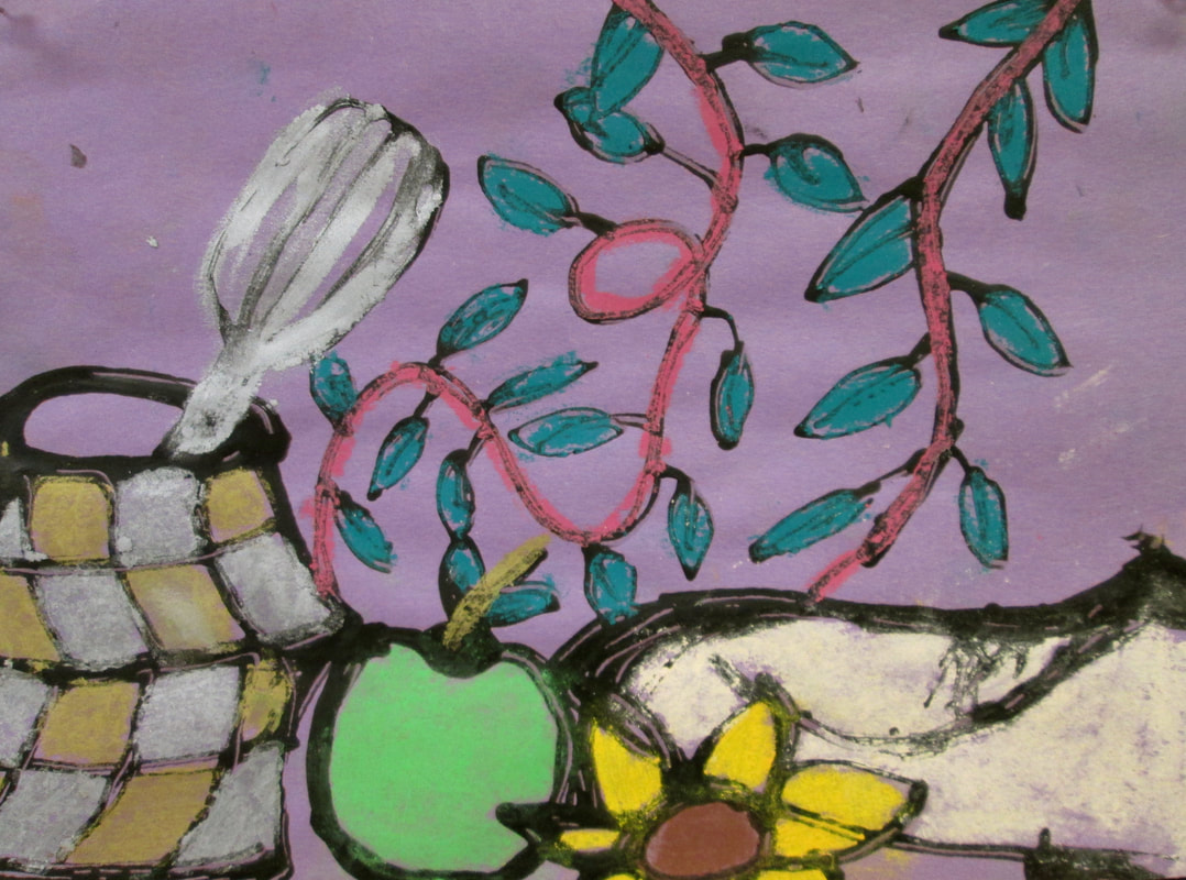
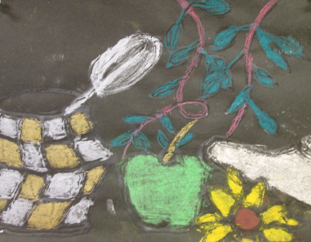
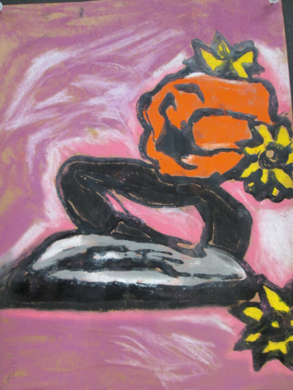
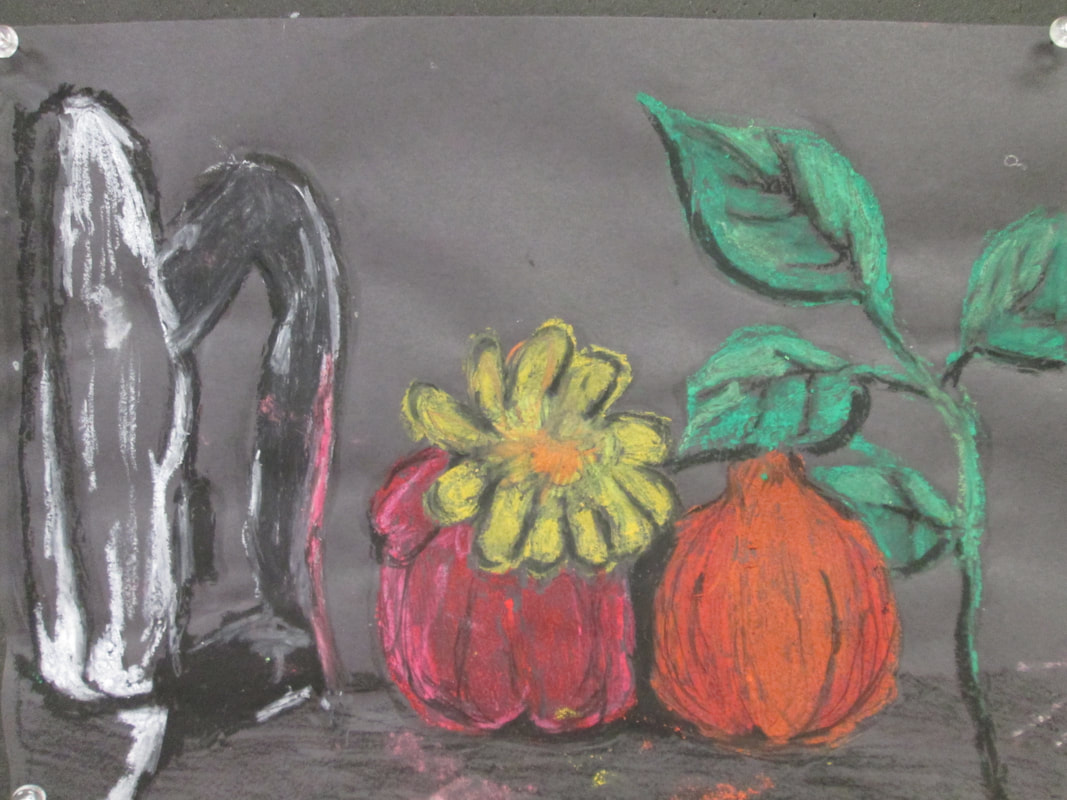
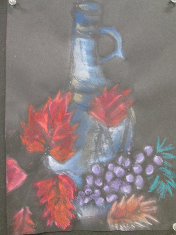
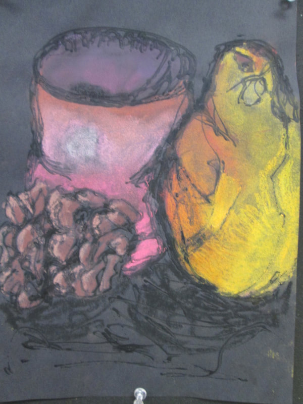
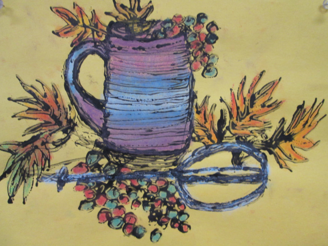
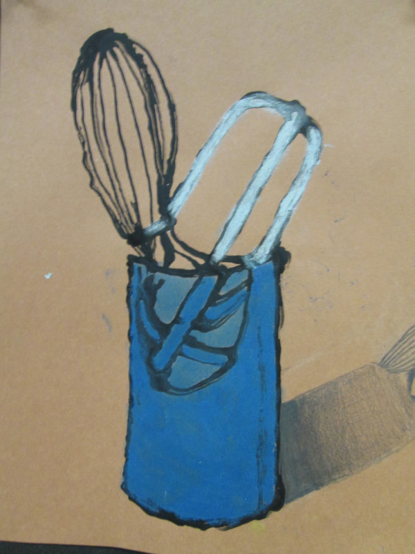
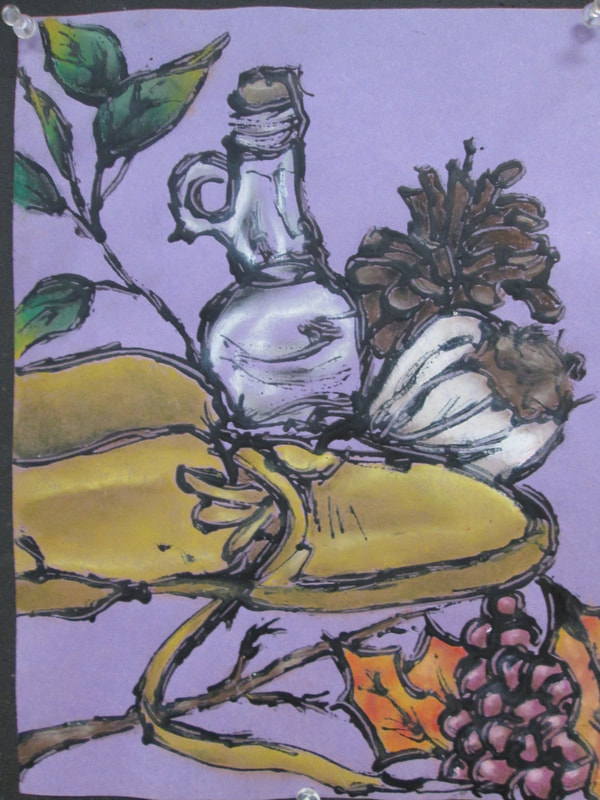
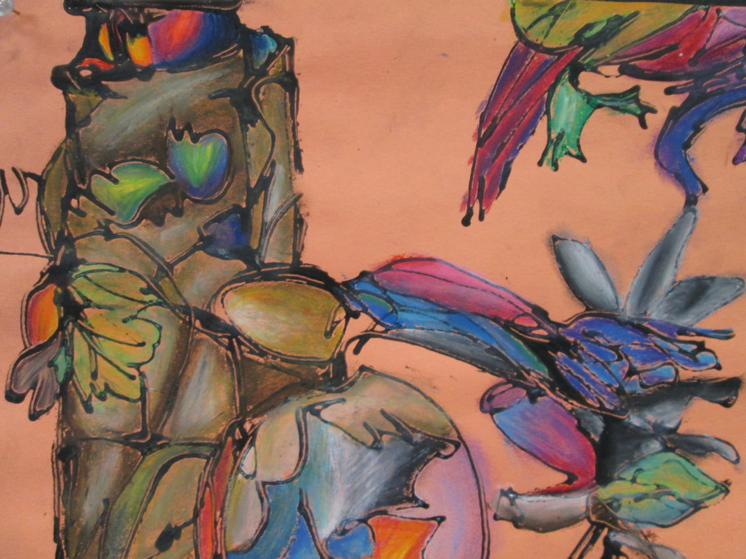
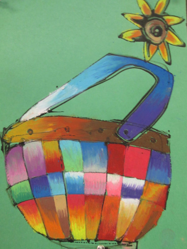
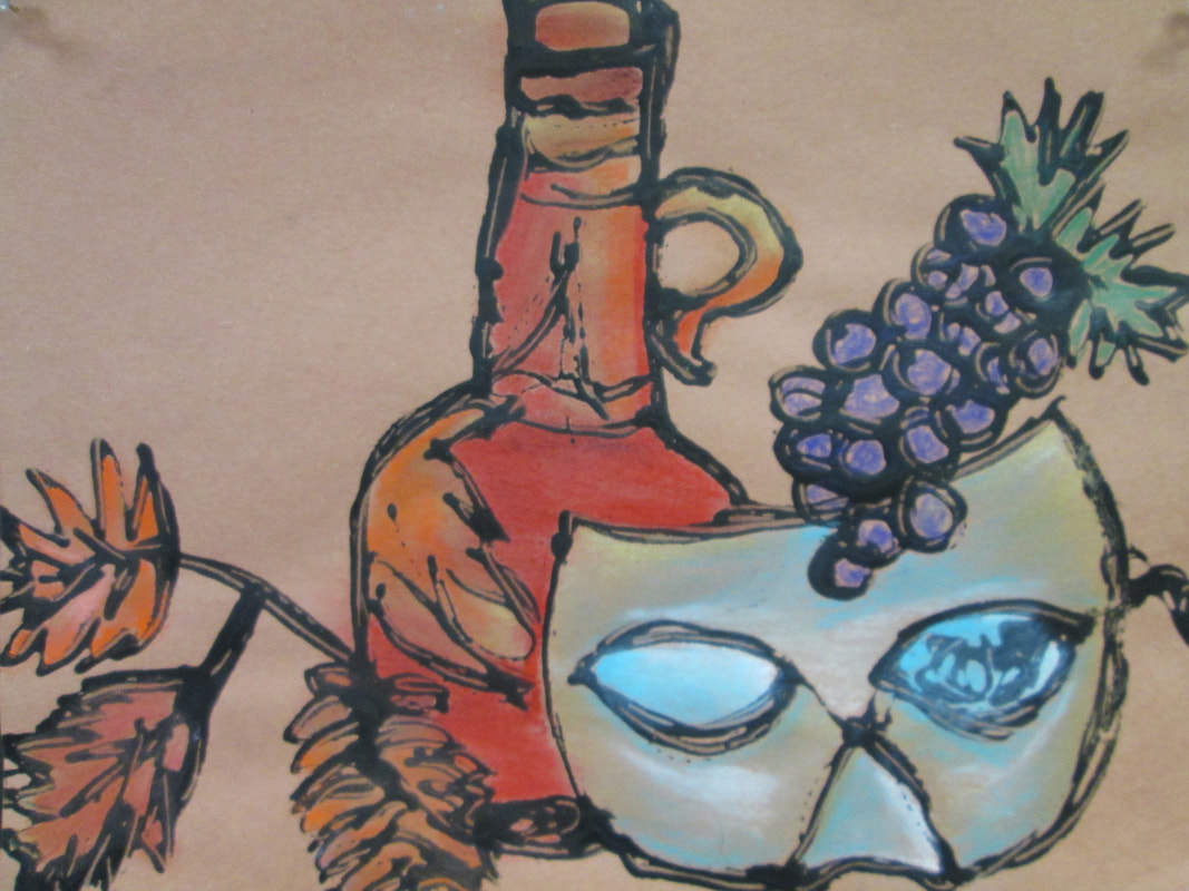
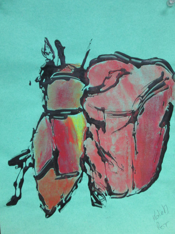
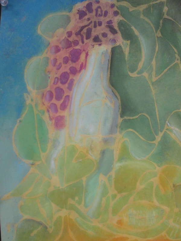
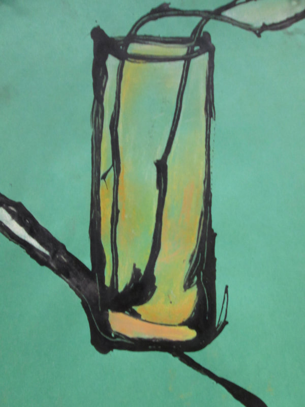
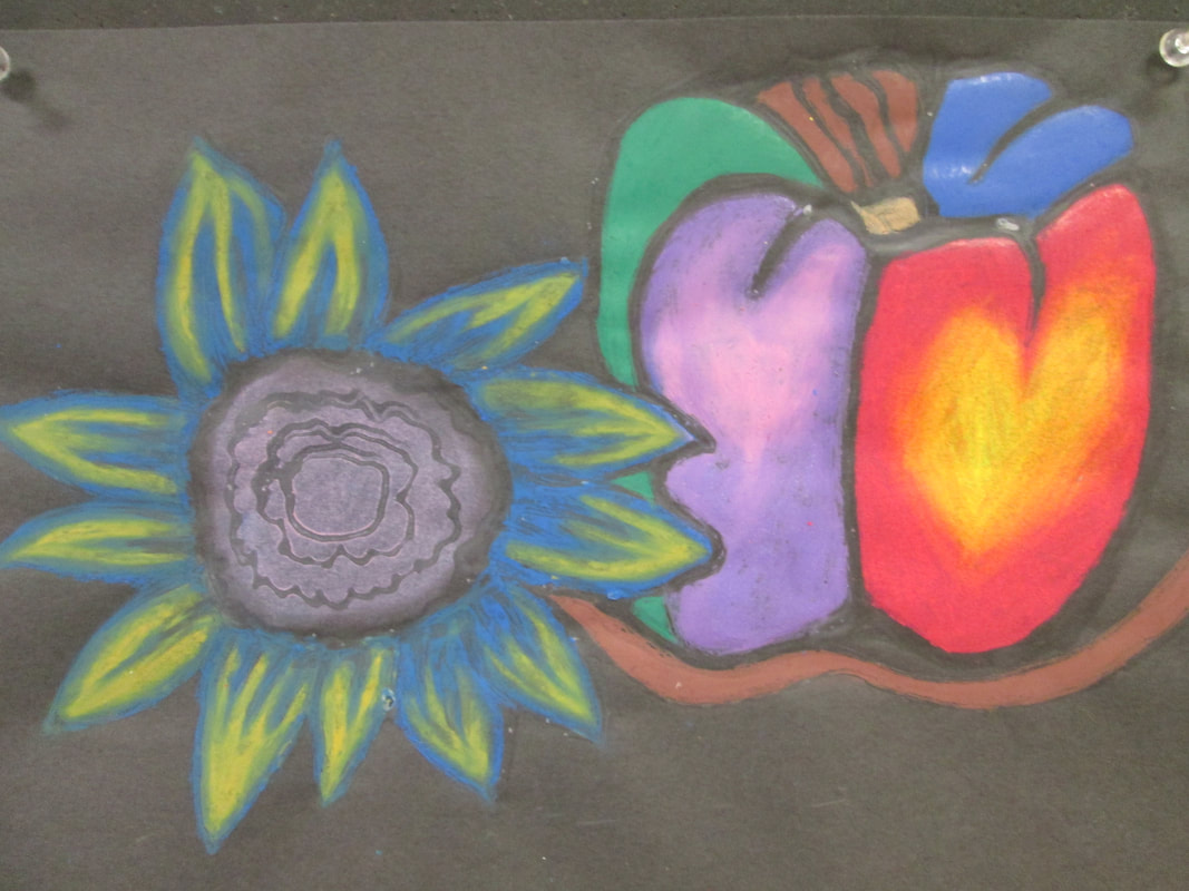
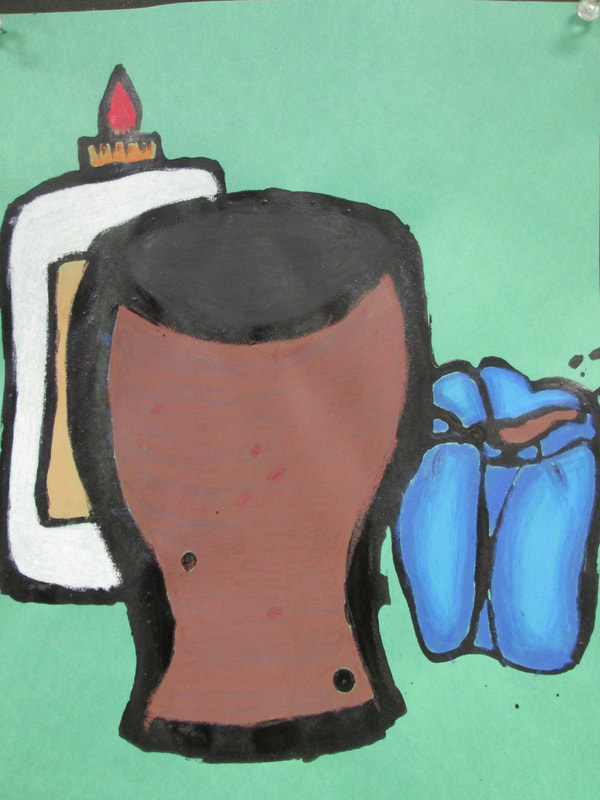
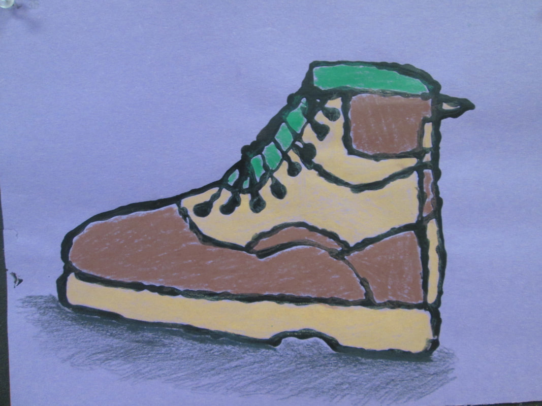
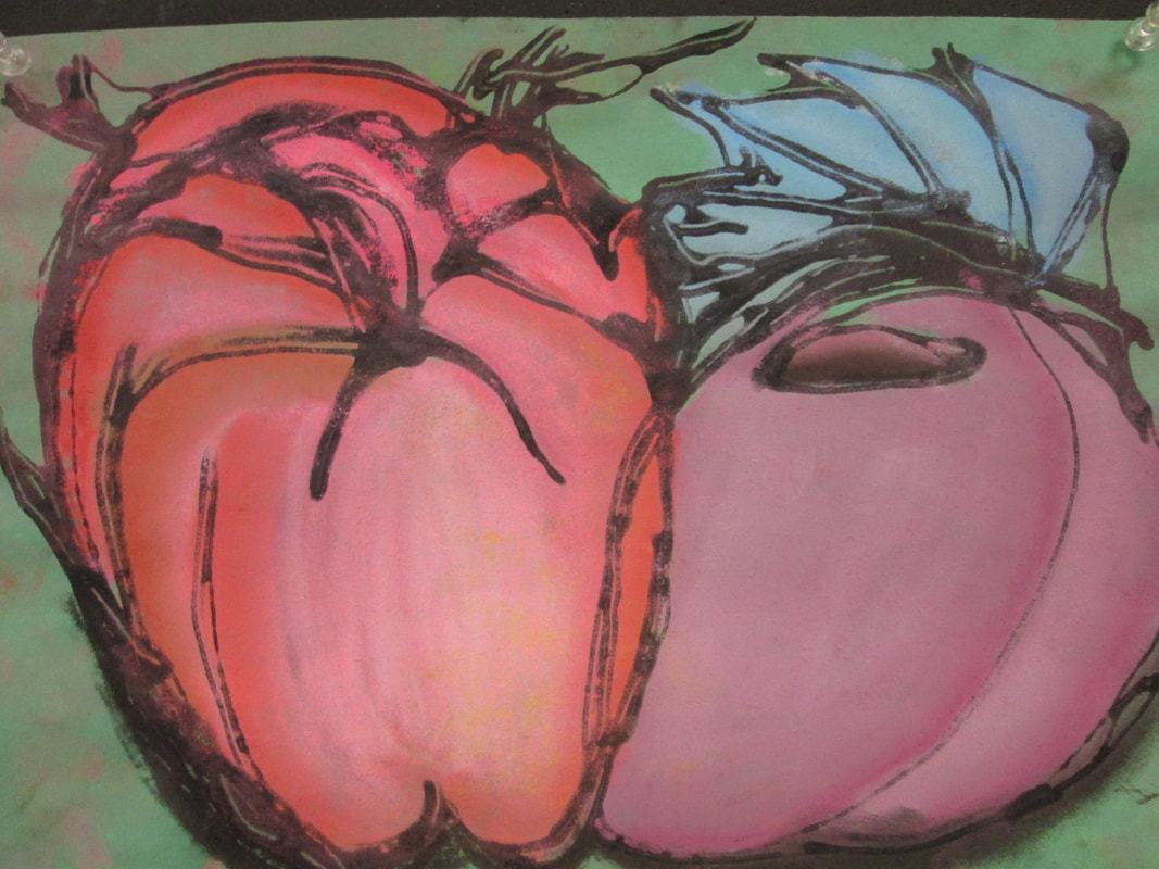
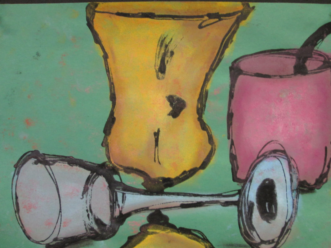
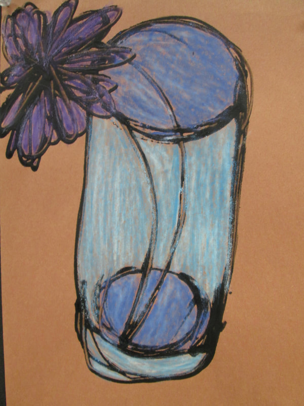
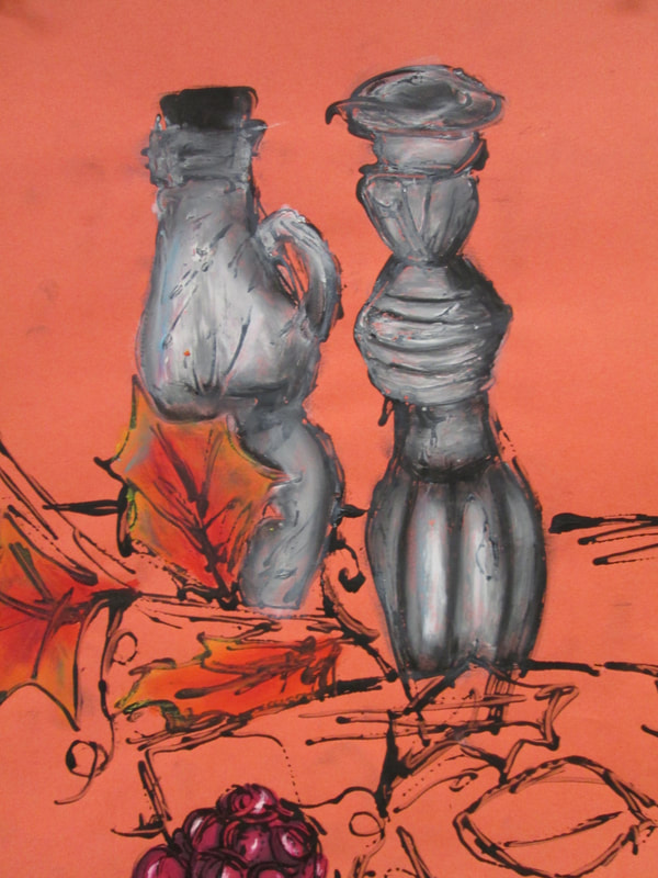
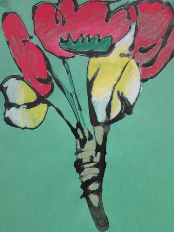
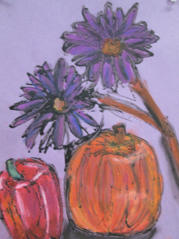
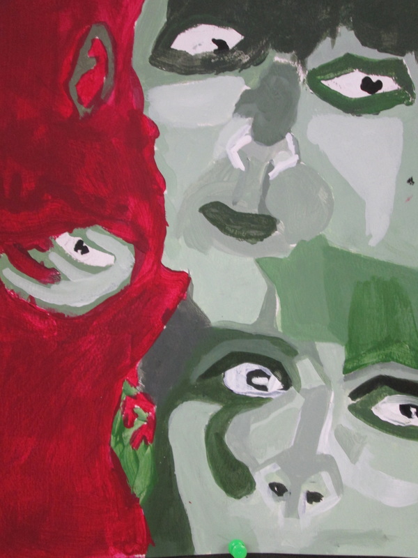
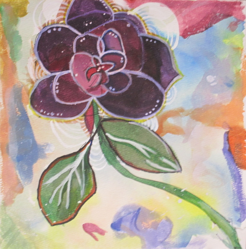
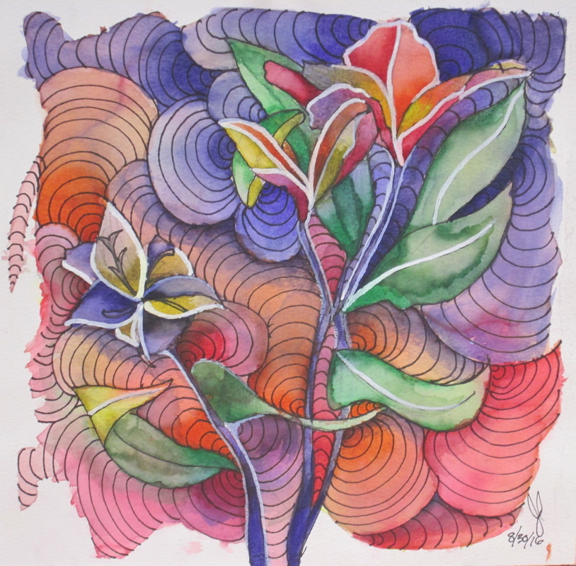
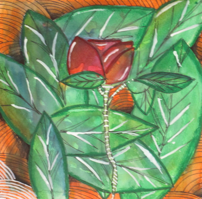
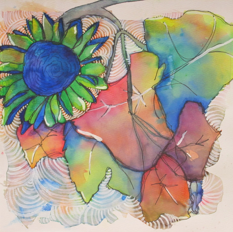
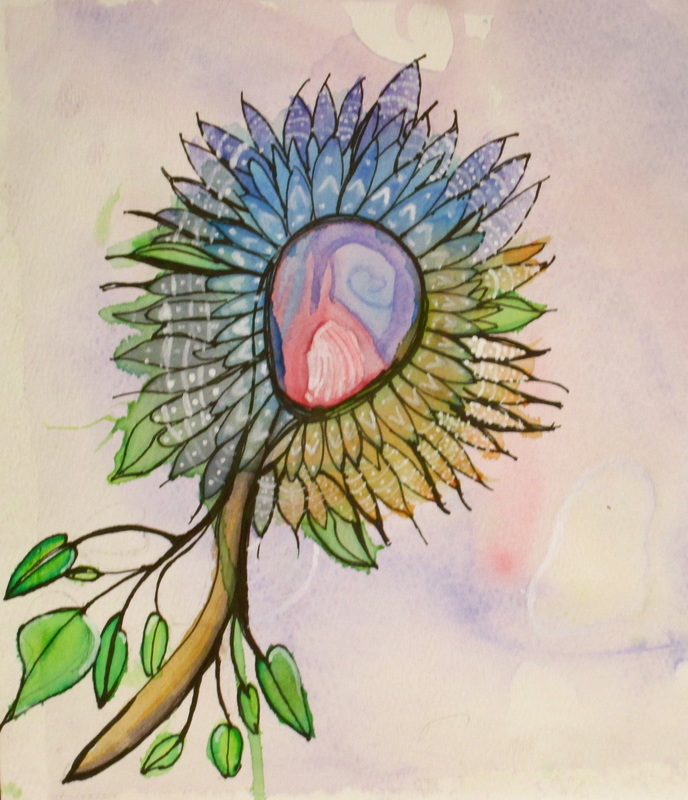
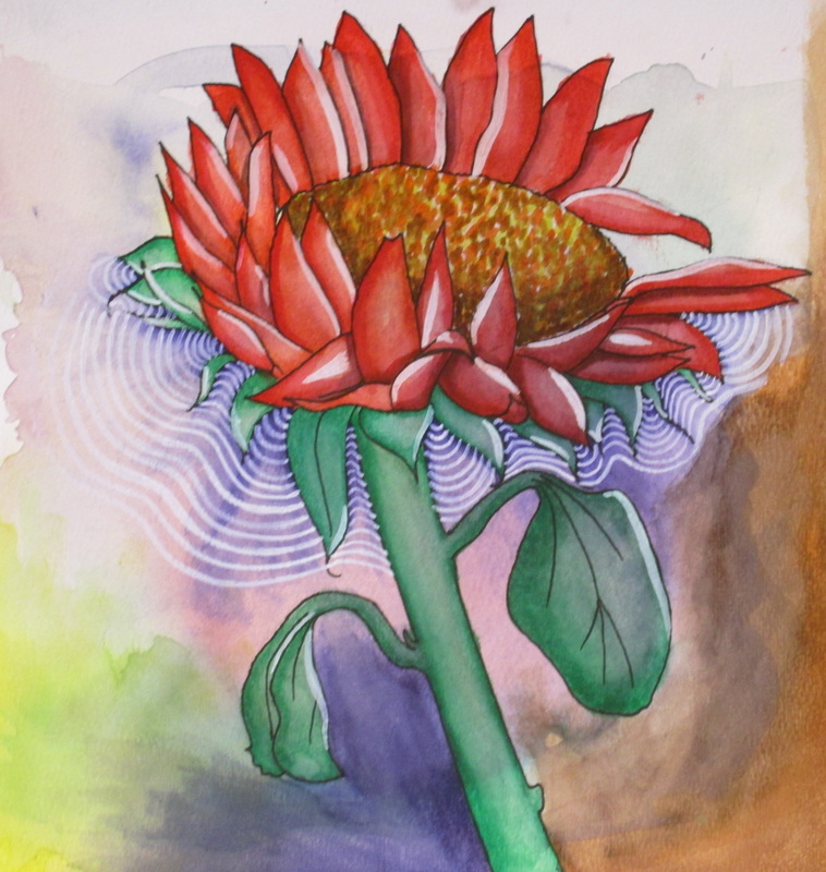
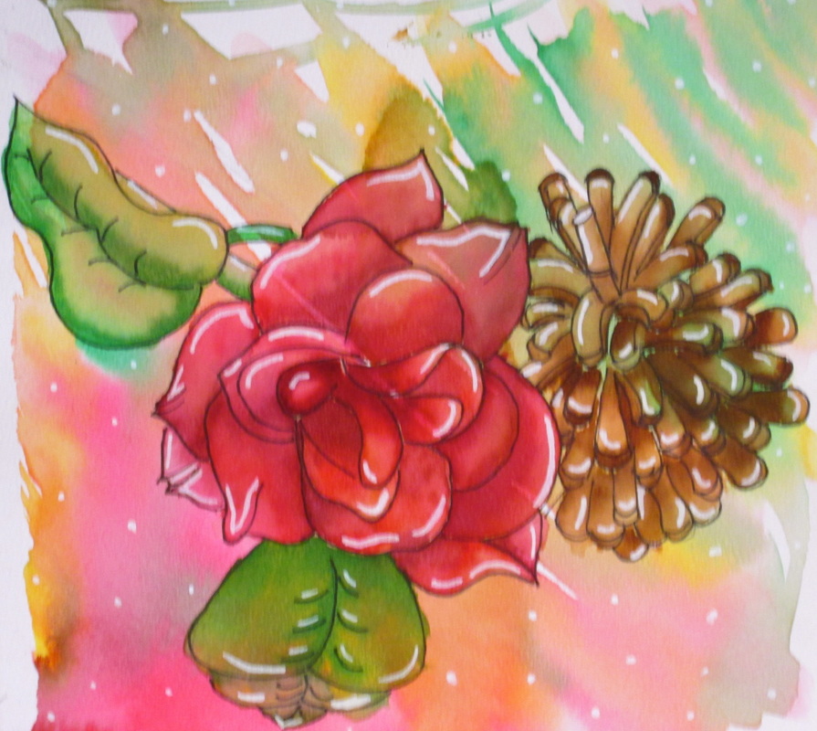
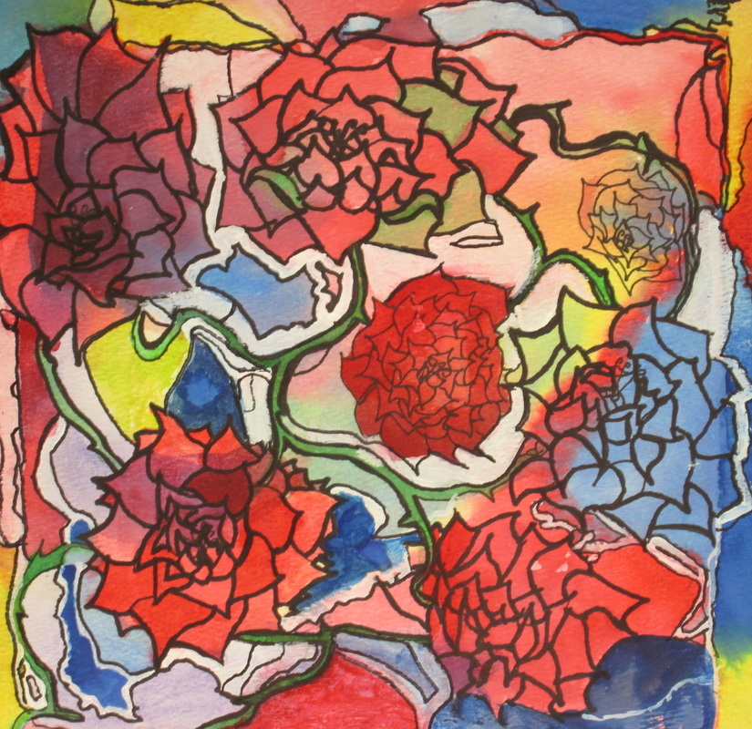
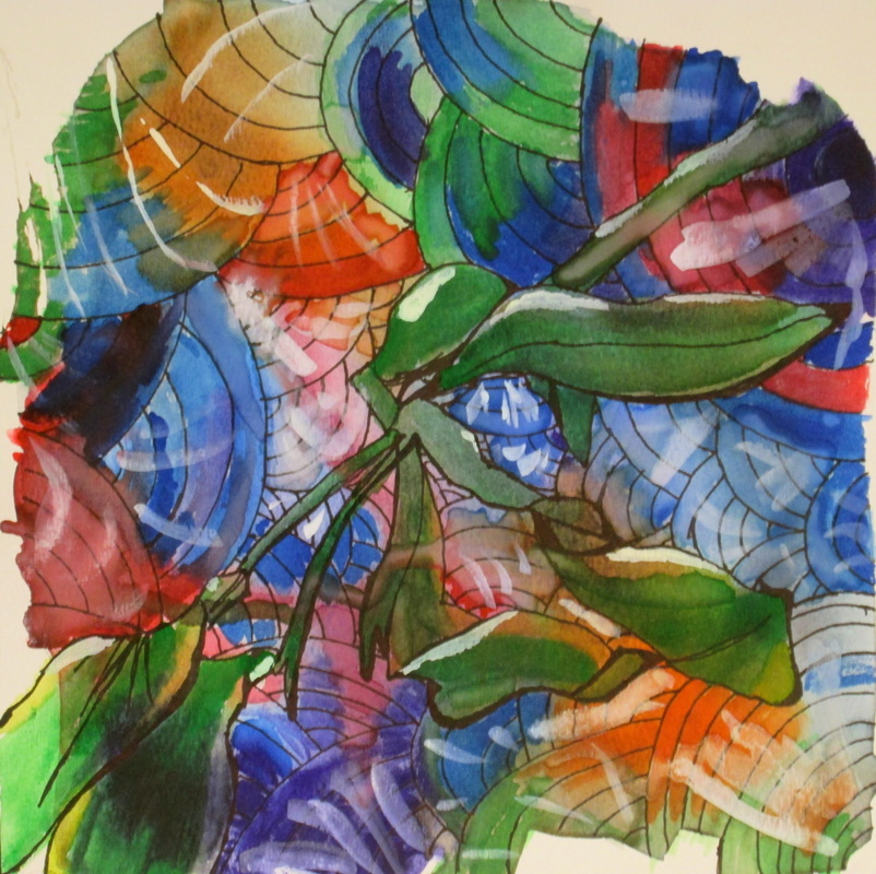
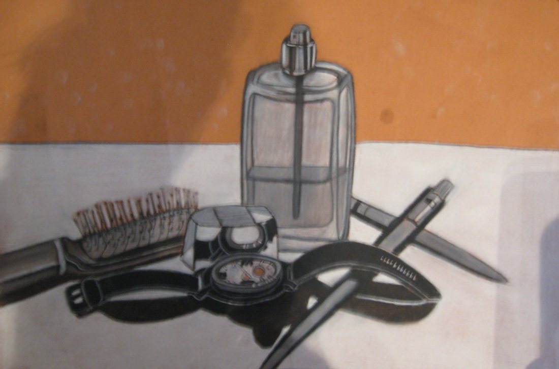
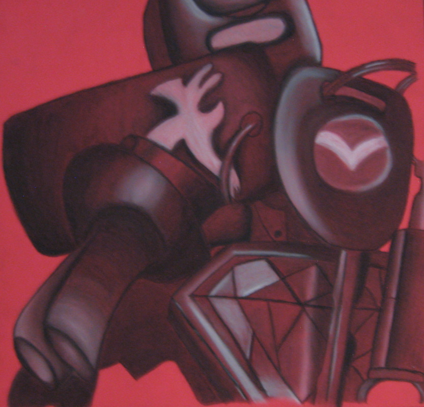
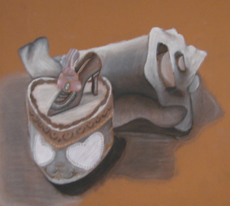
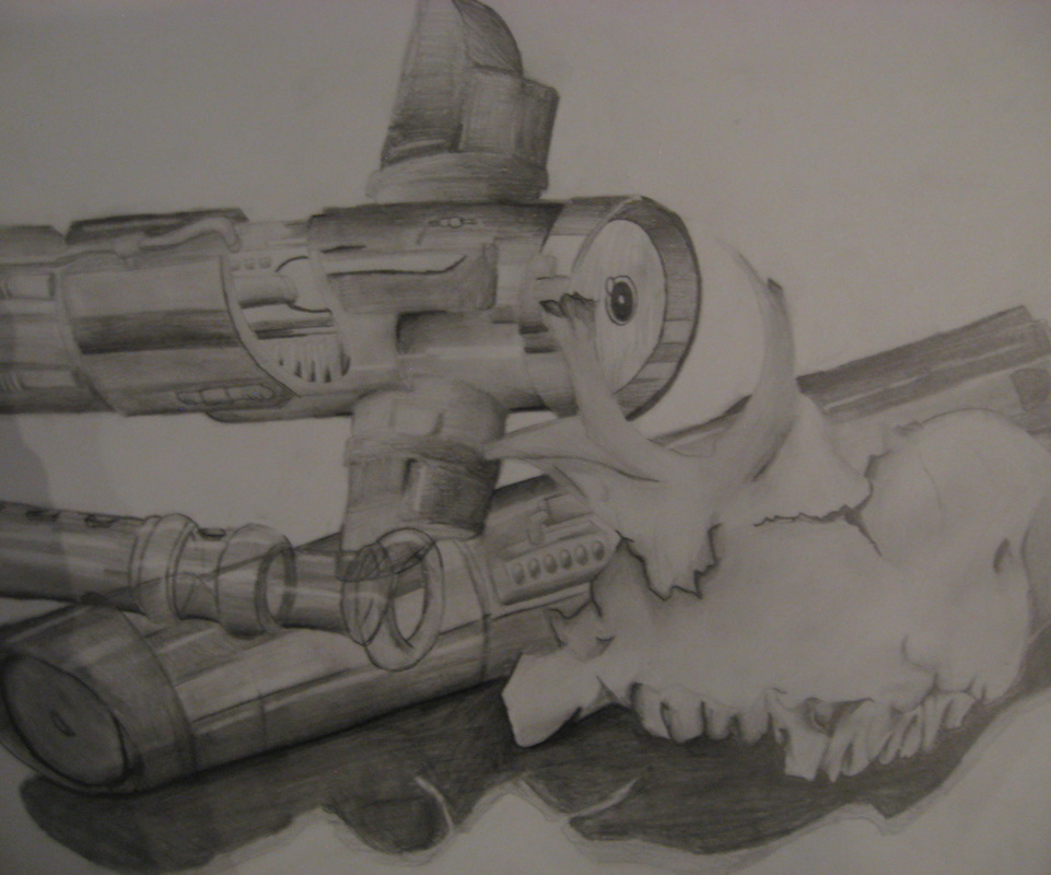
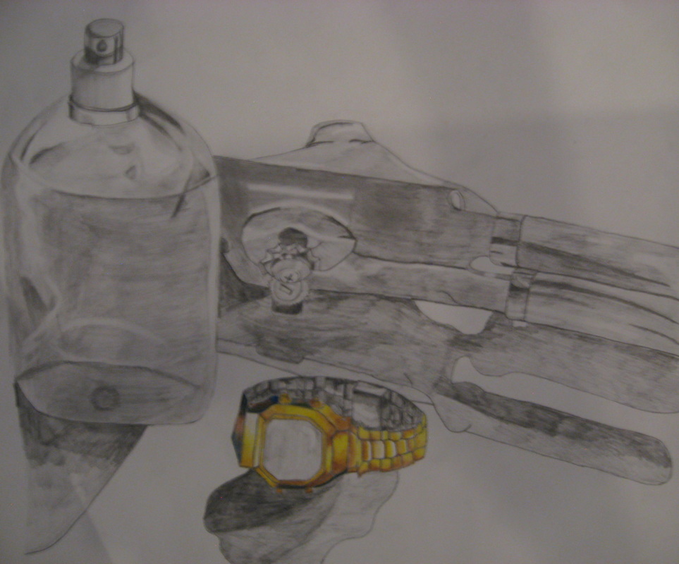
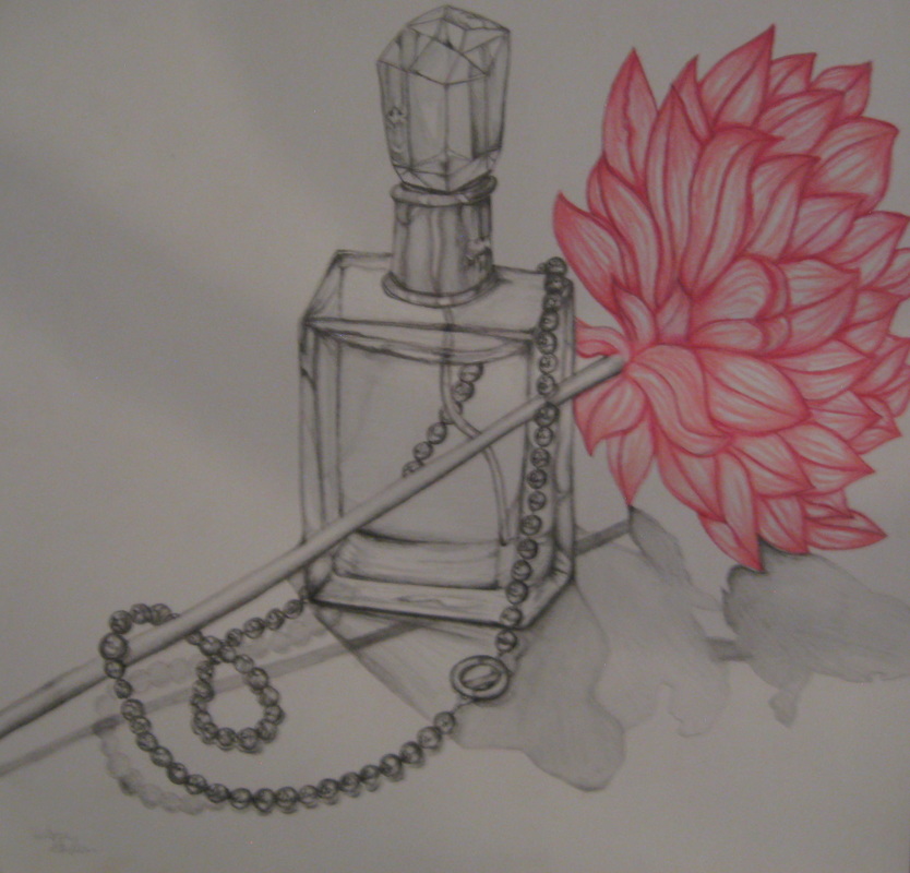
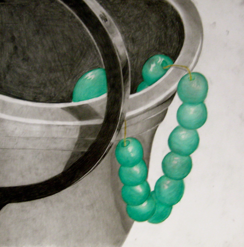
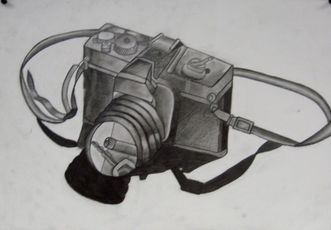
DRAWING/PAINTING 2: Still life Sectional Compositions
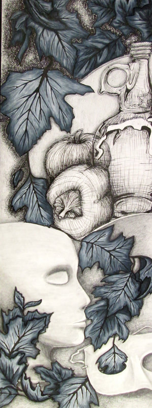
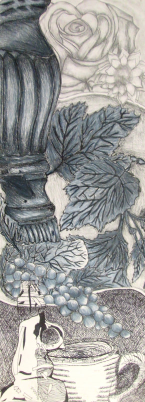
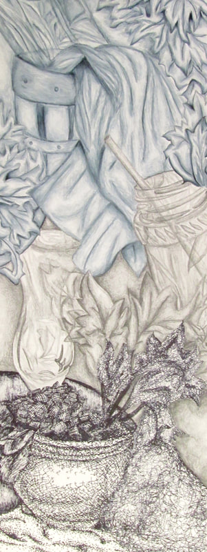
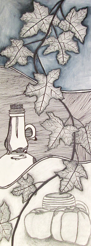
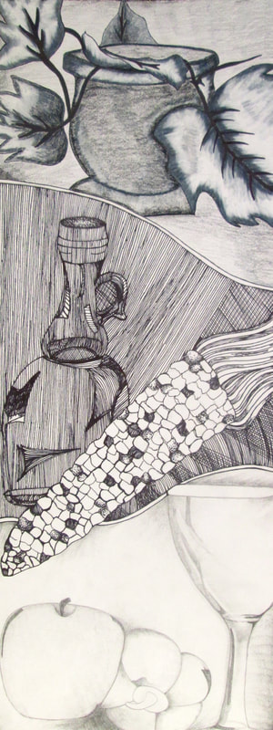
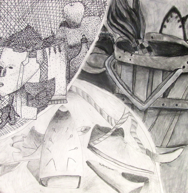
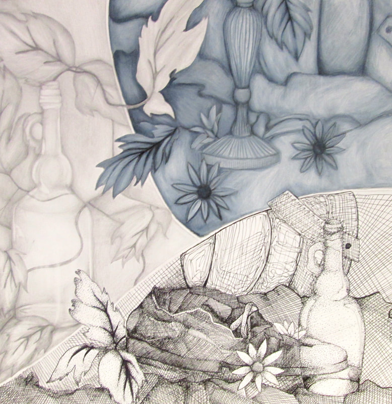
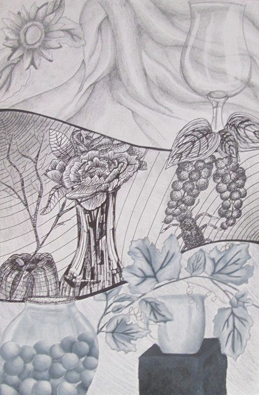
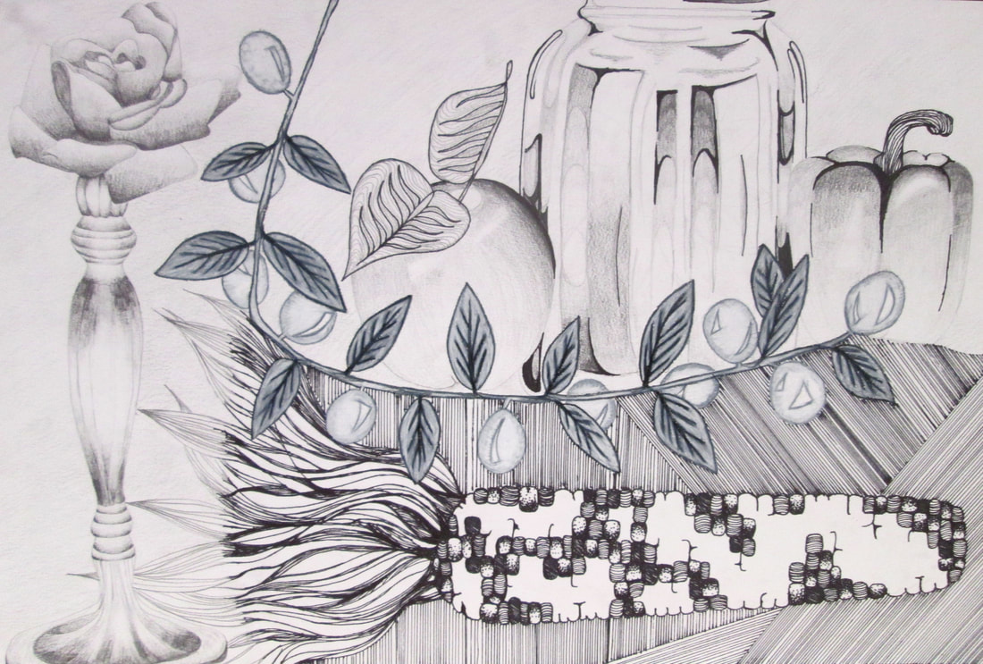
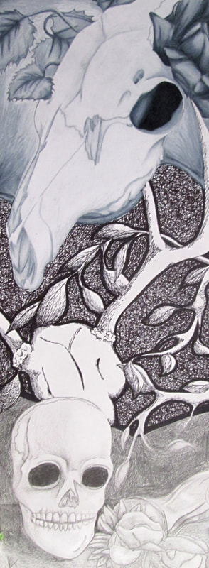
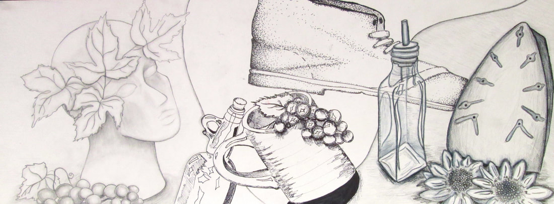
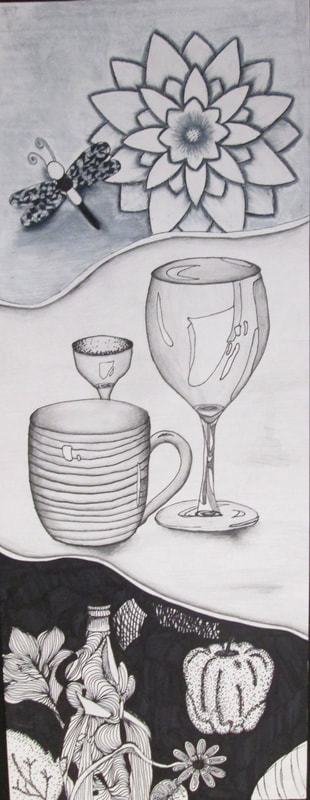
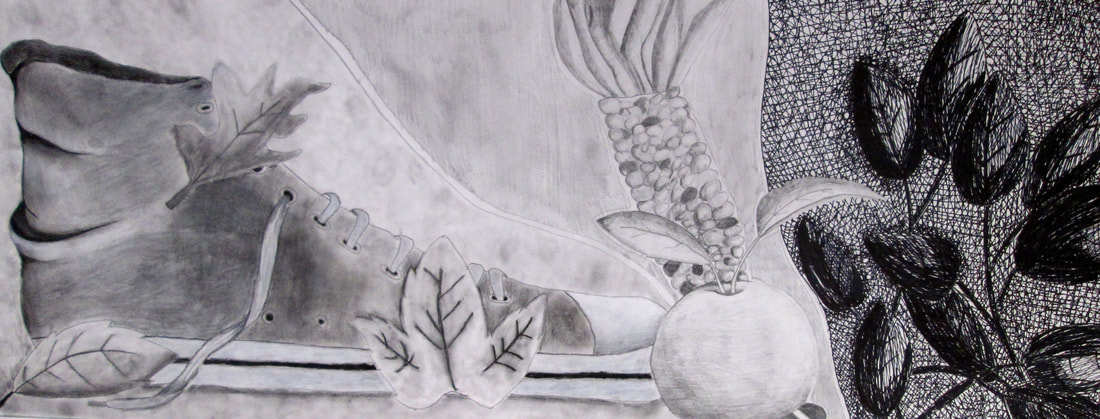
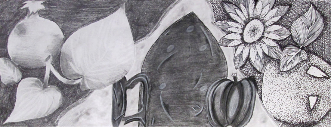
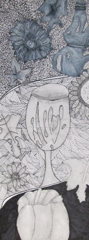
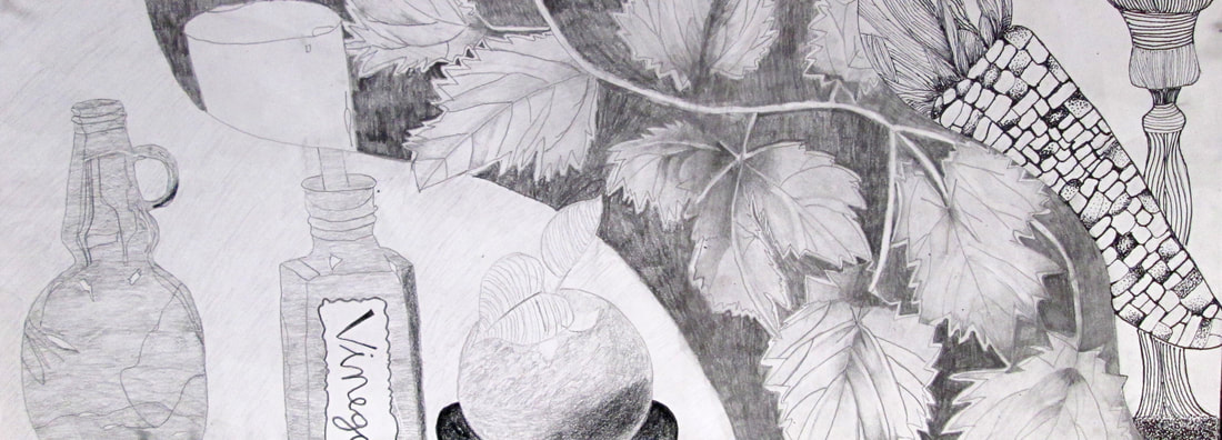
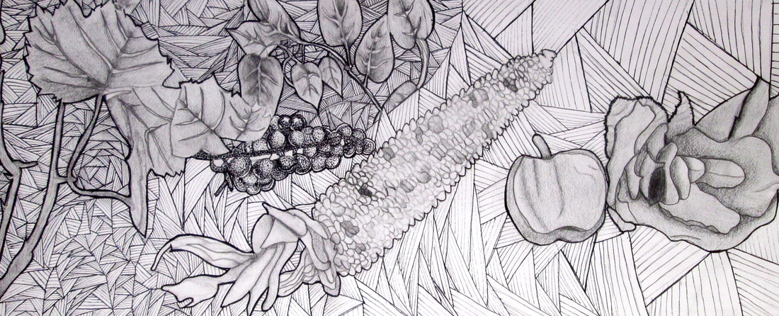
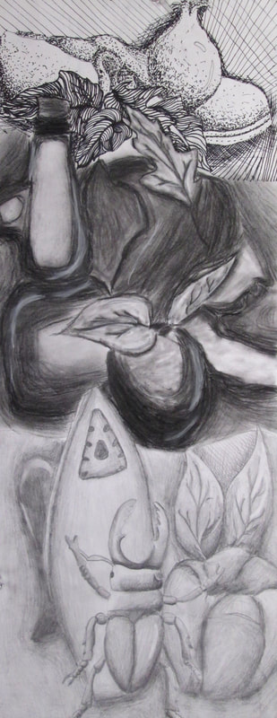
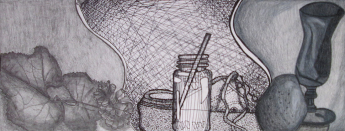
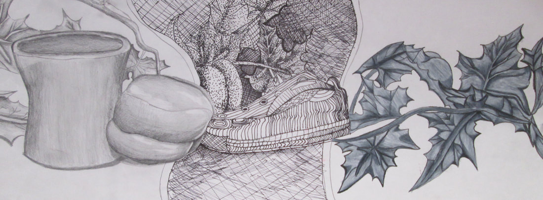
Drawing/Painting 2 students were continuing to hone in on observational skills and they chose an object from which to draw and then they drew random lines on top creating sections in their work, then they painted with analogous watercolor schemes. These are quick short studies that reinforce skills that young artists will continue to develop.
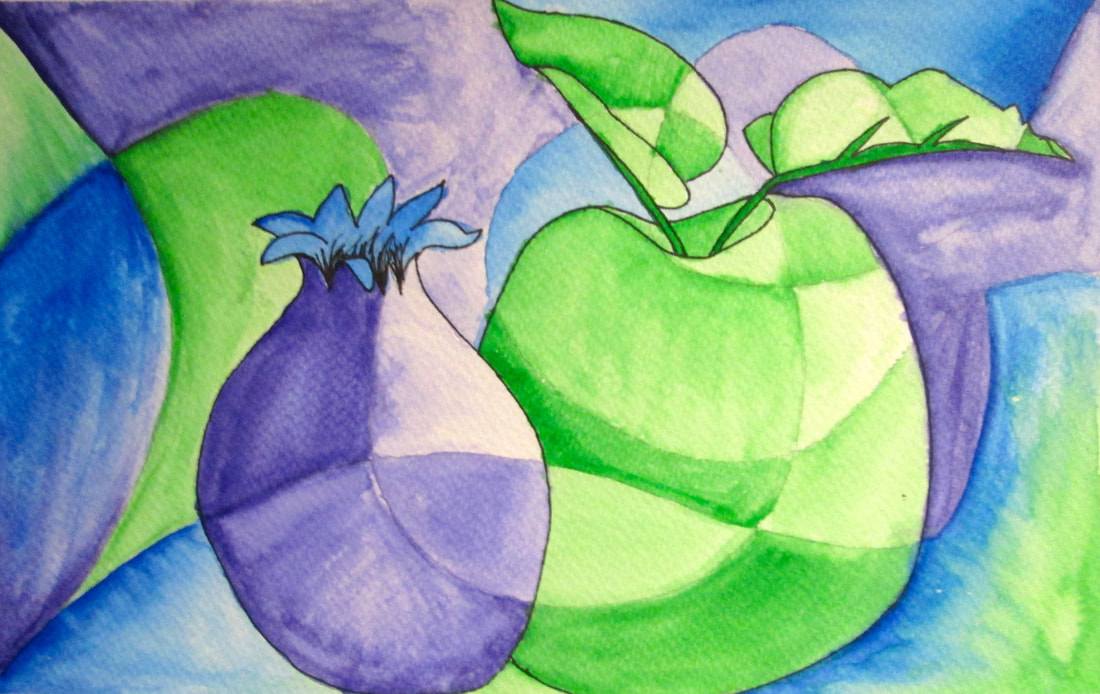
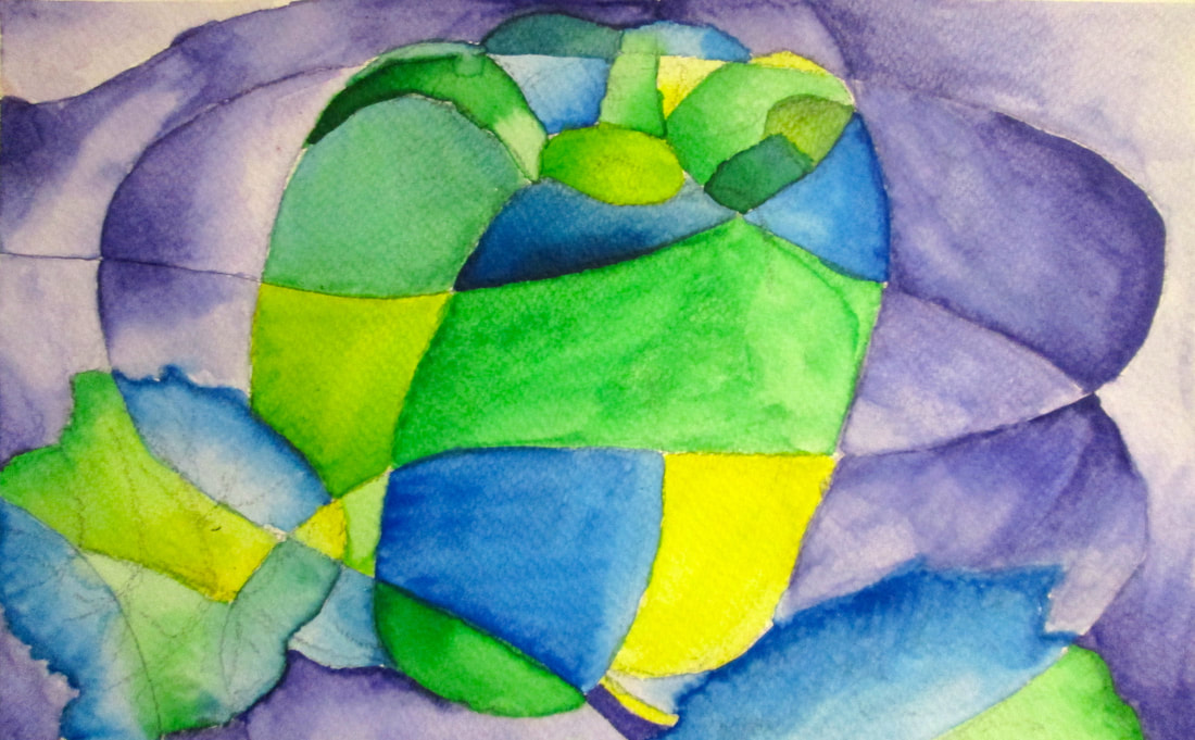
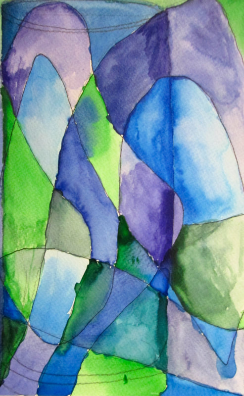
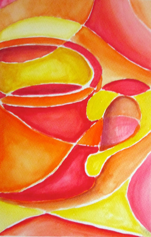
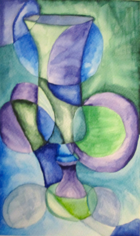
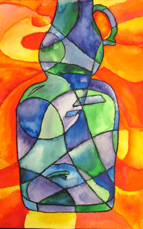
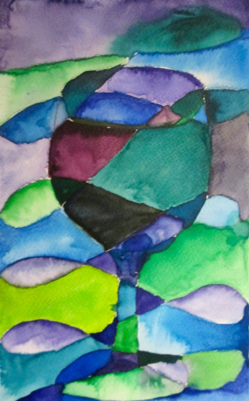
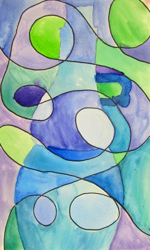
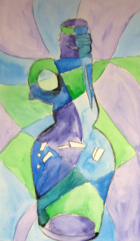
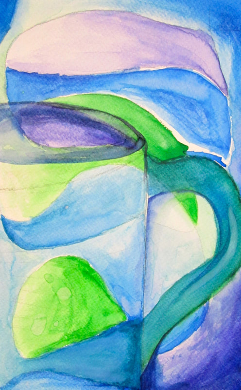
Observational drawing in Art is a key component to developing one's artistic savvy!! However stillife drawings can be long and daunting, and because of that we try to mix it up and play without too much concern for visual accuracy. When students are given an opportunity to play they relax and thus take in more valuable information. It is in essence, an unconscious transfer of developing their observational acuity.
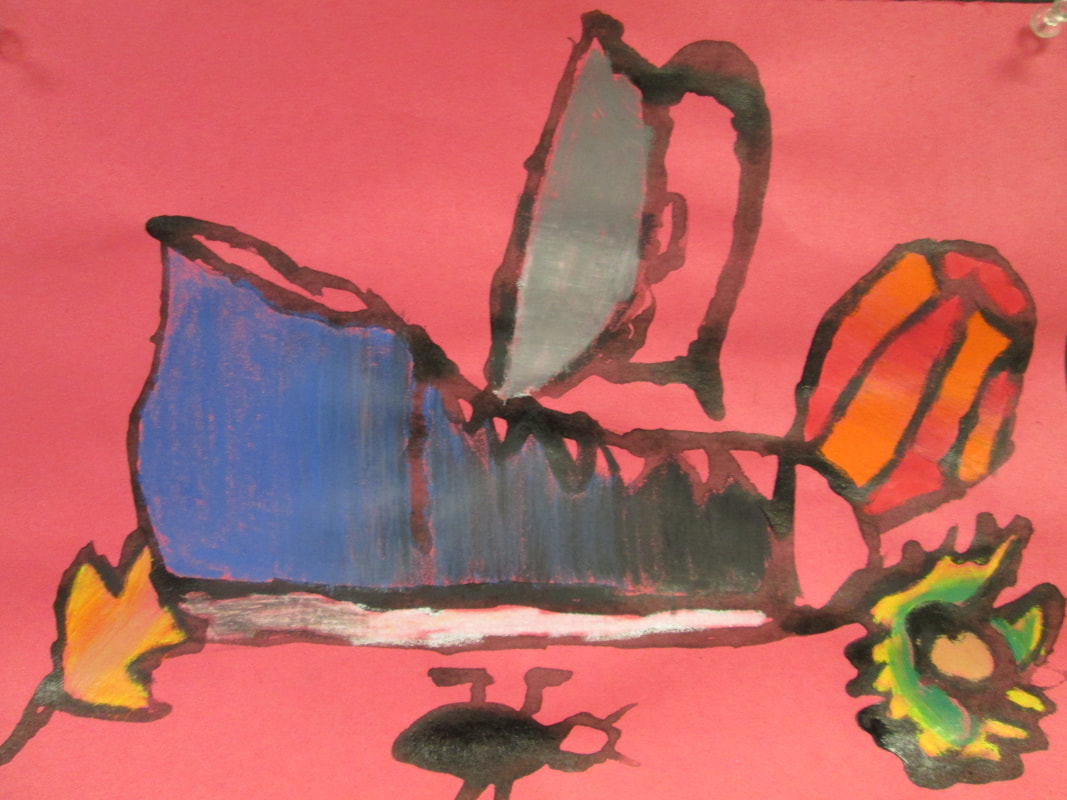
Below we used Black glue, construction paper, caran'dache, pastels , charcoal or colored pencil. The results are fun, whimsical and authentic snapshots of a student's interaction.
Below we used Black glue, construction paper, caran'dache, pastels , charcoal or colored pencil. The results are fun, whimsical and authentic snapshots of a student's interaction.


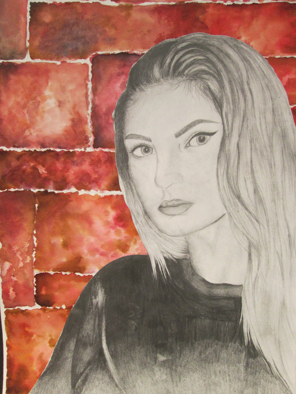
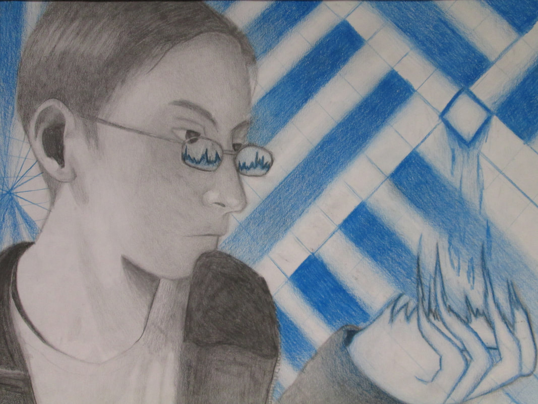
Fall 2017... Some surreal, some real selfies
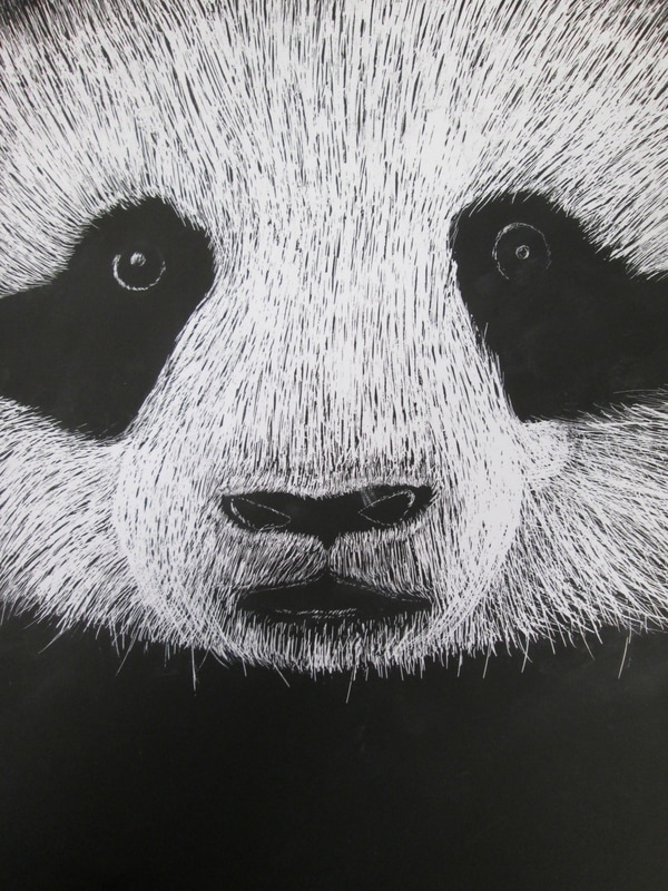
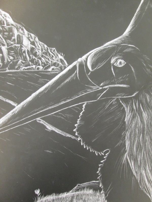
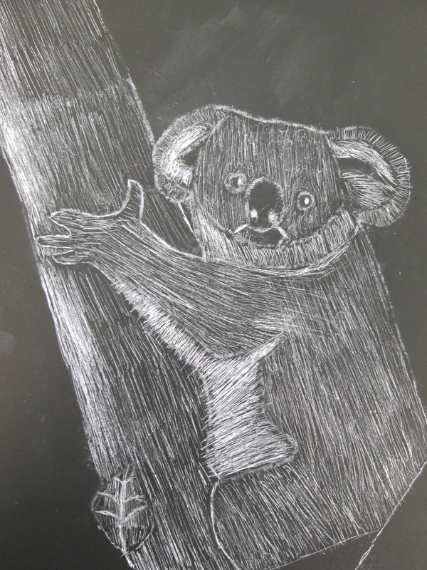
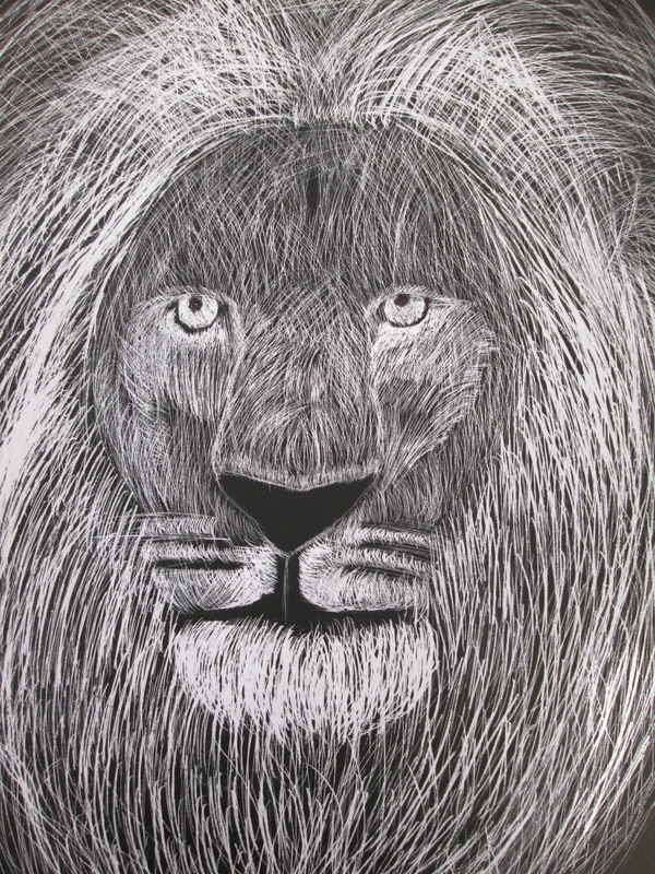
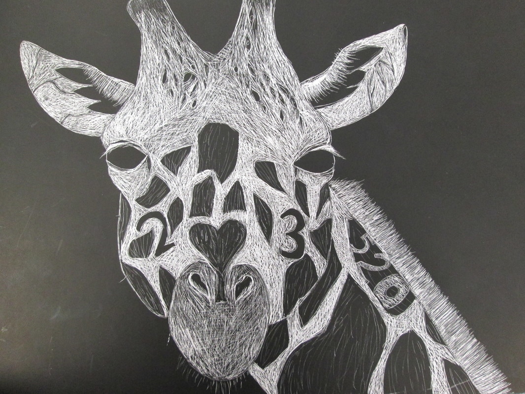
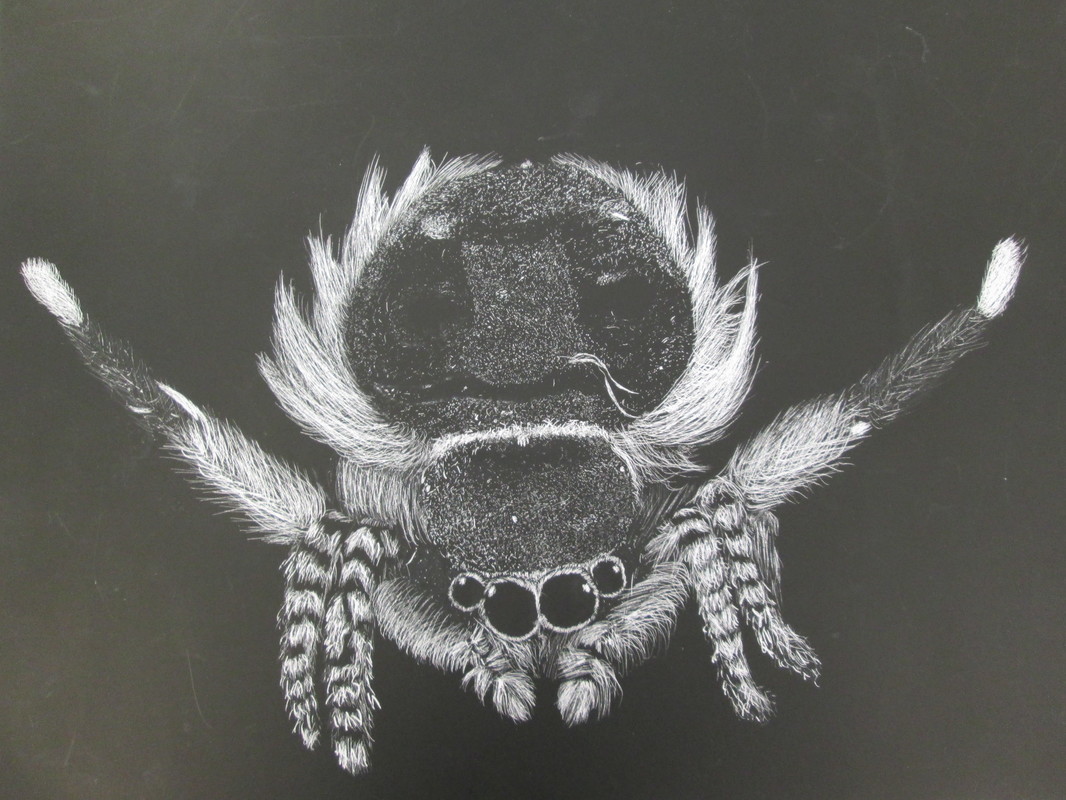
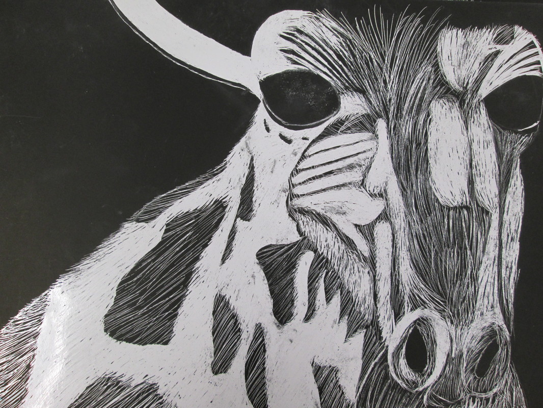
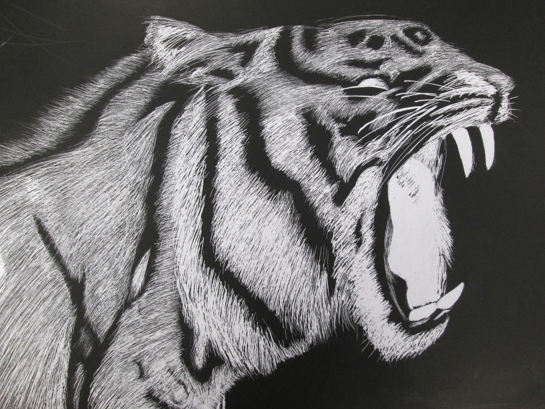
They just scratched the surface!!!
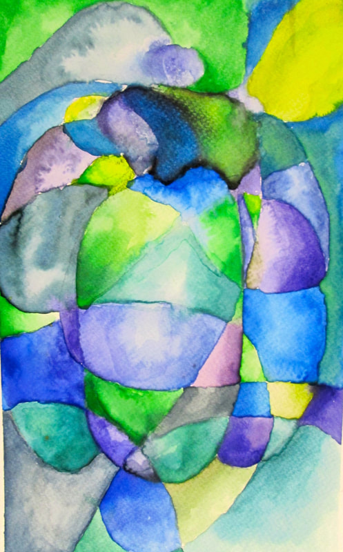
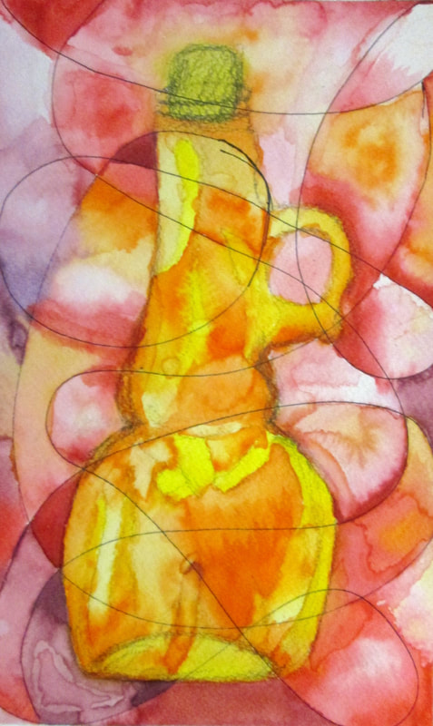
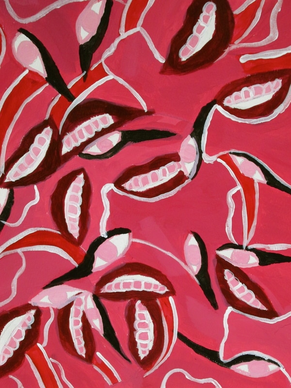
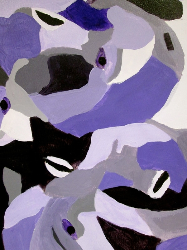
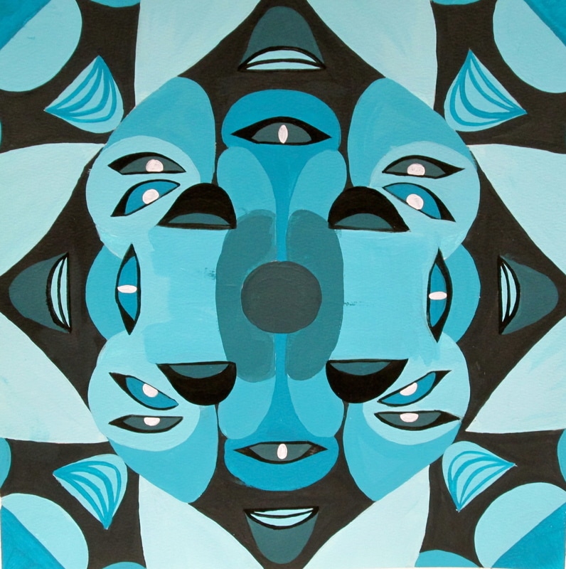
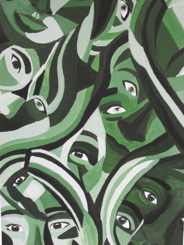
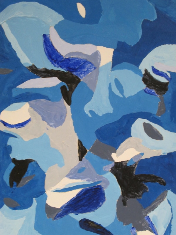
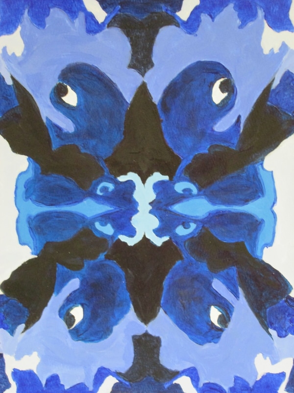
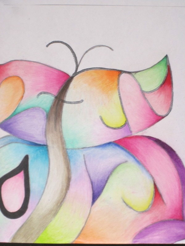
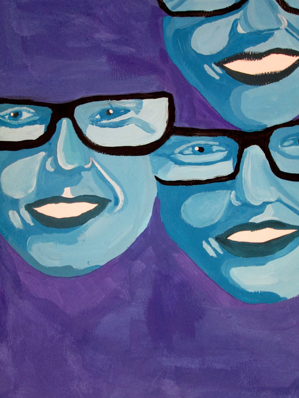
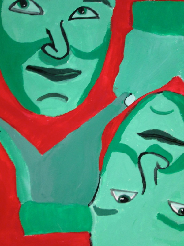
MonochroMatiC ABstract
Portrait interpretations
After students finish their self-portraits; a technical and long process then they use their drawings to find shapes that will create an abstract design. Once they have selected shapes and patterns they transfer the designs to watercolor paper. This year we did a tints and shades exercise. It is a fun switch from technical and "tight" to loose and interpretive. Below are the results.
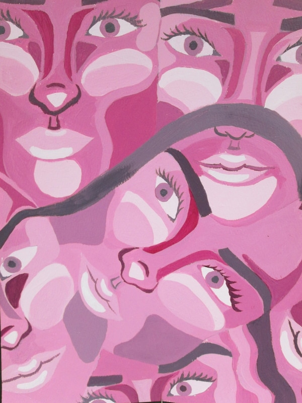
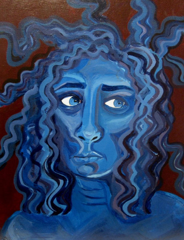
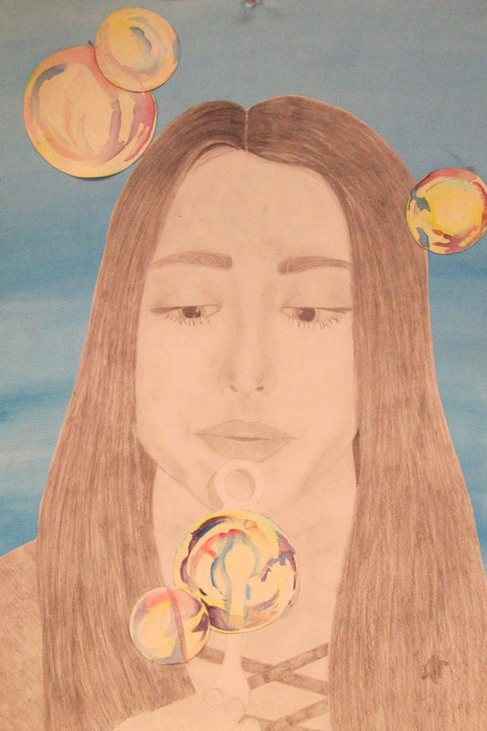
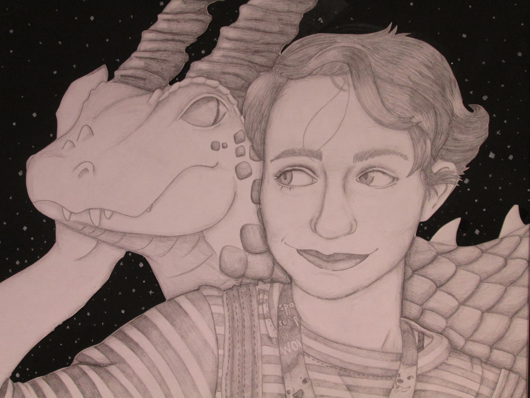
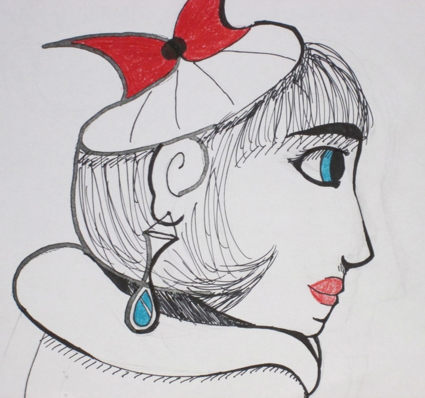
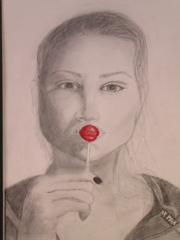
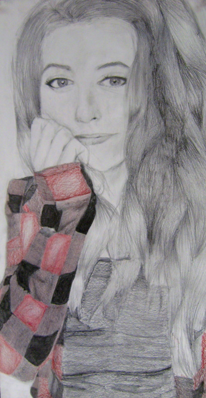
Spring 2017- "SELFIES" are in!
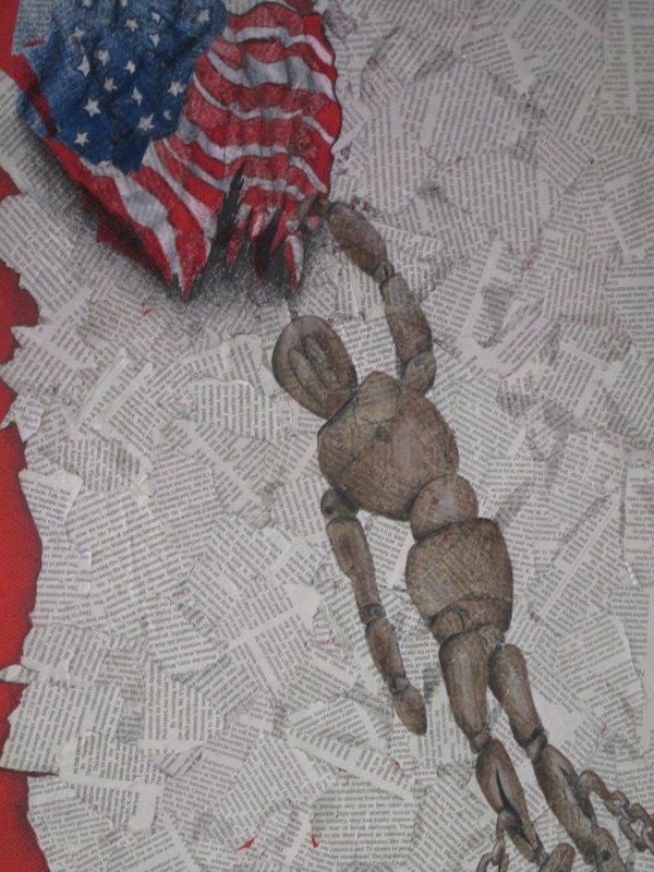
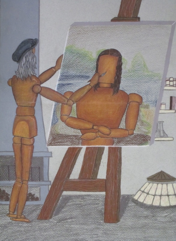
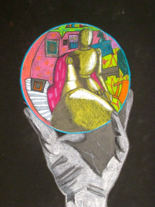
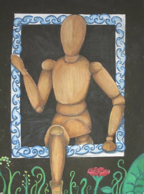
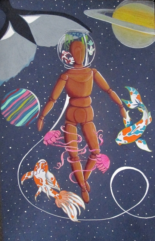
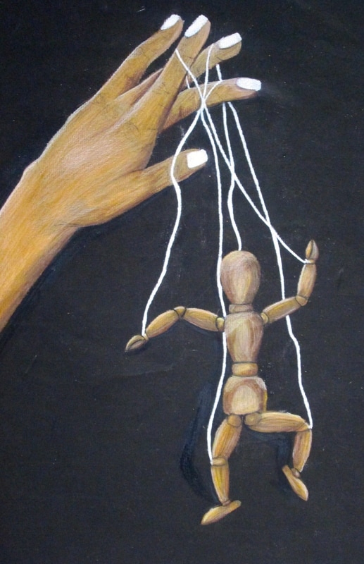
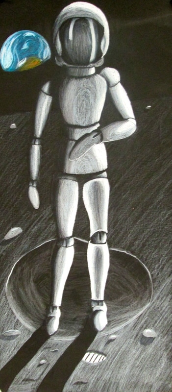
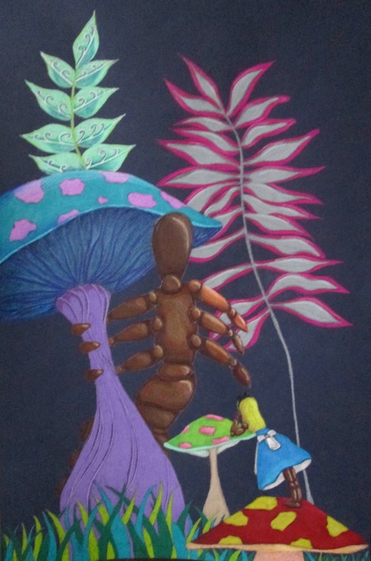
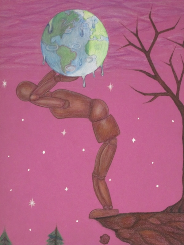
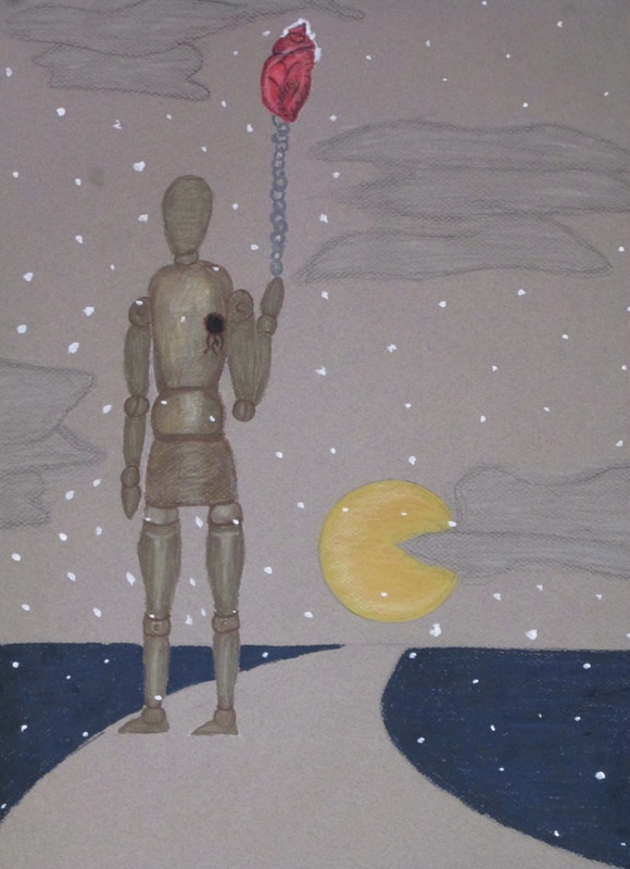
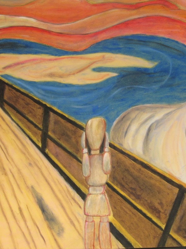
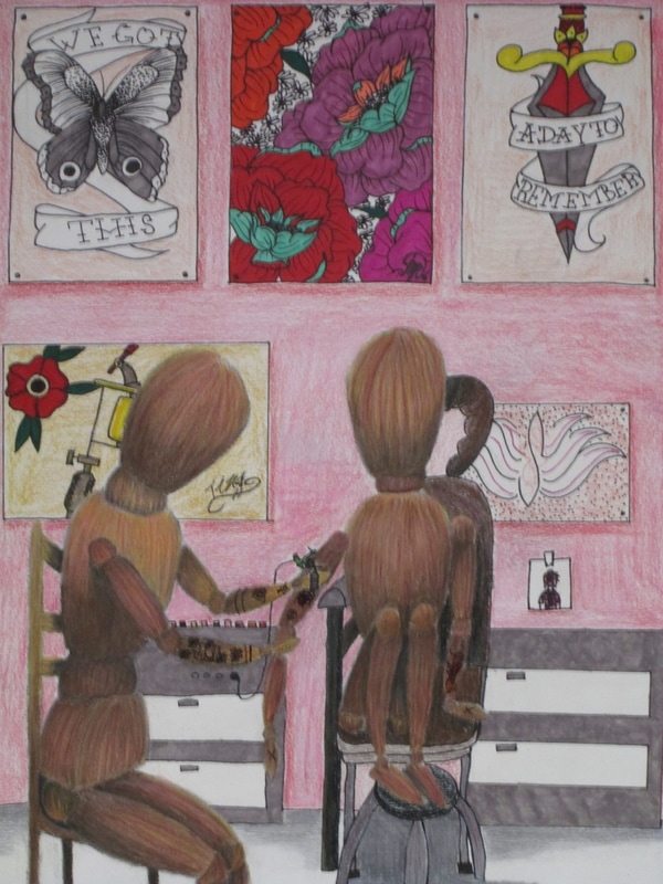
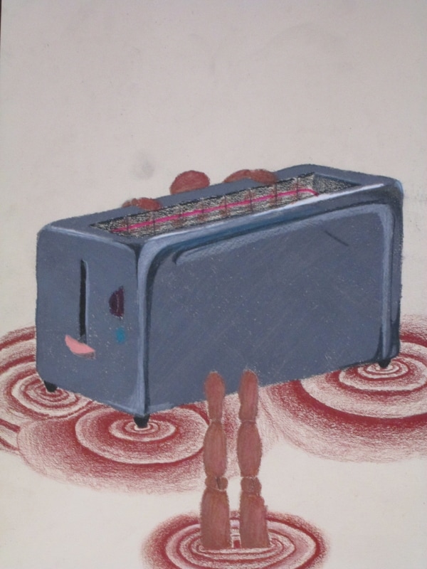
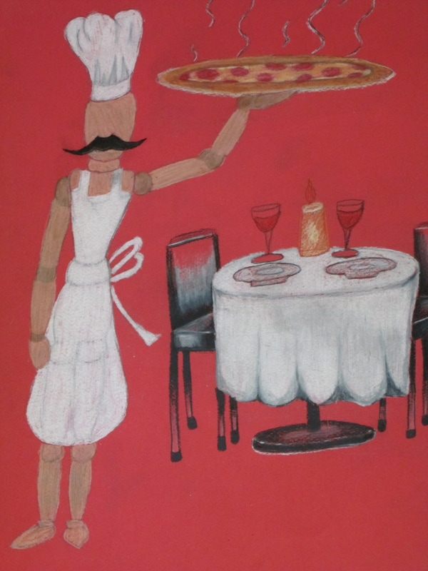
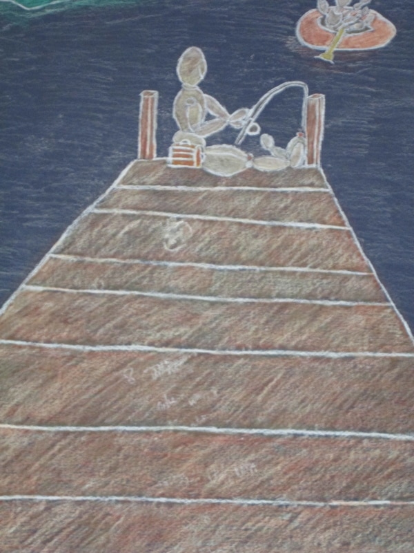
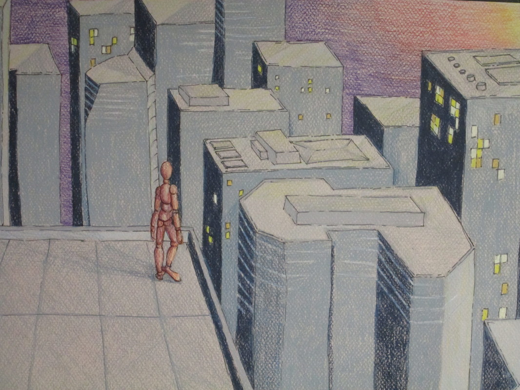
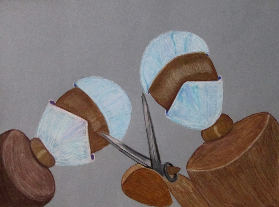
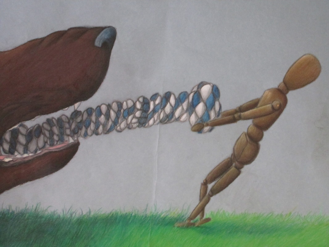
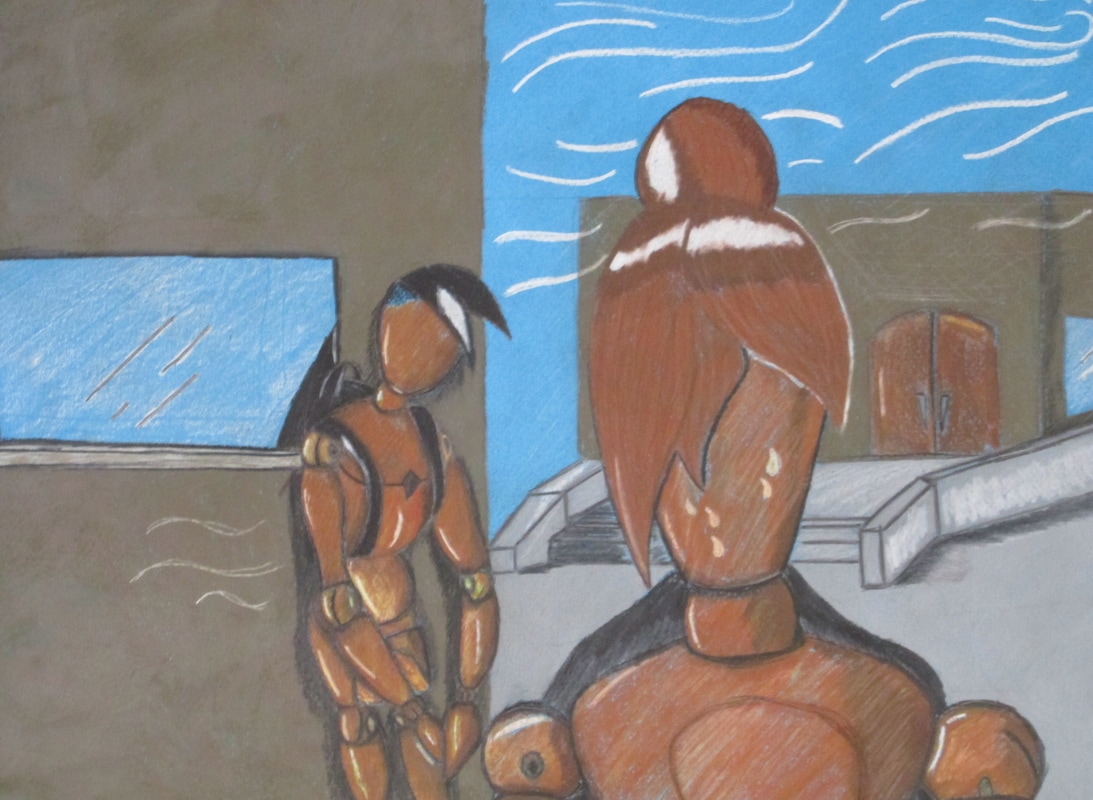
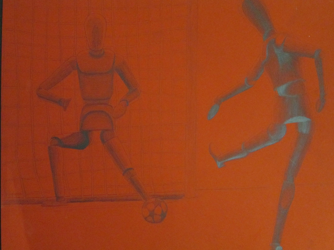
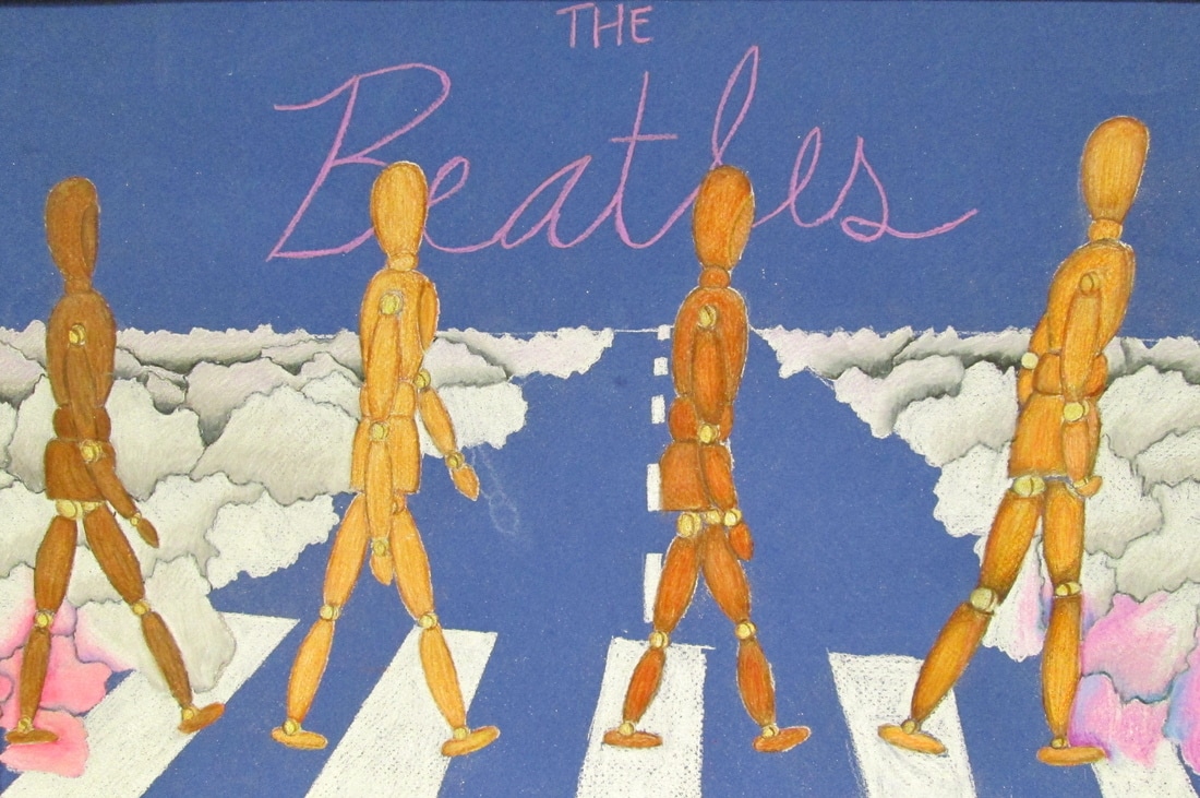
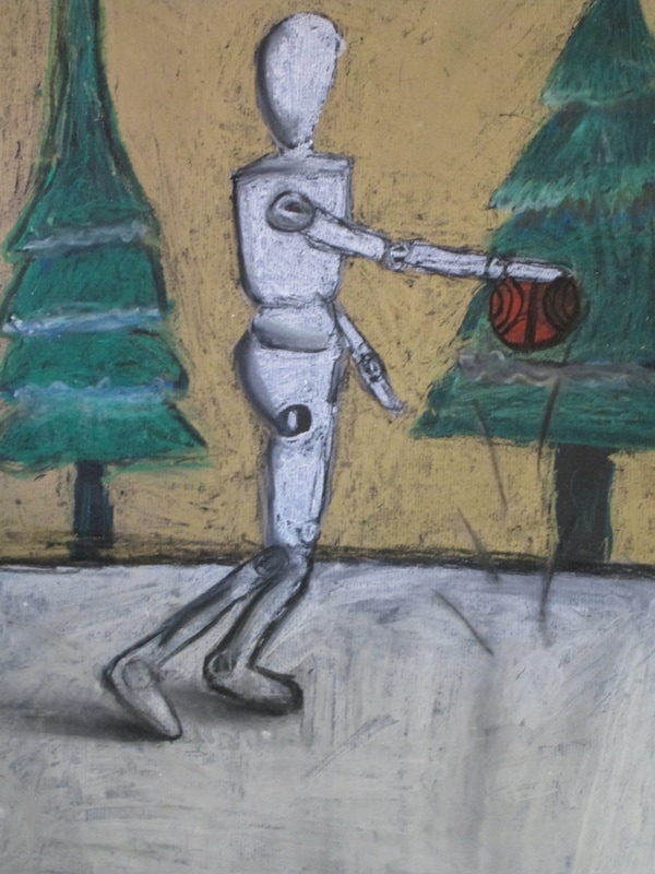
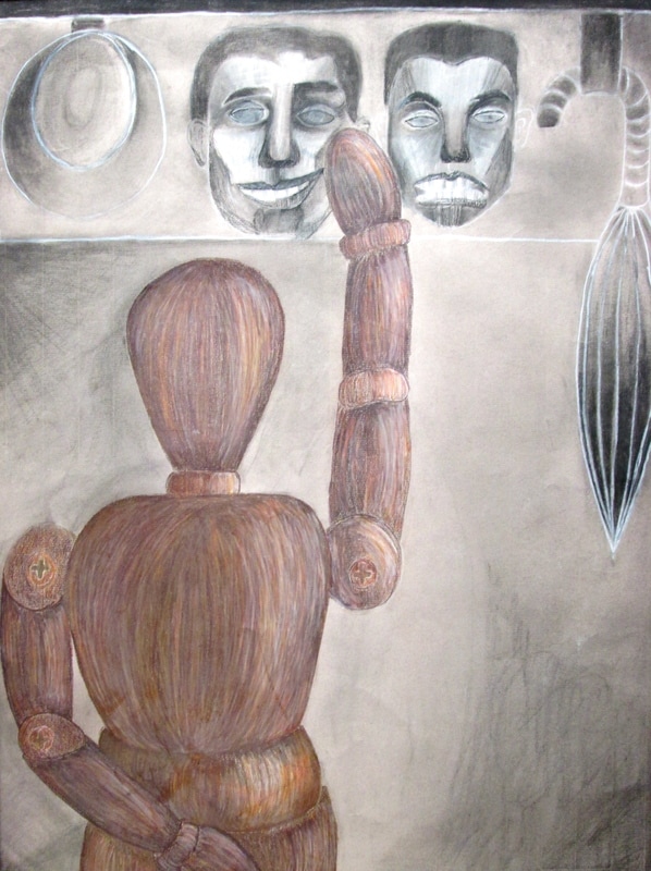
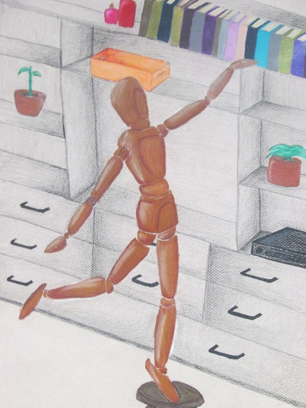
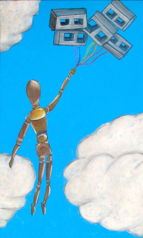
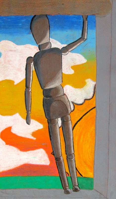
Mannequin Shenanigans... What "wood" you do?
This semester Drawing 2 students were asked to incorporate a "figure study" mannequin into an environment or integrate it into a famous art history piece. As the piece was coming to an end the artists were also asked to write a short story or poem about their mannequin. The following images are the results of their imagination and creative integration.
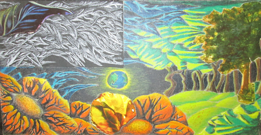
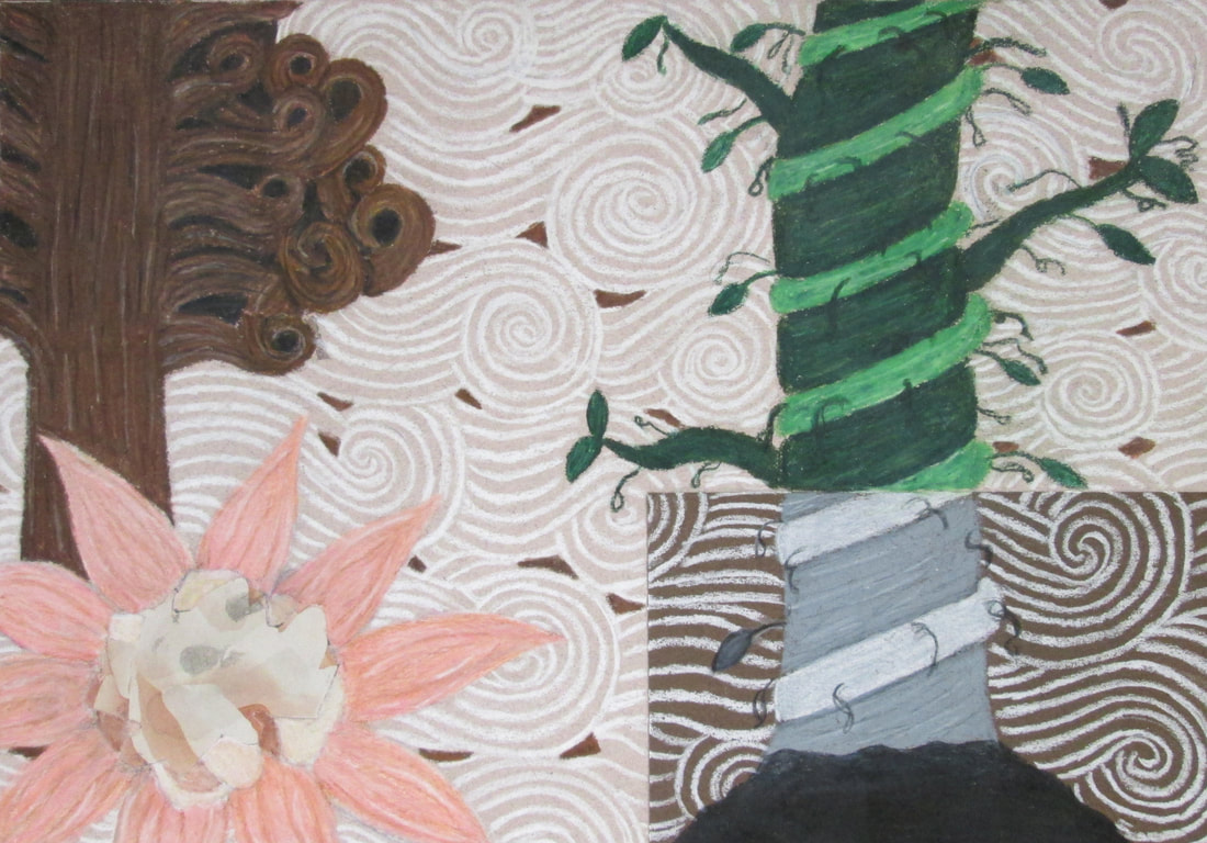
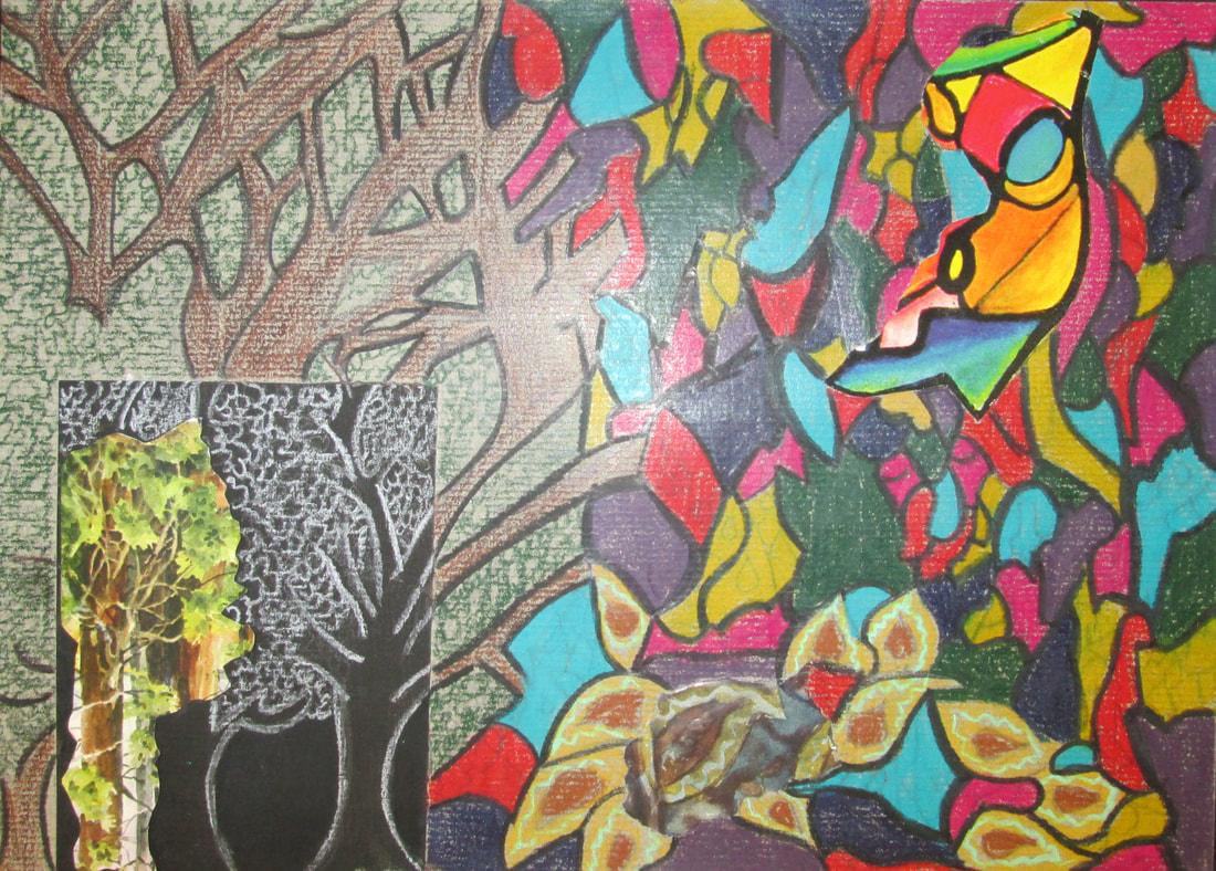
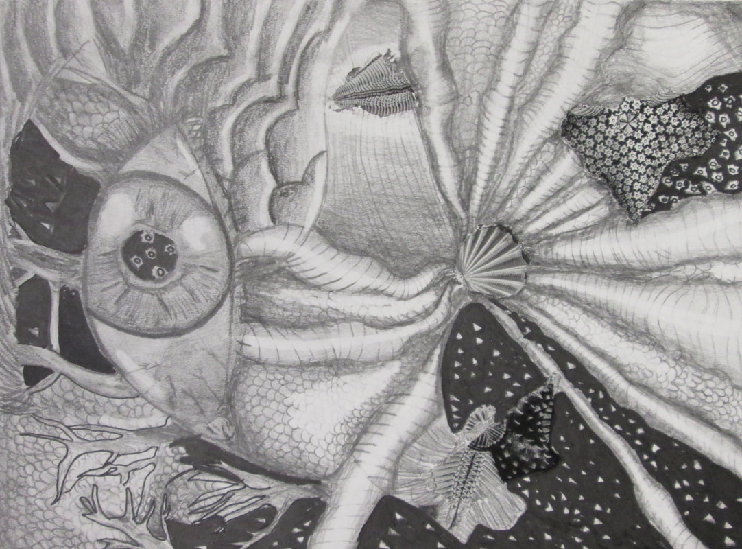
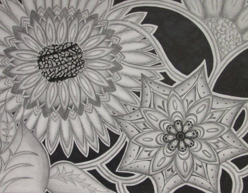
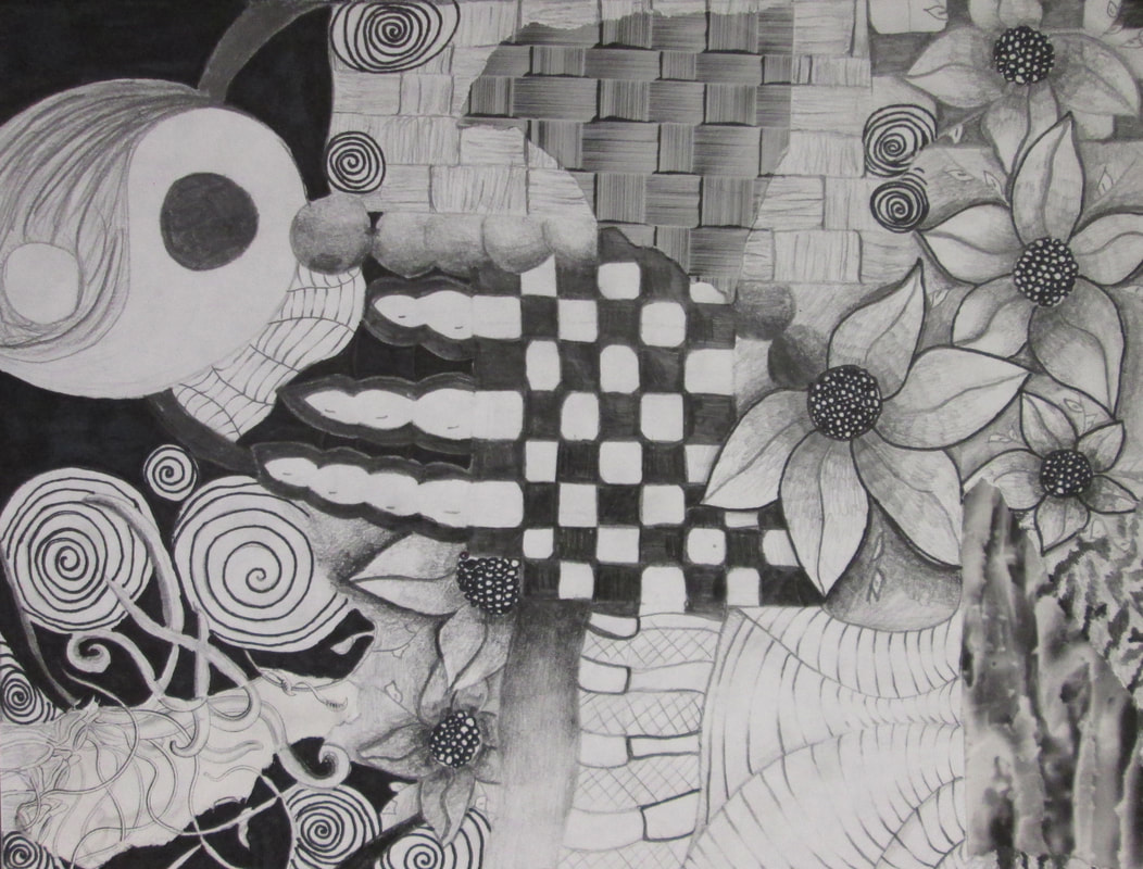
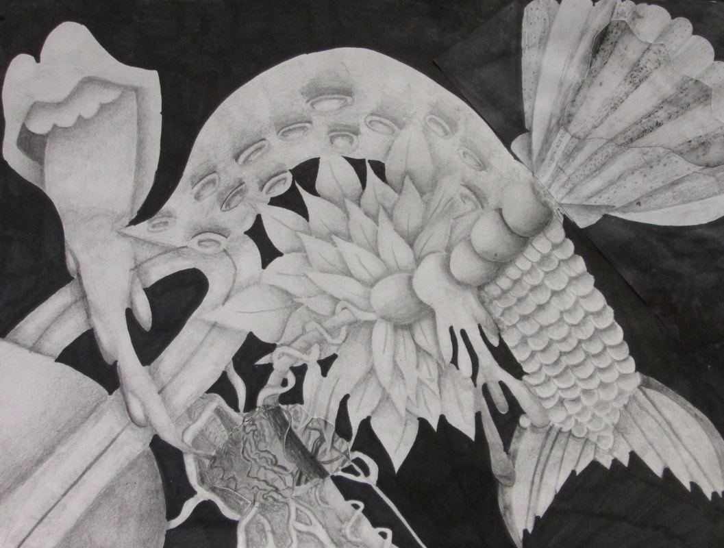
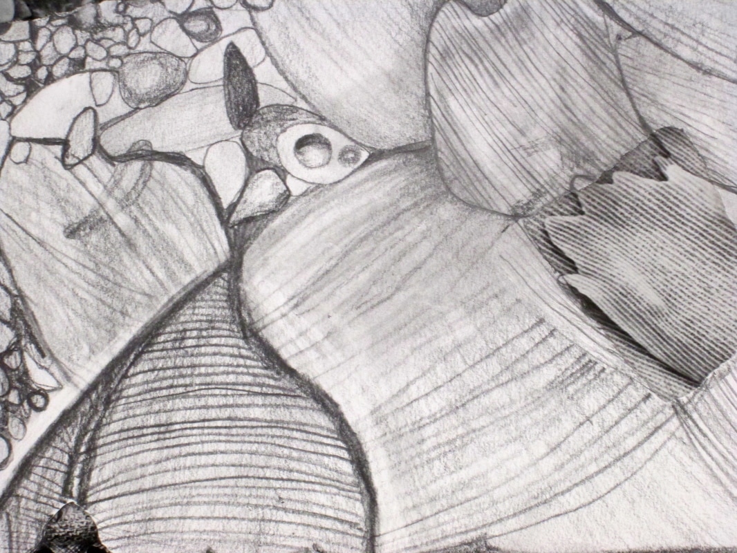
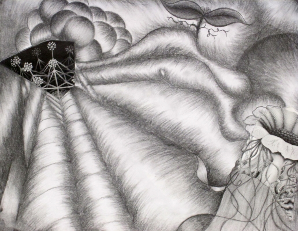
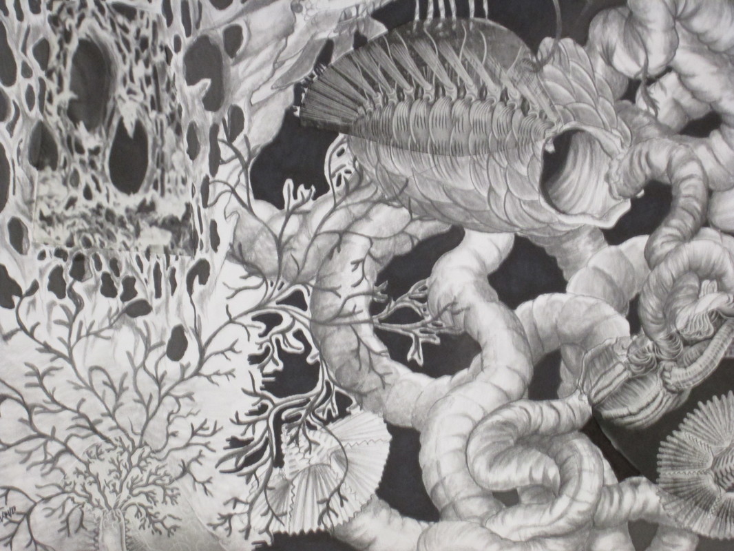
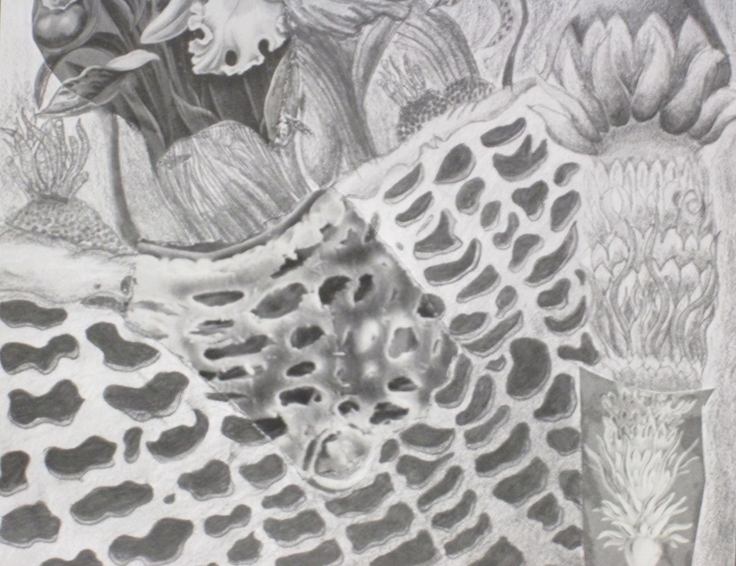
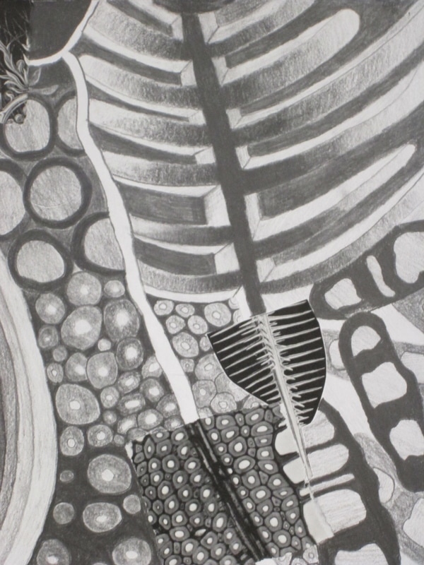
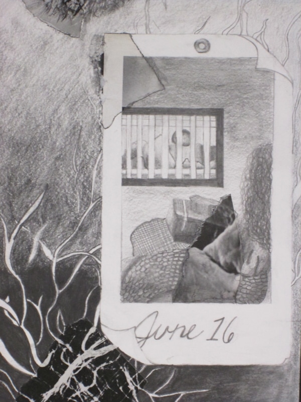
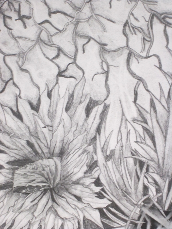
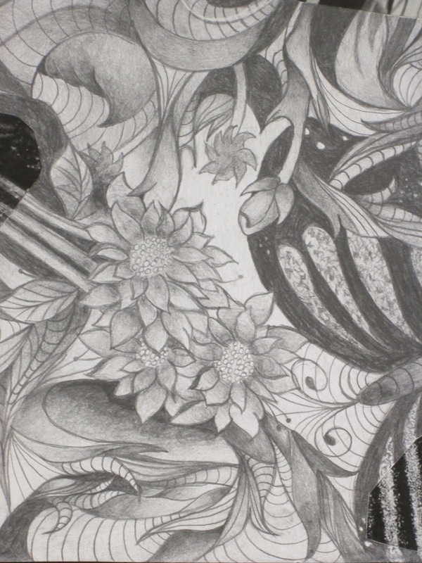
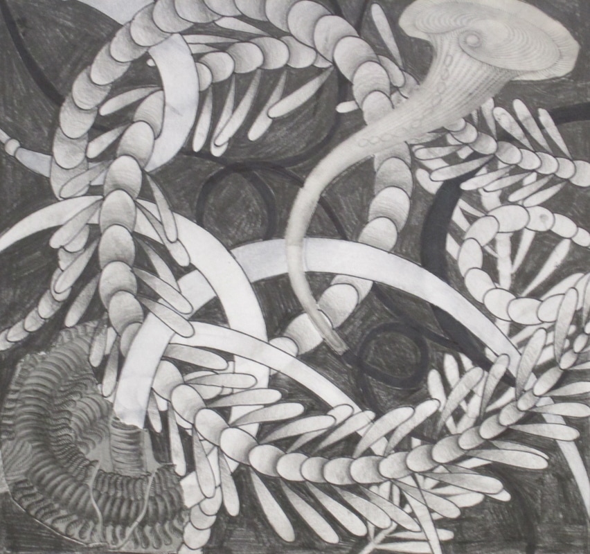
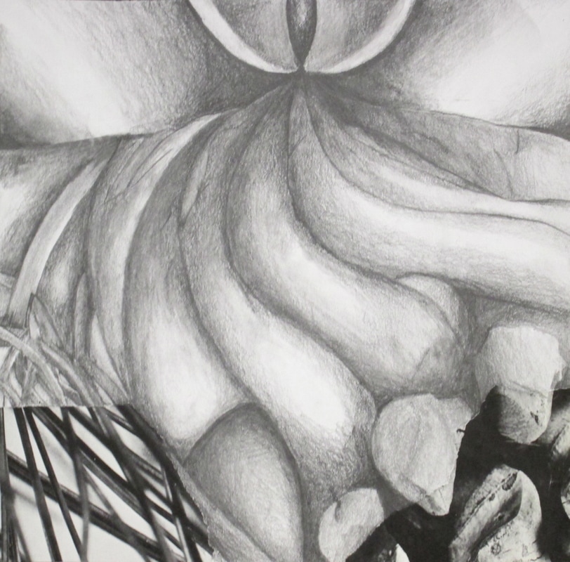
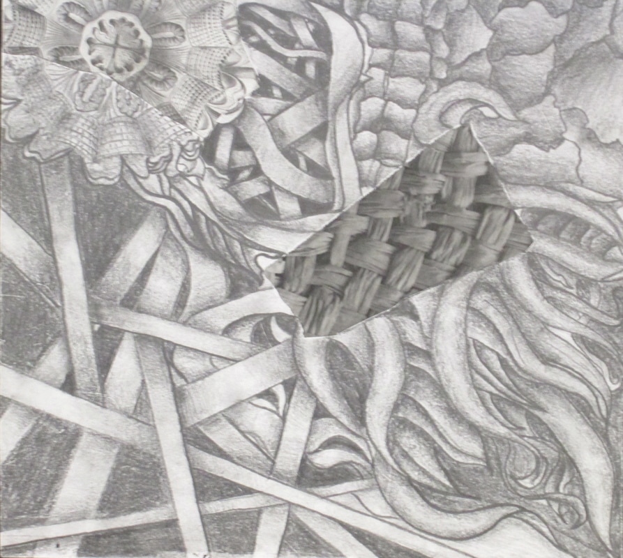
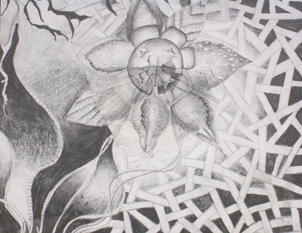
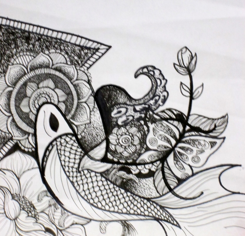
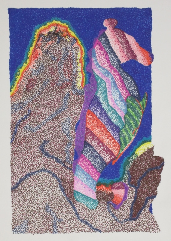
Extenders...
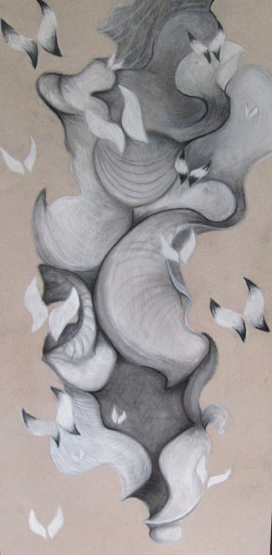
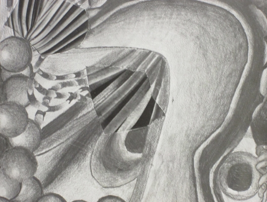
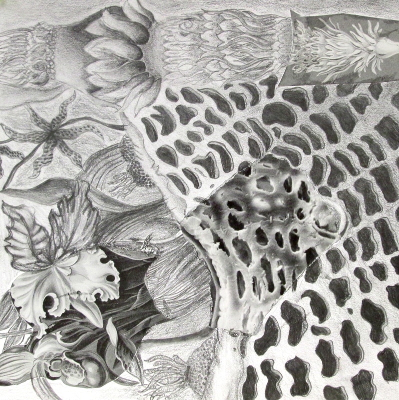
At the beginning of each semester we like to try and refresh students with past skills and shading is an essential part of a classroom. Shading- especially for the purpose of showing and creating the illusion of form is a valuable tool for all artists. An easy way for artists to loosen up is to work more organically and non representationally. The art is much less threatening when one is not preoccupied with representational depiction.
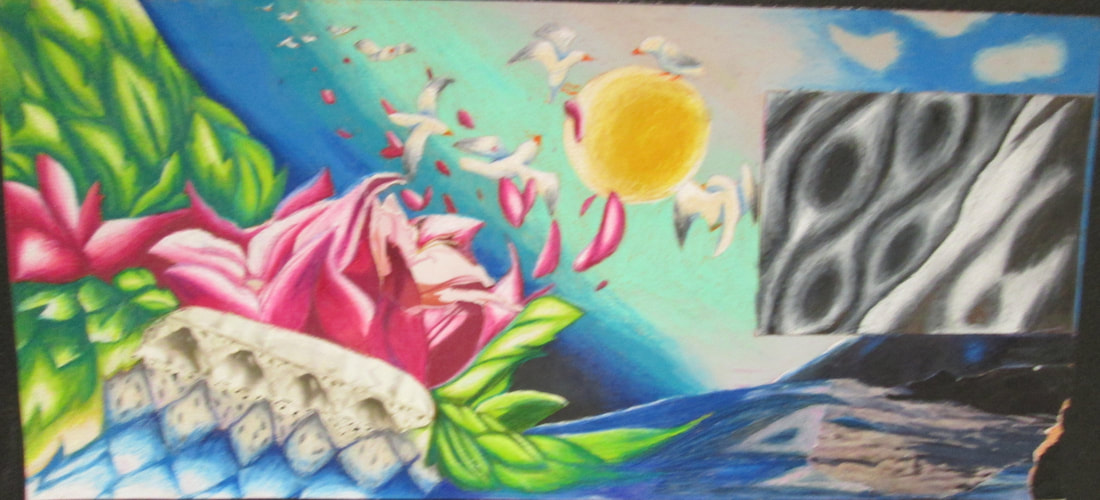
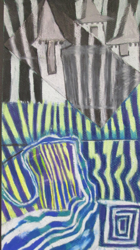
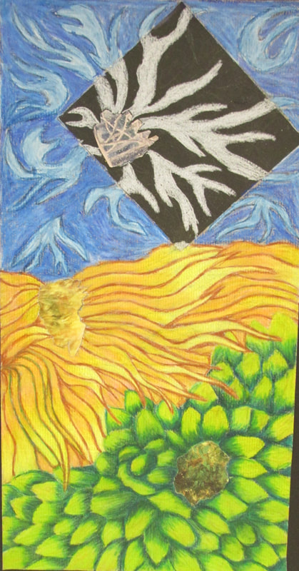
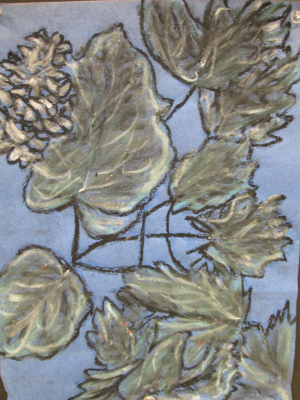
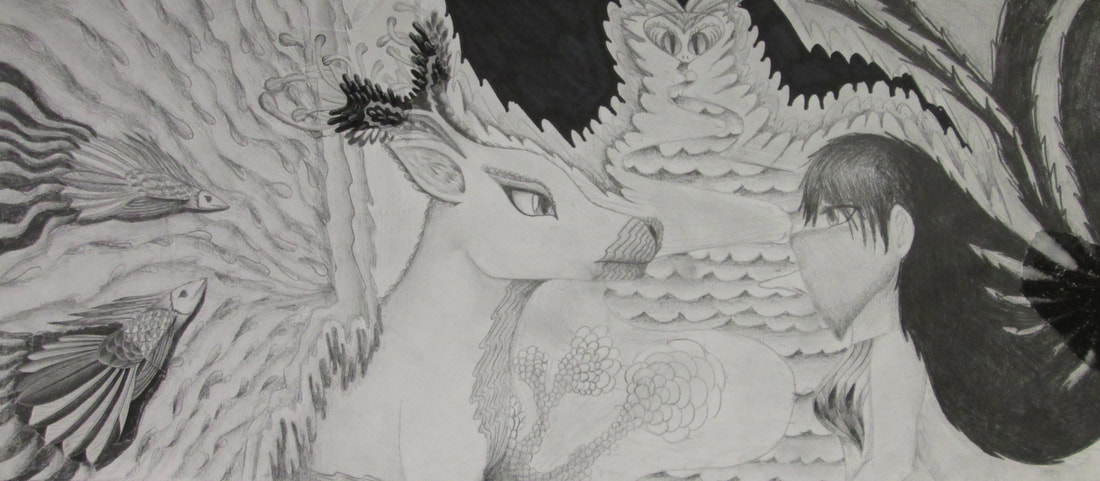
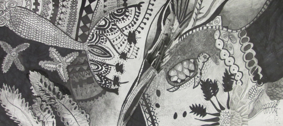
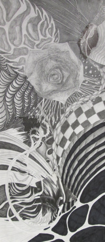
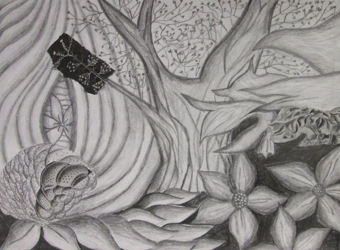
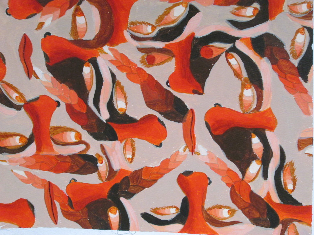
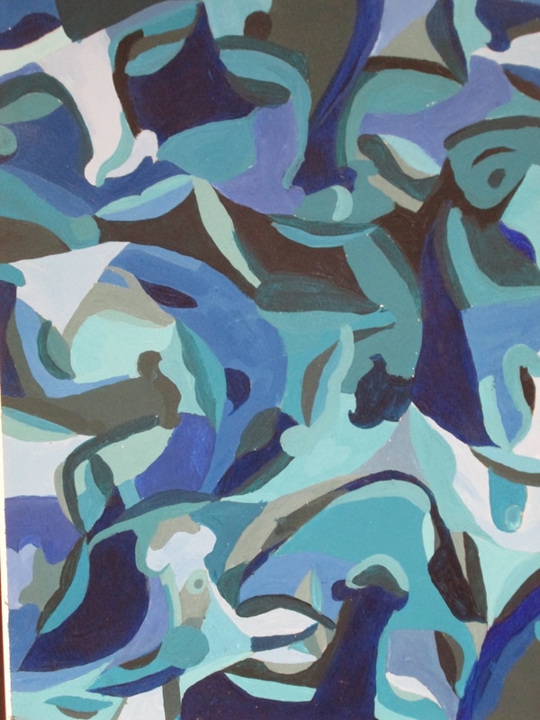
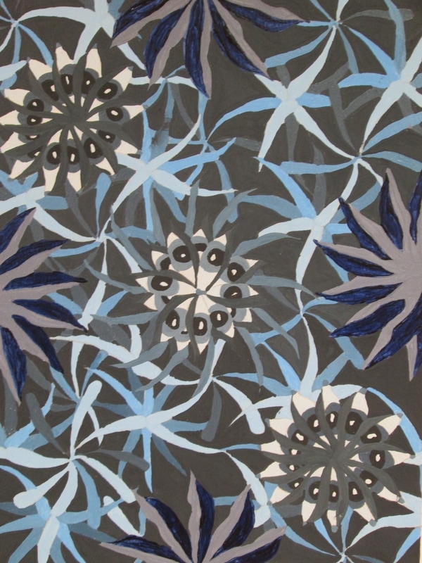
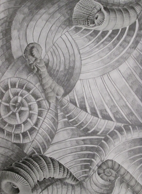
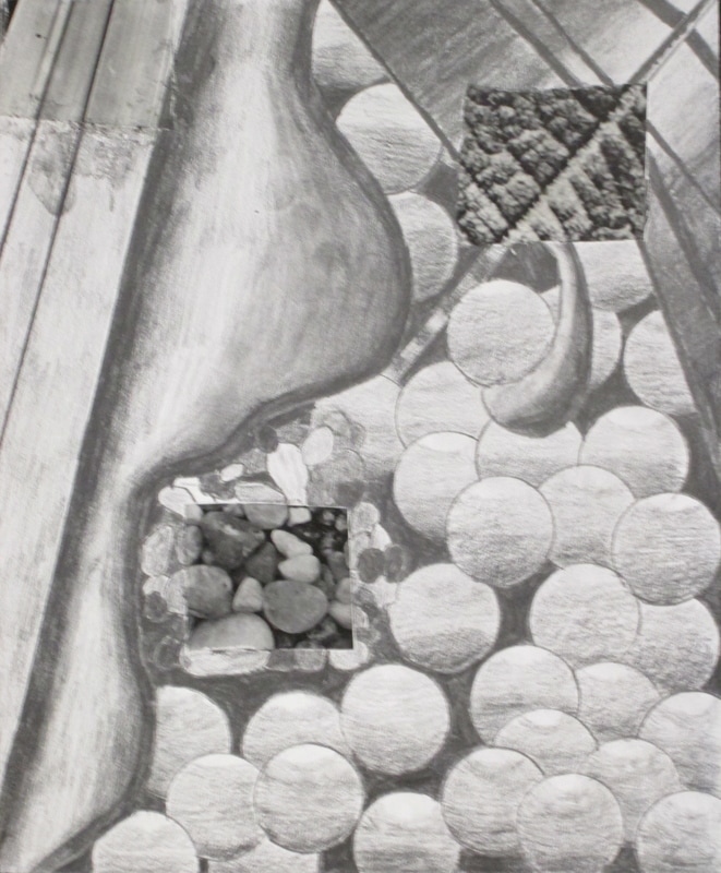
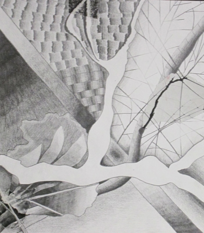
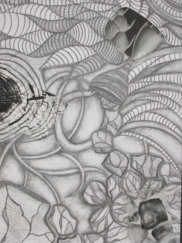
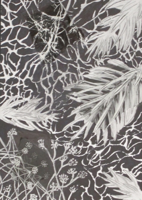
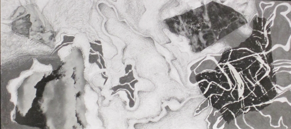
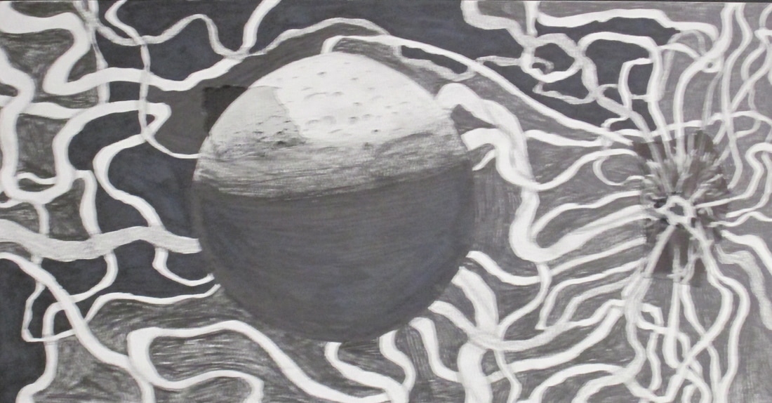
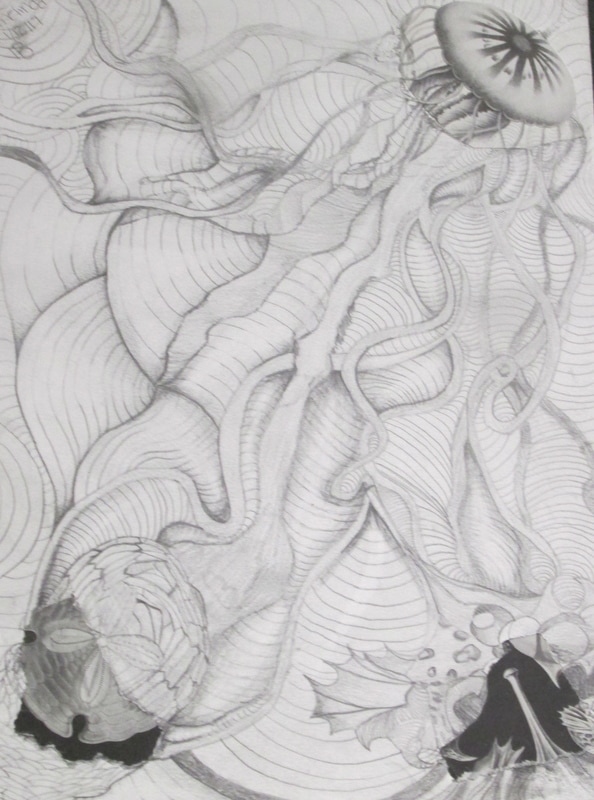
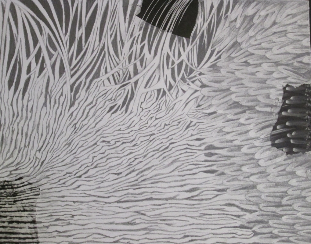
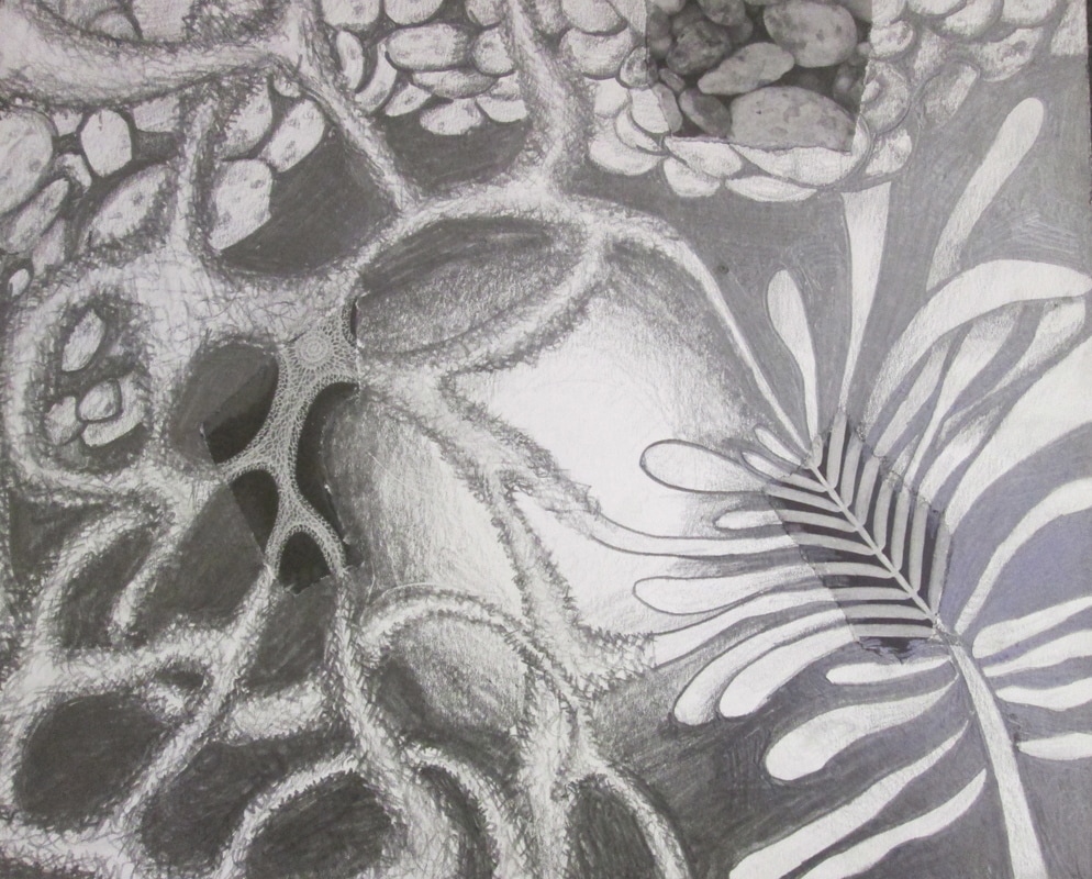
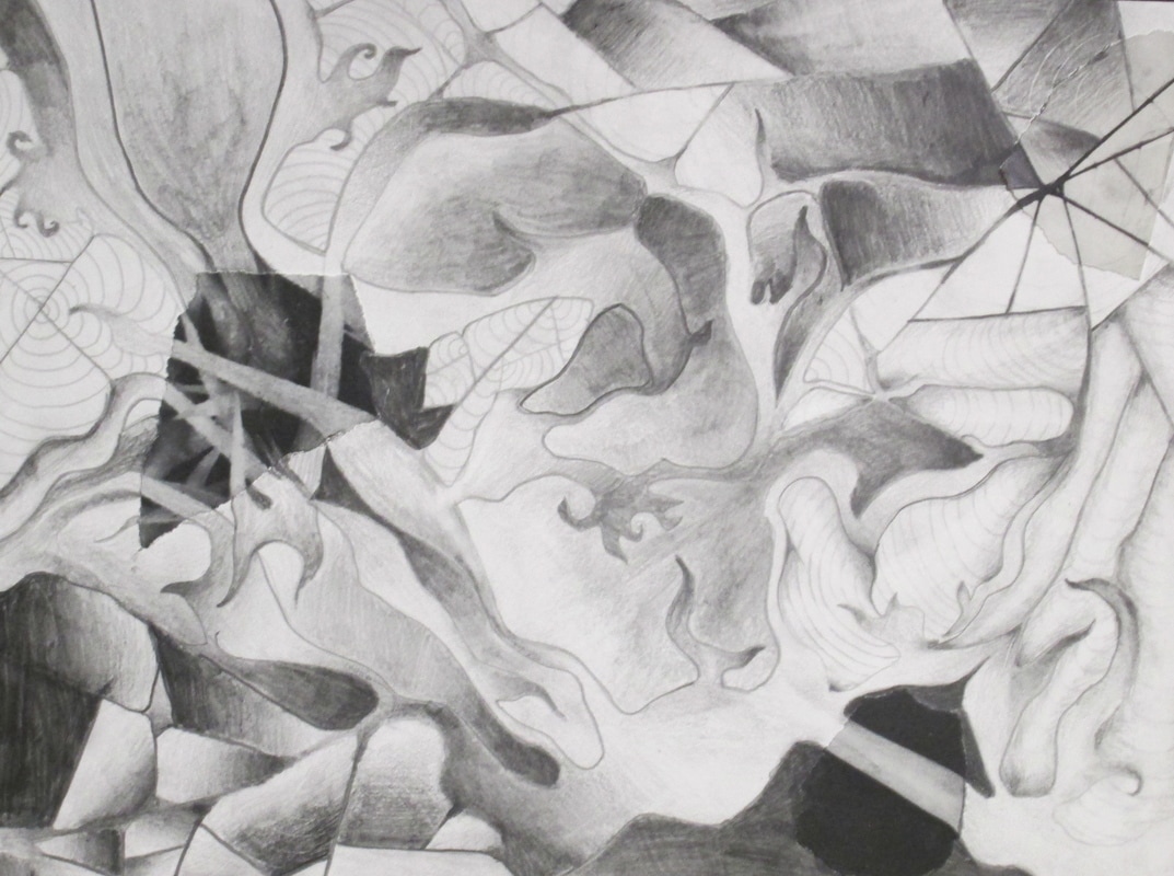
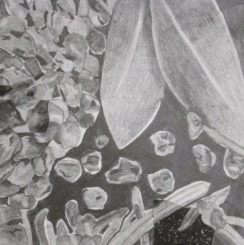
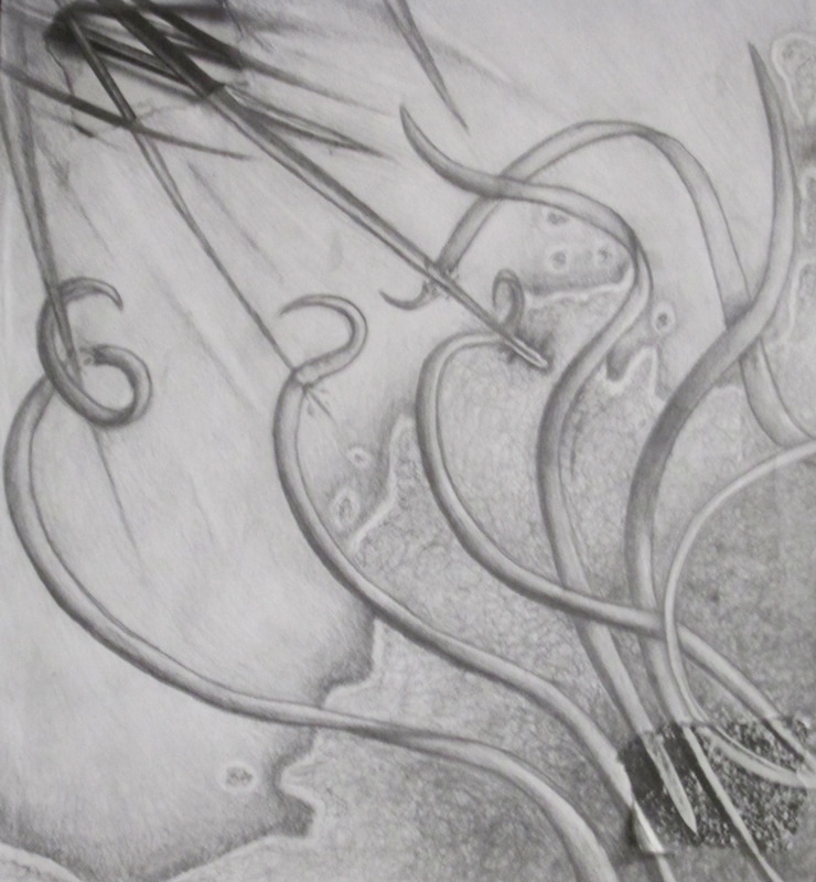
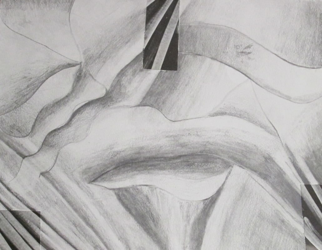
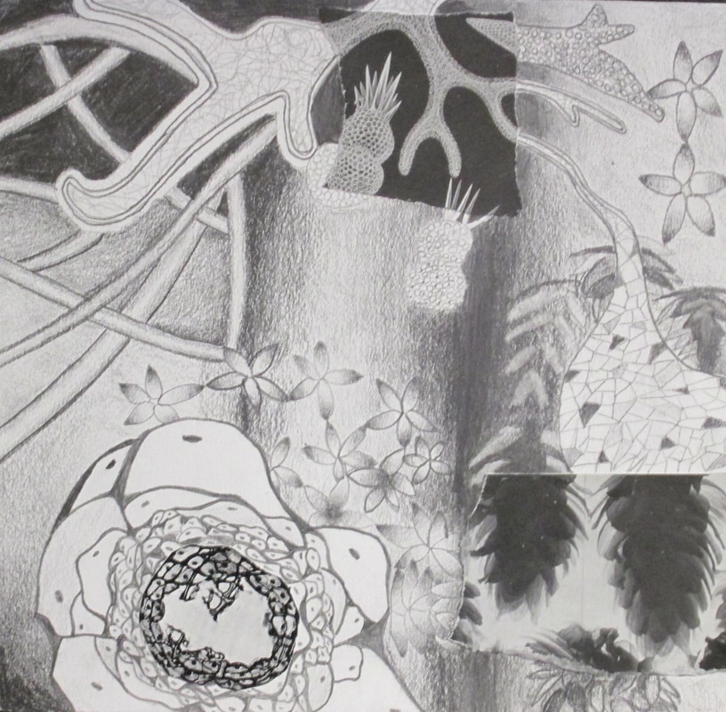
This year we looked at some small black and white "organic" depictions of plant and sea life. Students were asked to tear three small pieces of the drawings and glue them down and then extend the designs to make them their own. After which they went in and began to shade and create pockets of organic "form". Below are the finished results of their efforts!
This year we looked at some small black and white "organic" depictions of plant and sea life. Students were asked to tear three small pieces of the drawings and glue them down and then extend the designs to make them their own. After which they went in and began to shade and create pockets of organic "form". Below are the finished results of their efforts!
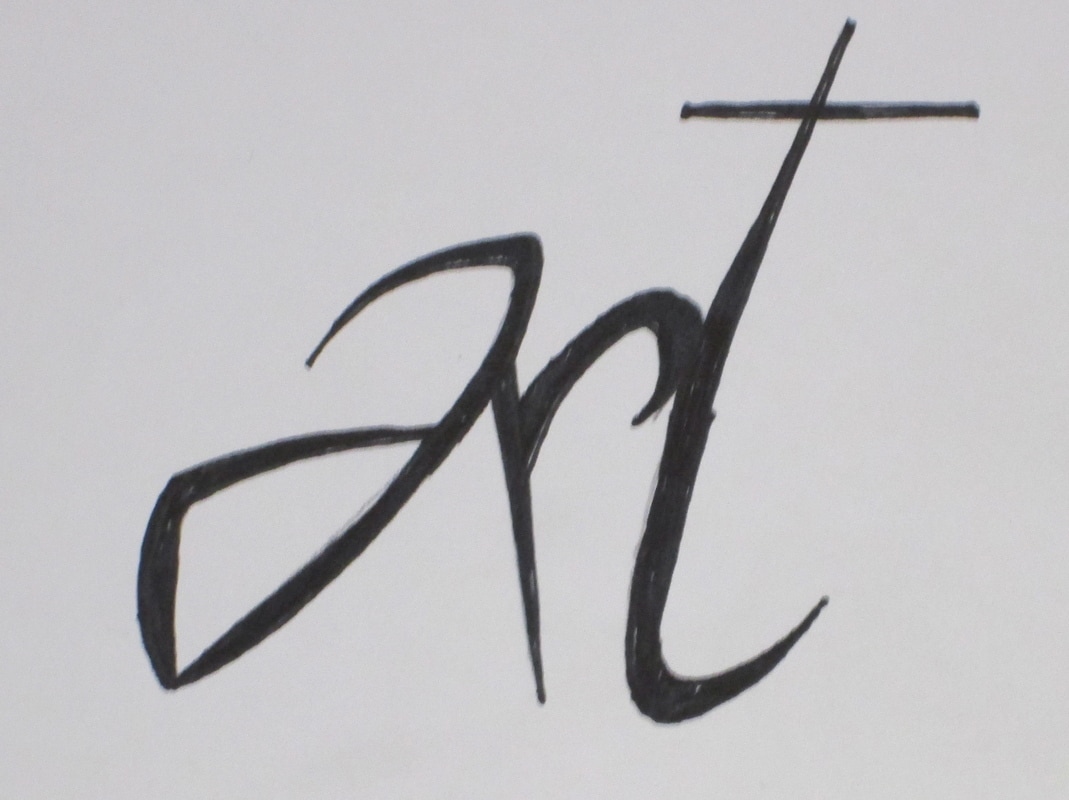
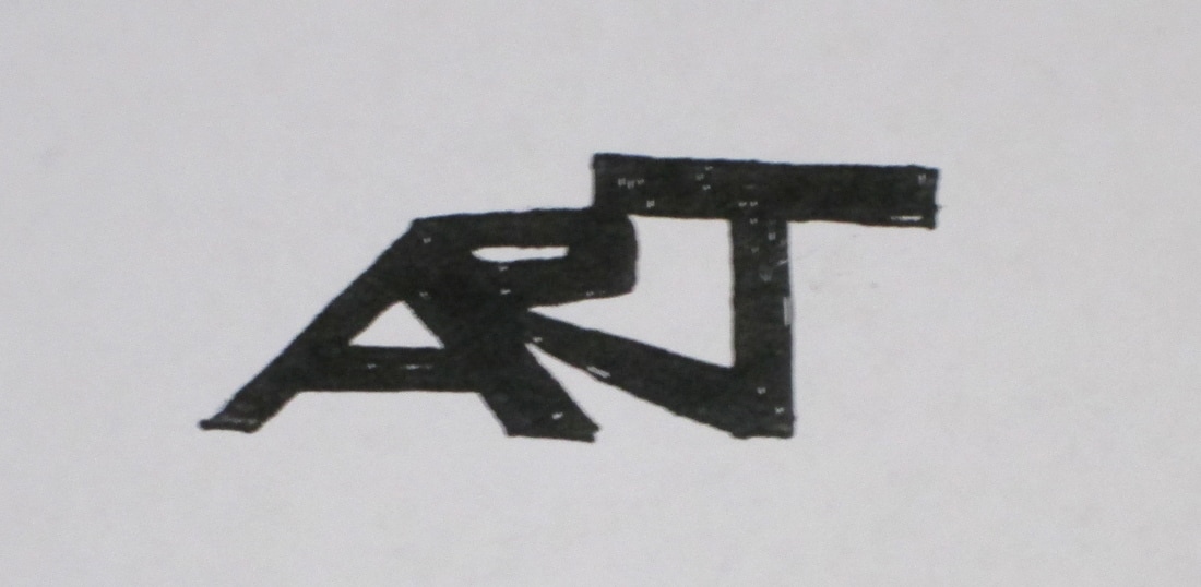
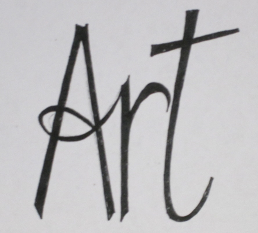
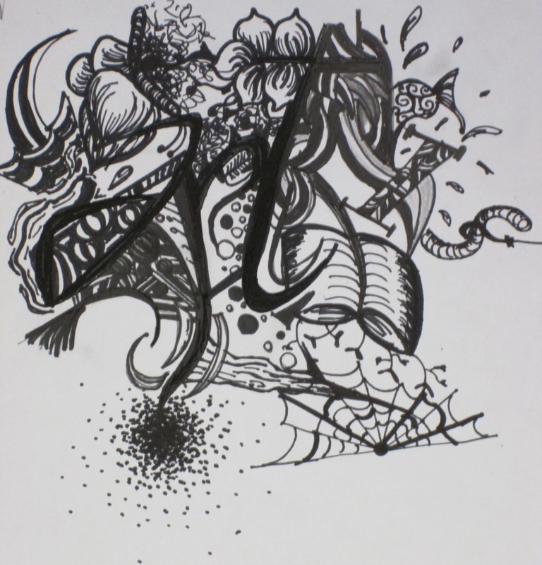
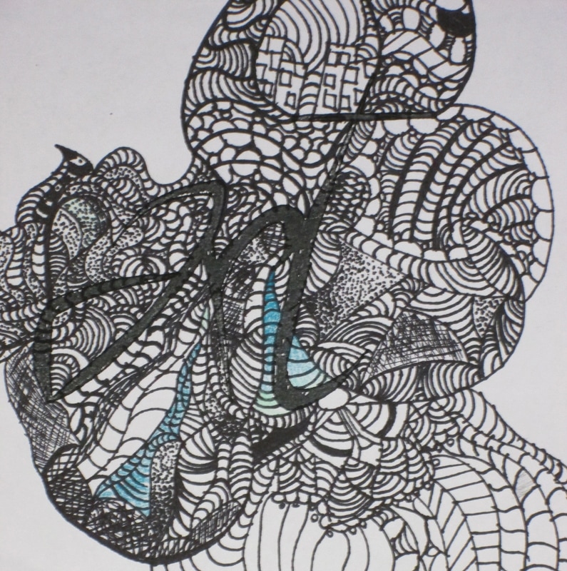
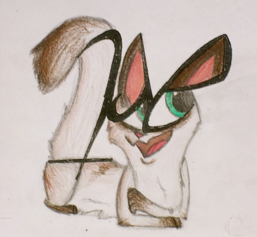
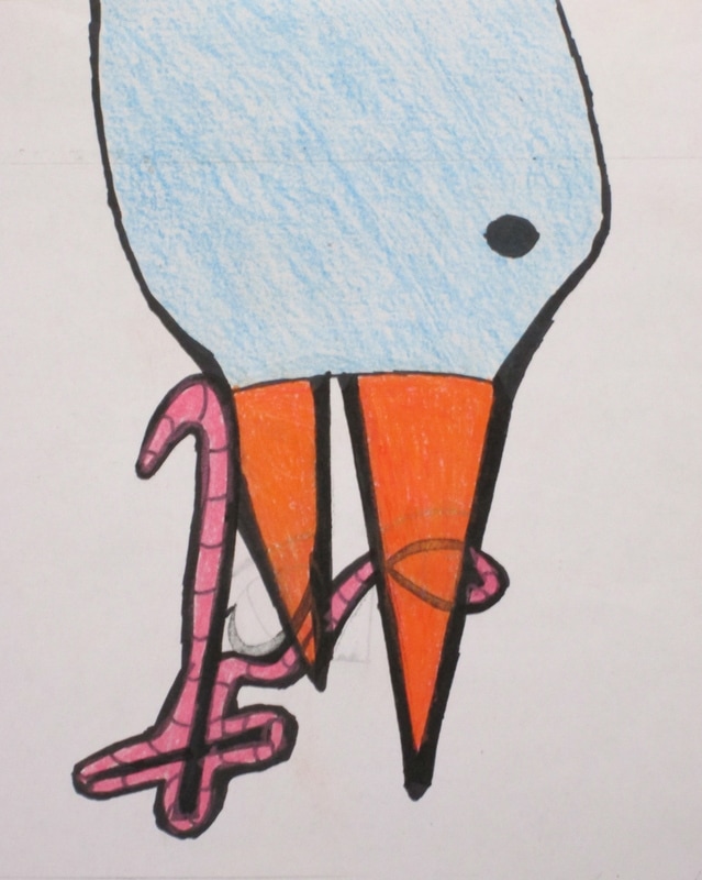
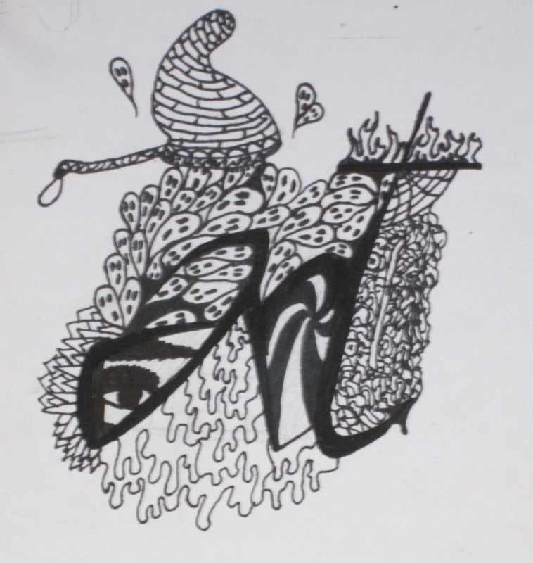
Creative Problem Solving...ARt,art, ArT
During the first day of class students are given a small piece of paper with an expressive depiction of the word ART. They are then asked to look at it from multiple angles and find a way to turn it in to something so that the viewer may not easily decipher the original word. It is a great exercise in problem solving, encouraging creative thought and a way to un-limit boundaries. In general students can find an exercise like this enjoyable and visually thought provoking. The following images are some of the results of this semester.
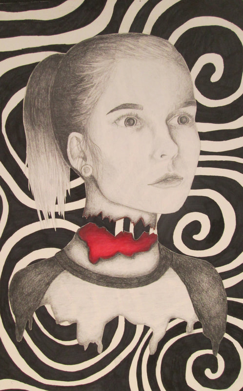
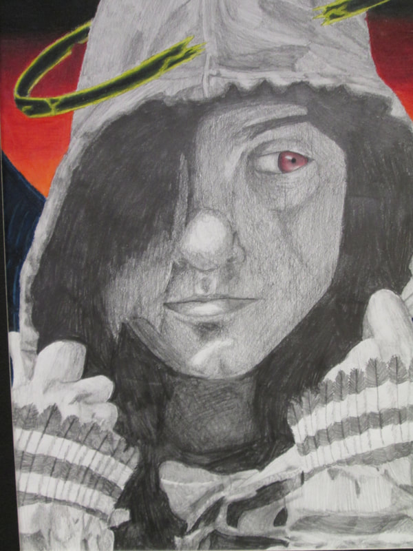
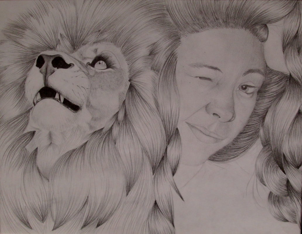
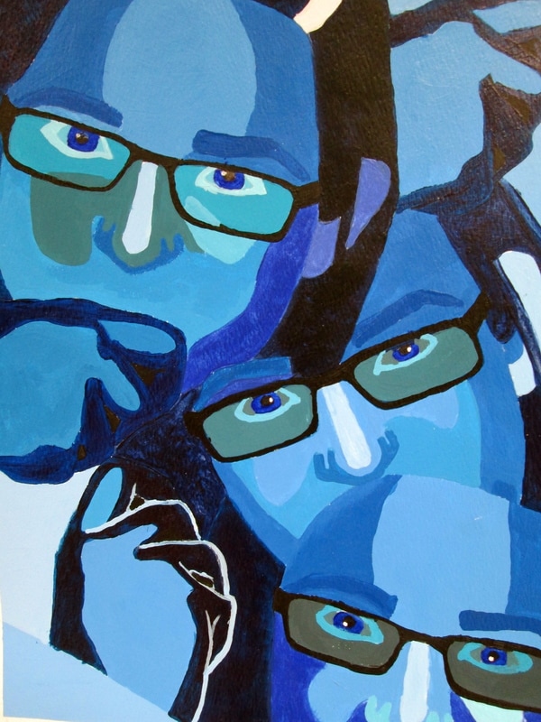
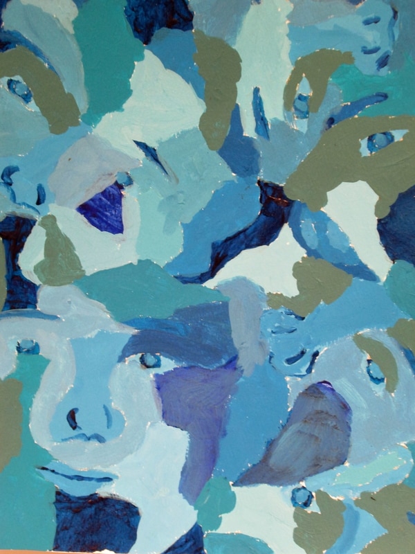
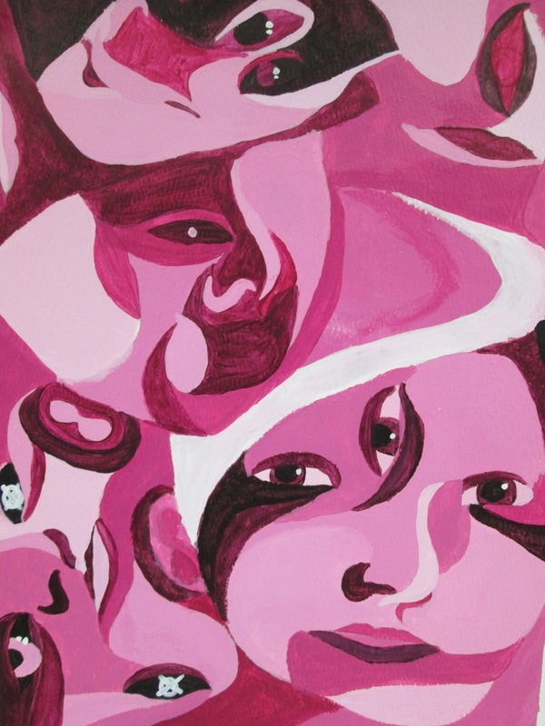
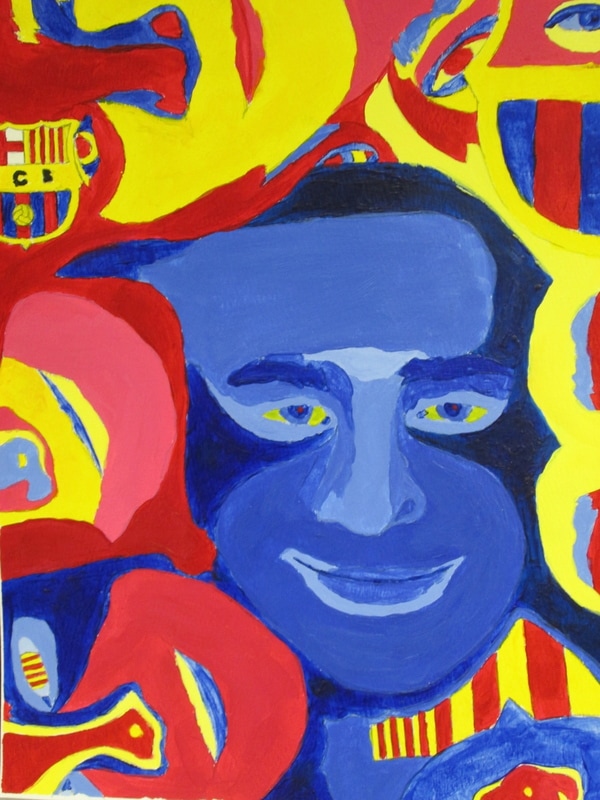
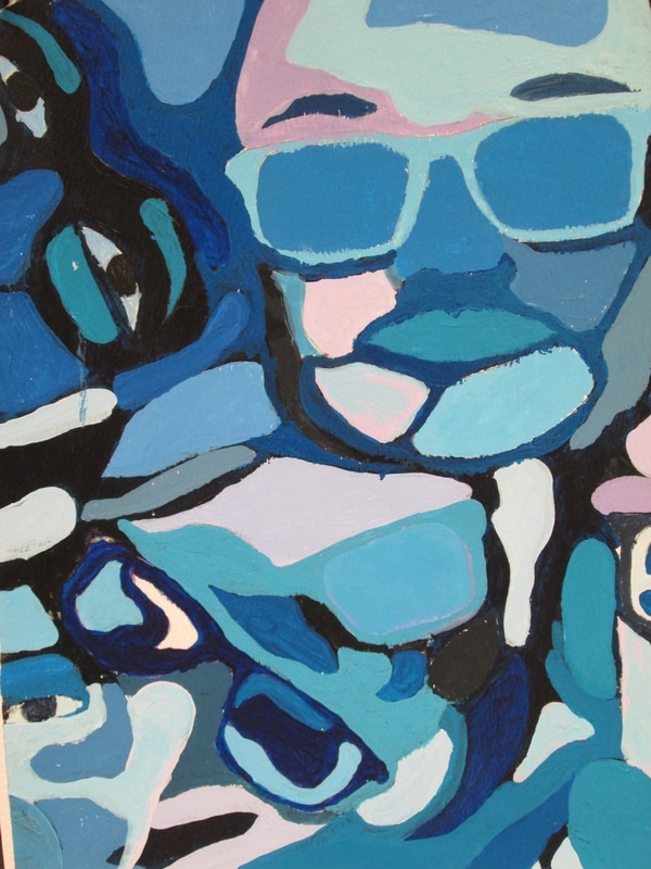
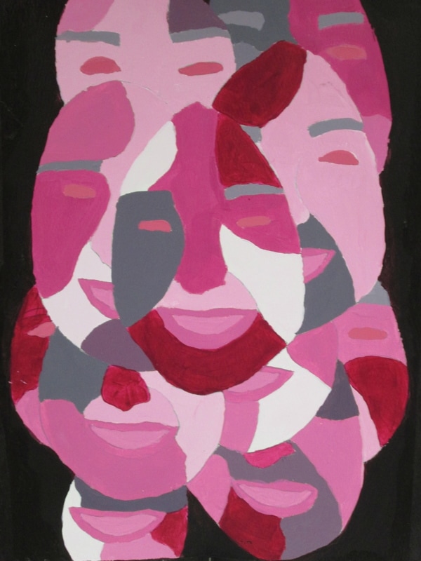
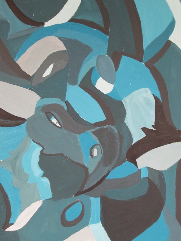
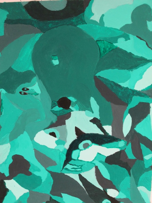
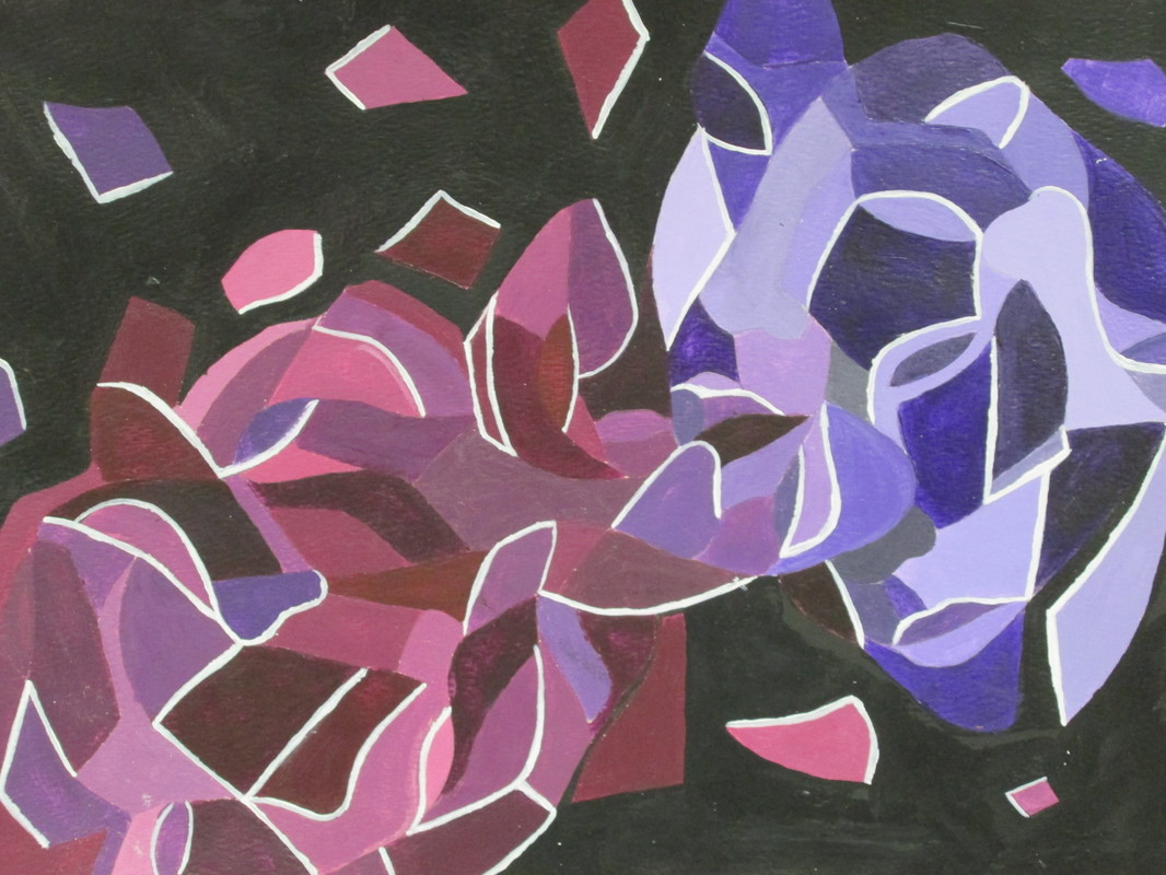
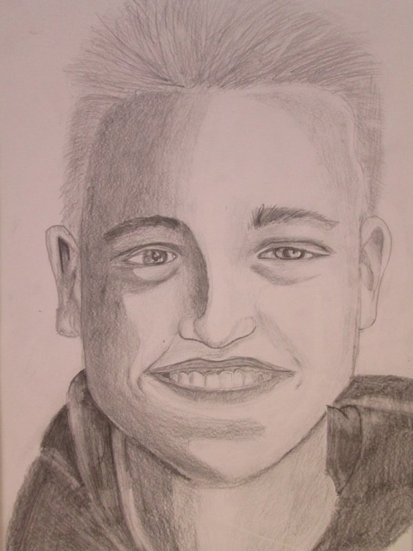
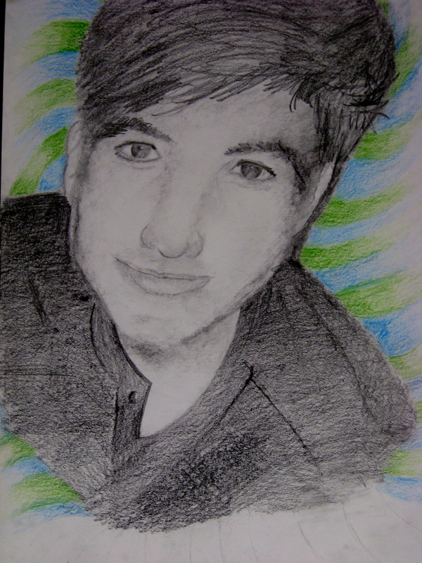
Fall 2016 Monochromatic portions of "Selfies"
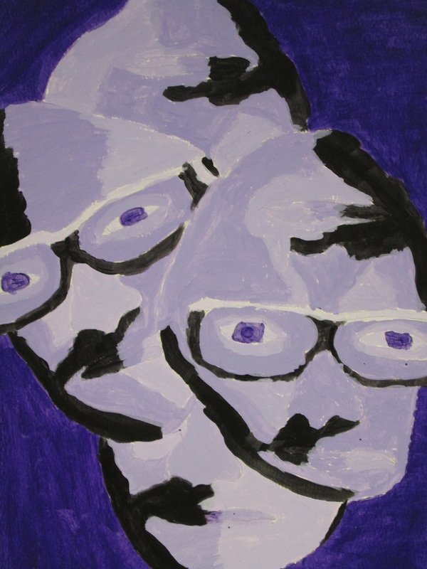
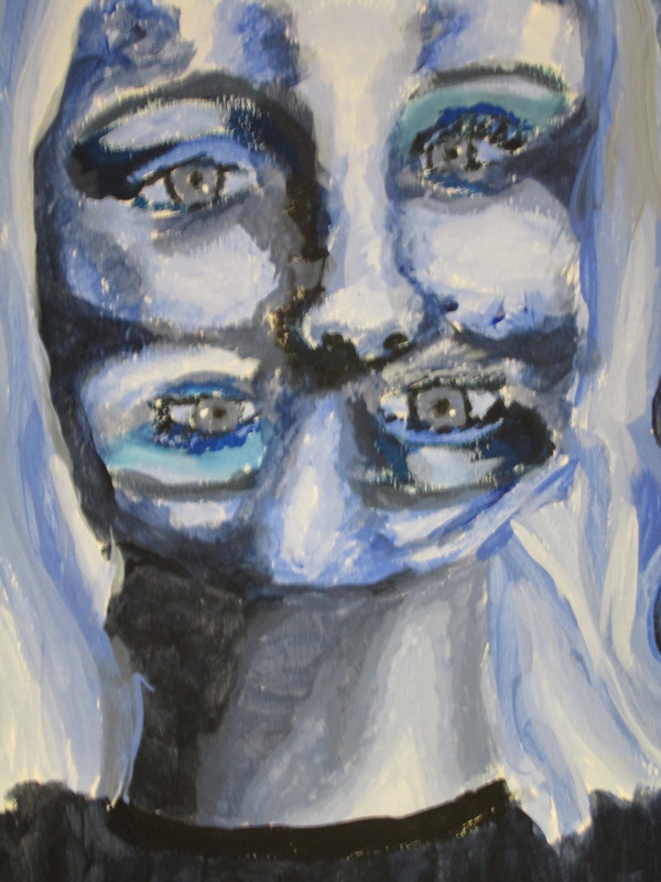
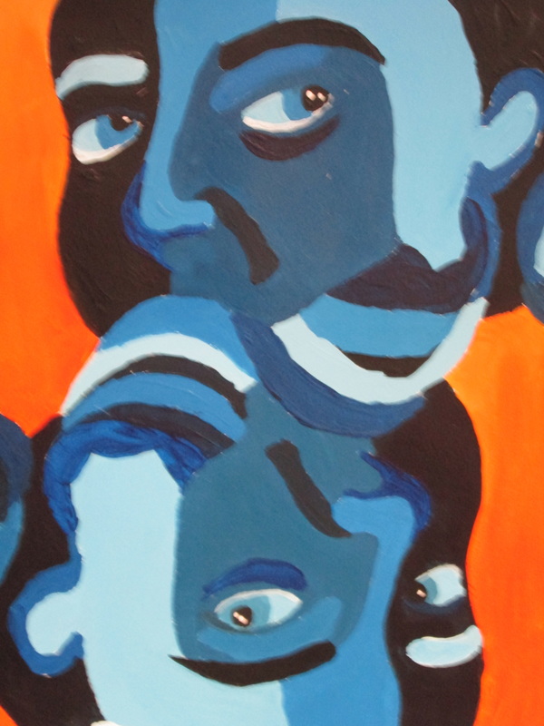
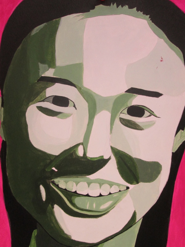
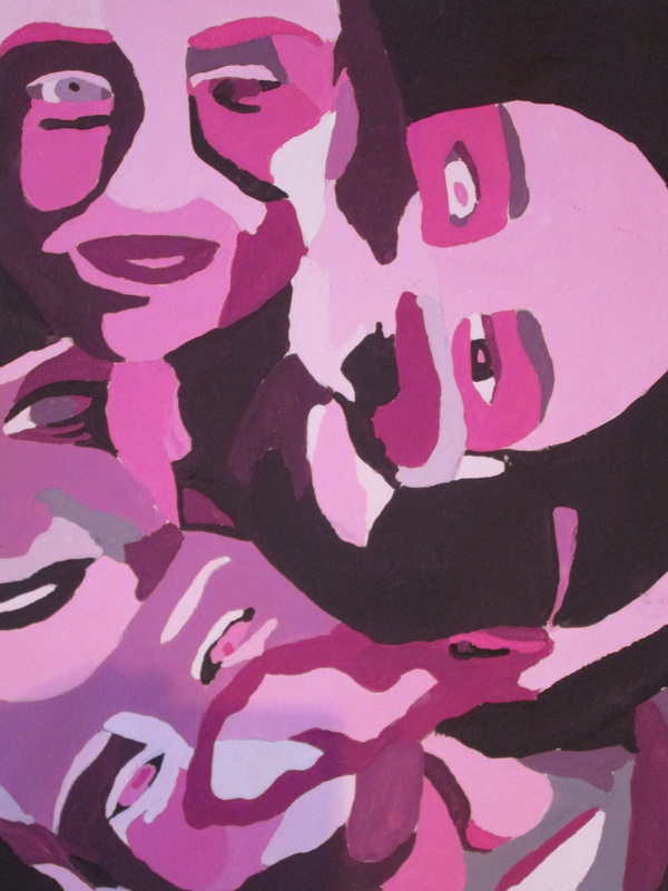
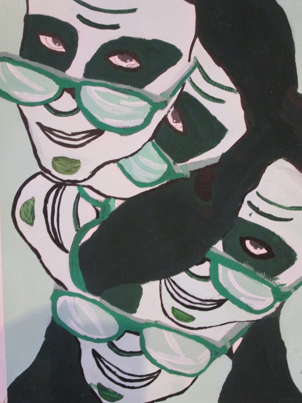
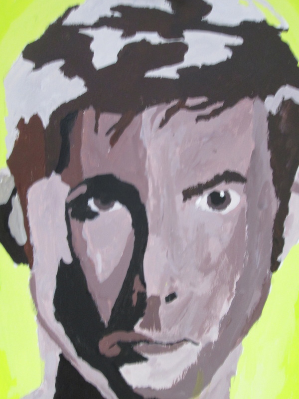
Fall 2016- "SELFIES" are in!
  |
Marcia J. - 12
HOW YOU DO IT? At the beginning, I examined the measurements between my features and tried my best to draw the basic outlines of my face and features as realistic as I could. It was really frustrating when I would erase and redraw the same feature so many times and it never matched the actual picture. My main goal at the beginning was just to get the basic outline so I could shade and add detail and achieve a realistic look. My “aha” moment was in the shading and realizing that after you get a basic outline of the face, the whole piece starts to come to life when you add the shading and add the details. Now that it’s done I feel so accomplished to have drawn myself in a way that I think people could recognize who is in the piece.REFLECT...I think I gained a better understanding of portraits and of the human face during this unit because I learned so much about the dimensions of every person’s face so I feel like I have a cheat sheet for the next time I draw a portrait. ADVICE? Take your time and take breaks. I think it’s really important to spend a lot of time trying to get the basic outline just right so that the further you move on, the more the portrait advances in realism and detail. I also found it helpful to take a few short breaks throughout the period because I found myself fixating on small areas that no one else even noticed and after taking a break from looking at a certain area, I was able to quickly fix certain spots and make the project something I was happy with. |
Kylin T. -10
HOW YOU DO IT? I started my portrait on the eyes in order to get all of the measurements correct. Then I moved to the nose and lips. For me one of the most frustrating parts of the drawing was my lips because I had all the measurements correct but they still didn’t look right. When I got the lips right, I realized that the iris’ in my eyes were too big. When I fixed that everything else seemed to fall into place and all I had to do was shade. Last came the hair, which was tricky since I have light hair so the contrasts between light and dark was hard to achieve. REFLECT...I think I gained a better understanding of portraits during this unit and of the human face. I now know that the perspective is very important because it may alter how you measure and put features in relation to each other. I also learned that the human face seems very simple and the skin seems easy to shade, but the larger spaces without any features have a lot of detail and require seemingly random shading. ADVICE?My advice when approaching a self portrait is to take it step-by-step and at your own pace, don’t try to rush it. Also start lightly until you have all the features and shaded portions drawn out and it looks how you want it to. Then, go in darker and add shading. |

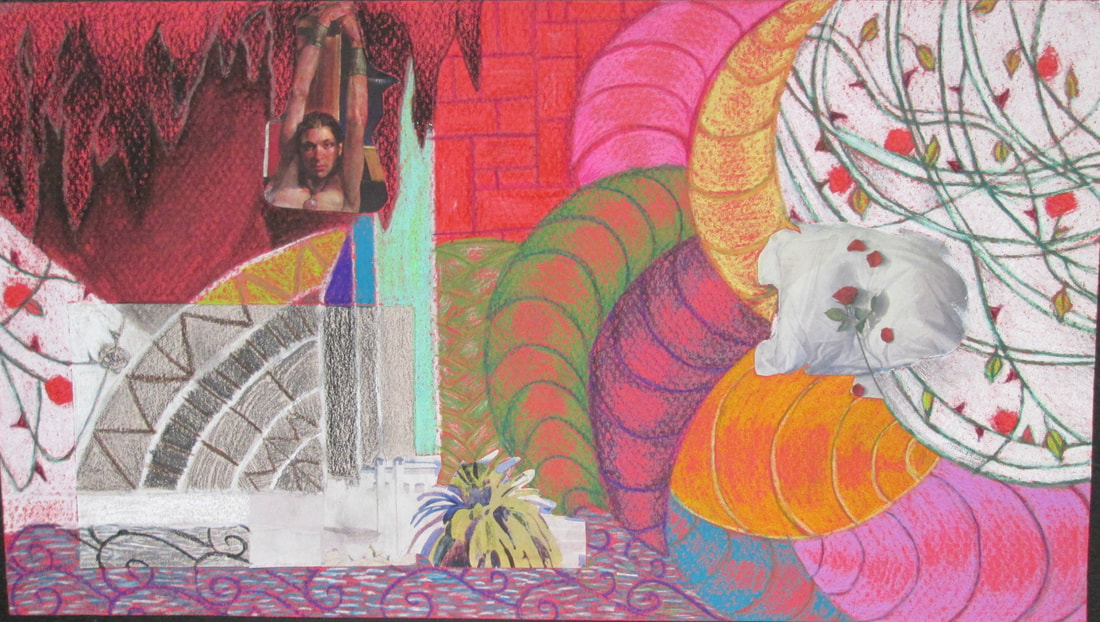
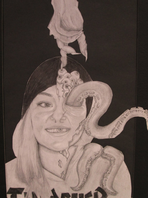
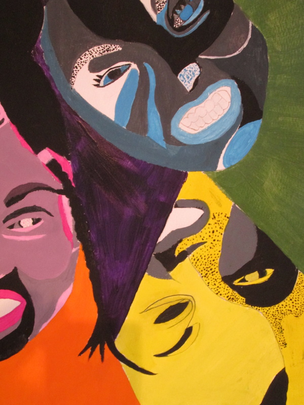
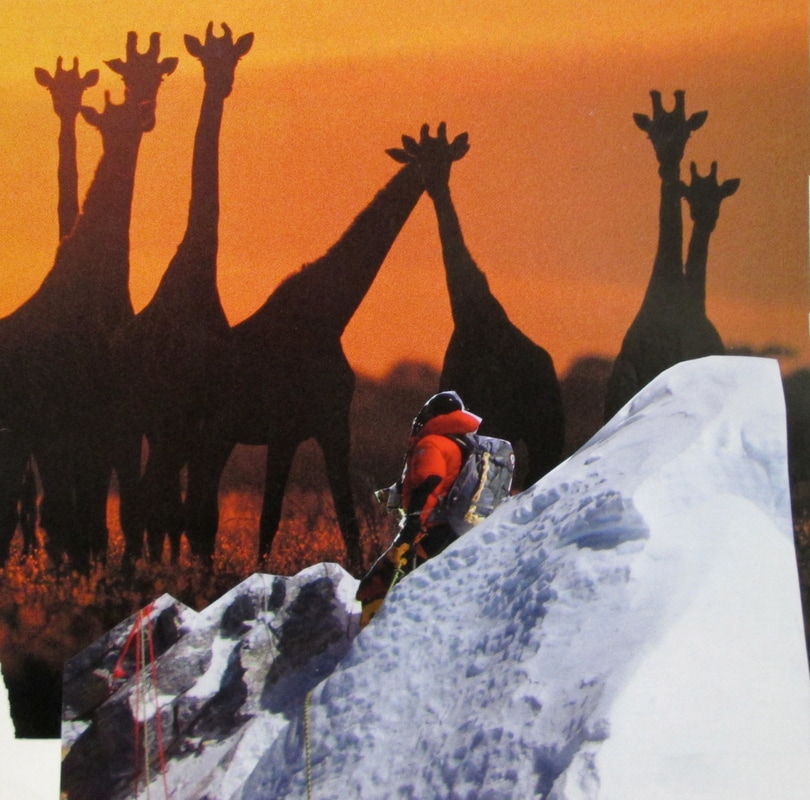
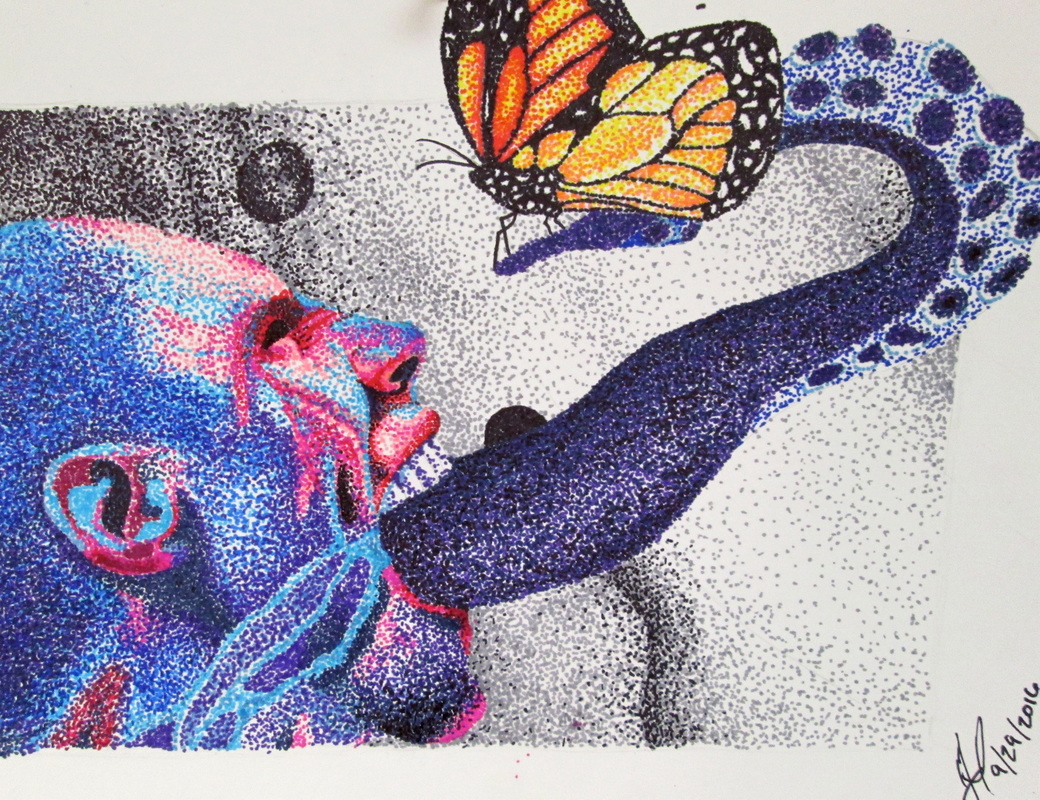
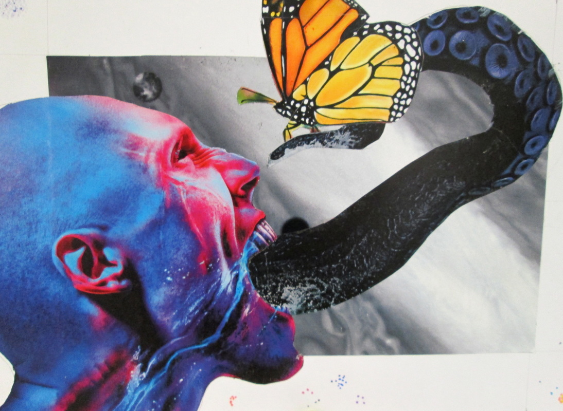
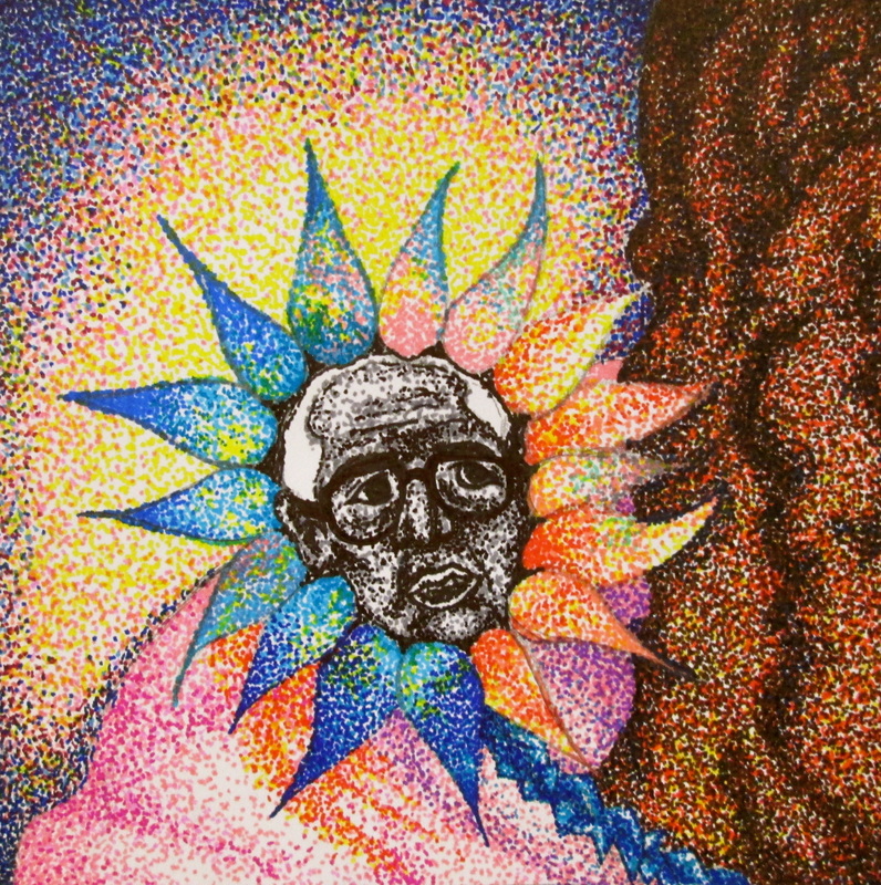
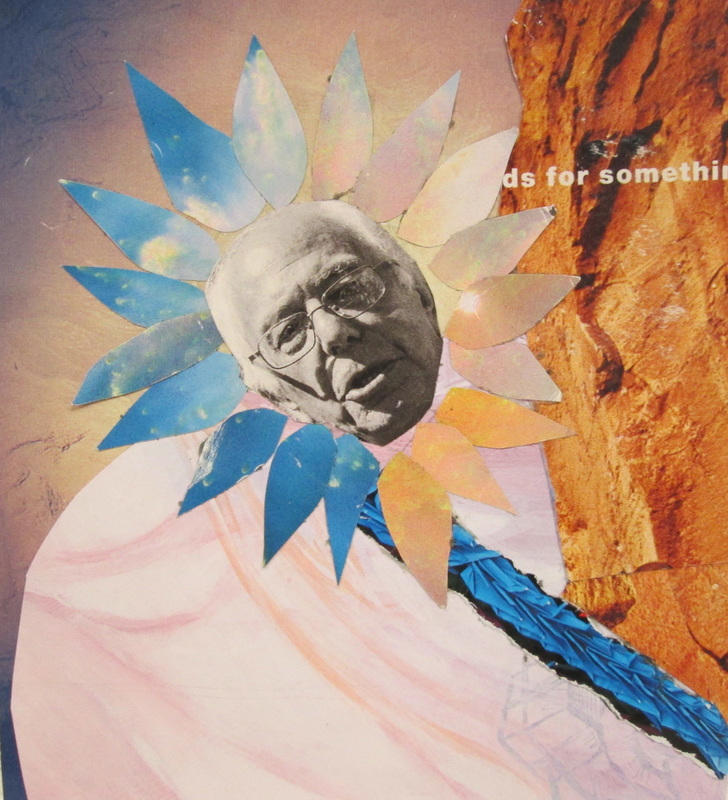
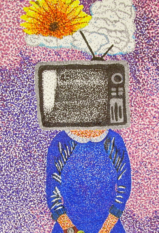
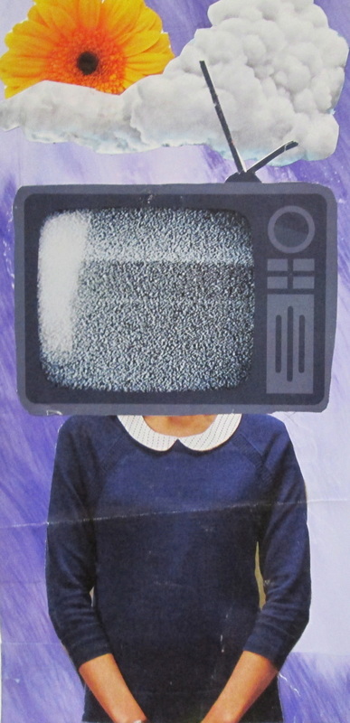
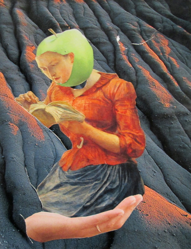
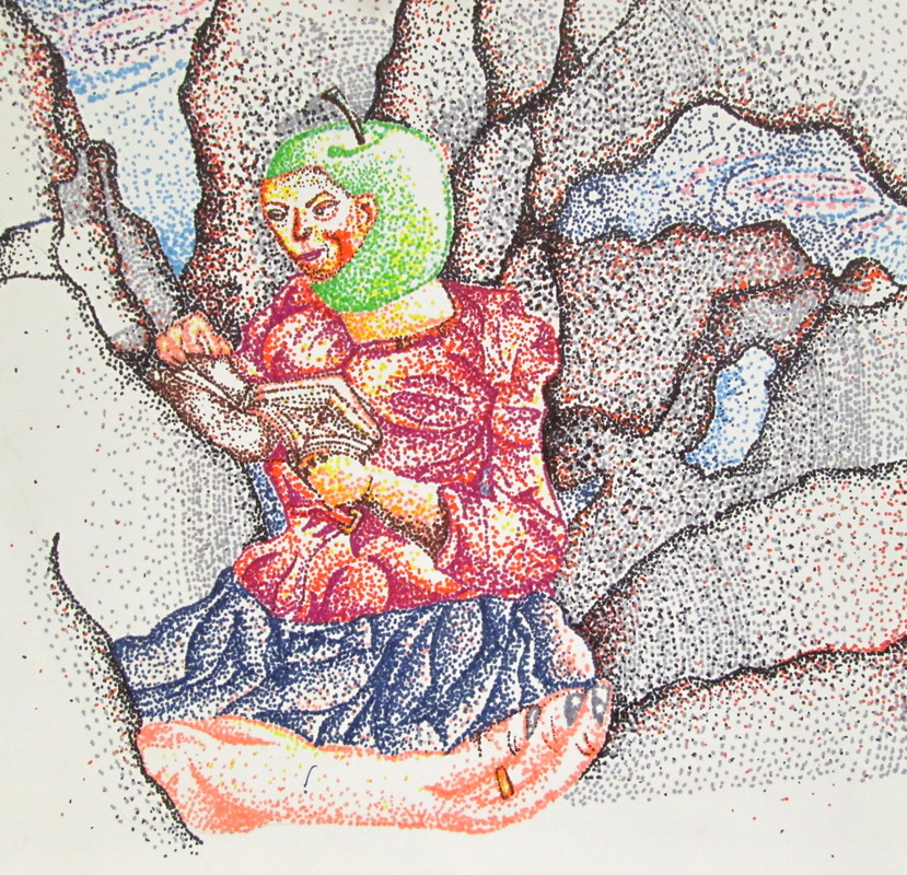
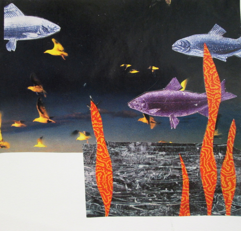
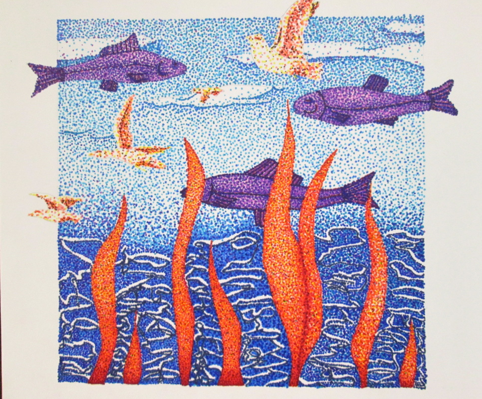
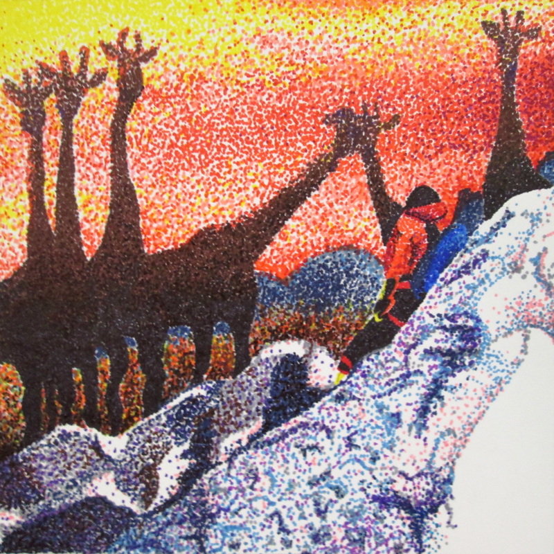
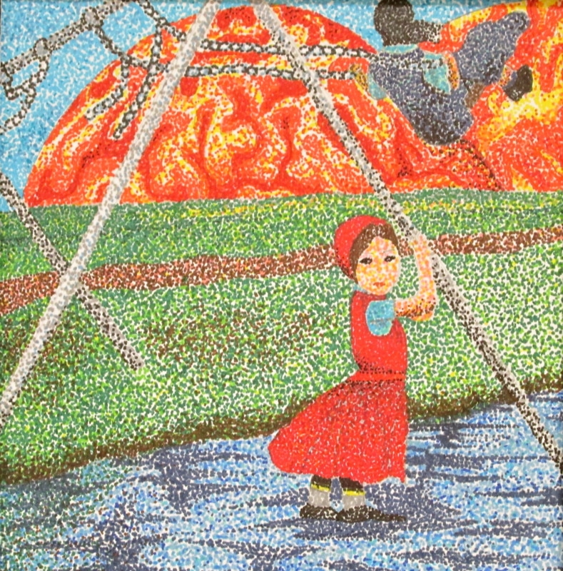
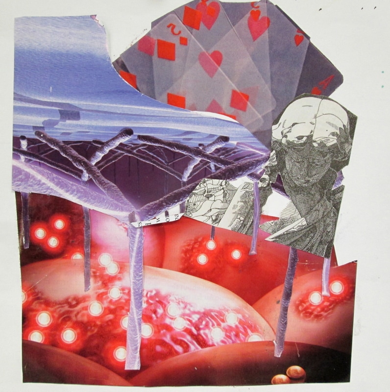
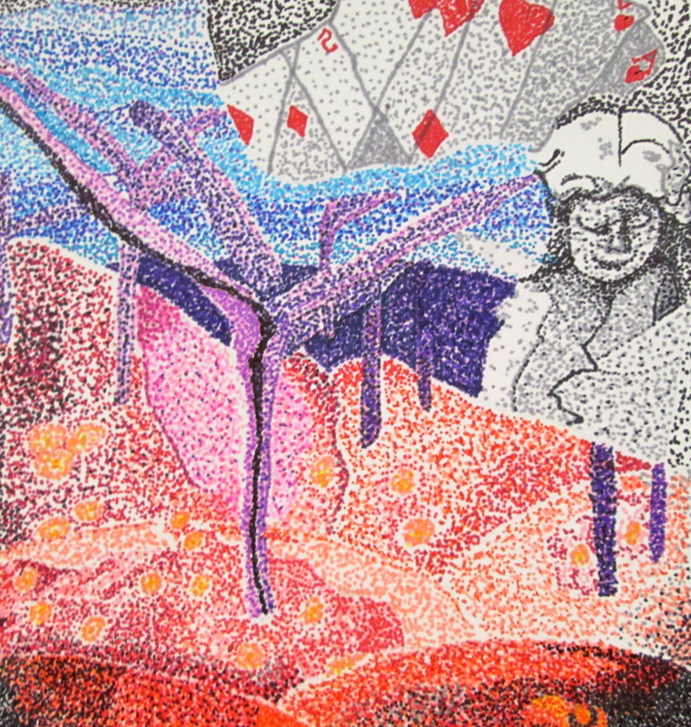
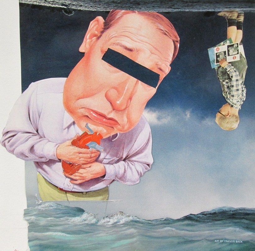
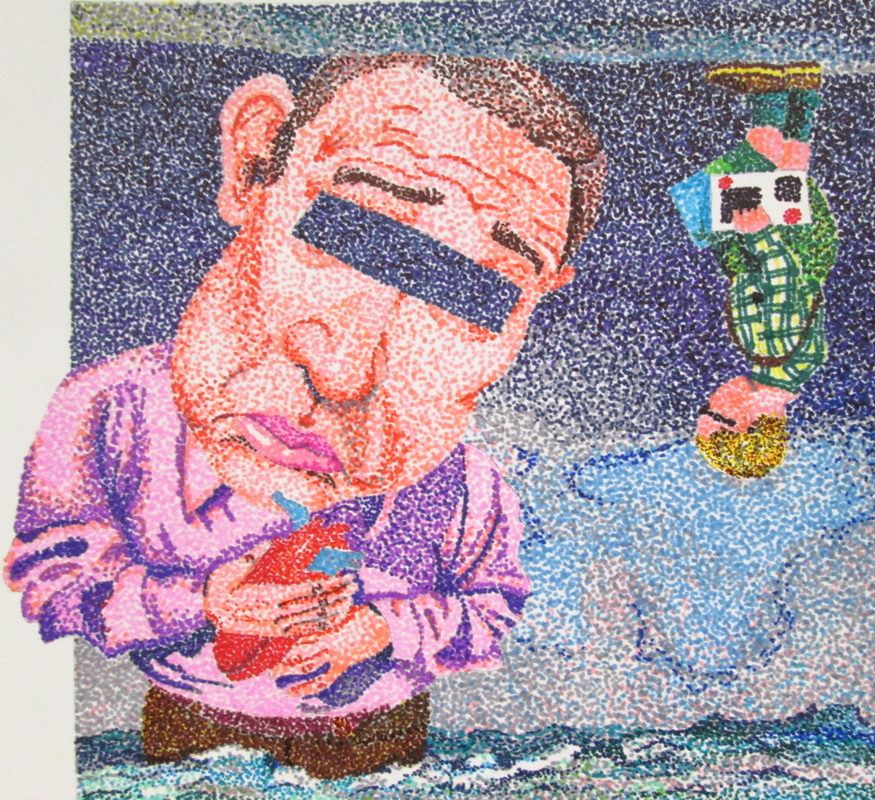
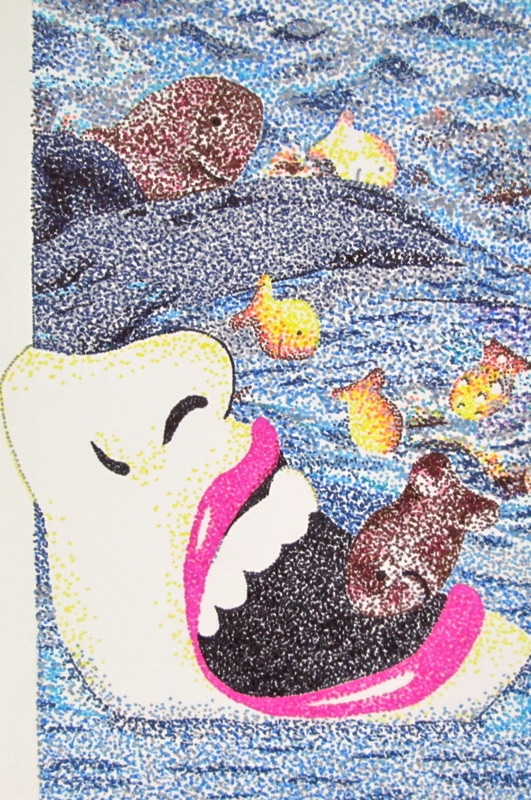
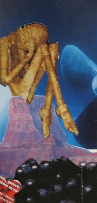
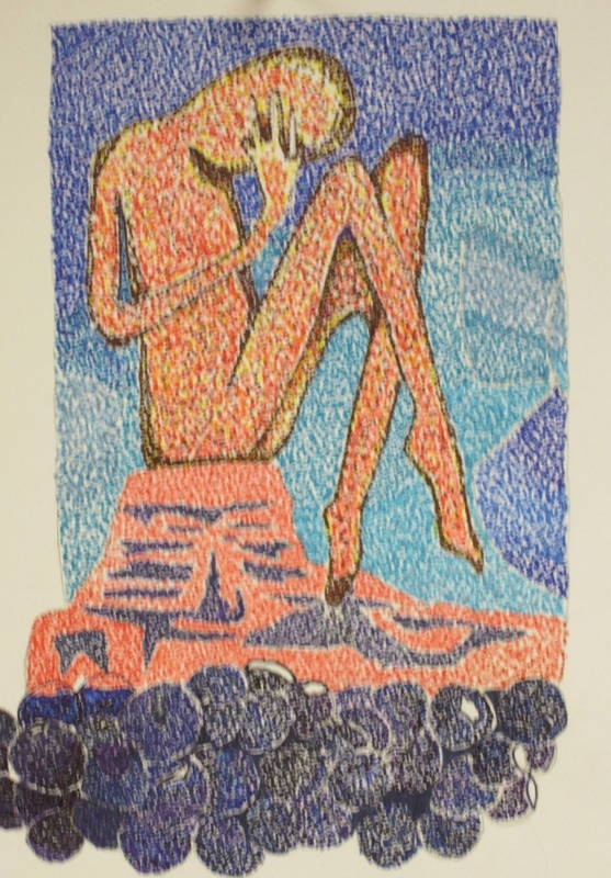
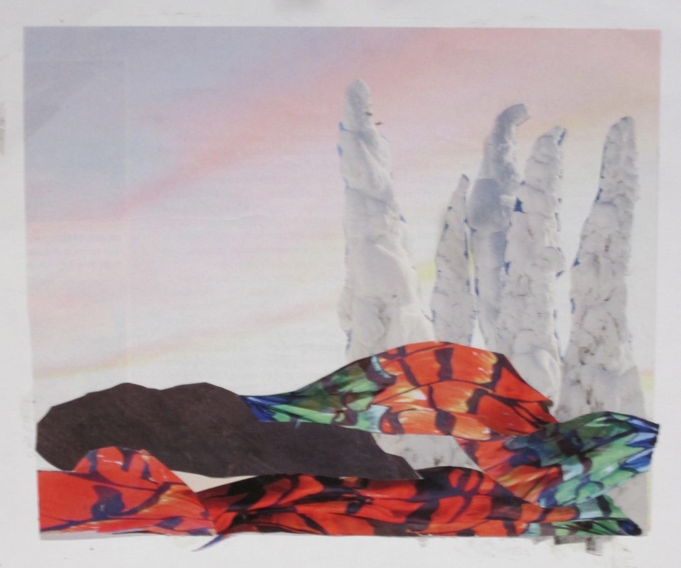
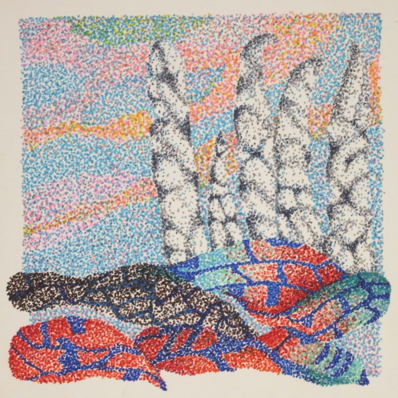
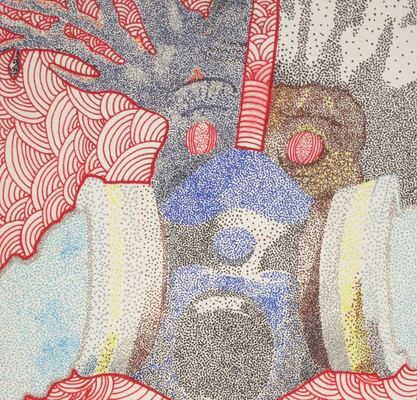
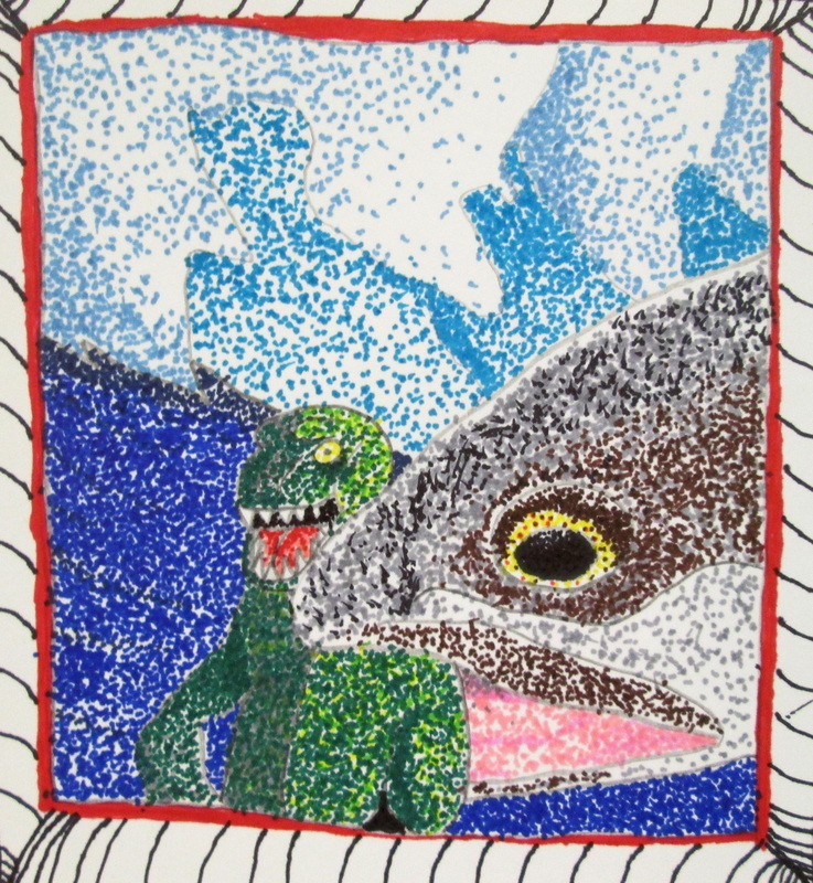
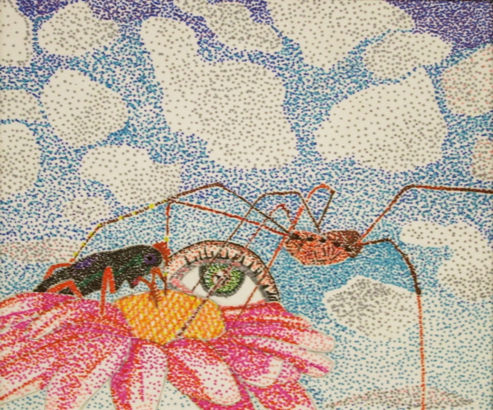
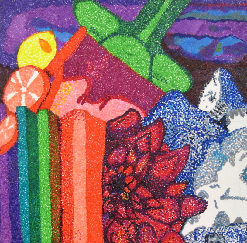
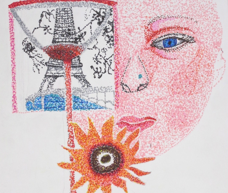
CollSURR-ipptles!
Students just finished a stippling unit based on self-designed surreal collages;
surrealism is defined as a 20th-century avant-garde movement in art and literature that sought to release the creative potential of the unconscious mind, for example by the irrational juxtaposition of images. Two artists often acclaimed for their surrealistic work are Salvador Dali and Rene Magritte. When we discuss Surrealism in the class it is compared to dreams and nightmares. That said a simpler artistic definition is to put imagery in an unusual or unexpected environment. An artist can play with size relationships, flipping environments or making something "do" what it does not normally "do". Below are the surreal student collages with their work.

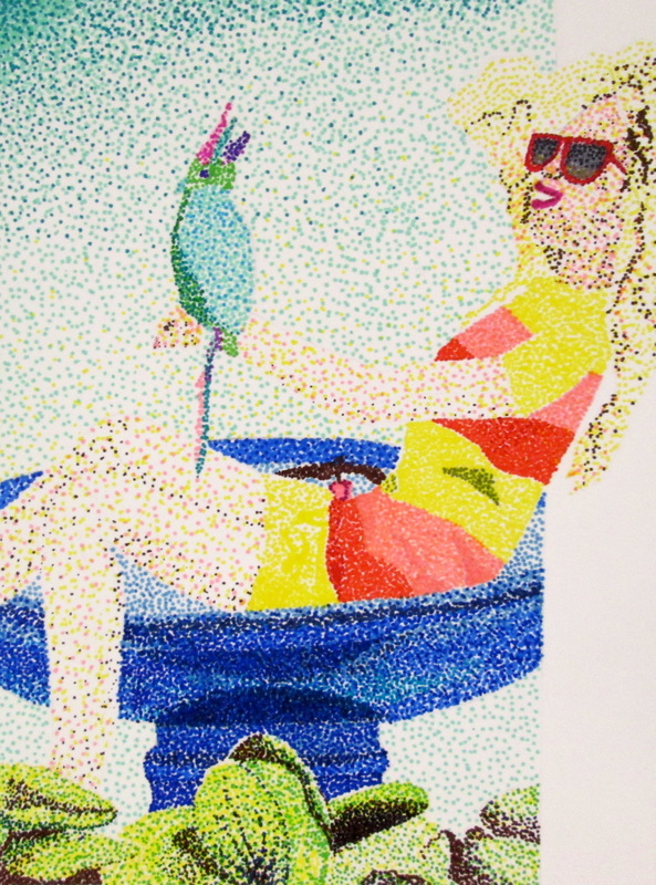
Marcia J. 12 - Reflection
In the steps for this stippling project, we started out by cutting pictures and forming a surreal collage by layering the pictures interestingly. After this, we copied the collage down on drawing paper and began stippling the first layer of the background. For mine specifically, I used mainly oranges and yellows to create the sunset. Then I continued to stipple the giraffes and I used a blend of blacks and browns to create the silhouette and went back with oranges to create a underlying glow of illumination. After this I used reds and oranges to stipple the man and then purples, blues, and pinks to add the details of the snow on the mountain. To finish, I went back and added more layers to the piece to add depth and more value. When I asked for approval on my first collage idea and it was stripped down to just two images, I was really surprised how simple the new collage looked but how interesting it was at the same time. The stippling was tedious but I loved seeing the progress when color was added. My challenge was nailing the detail in the mountain and picking out the right colors to represent it but once I started layering over the details the mountain really started to look more realistic. I loved the end result and seeing how every value molded into one picture from a distance and how they are distinguishable from close up.
In the steps for this stippling project, we started out by cutting pictures and forming a surreal collage by layering the pictures interestingly. After this, we copied the collage down on drawing paper and began stippling the first layer of the background. For mine specifically, I used mainly oranges and yellows to create the sunset. Then I continued to stipple the giraffes and I used a blend of blacks and browns to create the silhouette and went back with oranges to create a underlying glow of illumination. After this I used reds and oranges to stipple the man and then purples, blues, and pinks to add the details of the snow on the mountain. To finish, I went back and added more layers to the piece to add depth and more value. When I asked for approval on my first collage idea and it was stripped down to just two images, I was really surprised how simple the new collage looked but how interesting it was at the same time. The stippling was tedious but I loved seeing the progress when color was added. My challenge was nailing the detail in the mountain and picking out the right colors to represent it but once I started layering over the details the mountain really started to look more realistic. I loved the end result and seeing how every value molded into one picture from a distance and how they are distinguishable from close up.


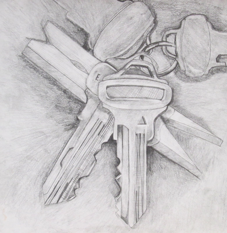
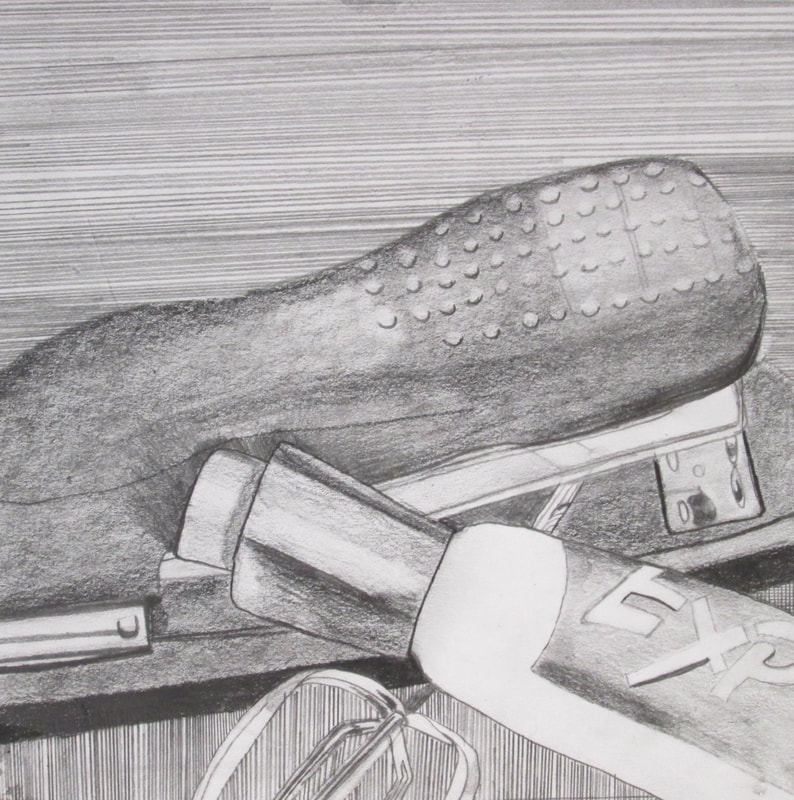
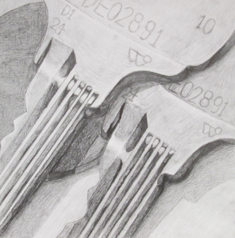
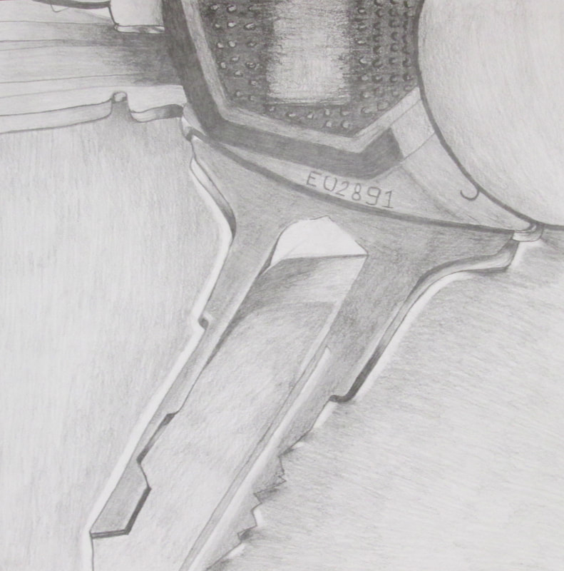
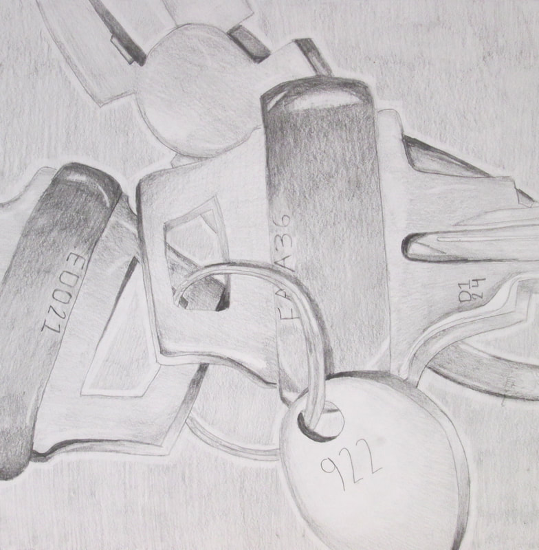
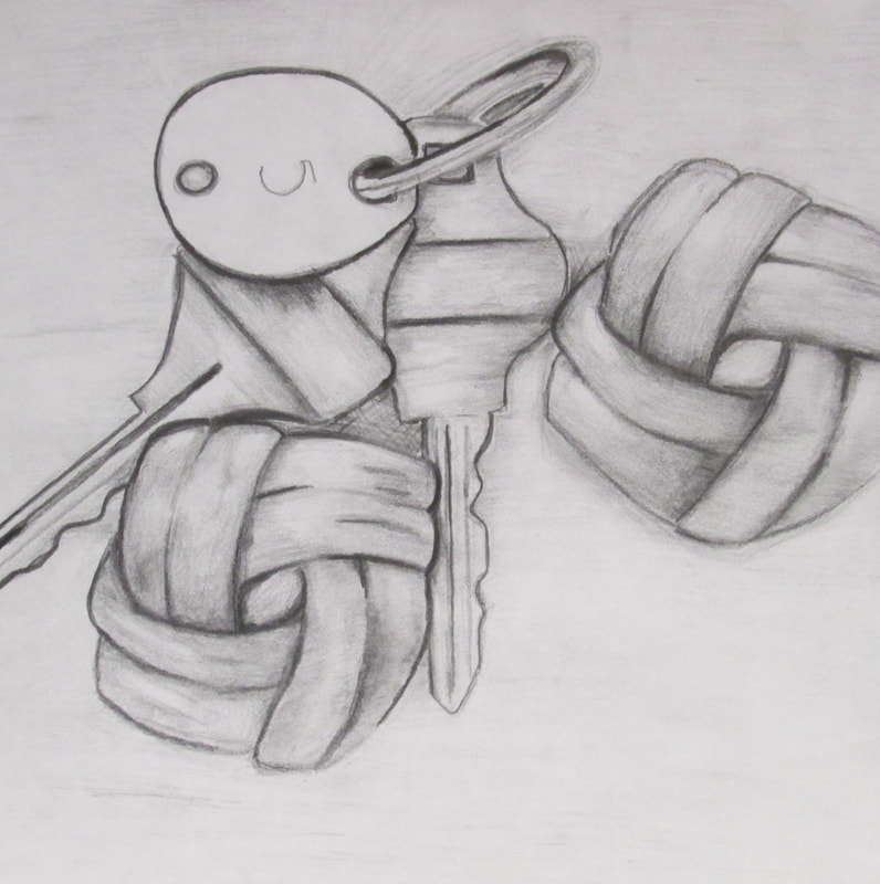
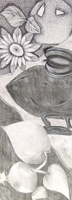
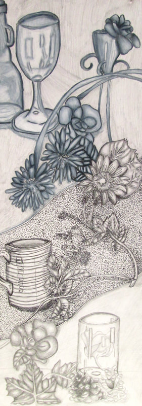
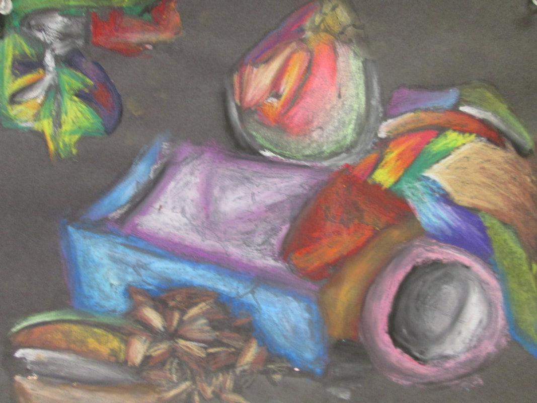
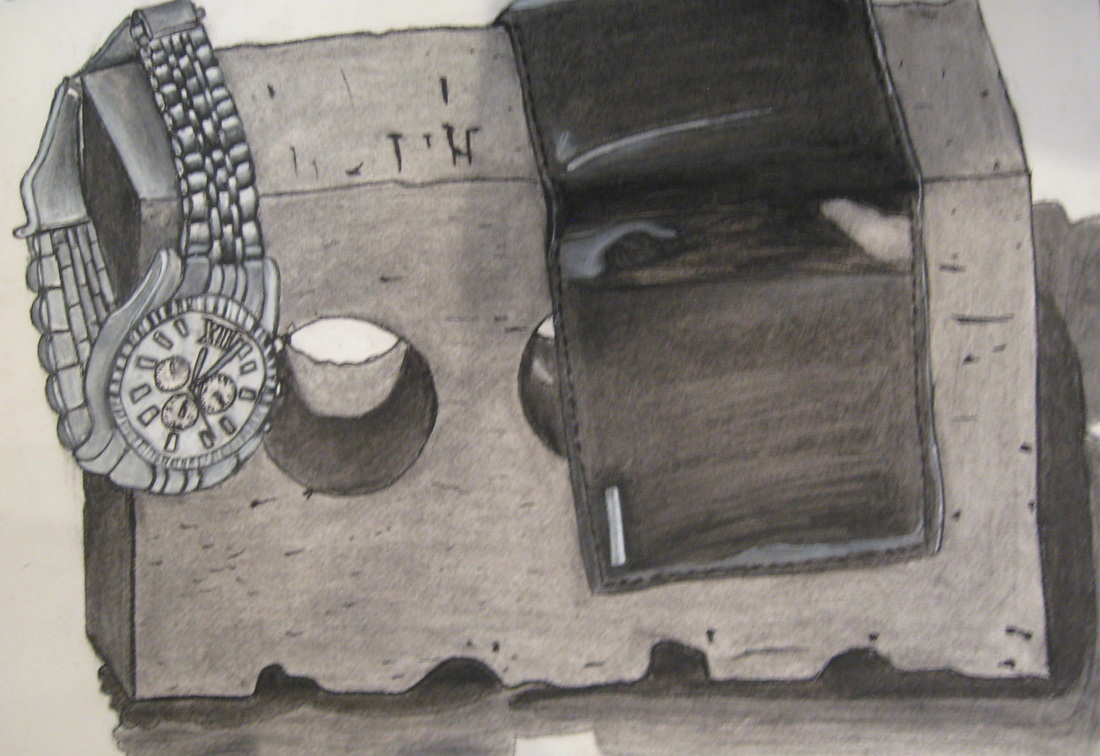
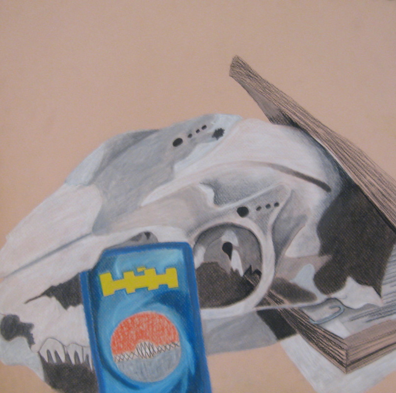
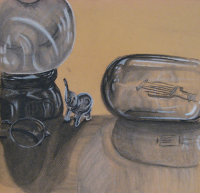
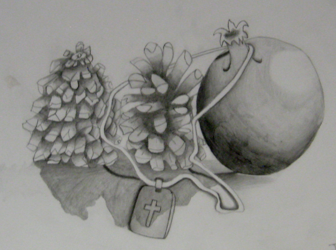
Spring 2016 Personal Stillife : Charcoal & Pencil
Students this Spring were asked to bring in a personal item and add it to a mundane group of objects; they were then given the choice to render the compositions in Charcoal, pencil or colored pencil. Below are the results of their hard work! When an artist has to draw objects that have little or no meaning to them they can see them with more objectivity, increasing their ability to draw without judgment; that said add one personal item that has meaning and the interest in the work increases!
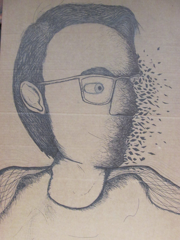
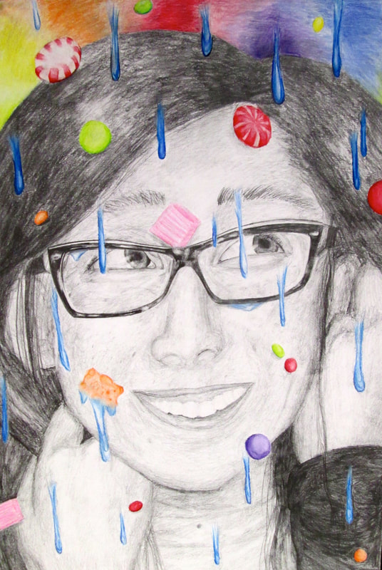
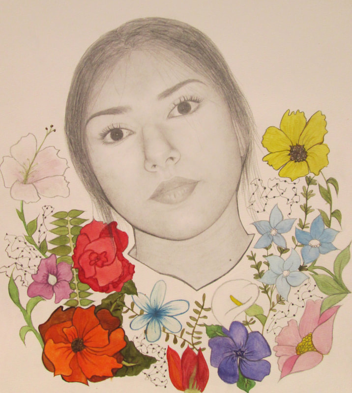
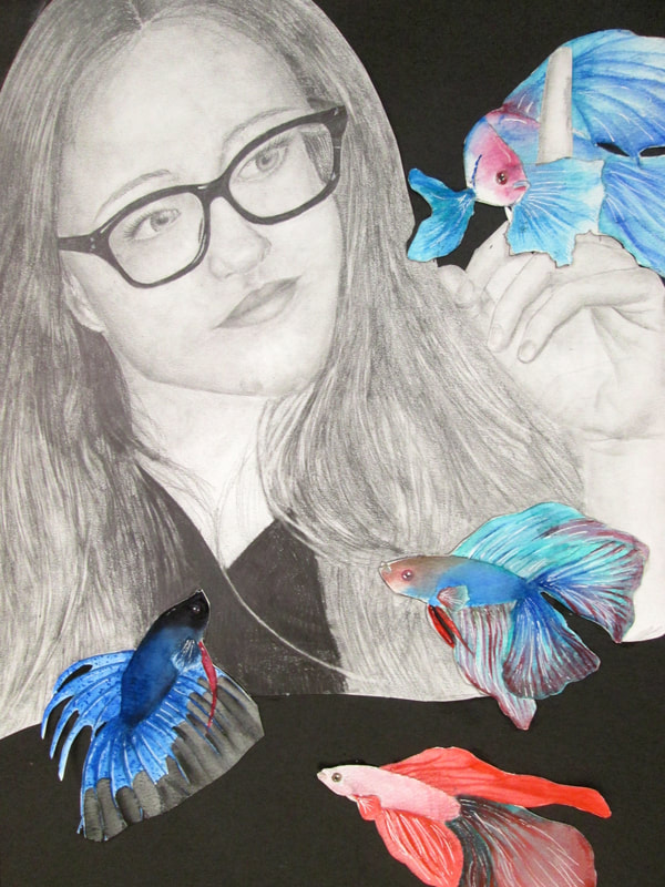
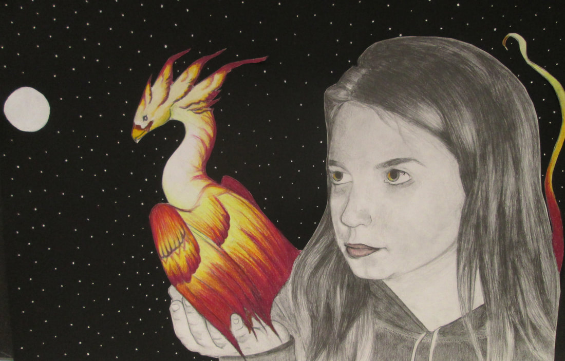
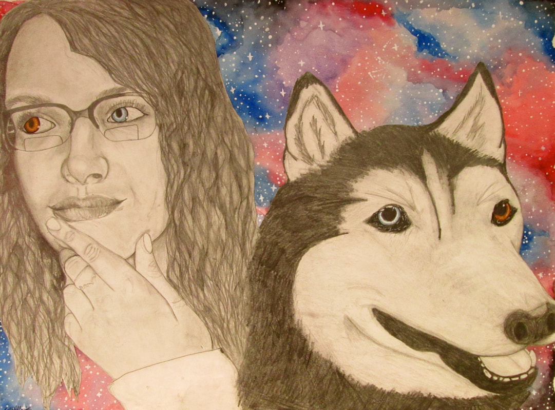
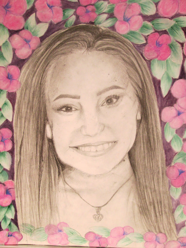
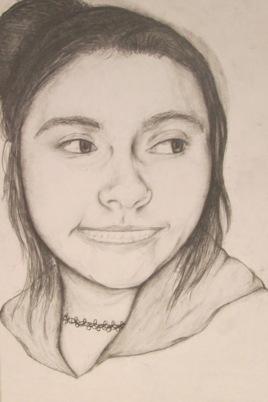
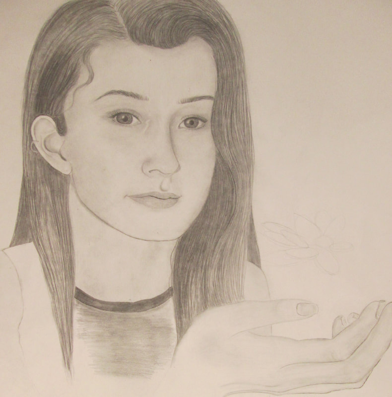
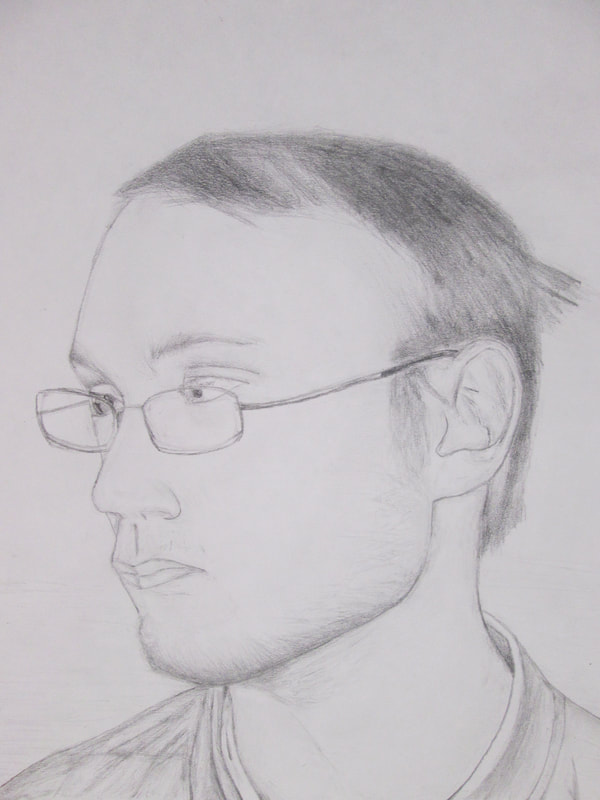
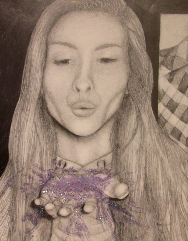
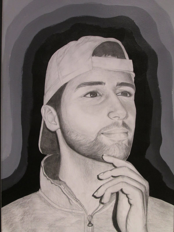
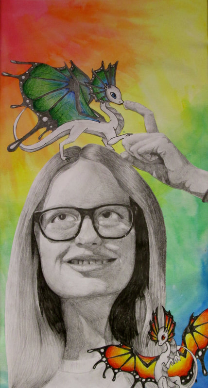
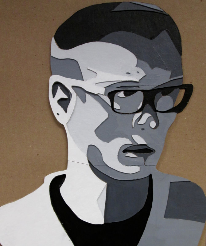
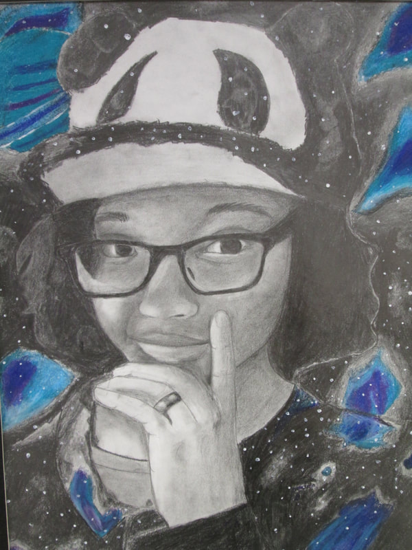
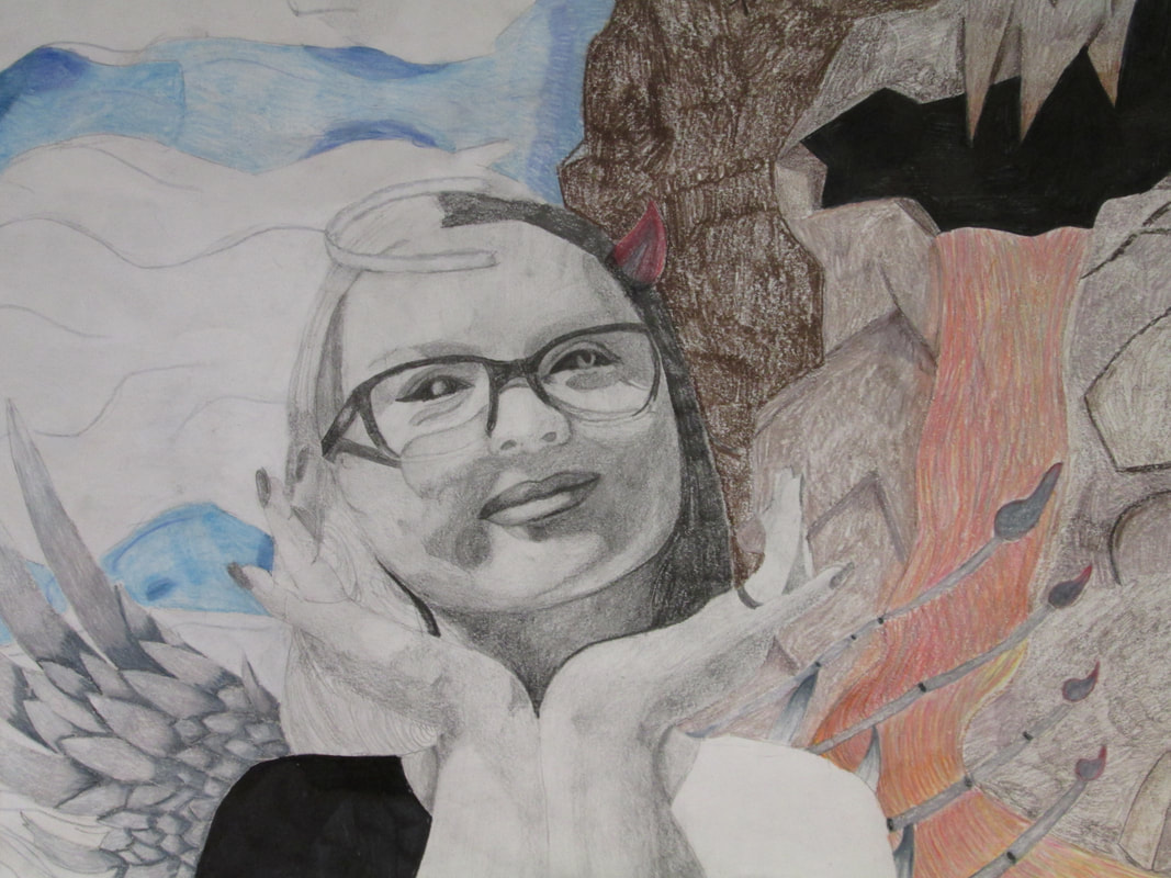
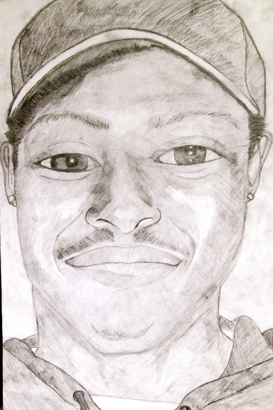
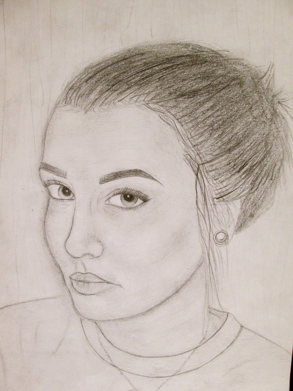
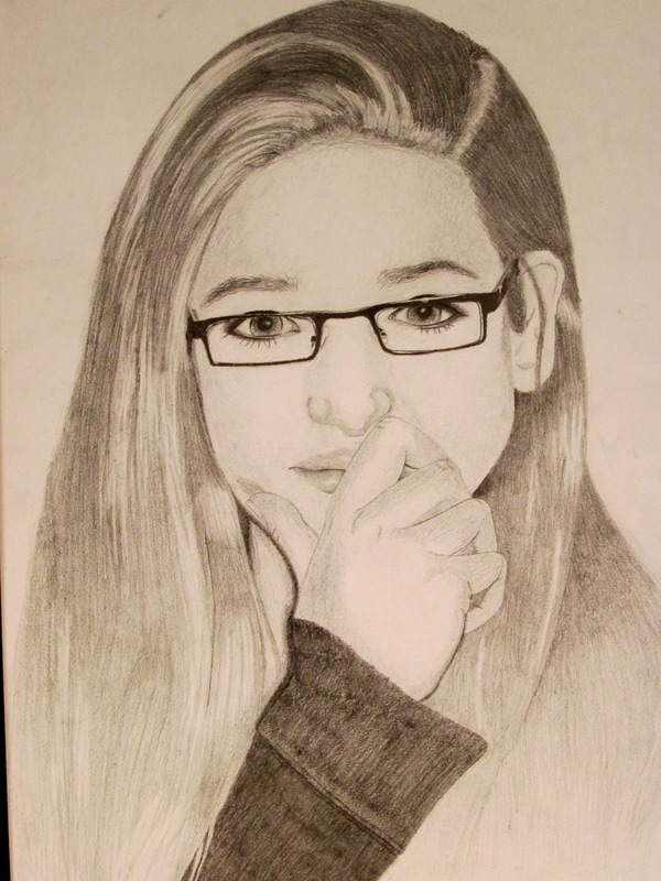
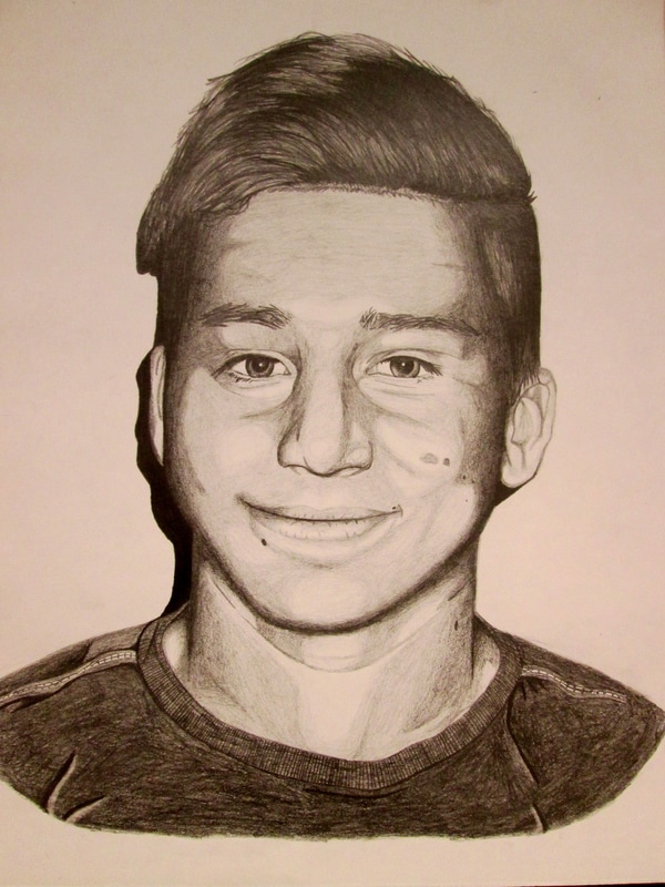
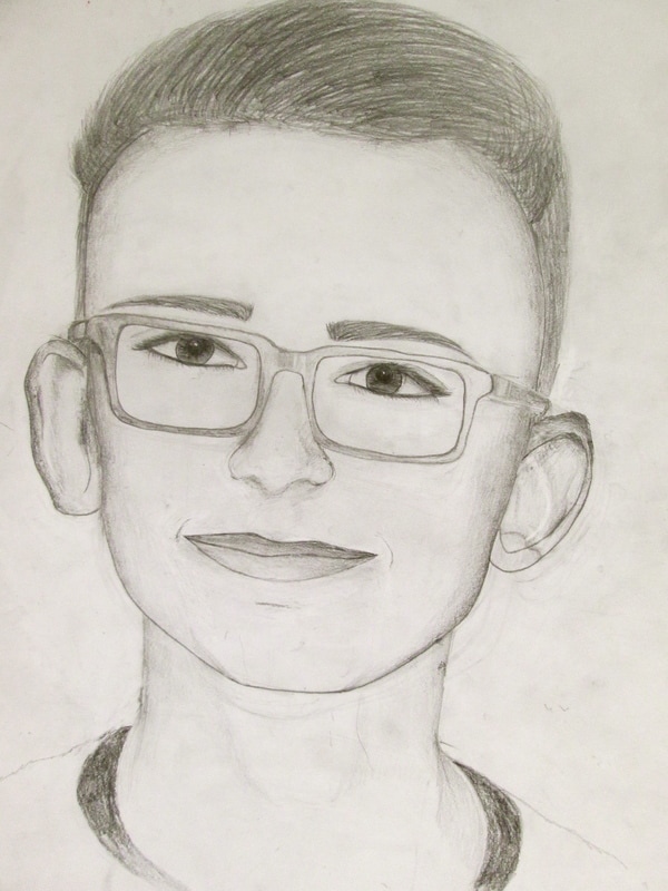
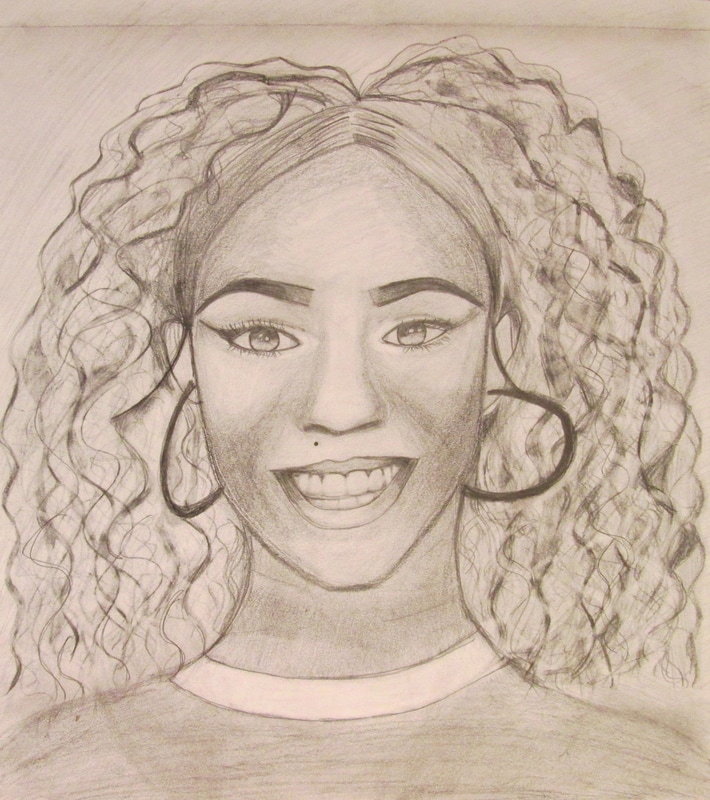
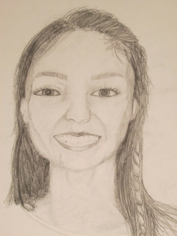
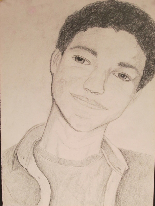
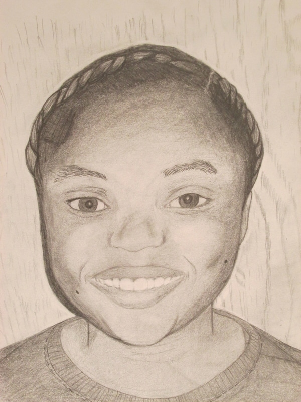
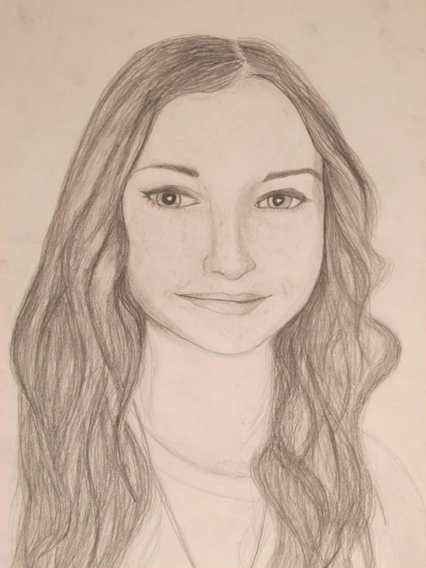
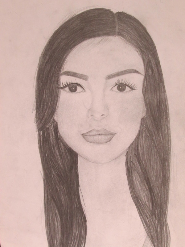
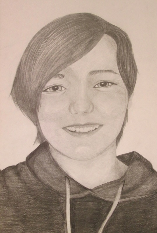
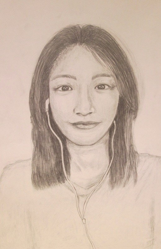
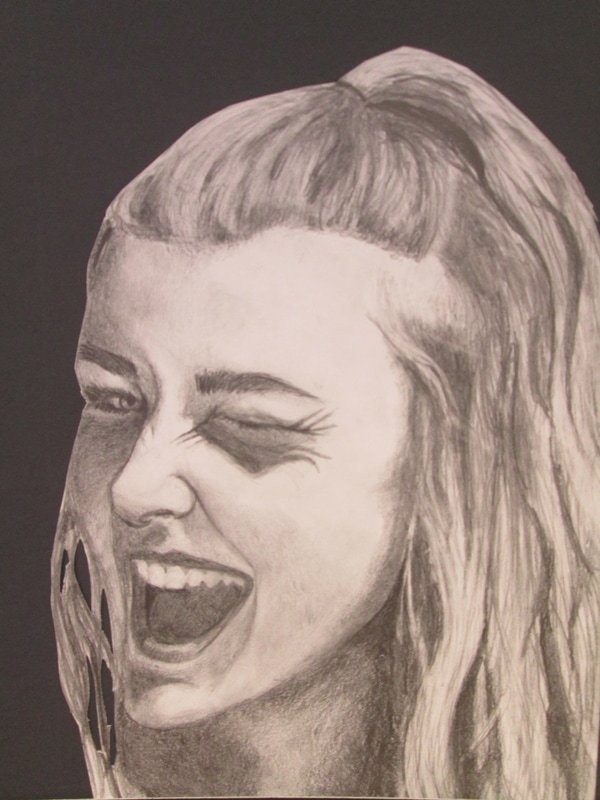
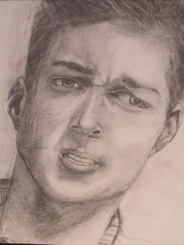
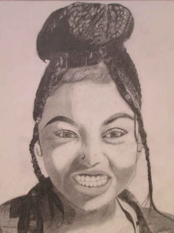
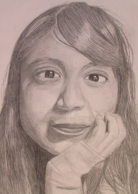
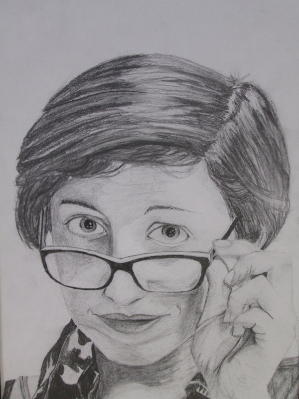
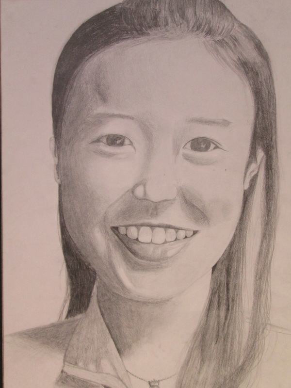
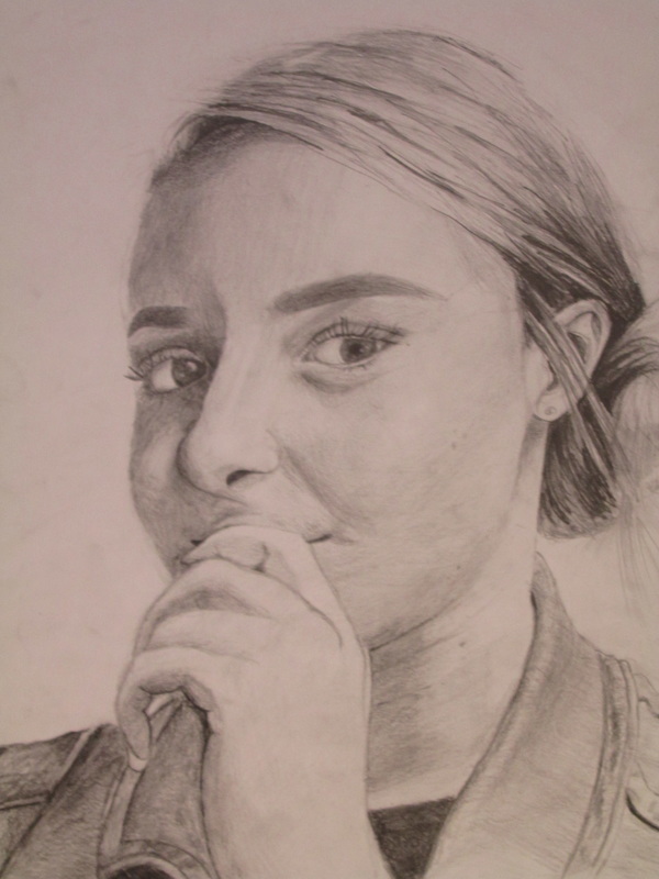
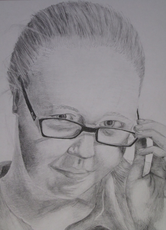
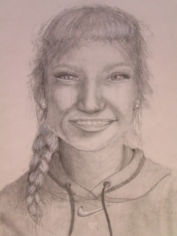
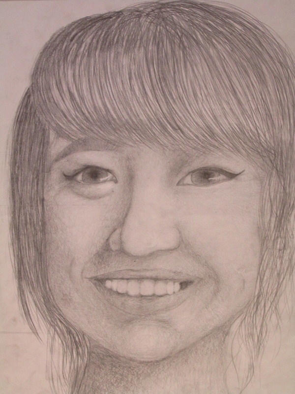
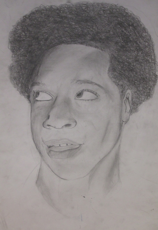
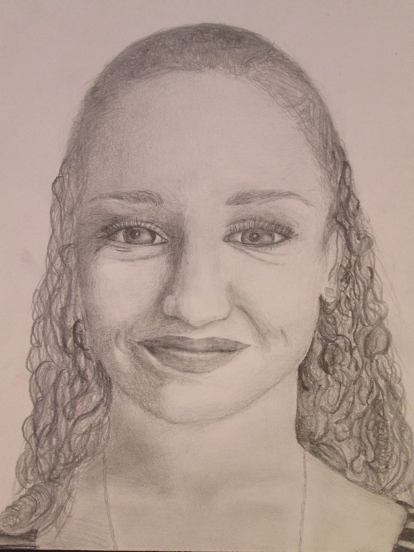
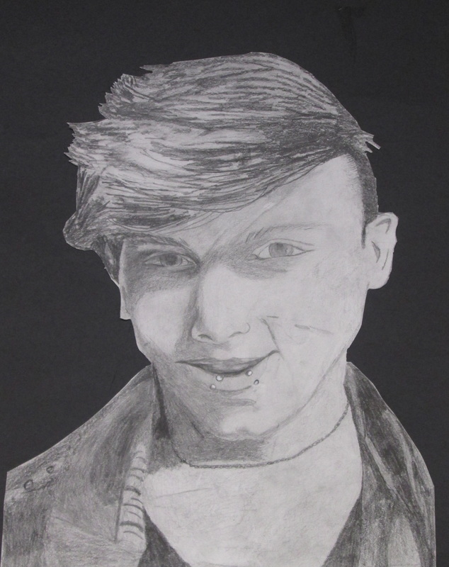
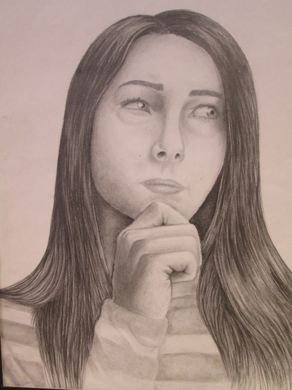
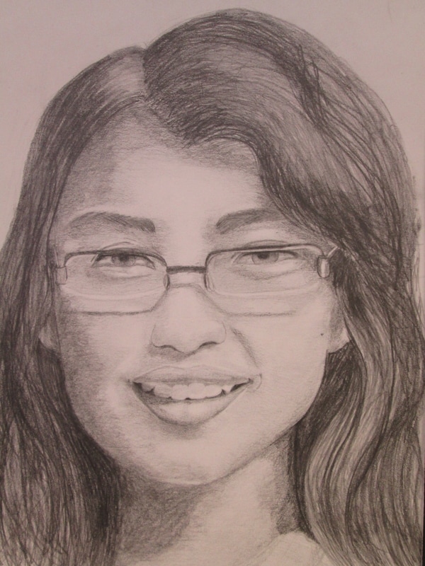
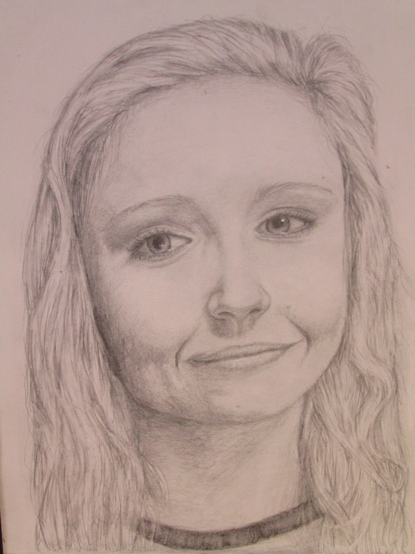
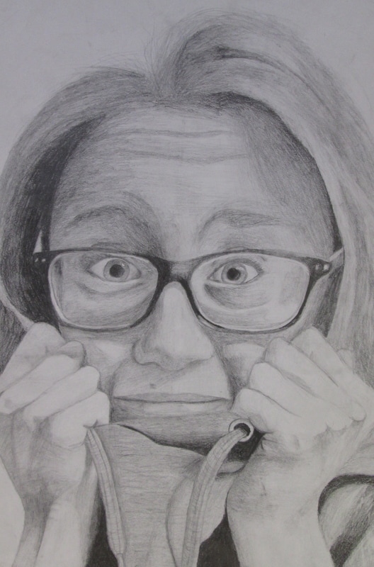
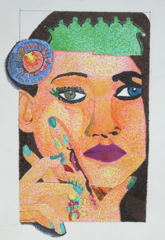
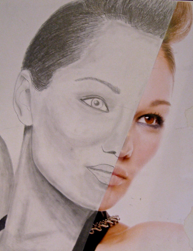
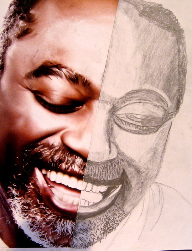
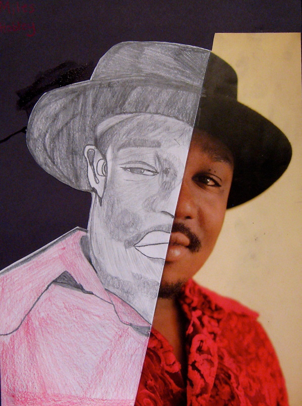
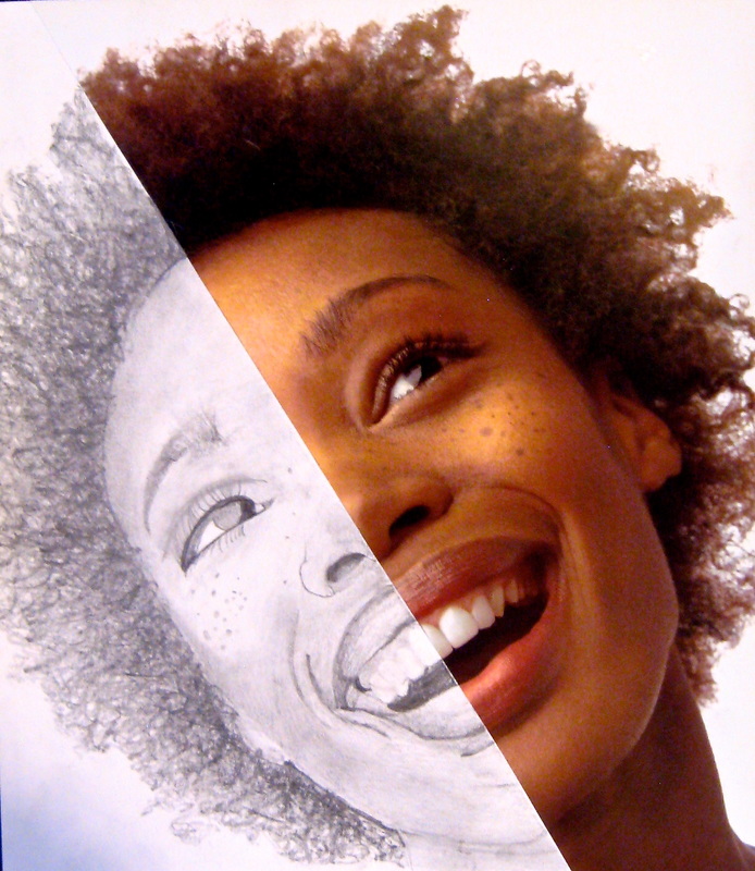
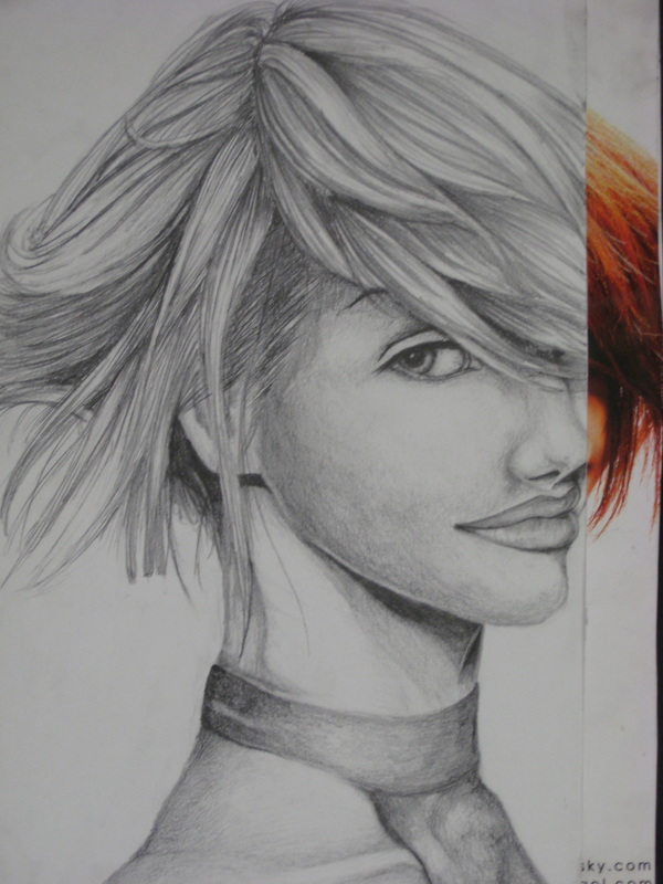
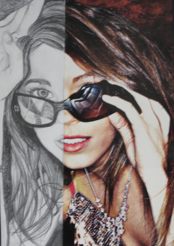
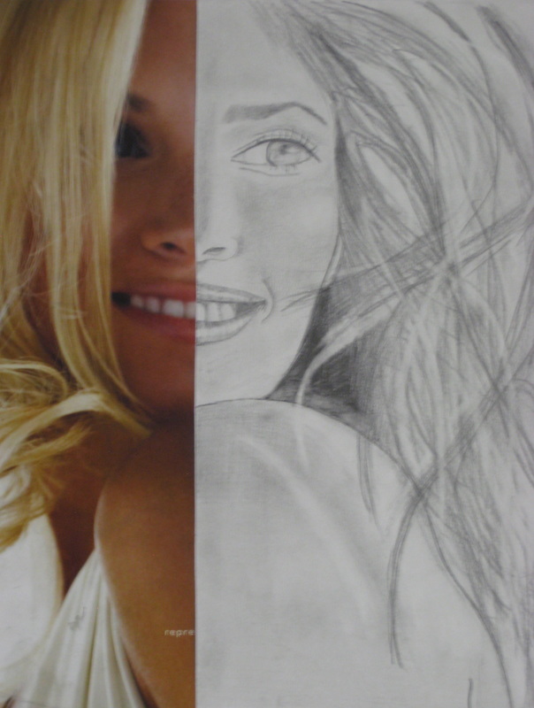
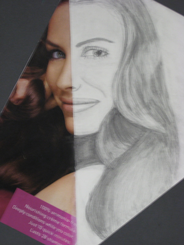
Fall 2015- "SELFIES" are in!
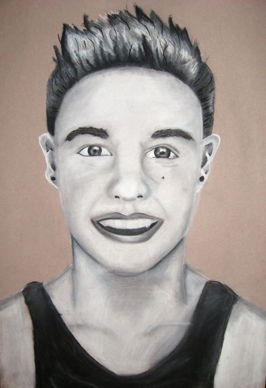
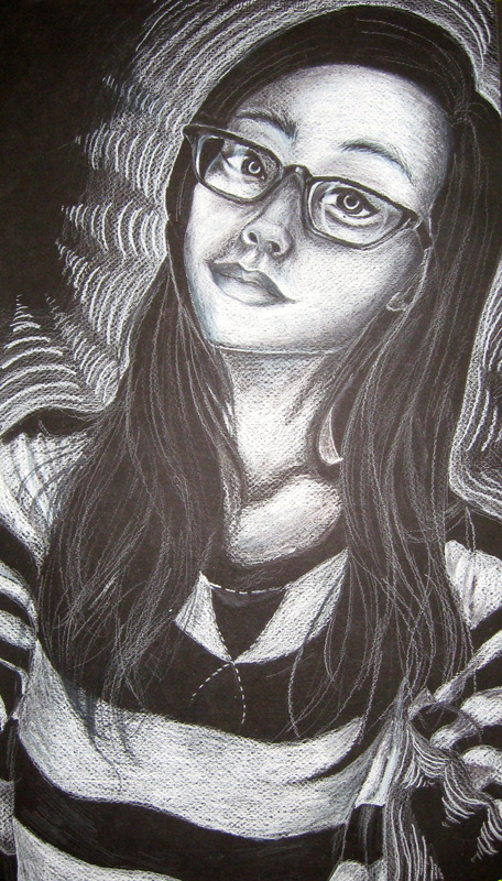
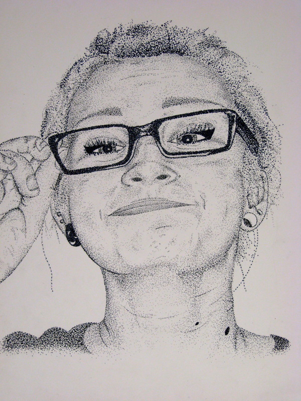
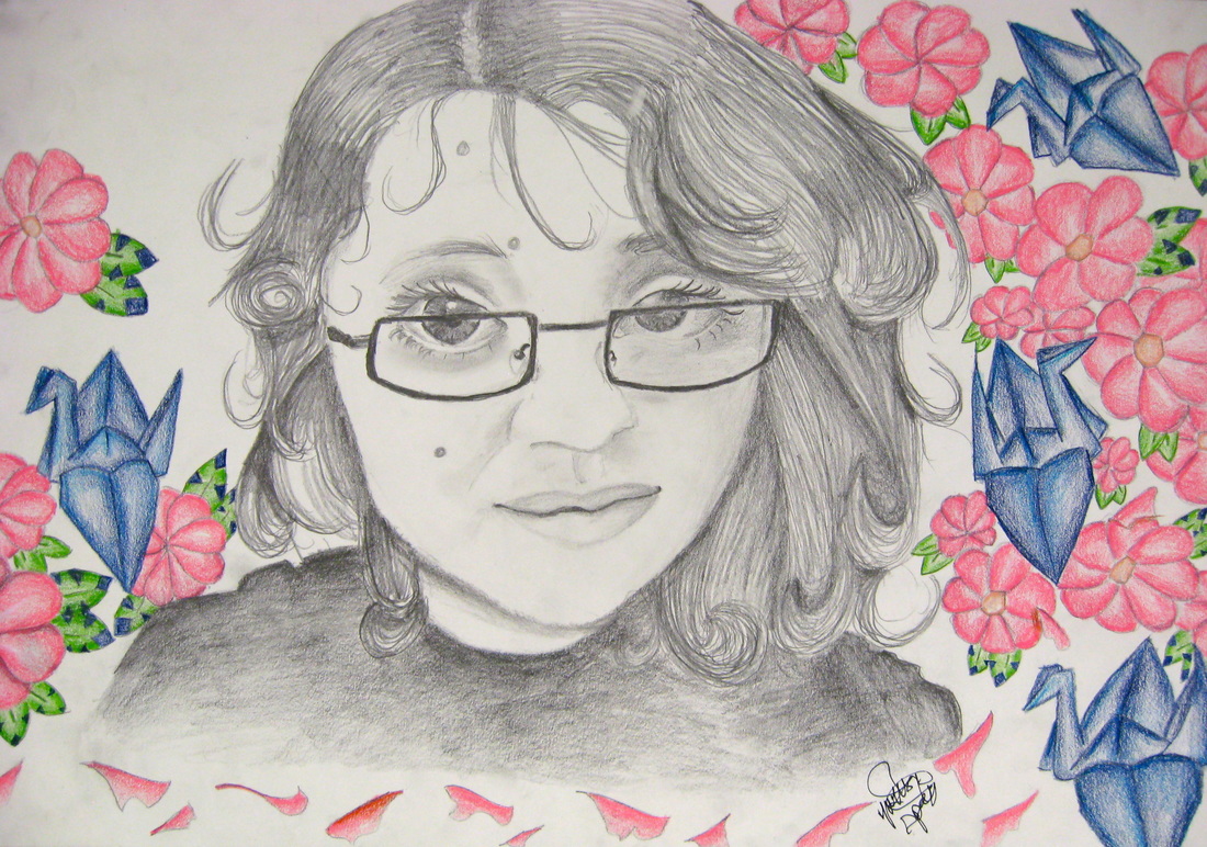
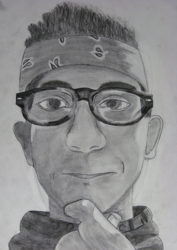
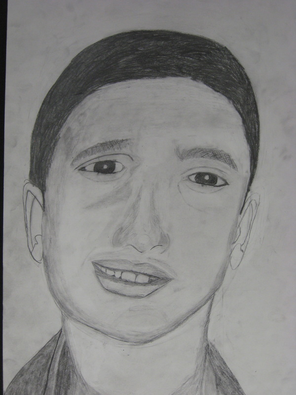
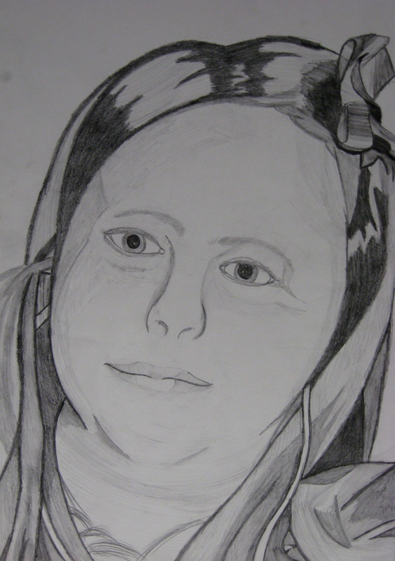
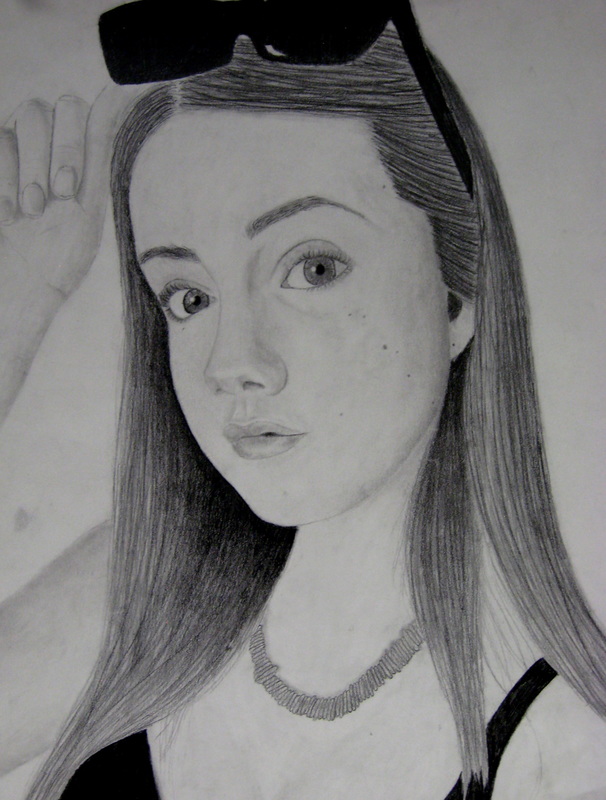
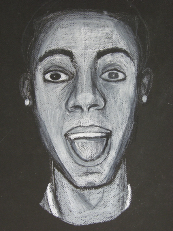
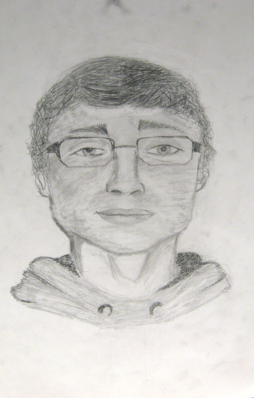
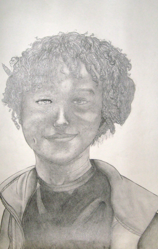
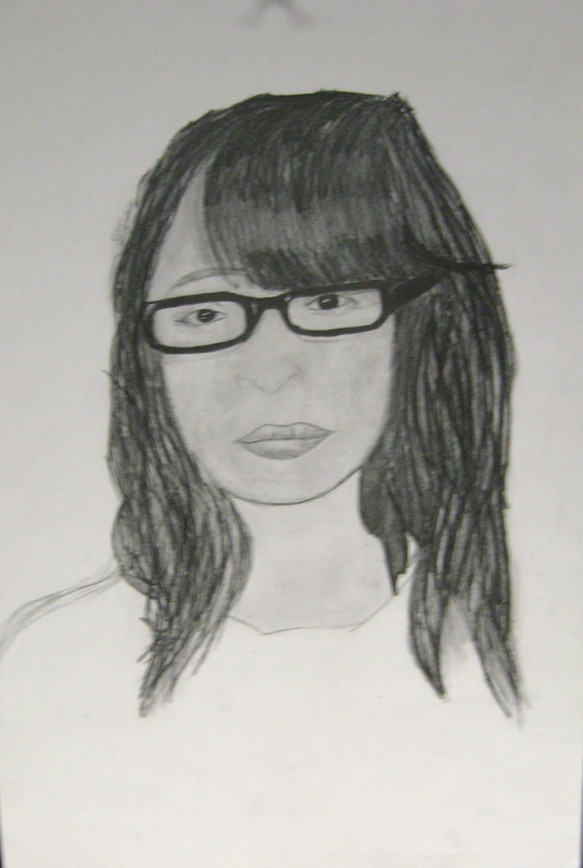
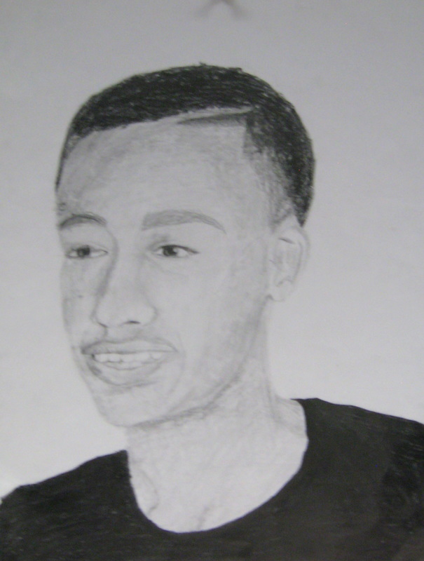
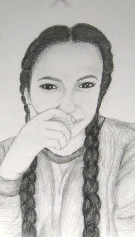
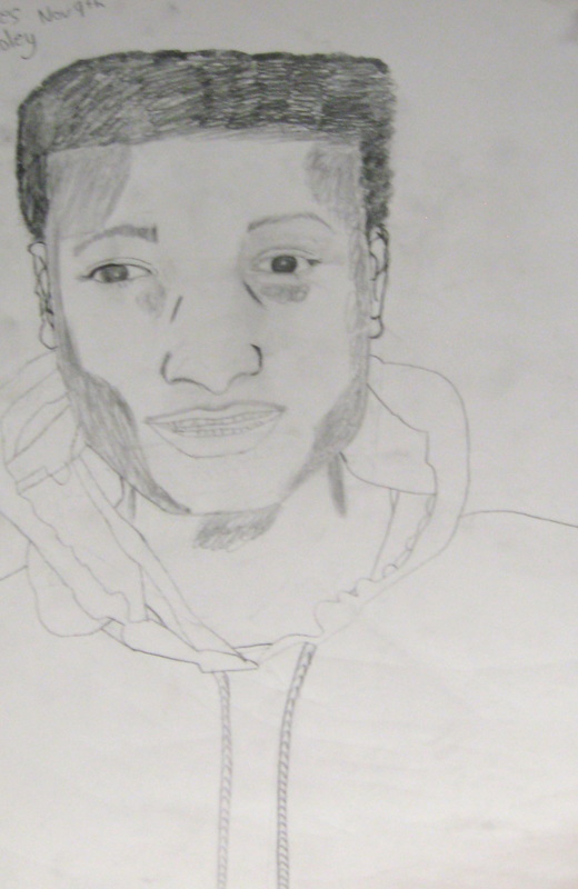
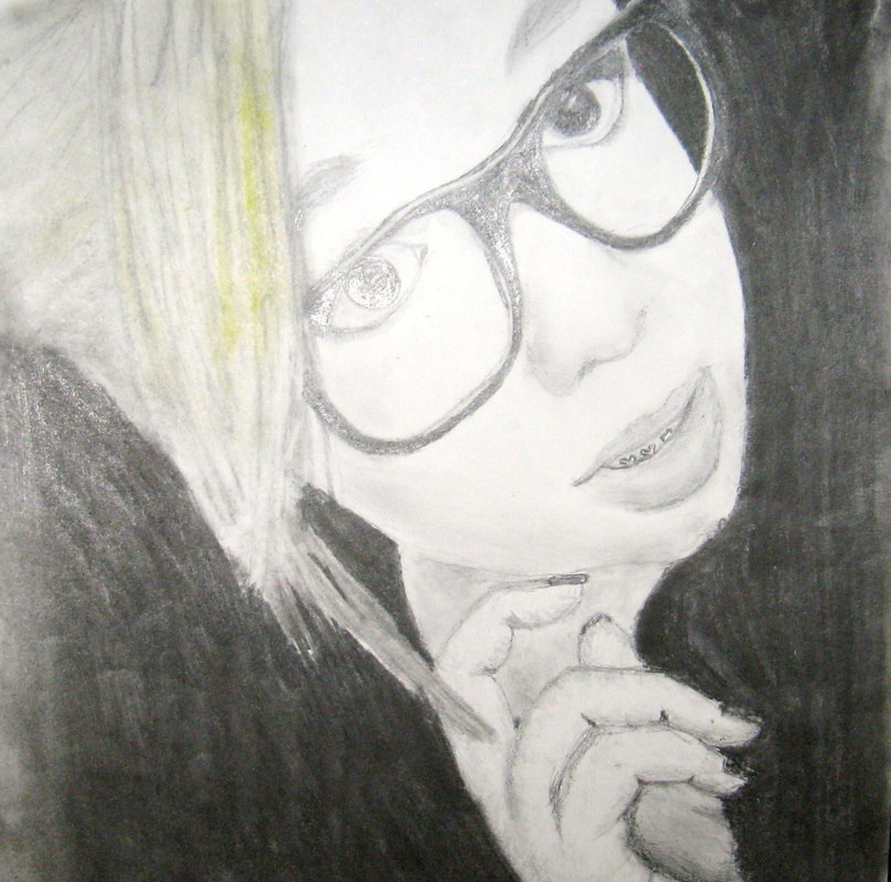
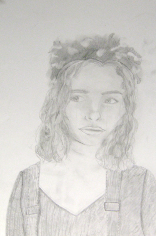
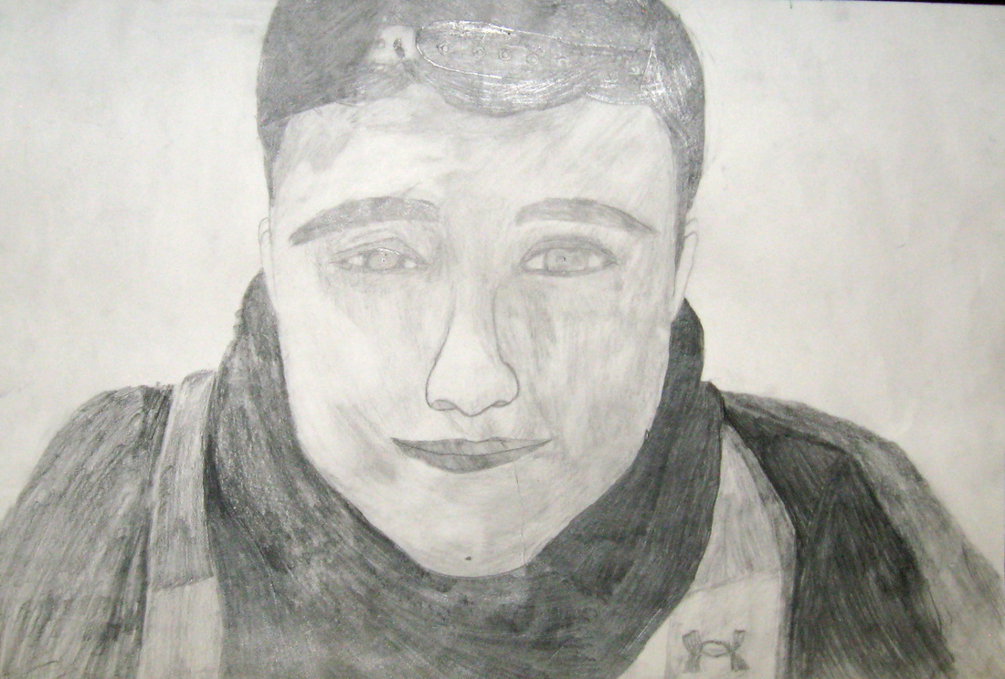
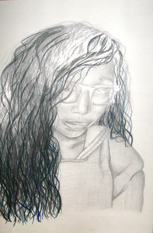
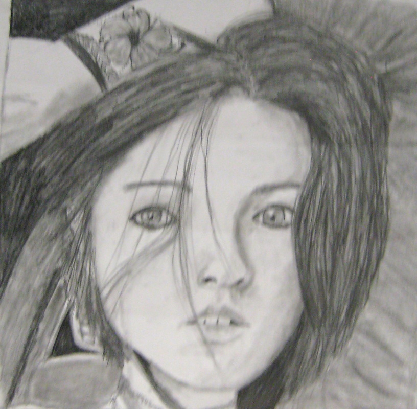
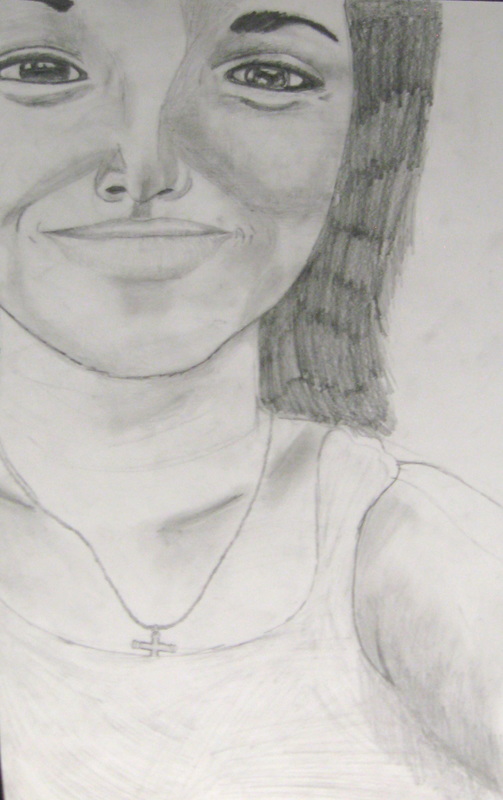
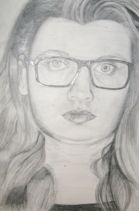
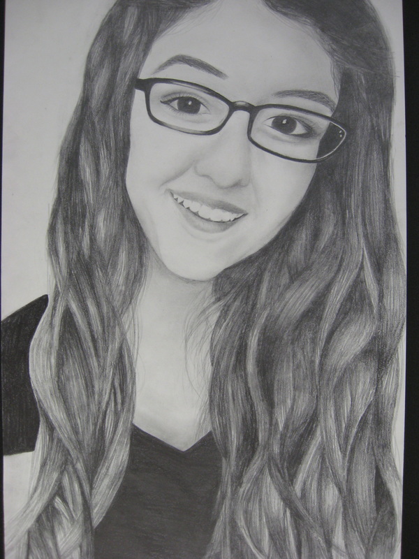
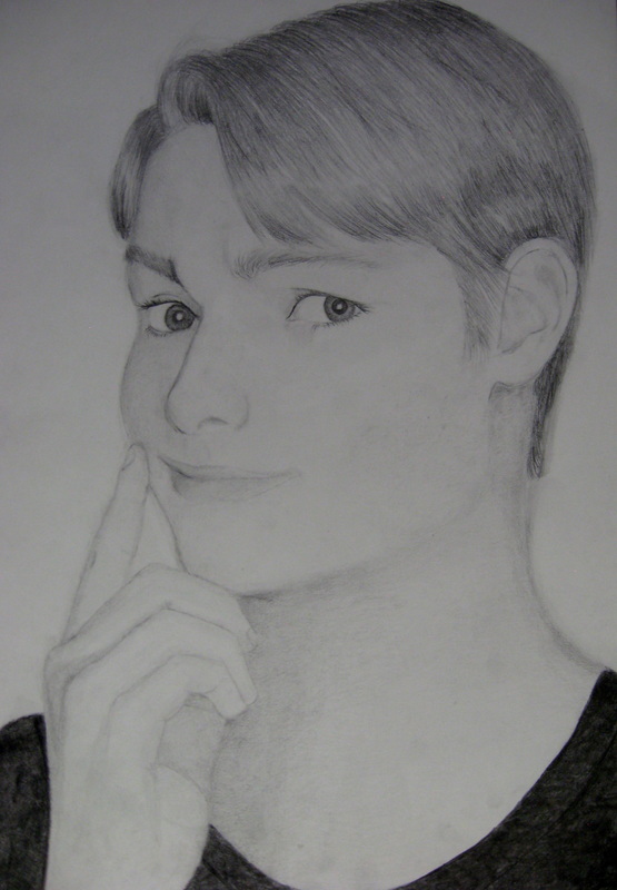
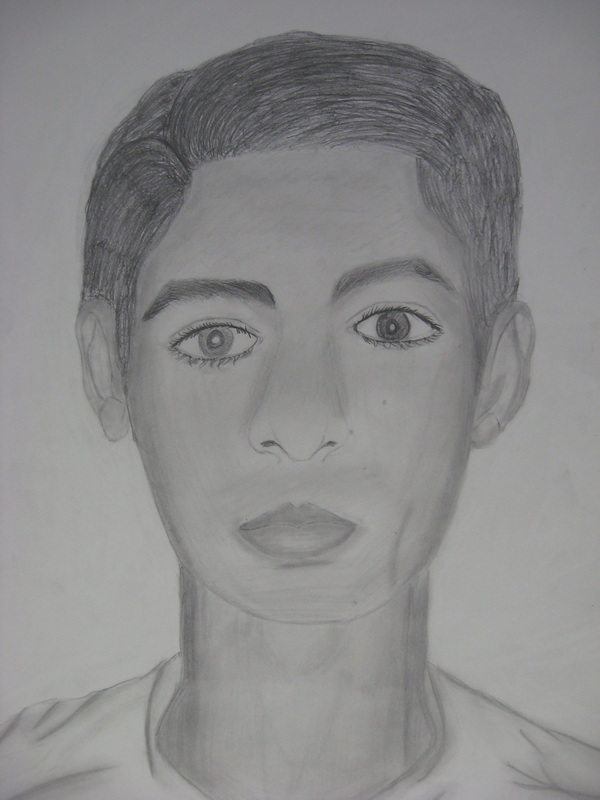
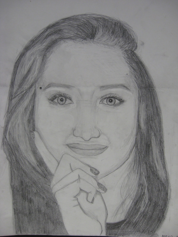
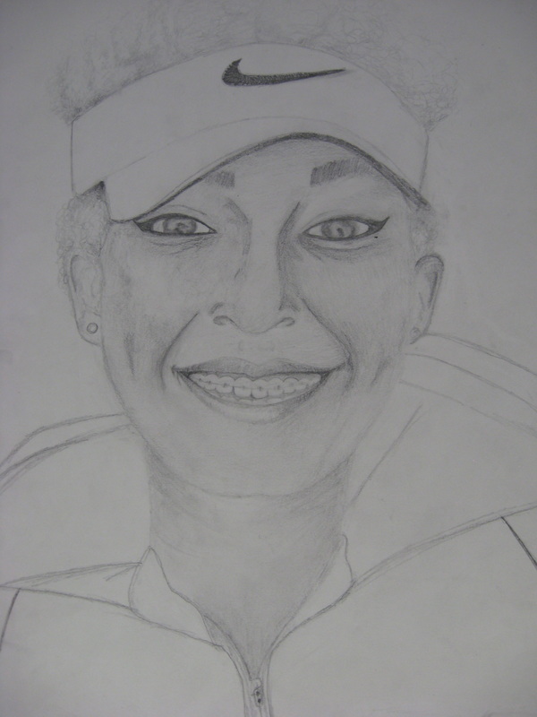
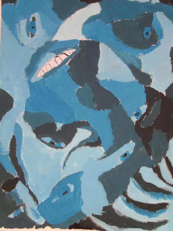
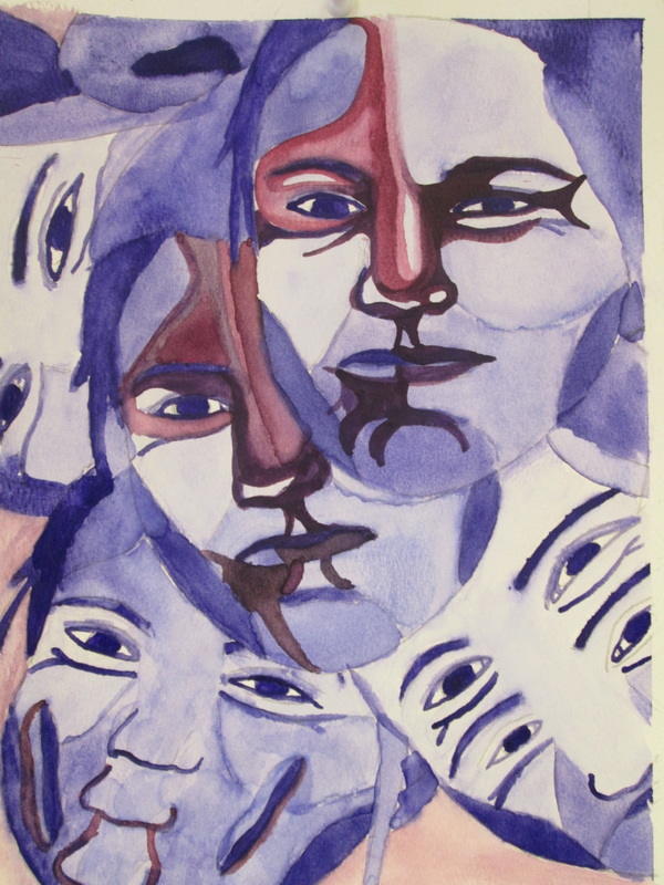
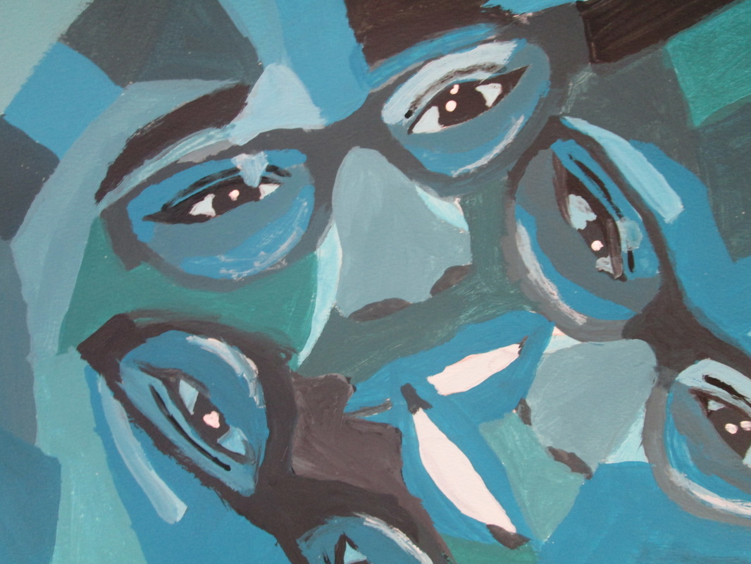
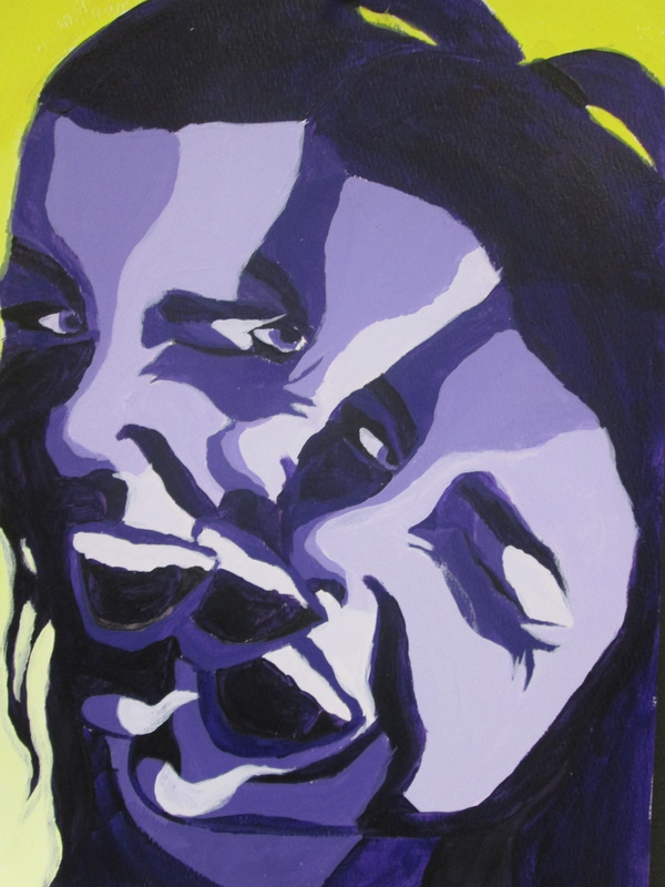
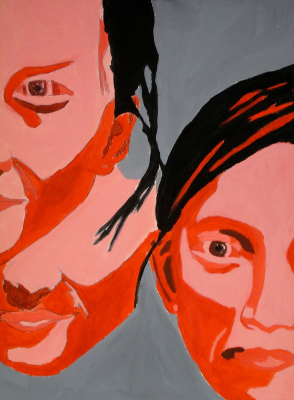
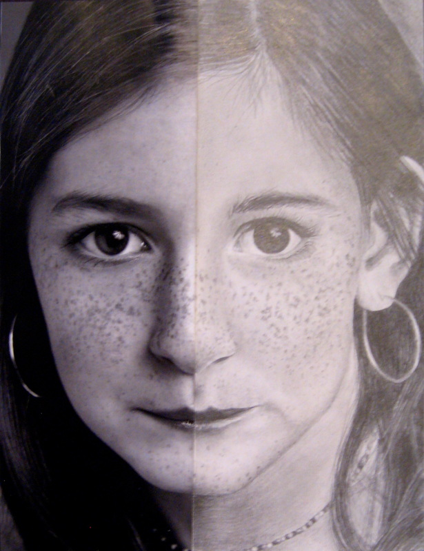
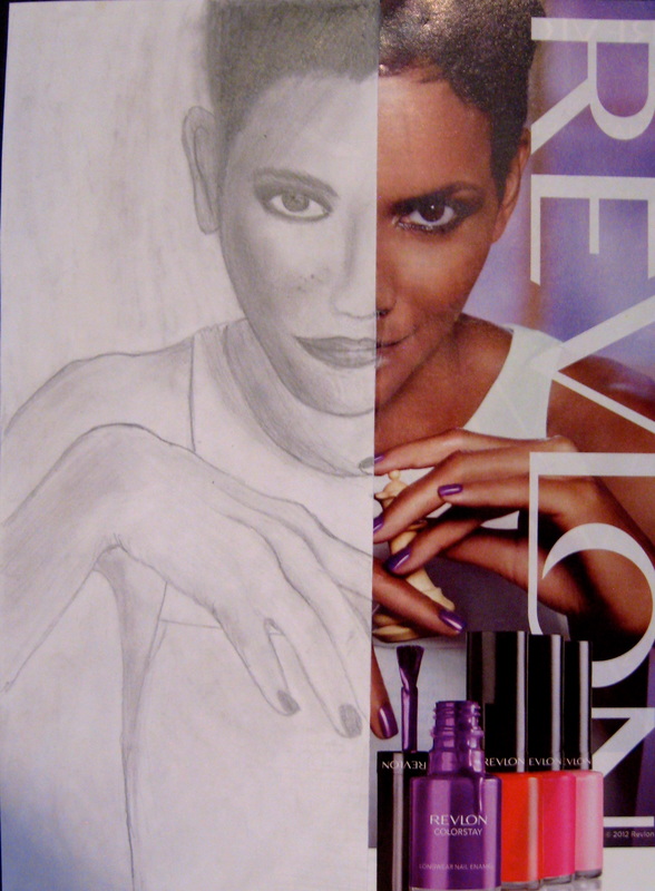
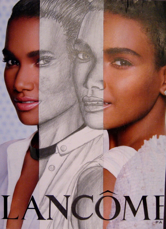
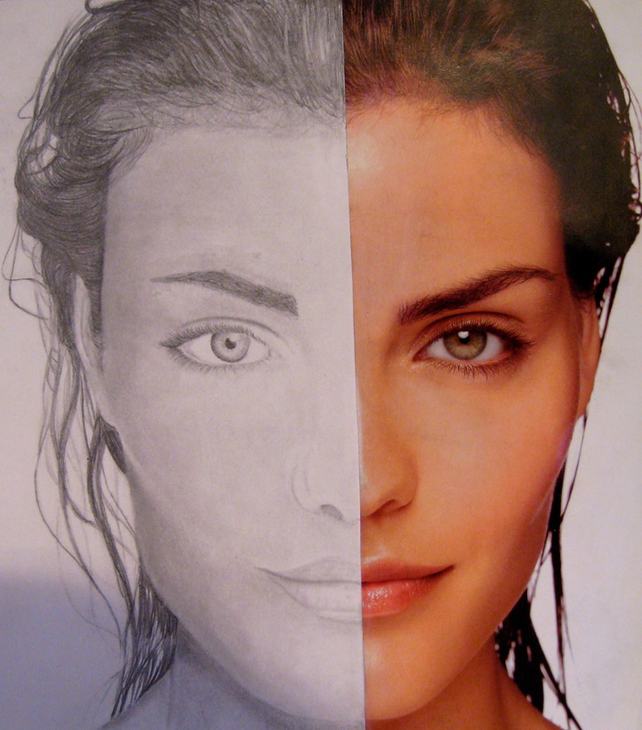
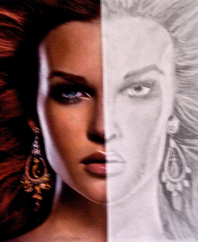
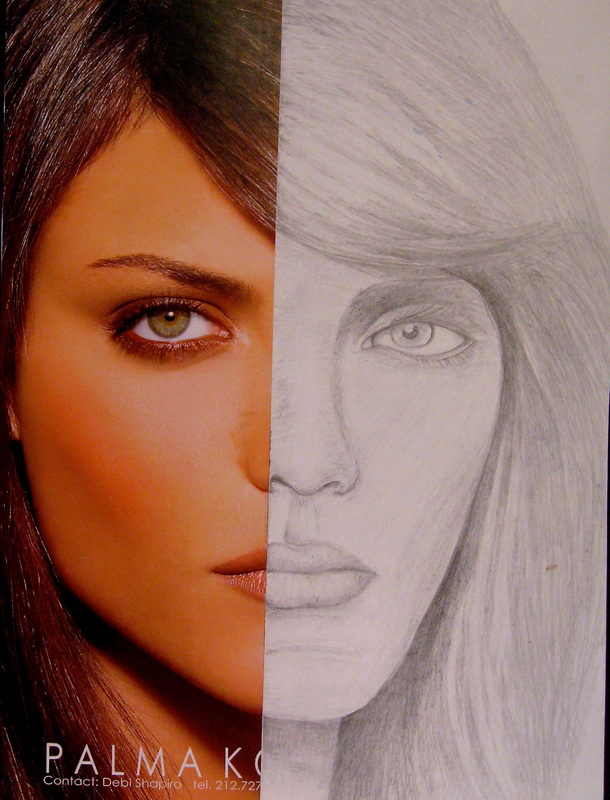
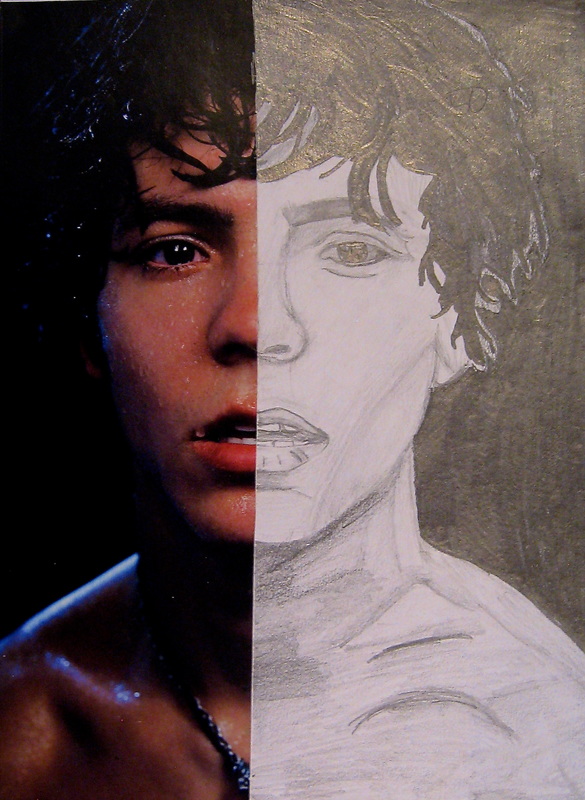
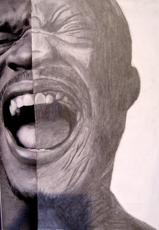
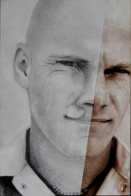
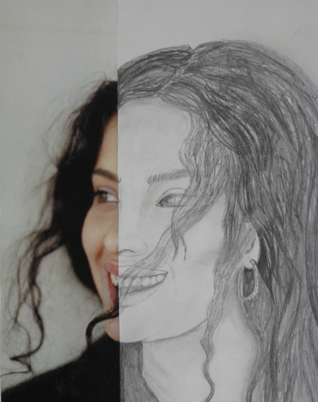
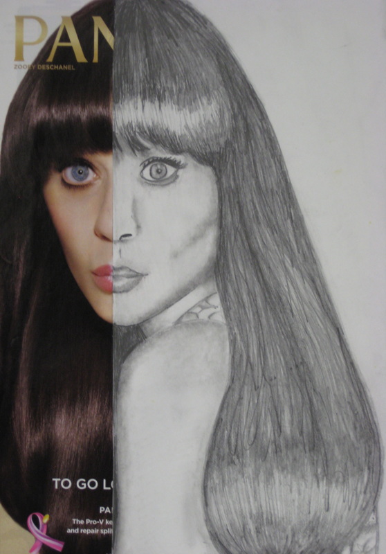
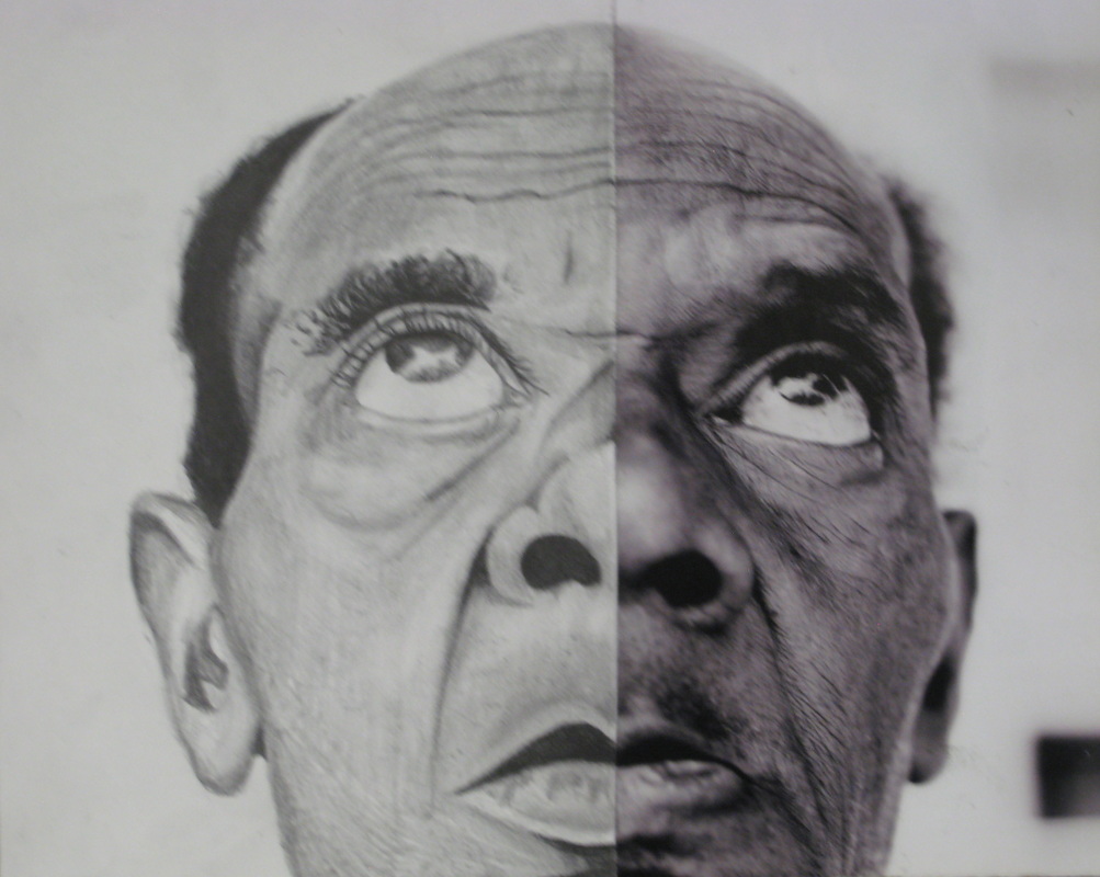
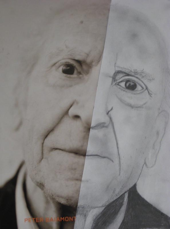
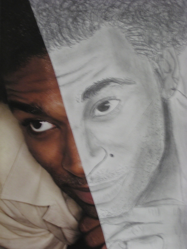
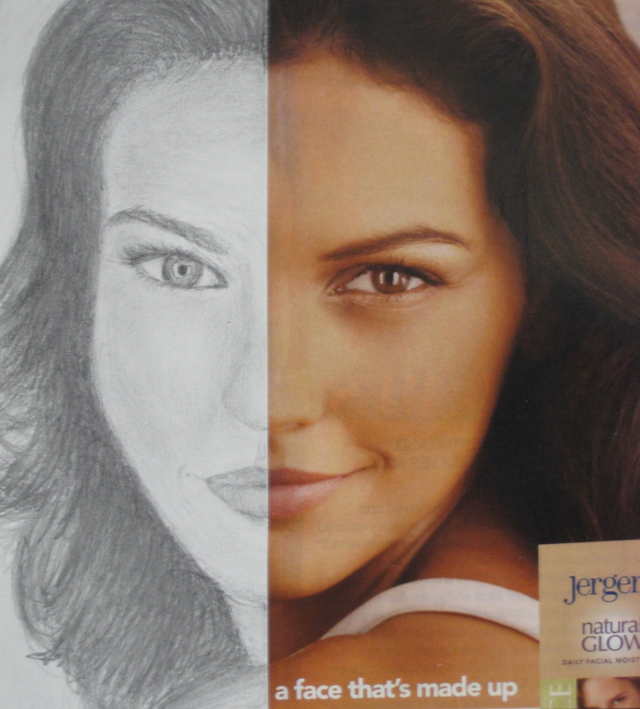
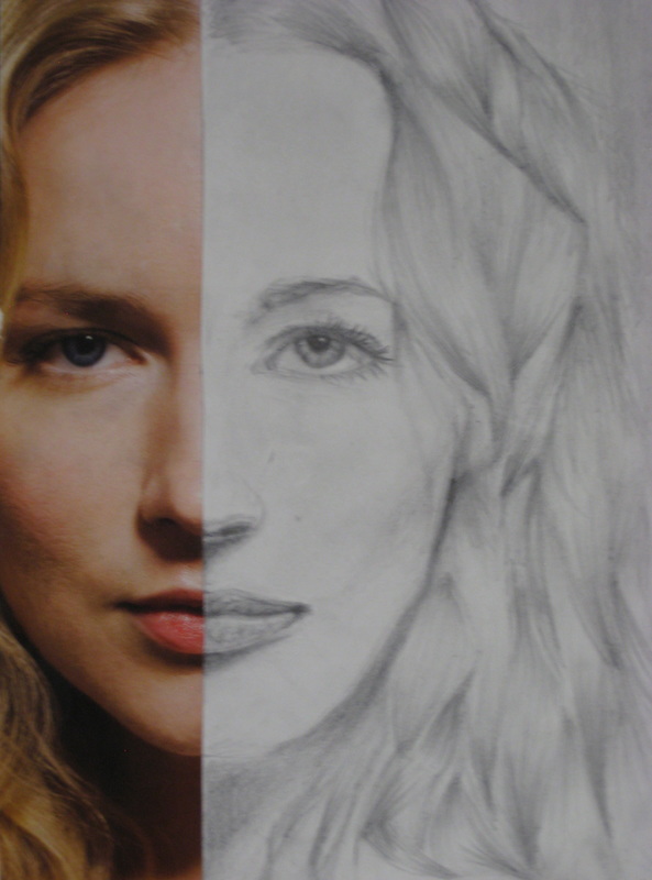
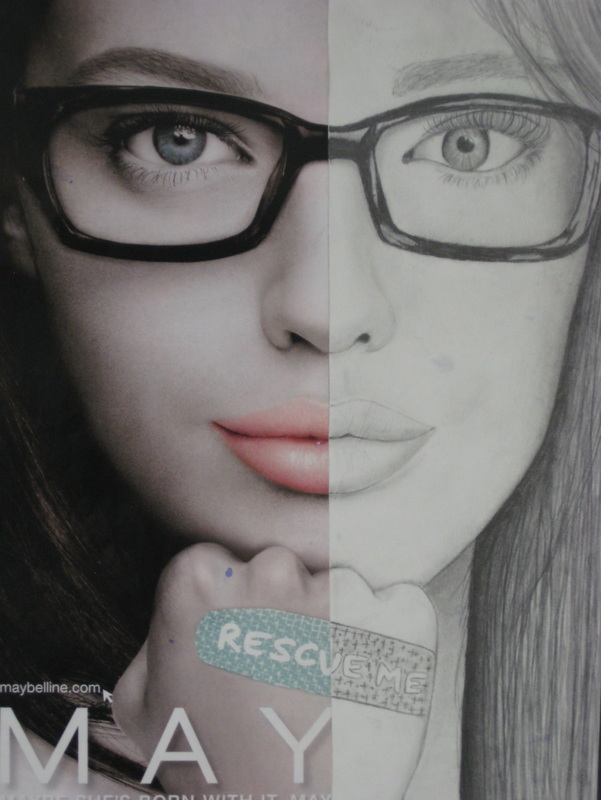
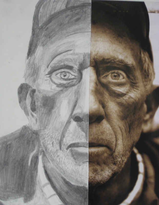
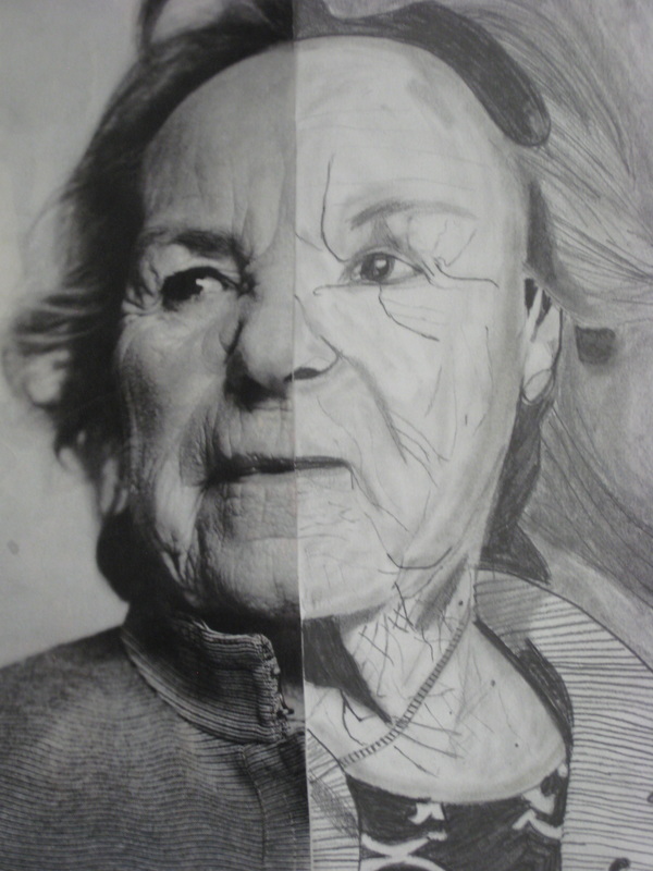
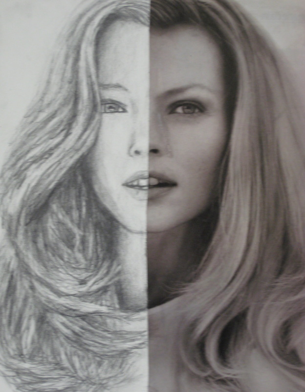
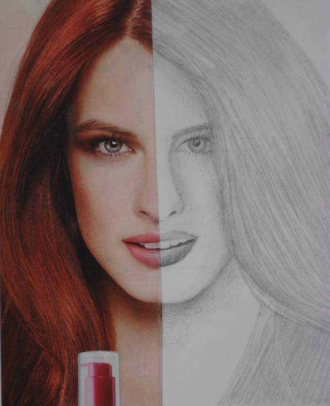
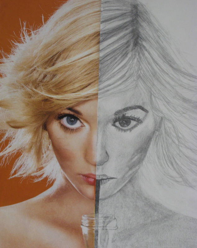
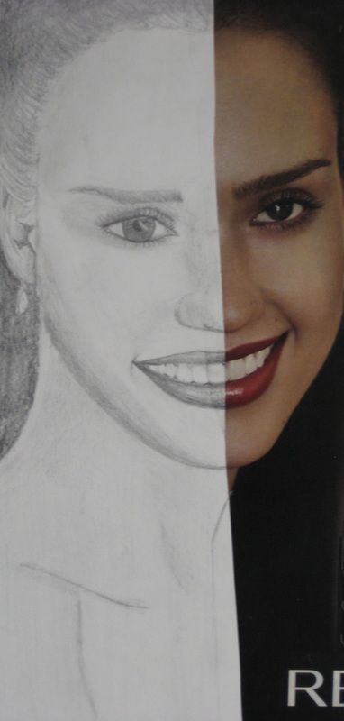
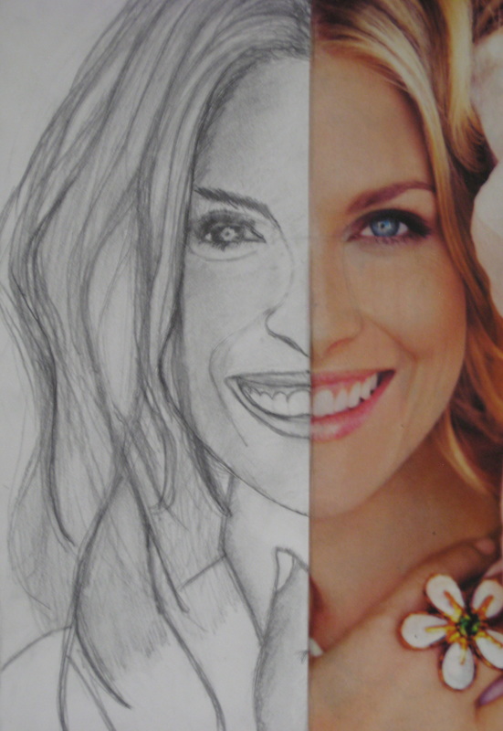
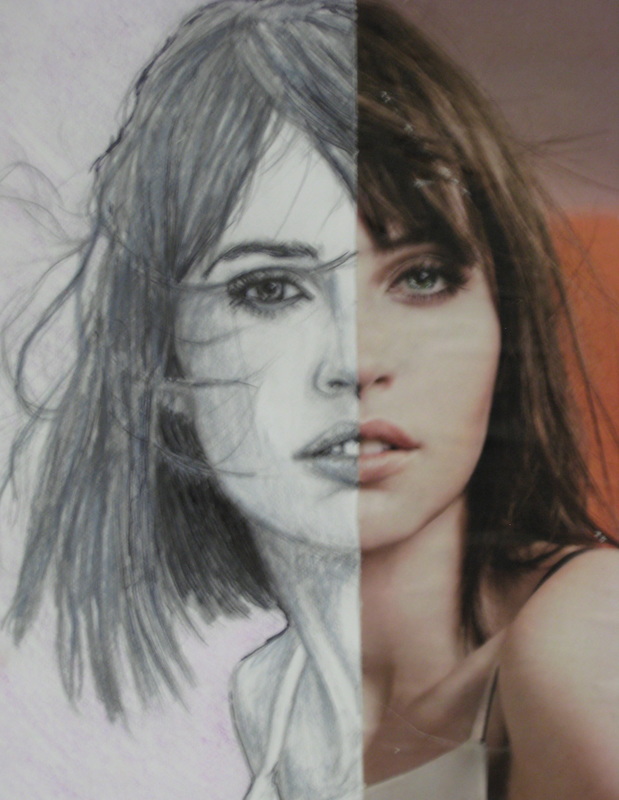
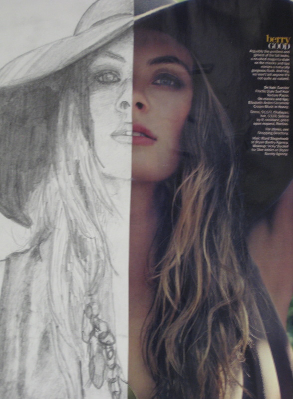
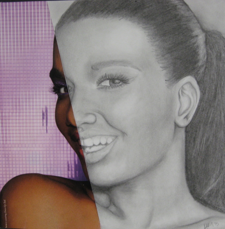
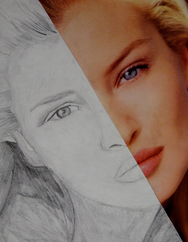
In level 2 students are introduced to Portraits. Most who are interested in art want to learn how to draw people. So we launch into an in depth investigation of the self-portrait. In order to prepare and build skill students will do an exercise that involves matching a half of a face, this helps the student learn how to depict features and match values.
The following images are the results of their efforts.
The following images are the results of their efforts.
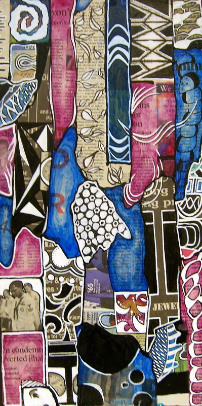
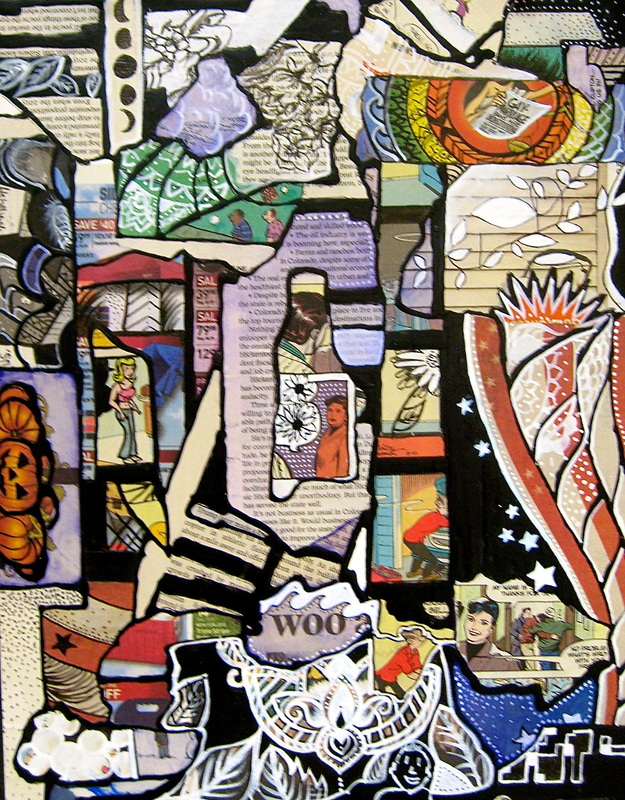
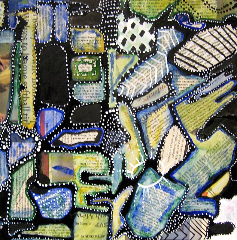
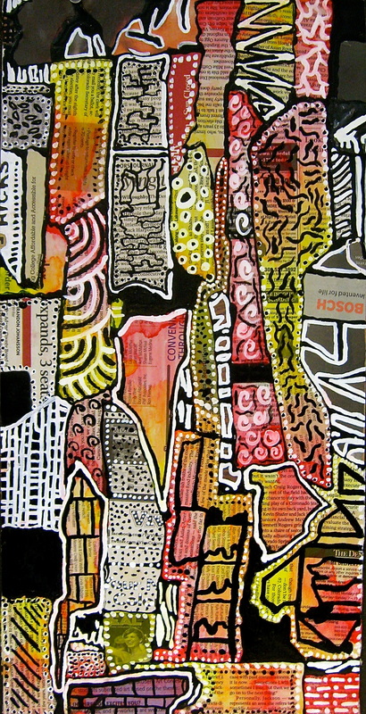
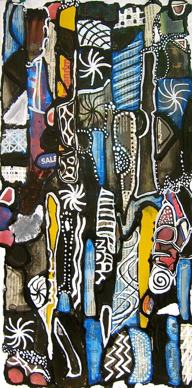
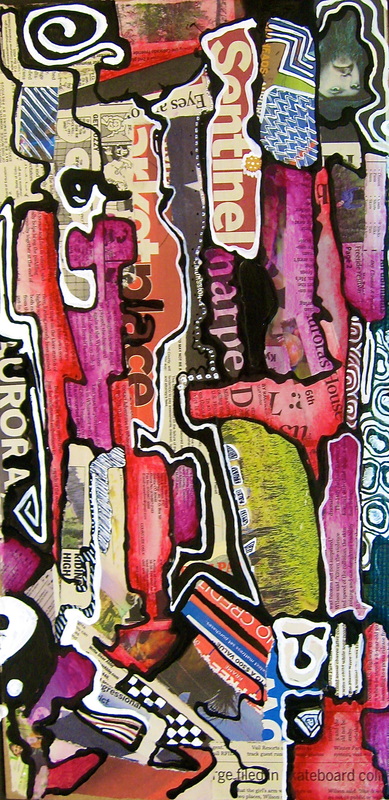
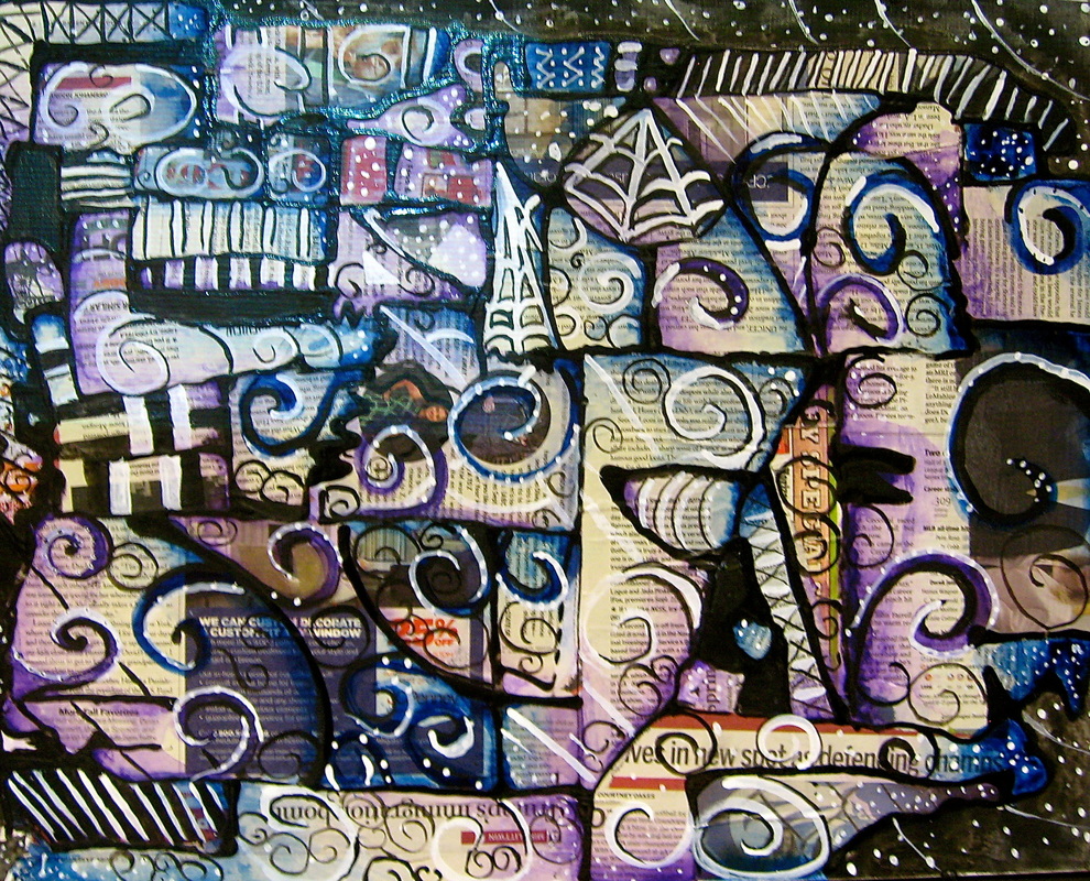
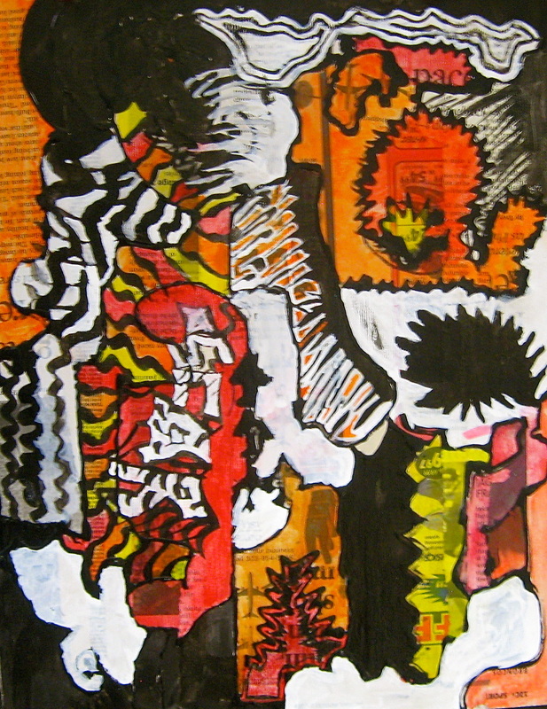
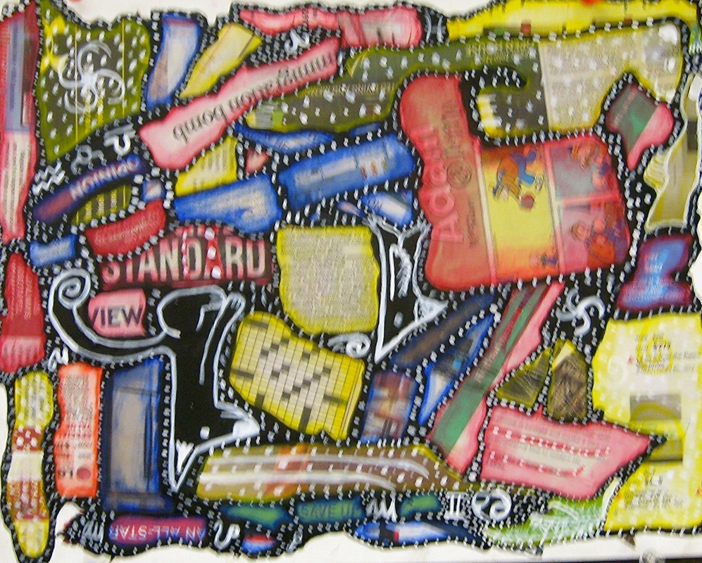
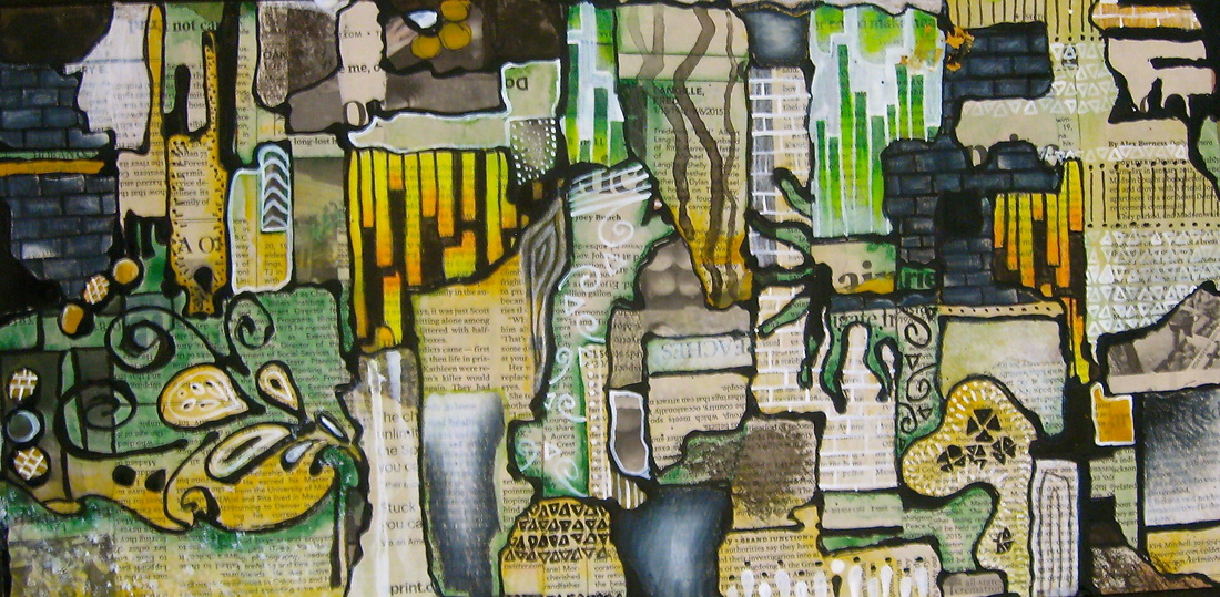
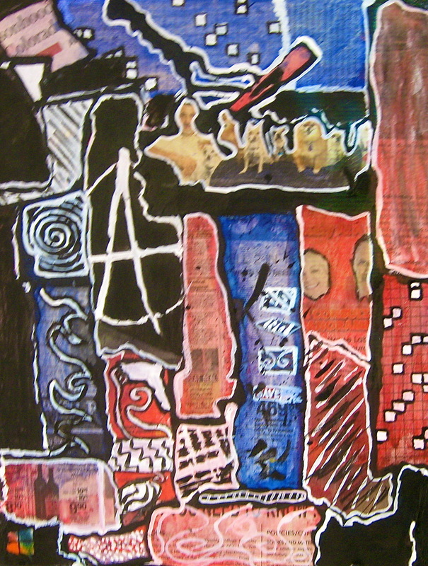
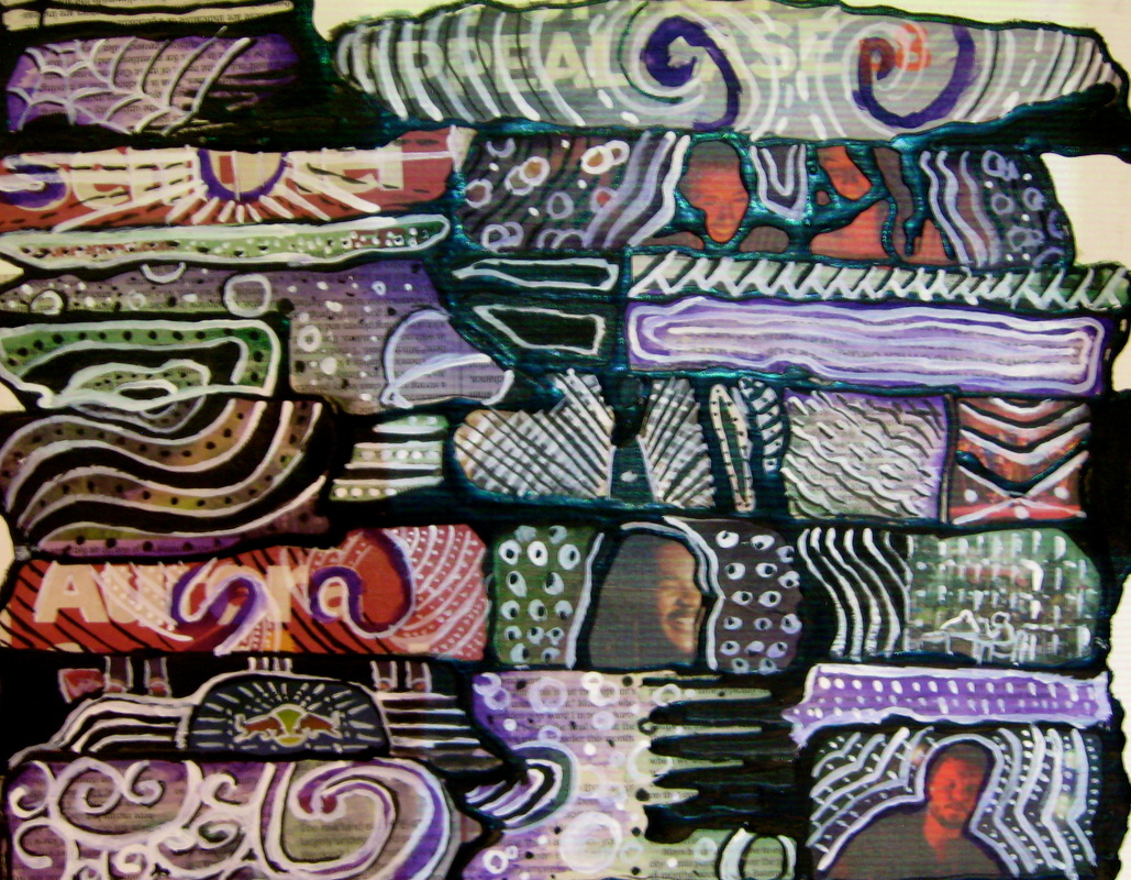
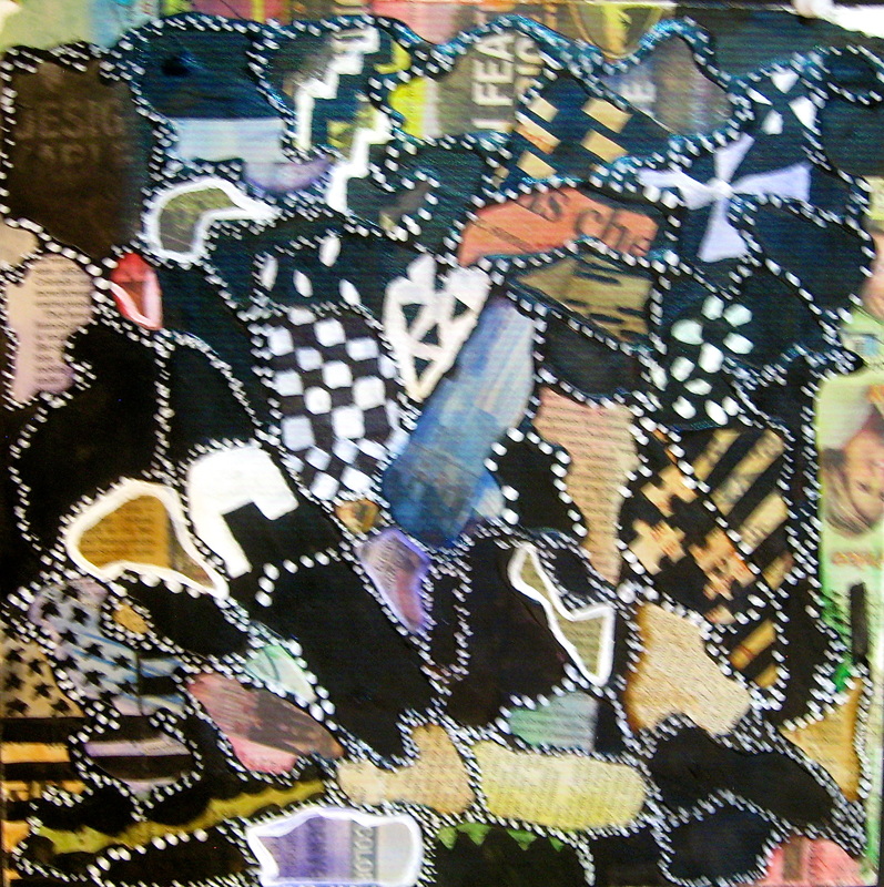
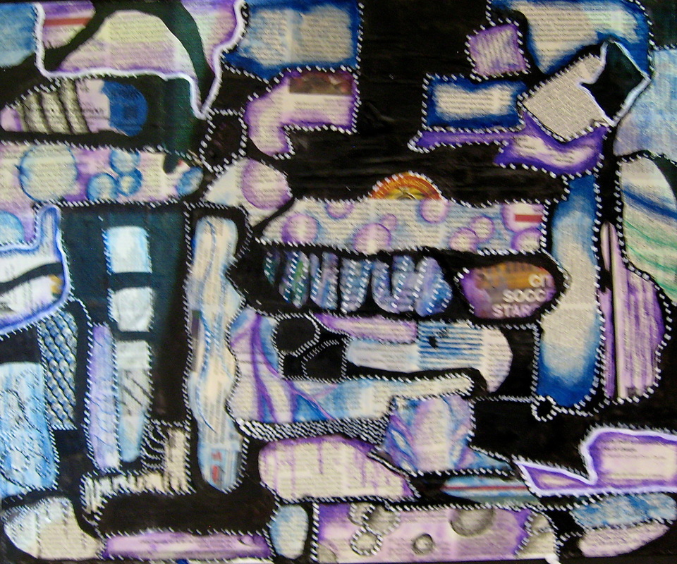
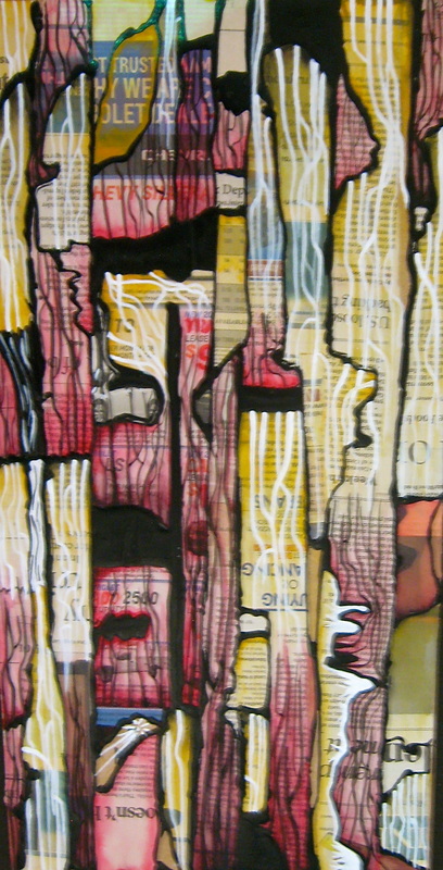
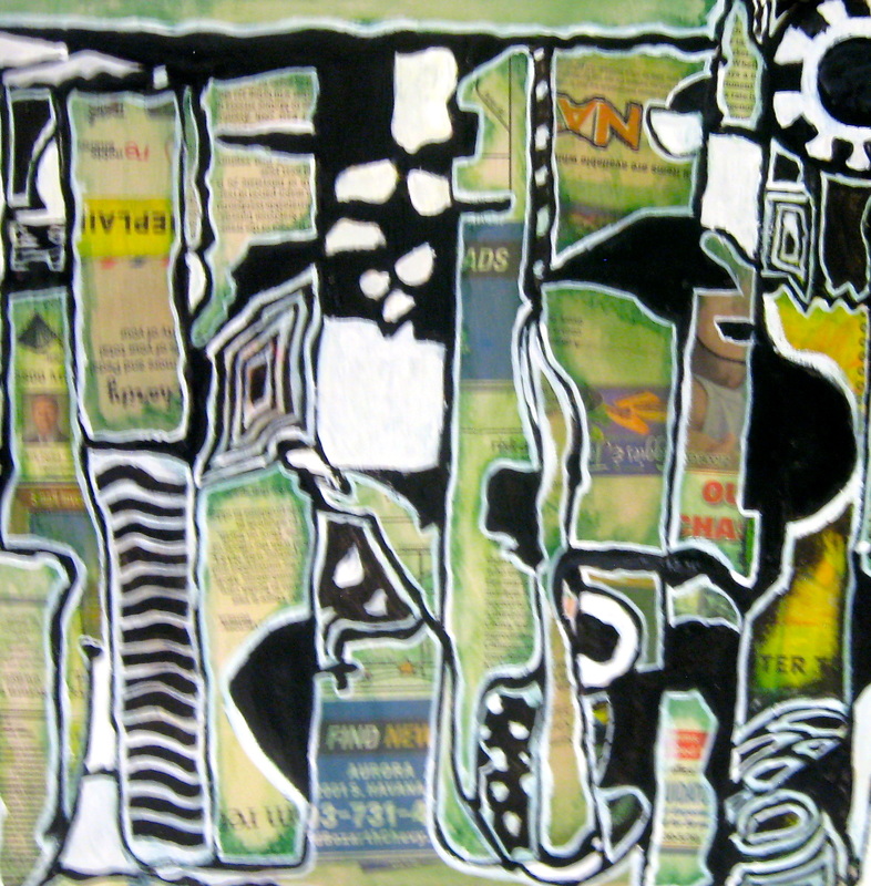
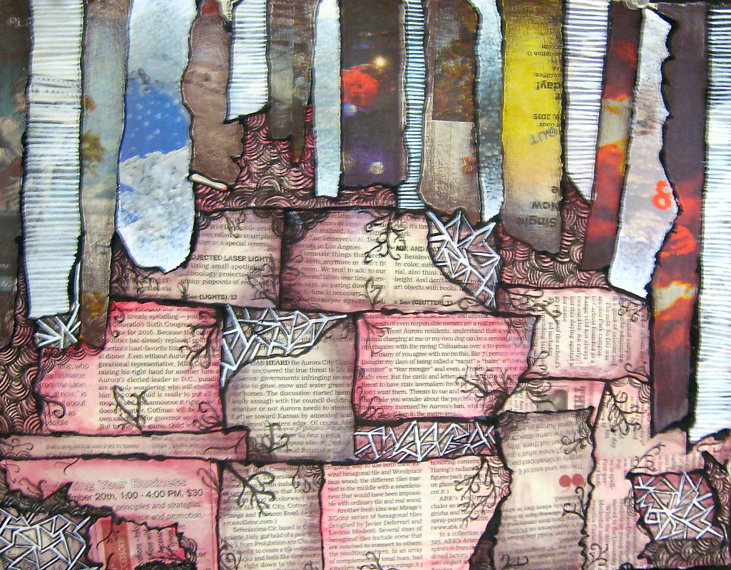
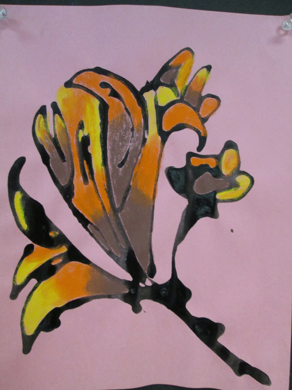
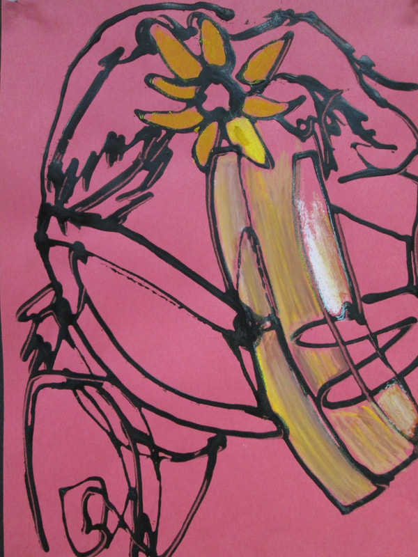
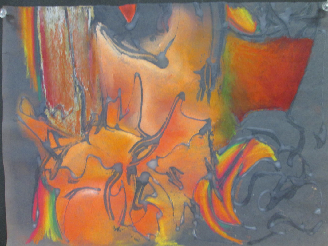
Artists interact with Black Glue, Print, & White Ink...
Draw/Paint 2 students were given the task of interacting with a piece of art that is unplanned. We started with collaging newspaper, then they added Black Glue to " unplanned" shapes they found within the print. The next step was to add watercolor in a soft graded style, or not... then we went in with white ink and they found or created patterns and designs. After we got to a certain point they went back in and added larger black shapes with ink.. The ultimate goal was to create a visually unified & balanced composition without planning but rather reacting to the potential designs within the board. It is hard to know when you are done but the benefits of entangling yourself with visual interaction can be very impacting for one's creative development. Below are the Black Glue Designs.