2020 COVID Sketch Challenge for students.. we all drew together!
"Art- especially the discipline of drawing-along with philosophy, history, and literature, helps us interpret our experiences visually, emotionally, and aesthetically. As mature human beings we try to create wholeness in ourselves; one recognized way to achieve that goal is through the creative process. For the visual artist drawing lies at the very core of that process."
( Drawing A Contemporary Approach, Teel Sale Claudia Betti pg. 6)
( Drawing A Contemporary Approach, Teel Sale Claudia Betti pg. 6)
Class Fees: Pay here for your student's lab fees
eaglecresths.revtrak.net/class-fees2/visual-arts-class-fees/#/list
2019/20 Portfolio of Student Work...
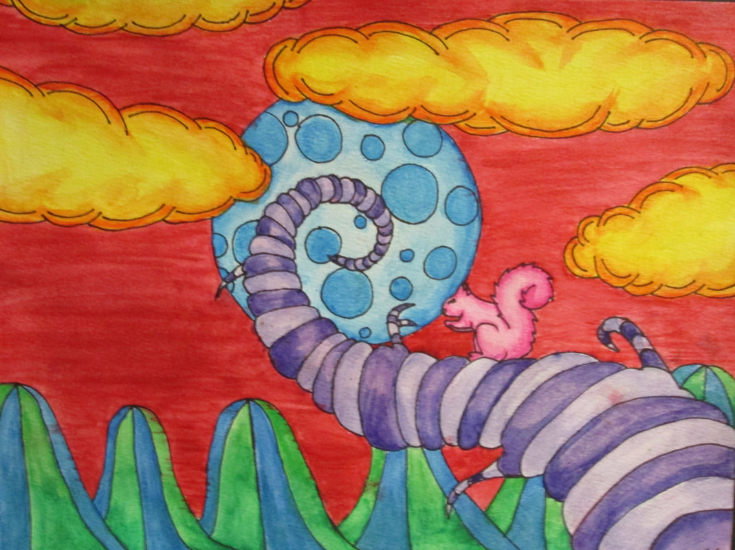
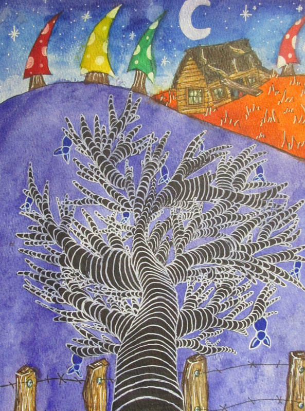
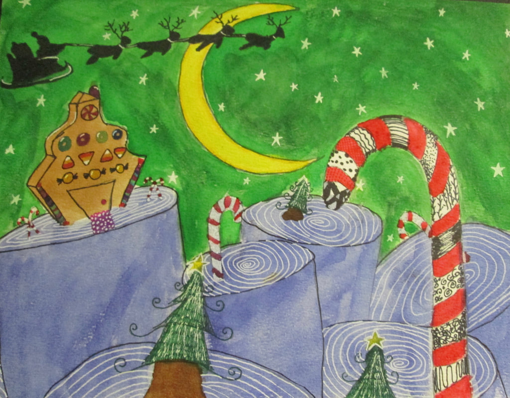
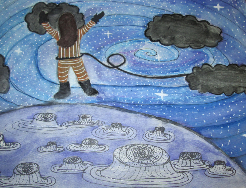
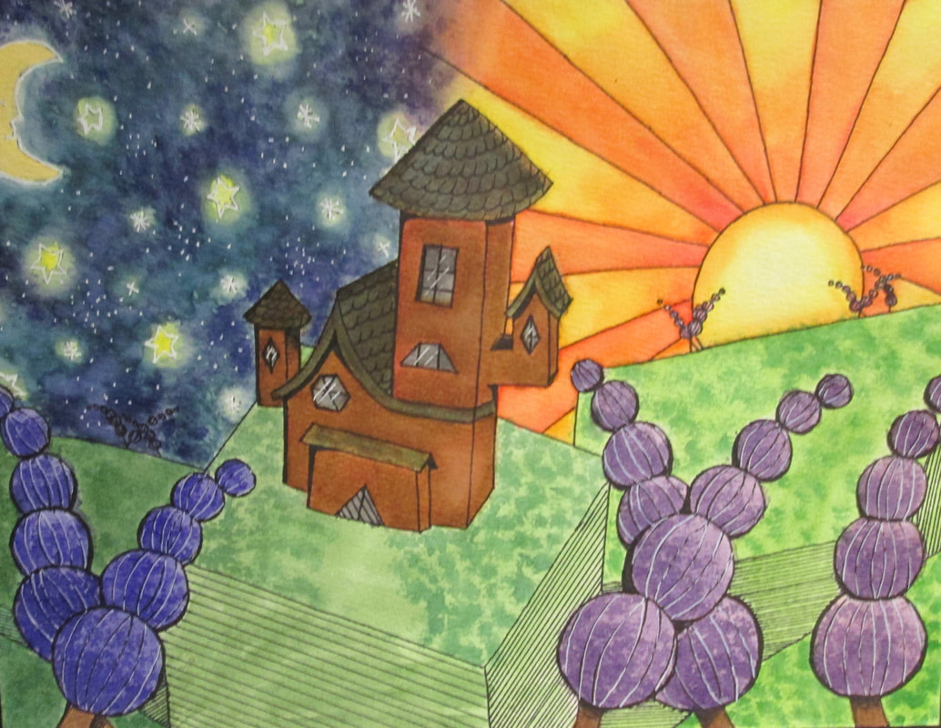
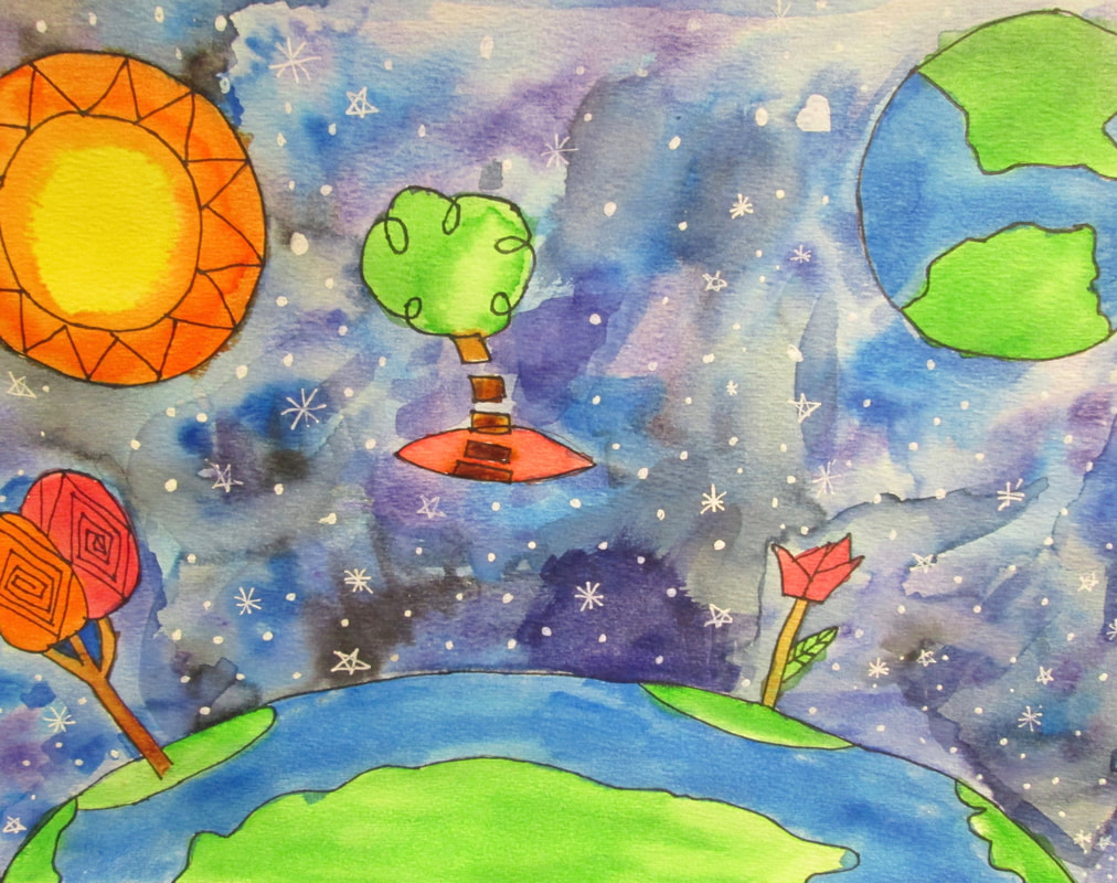
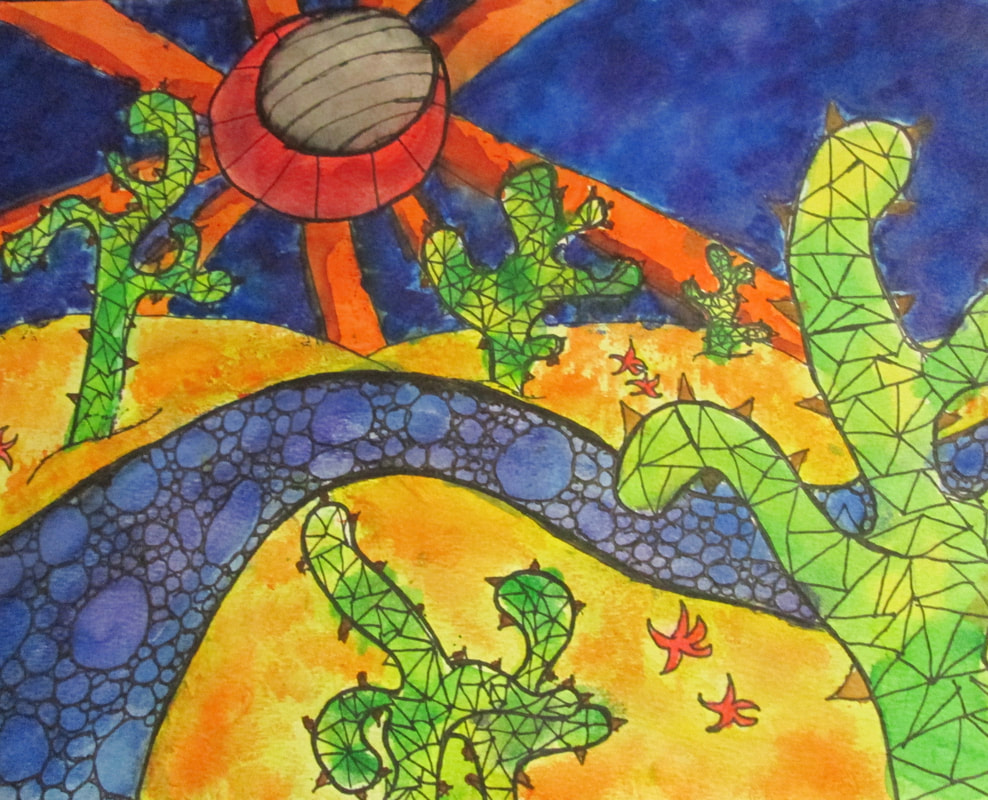
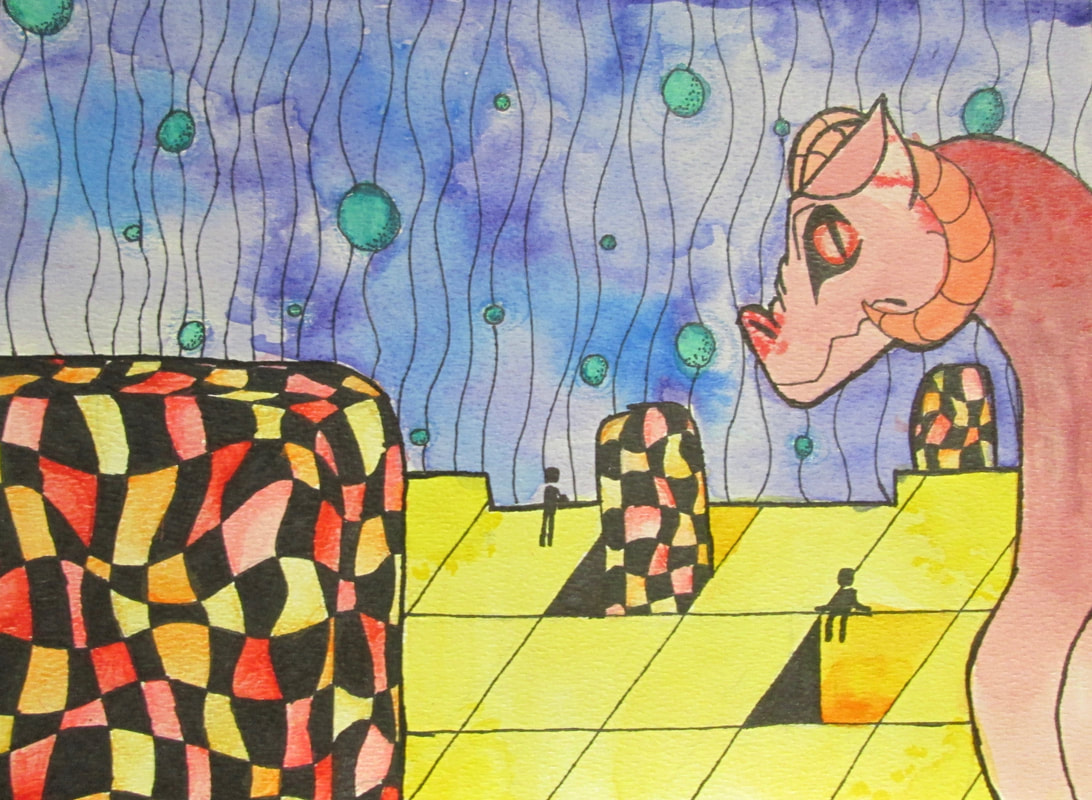
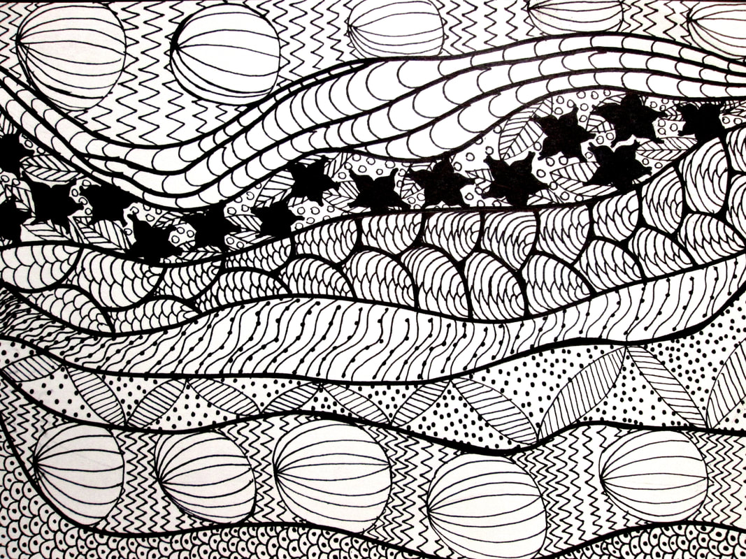
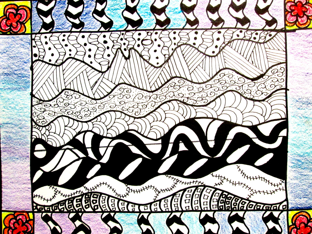
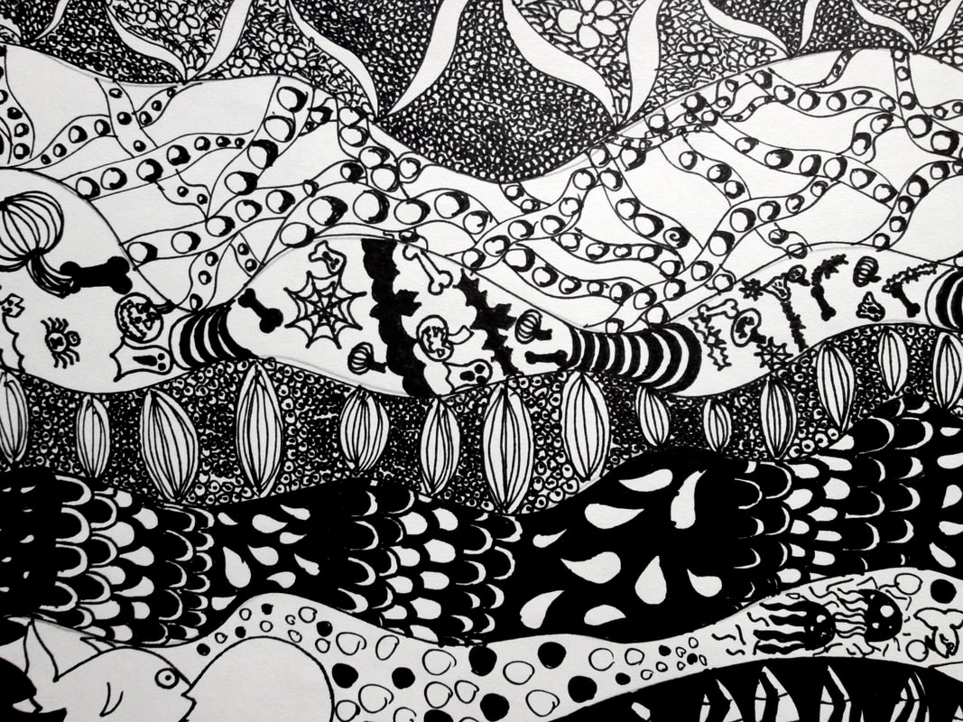
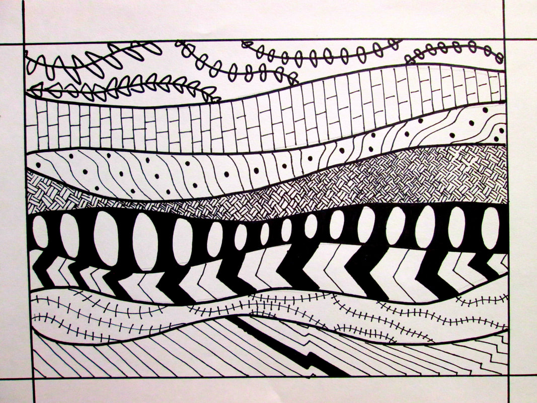
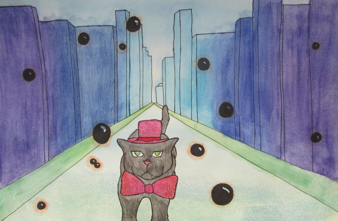
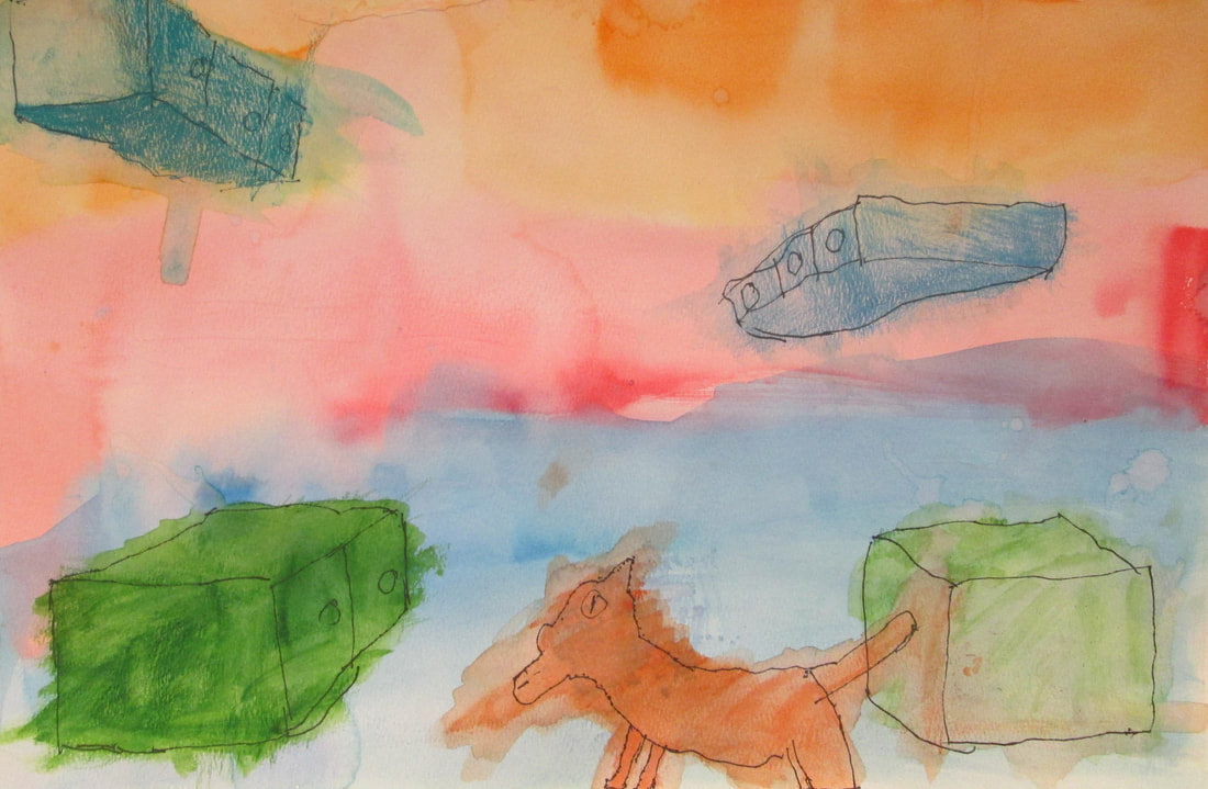
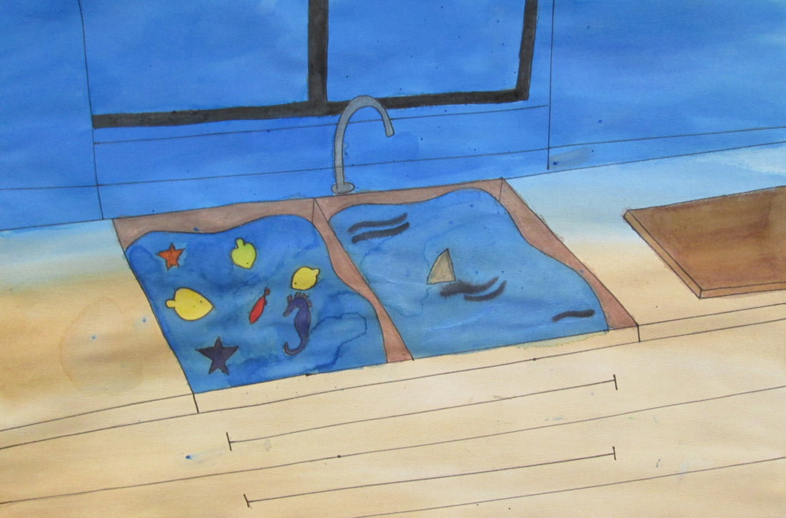
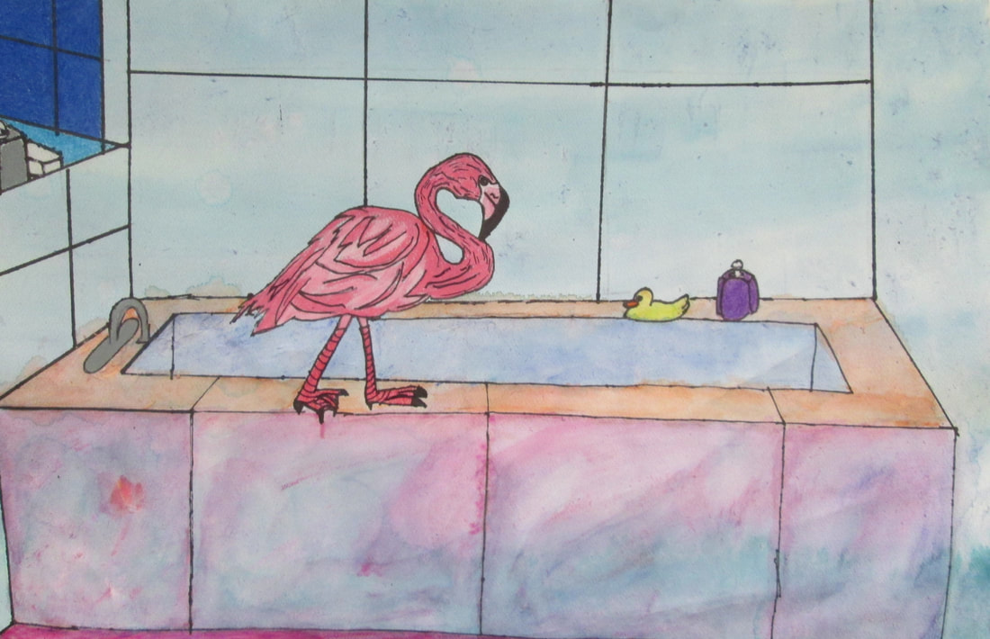
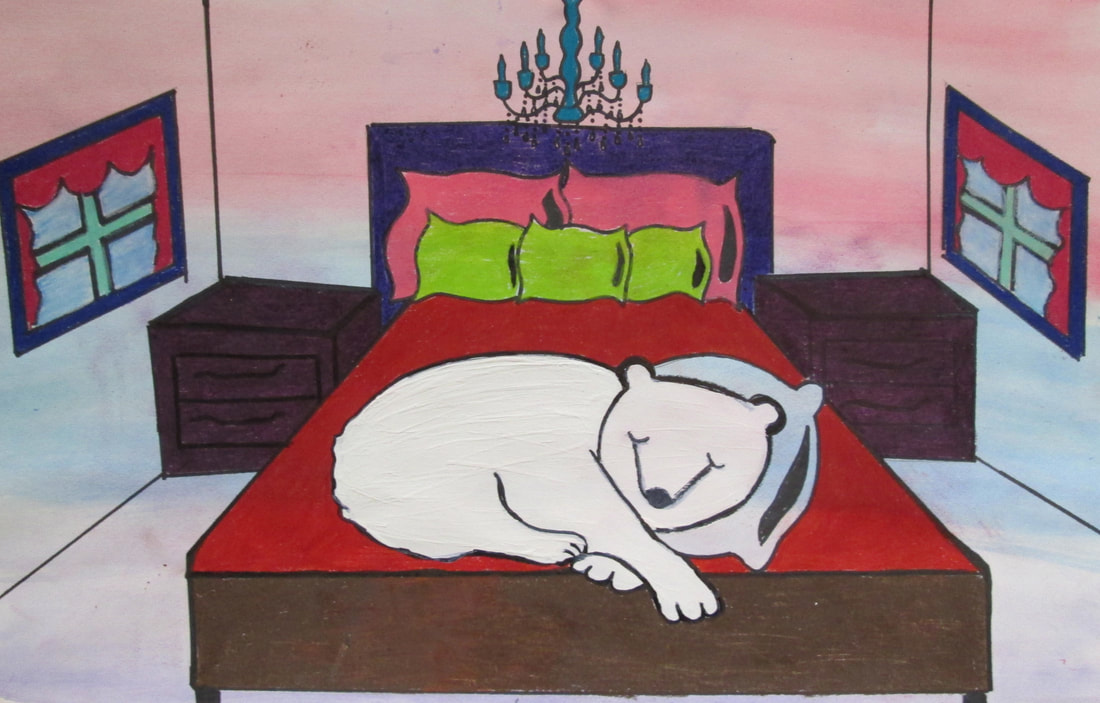
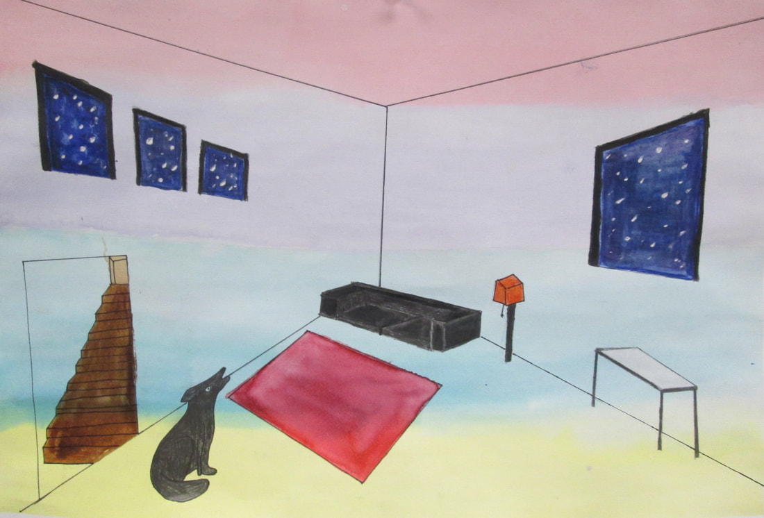
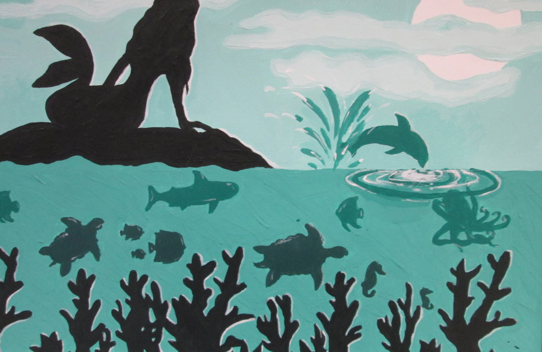
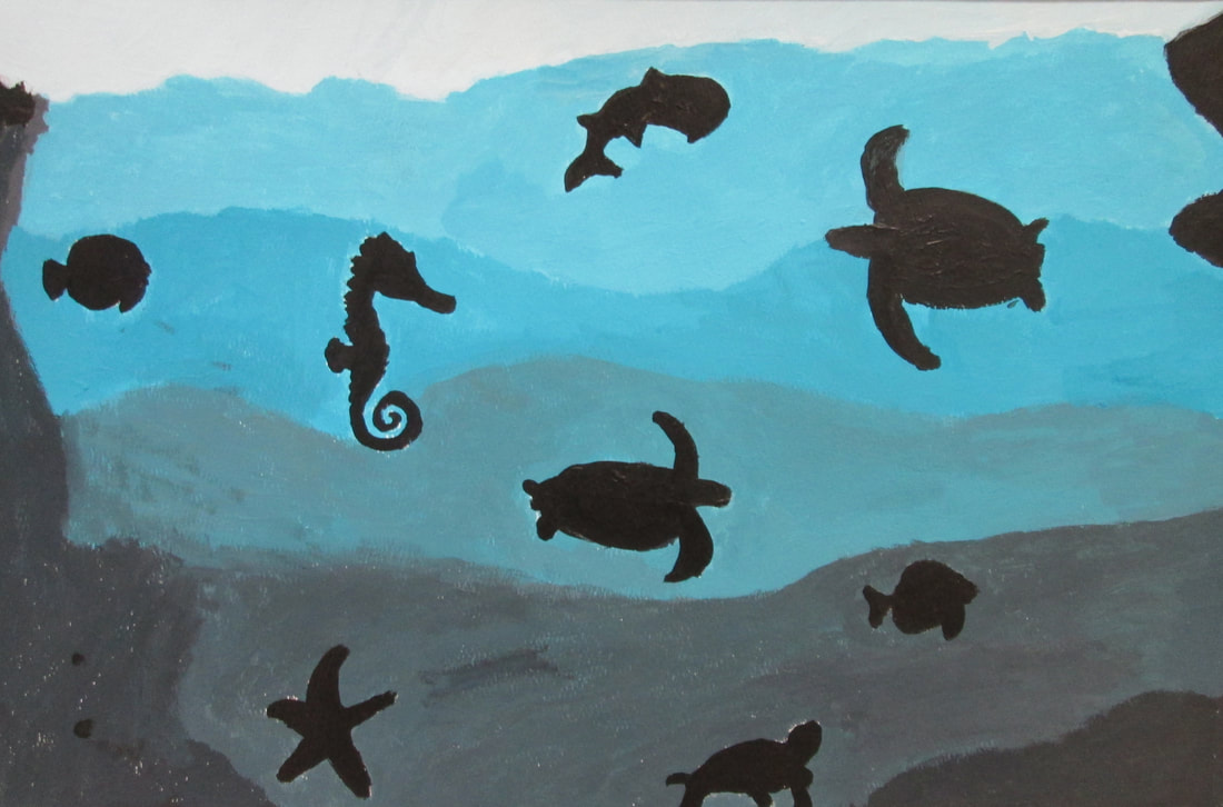
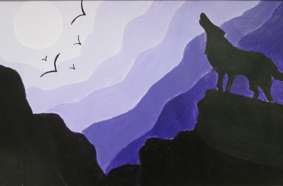
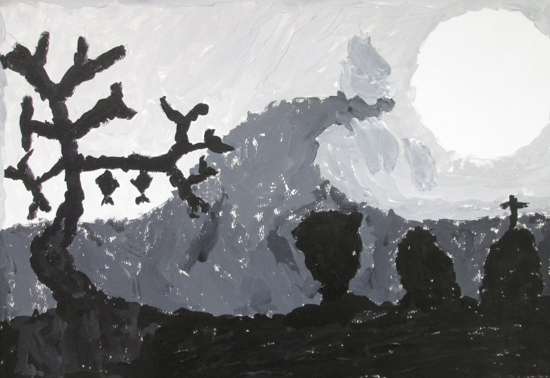
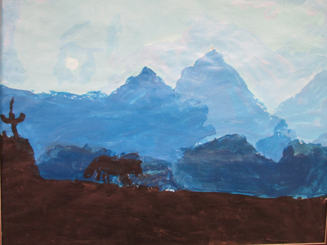
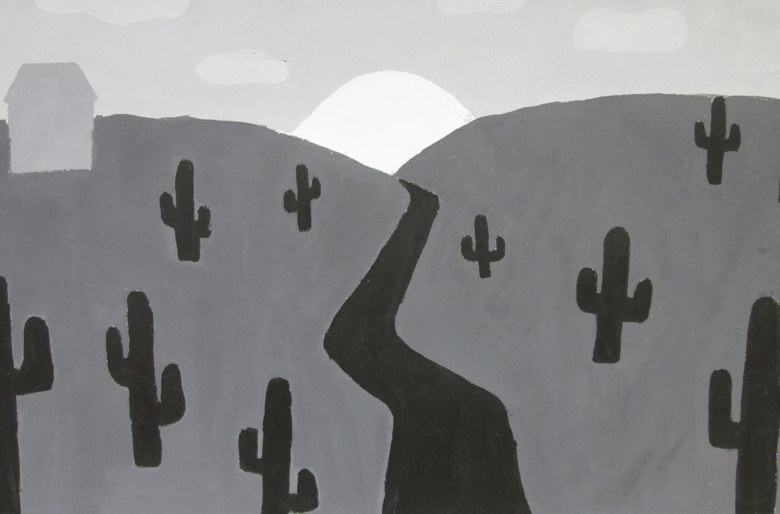
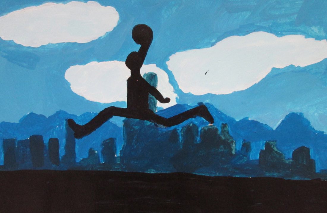
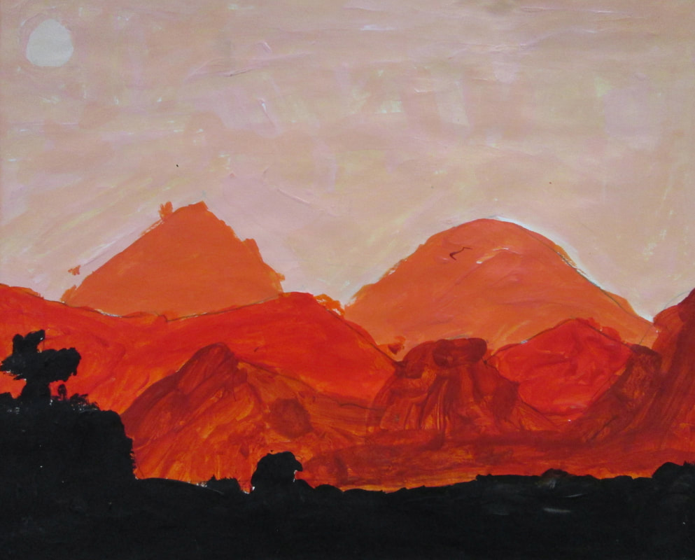
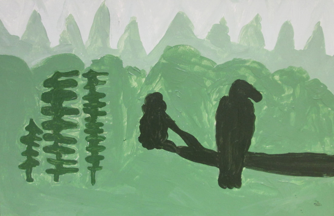
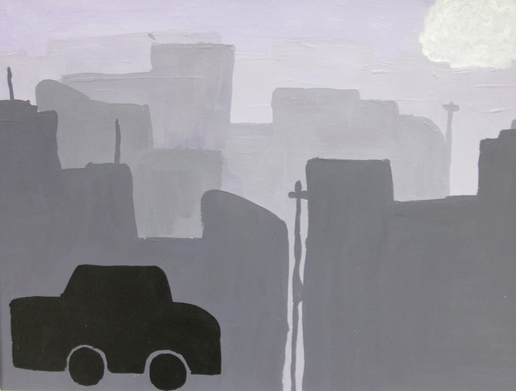
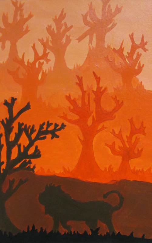
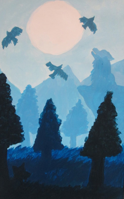
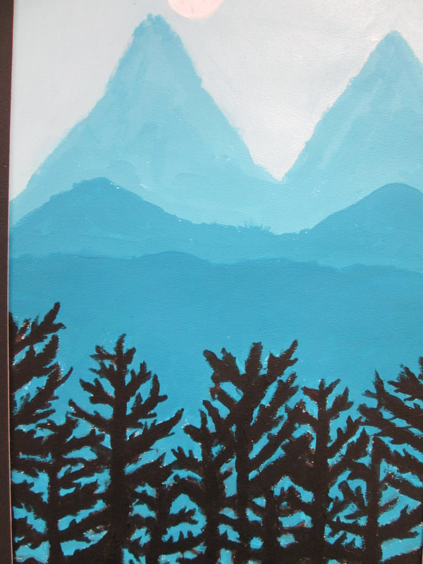
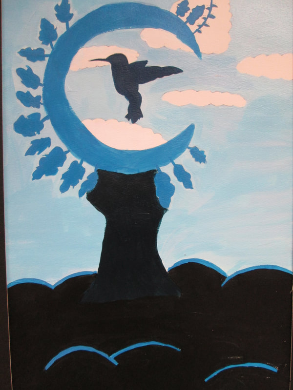
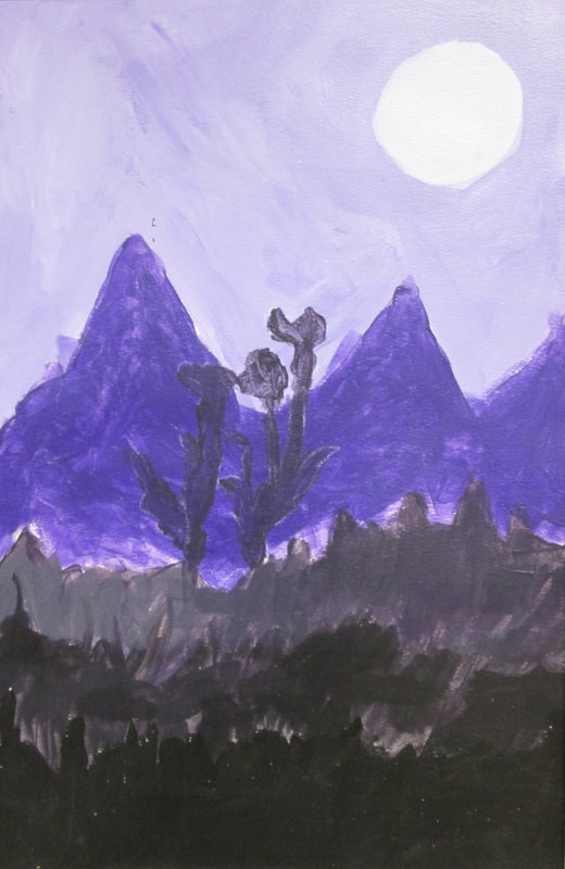
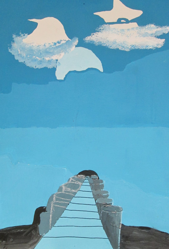
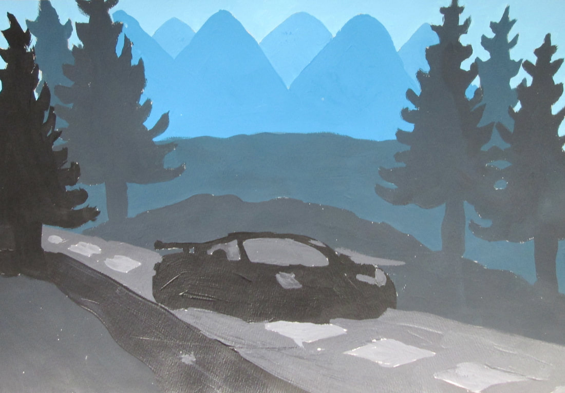
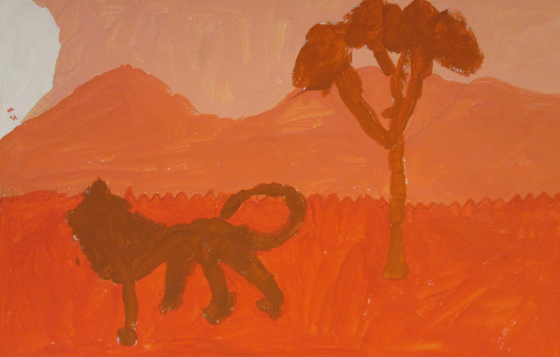
Whimsical Landscapes...
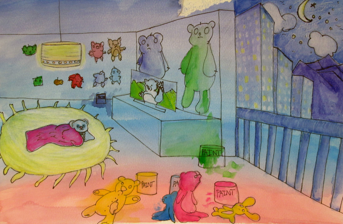
Drawing/ Painting 1 classes were introduced to the artistic concepts of how to make something whimsical. Whimsical art can be characterized by bright colors, exaggeration, unexpected size relationships, fanciful patterns and unusual circumstances. We examined the work of Dr. Suess and the more macabre work of Tim Burton and Edward Gorey. The Whimsical Landscapes below are what they created.
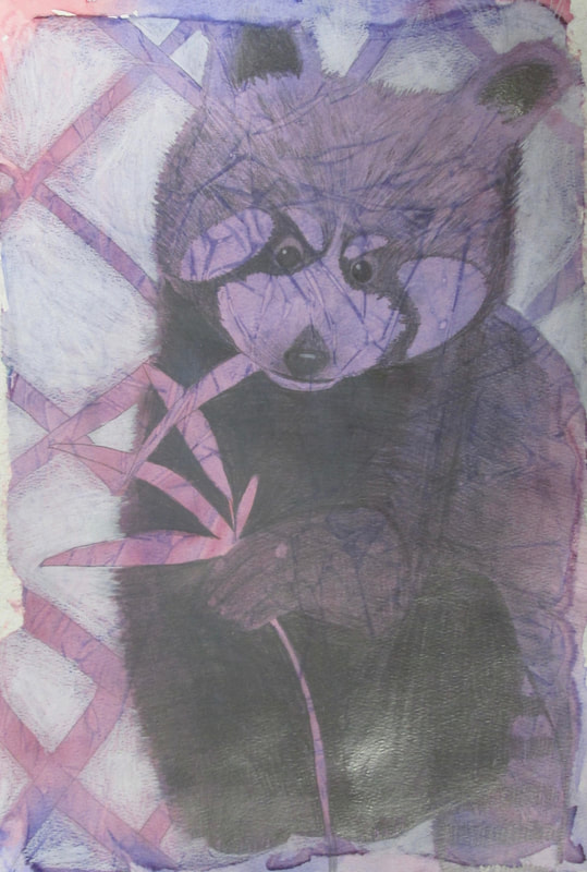
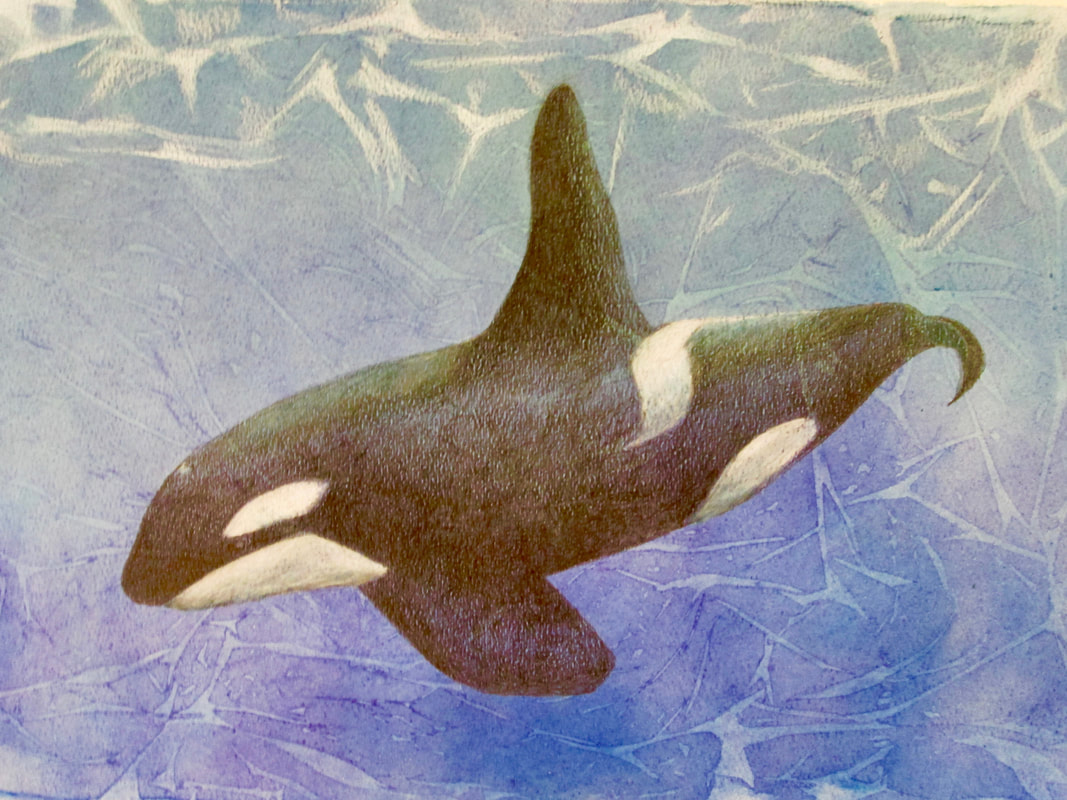
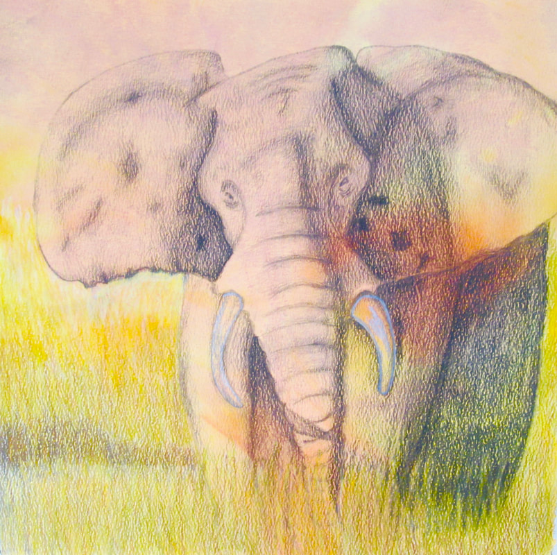
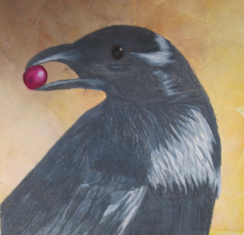
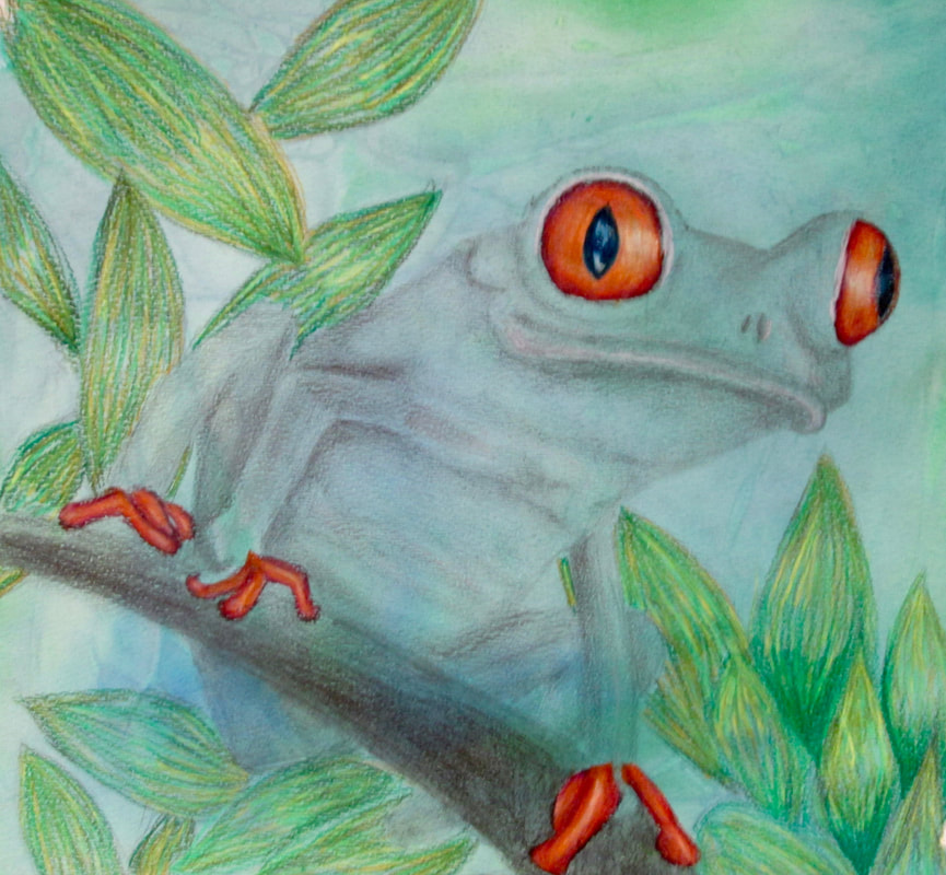
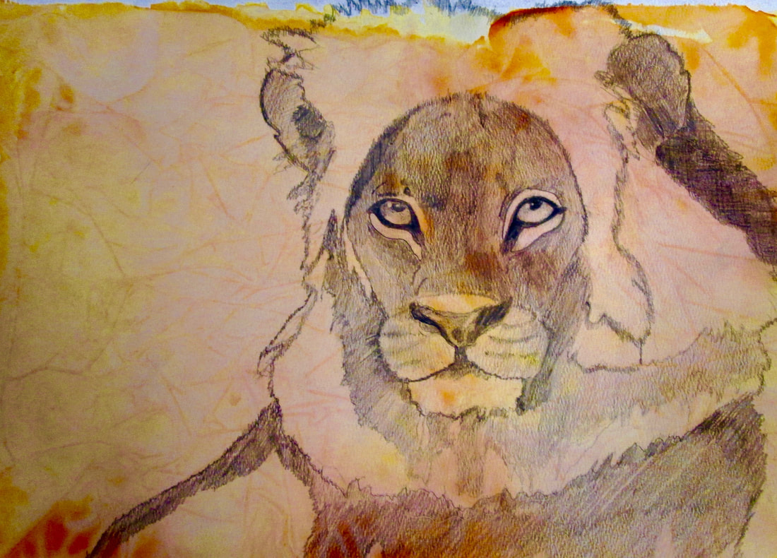
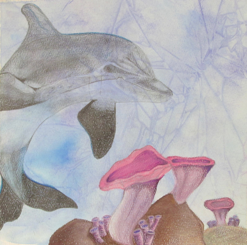
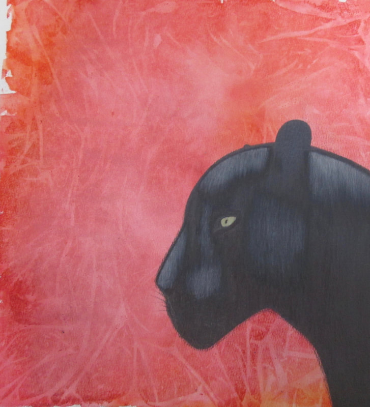
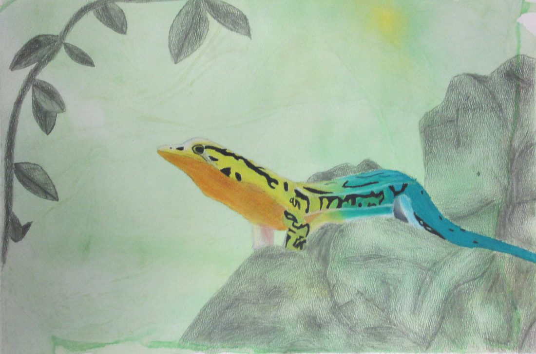
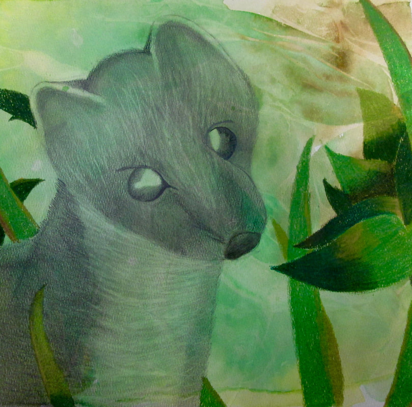
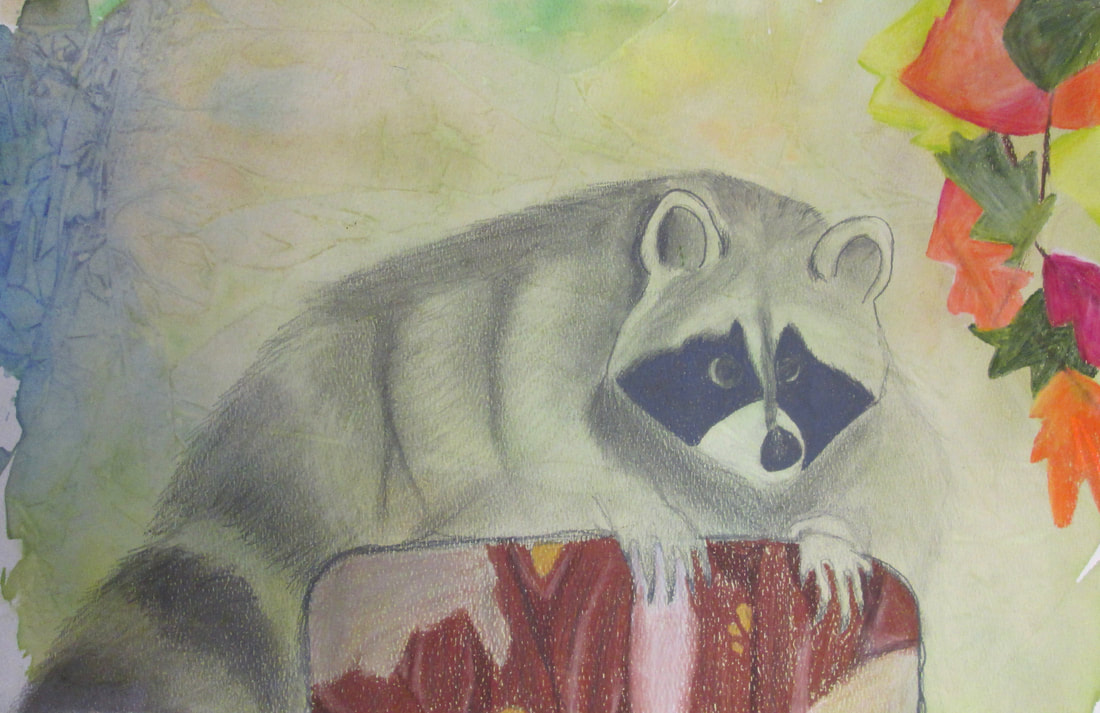
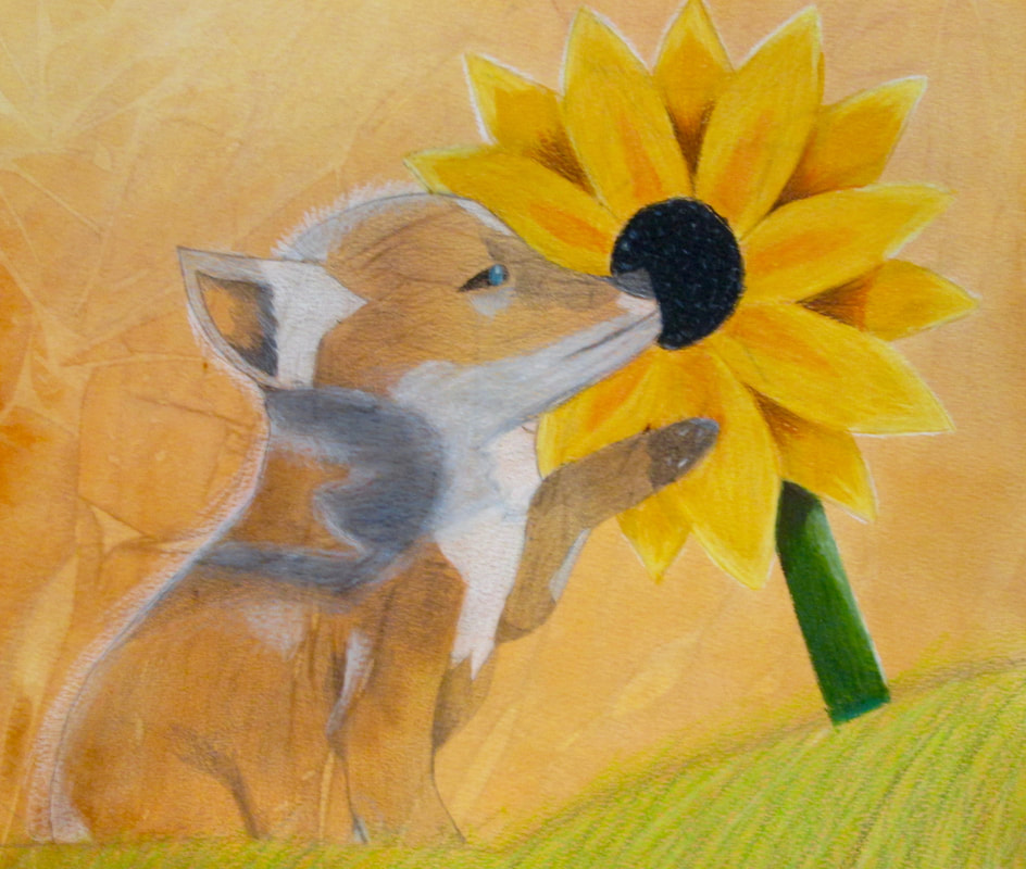
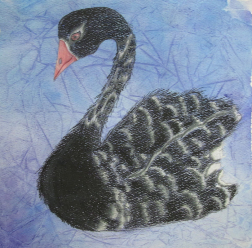
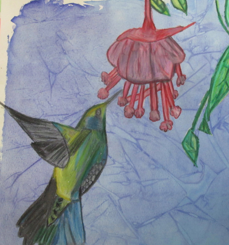
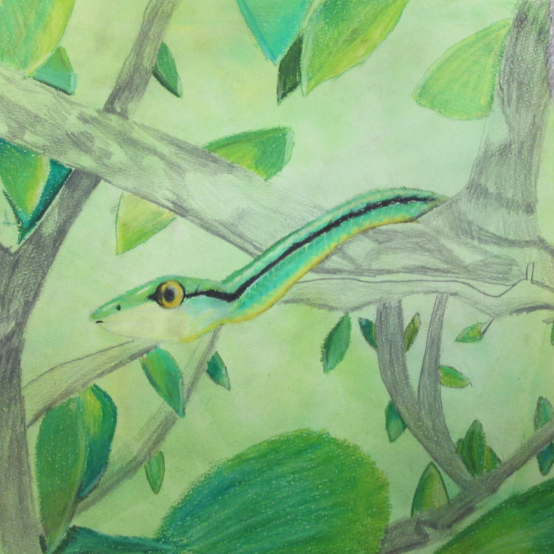
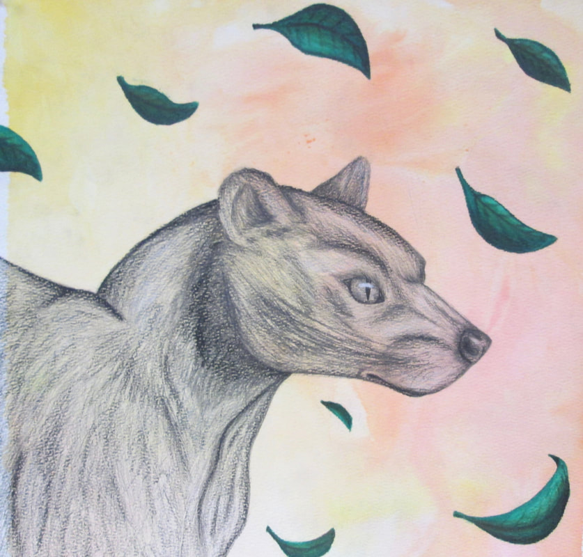
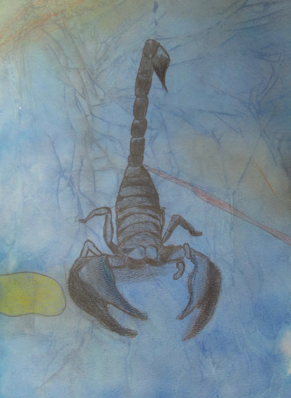
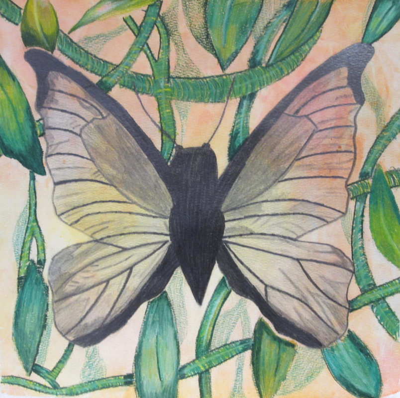
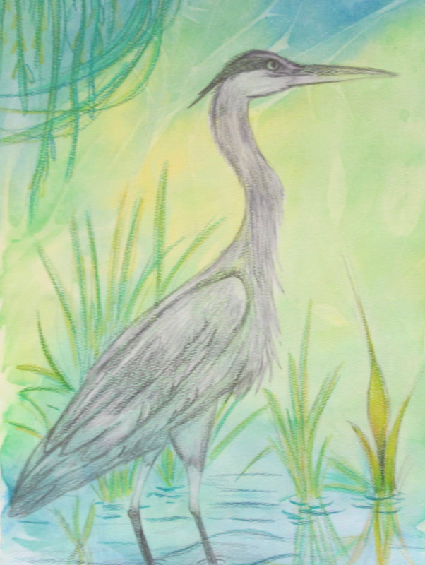
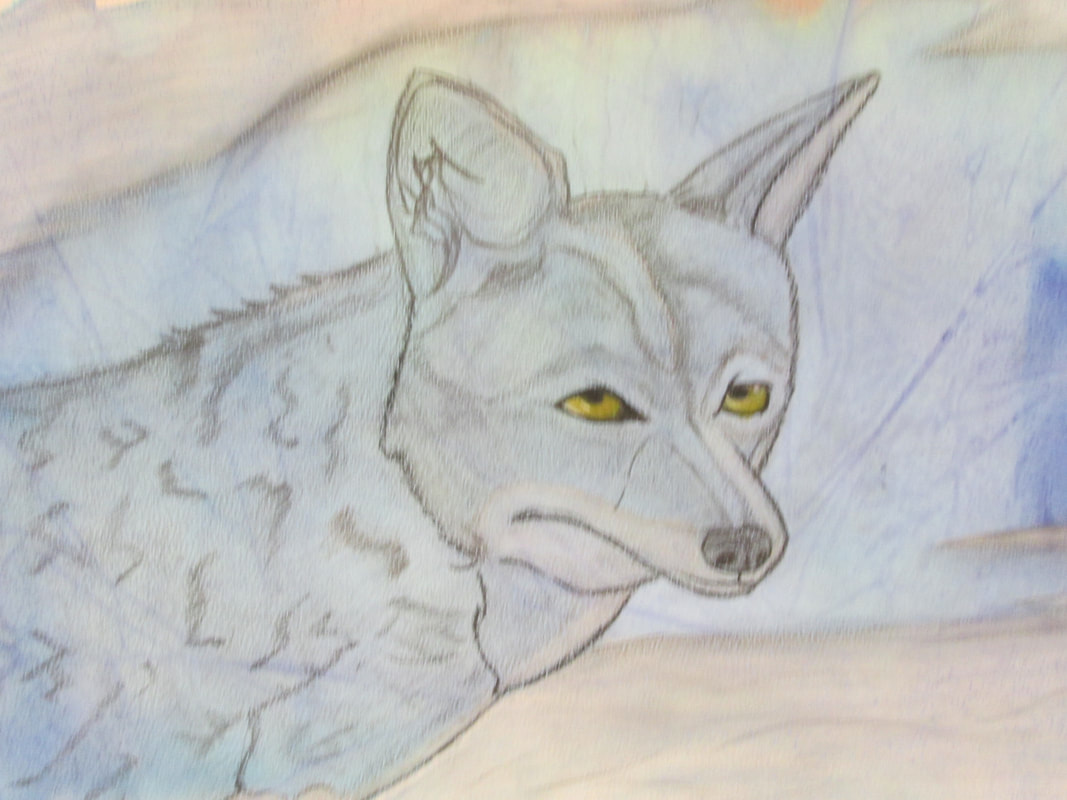
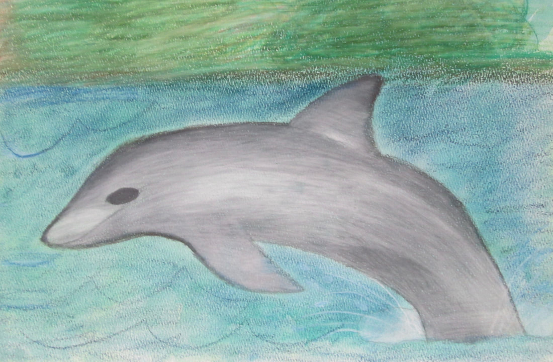
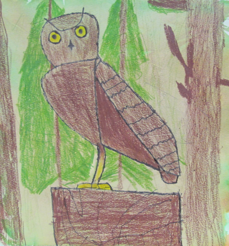
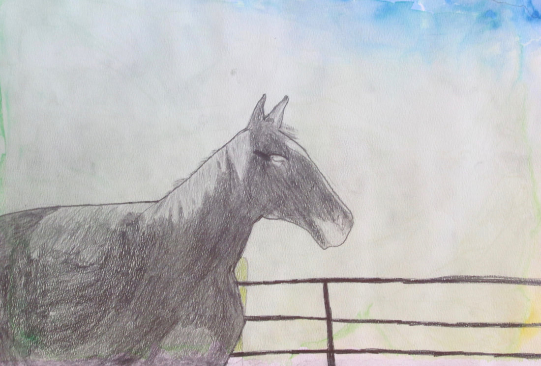
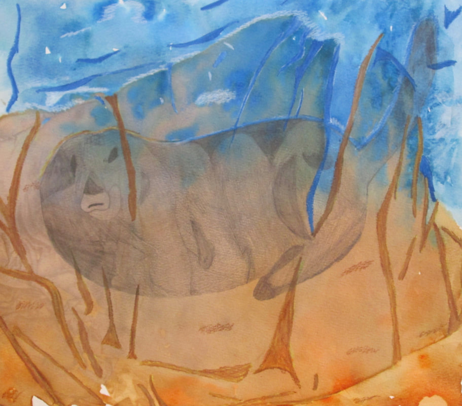
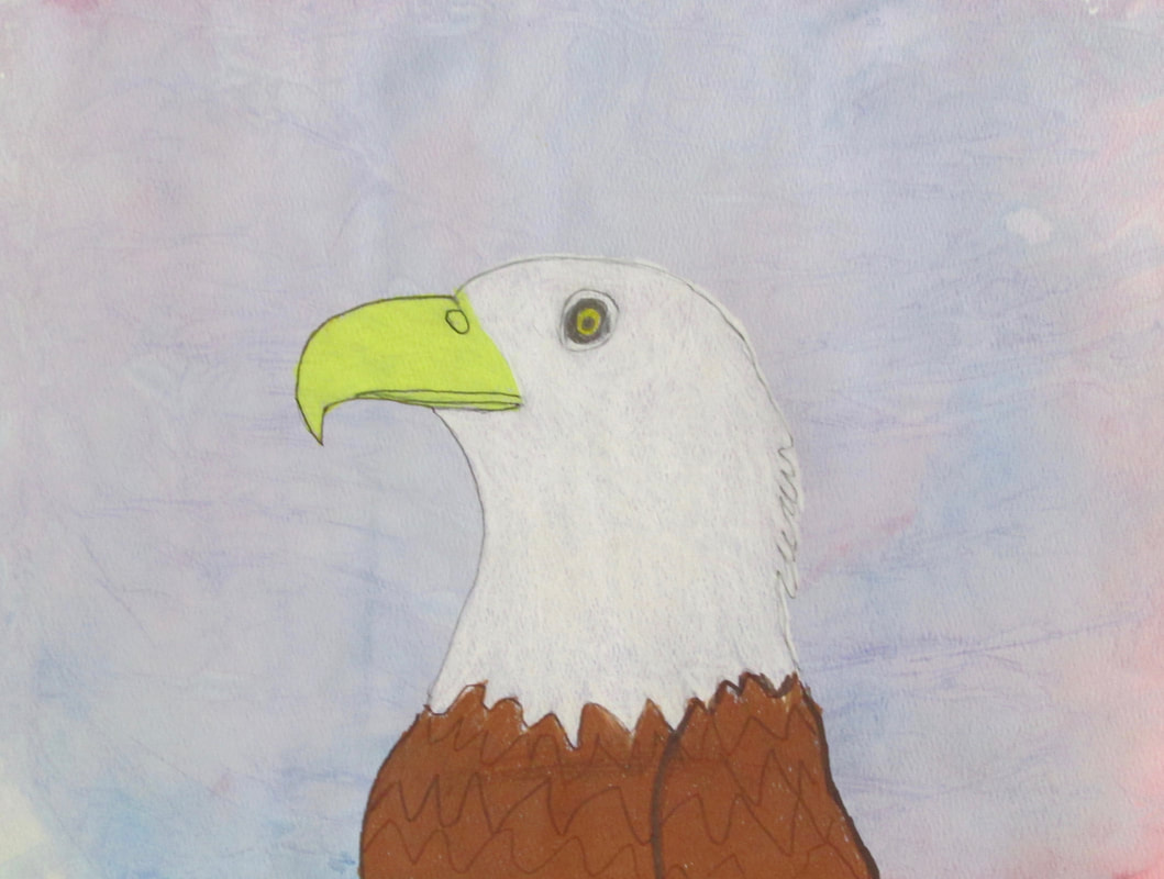
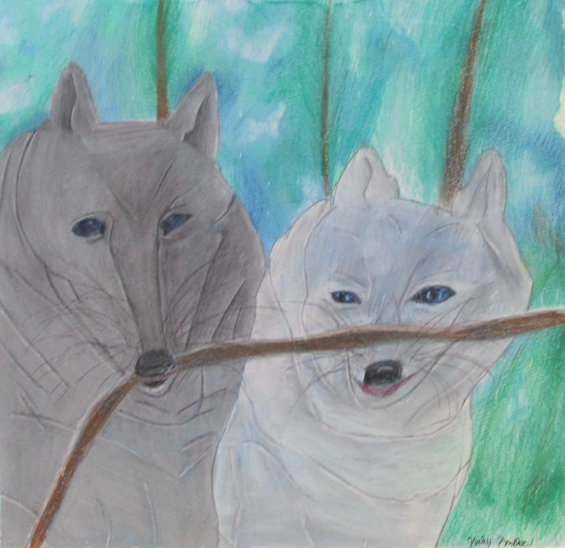
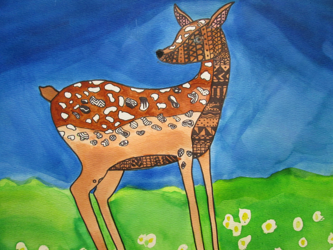
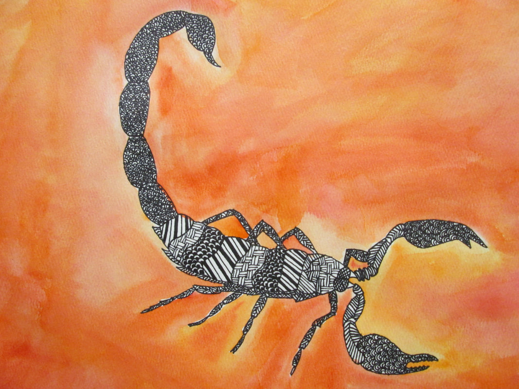
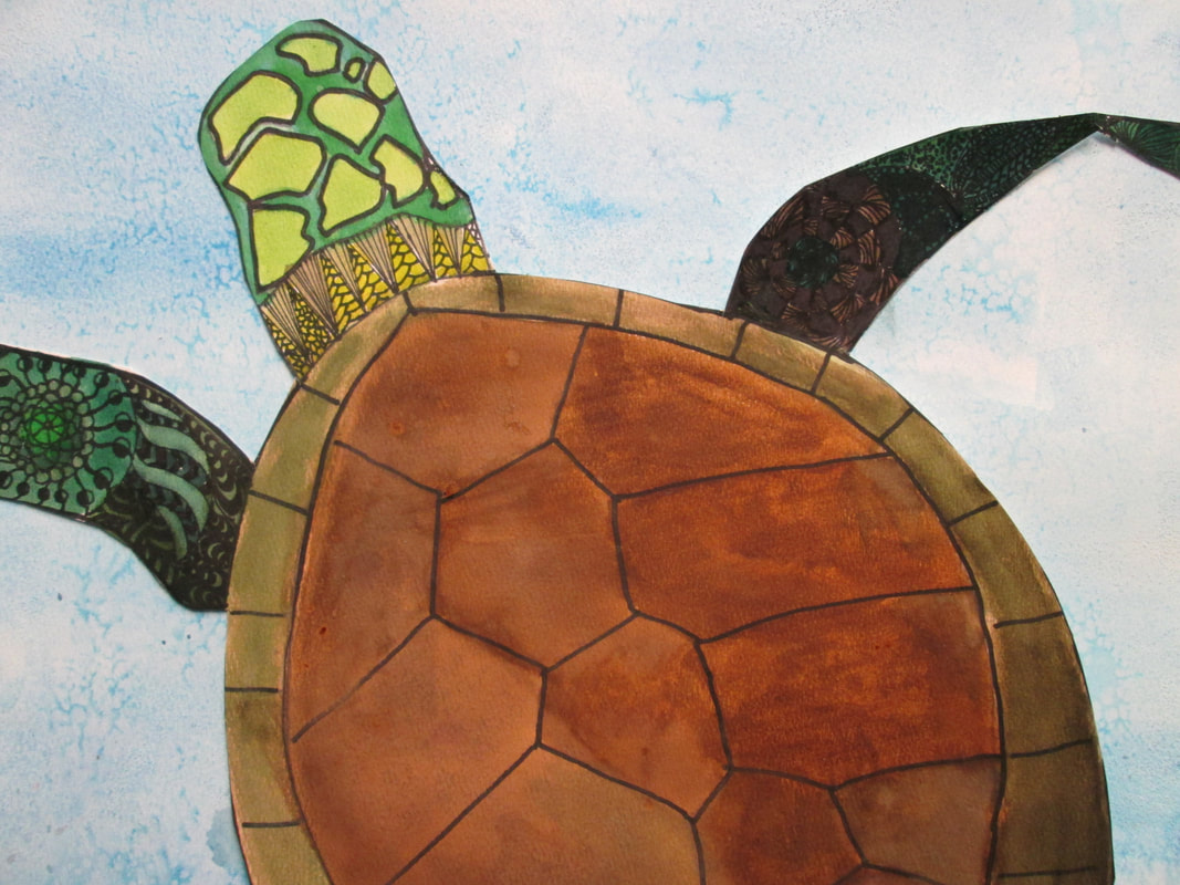
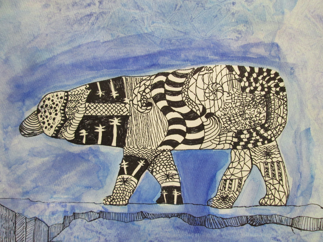
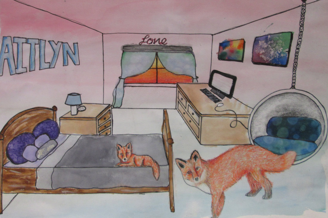
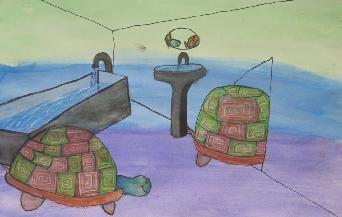
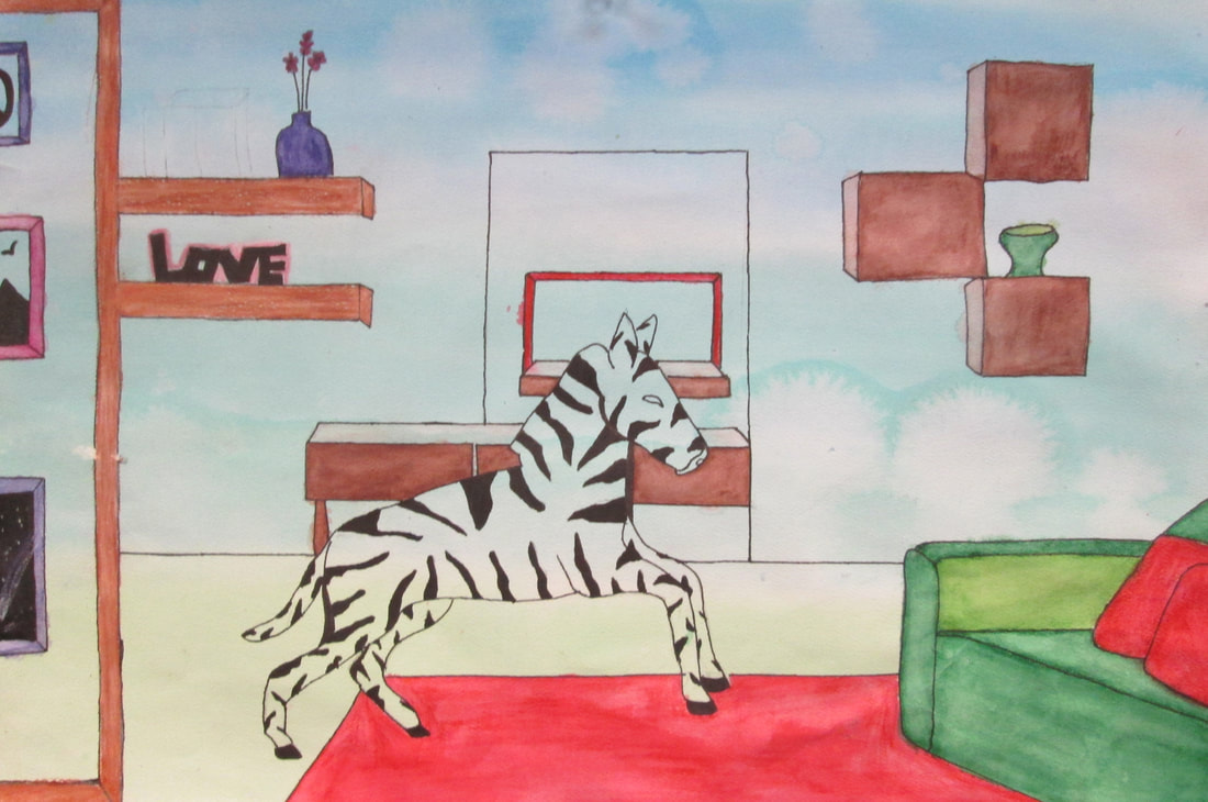
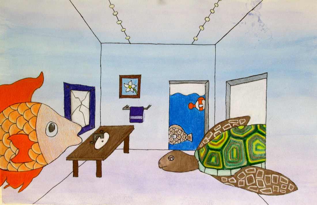
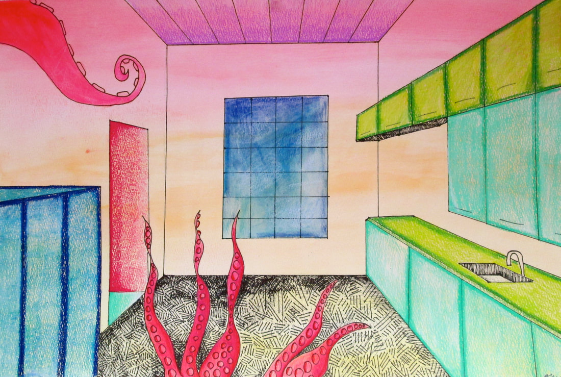
Drawing/Painting 1 students chose from the Native American totem cards.. they picked an animal and looked up the characteristics. They could choose to depict the animal they selected or illustrate an animal of their own choosing. They worked on value shading and put the shaded fauna onto a loose watercolor background with a saran wrap effect on top. Pictured below are the impressive drawings they came designed.
2018-19 Student Portfolio of Artwork
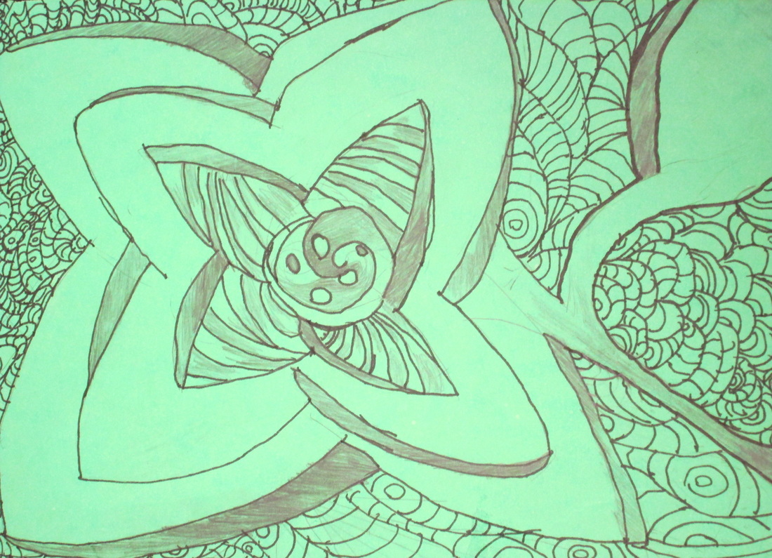
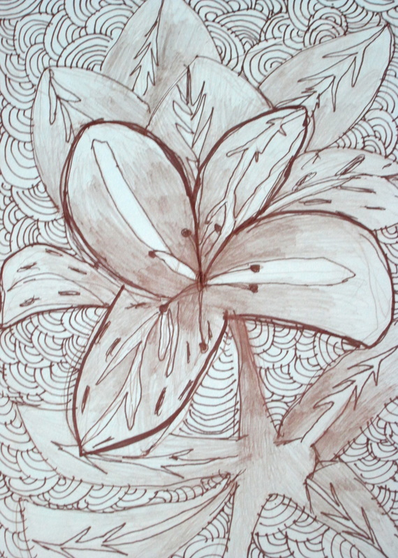
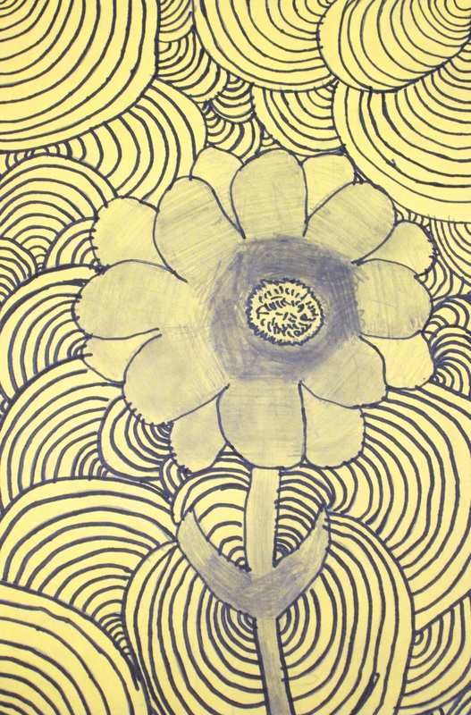
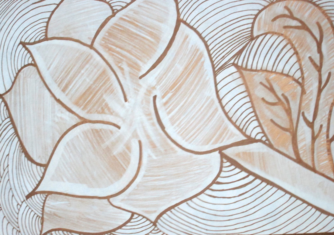
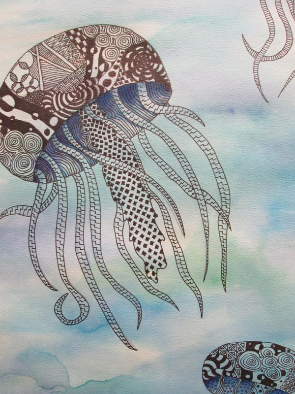
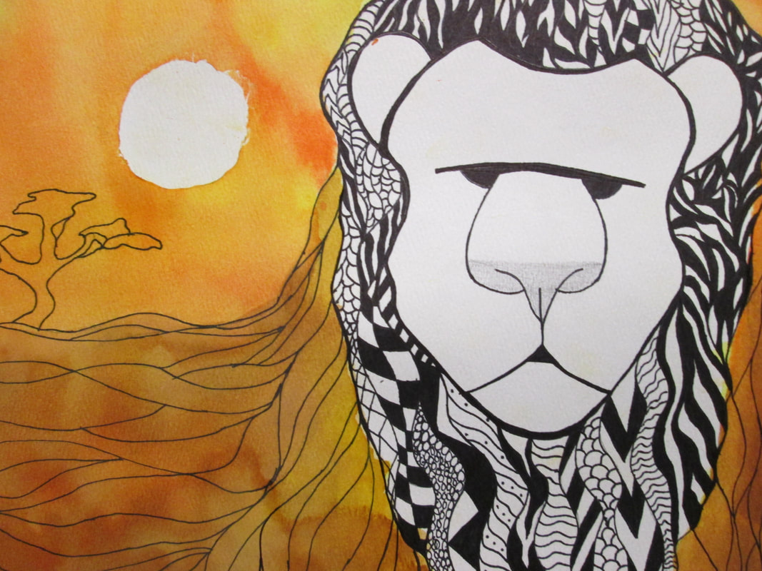
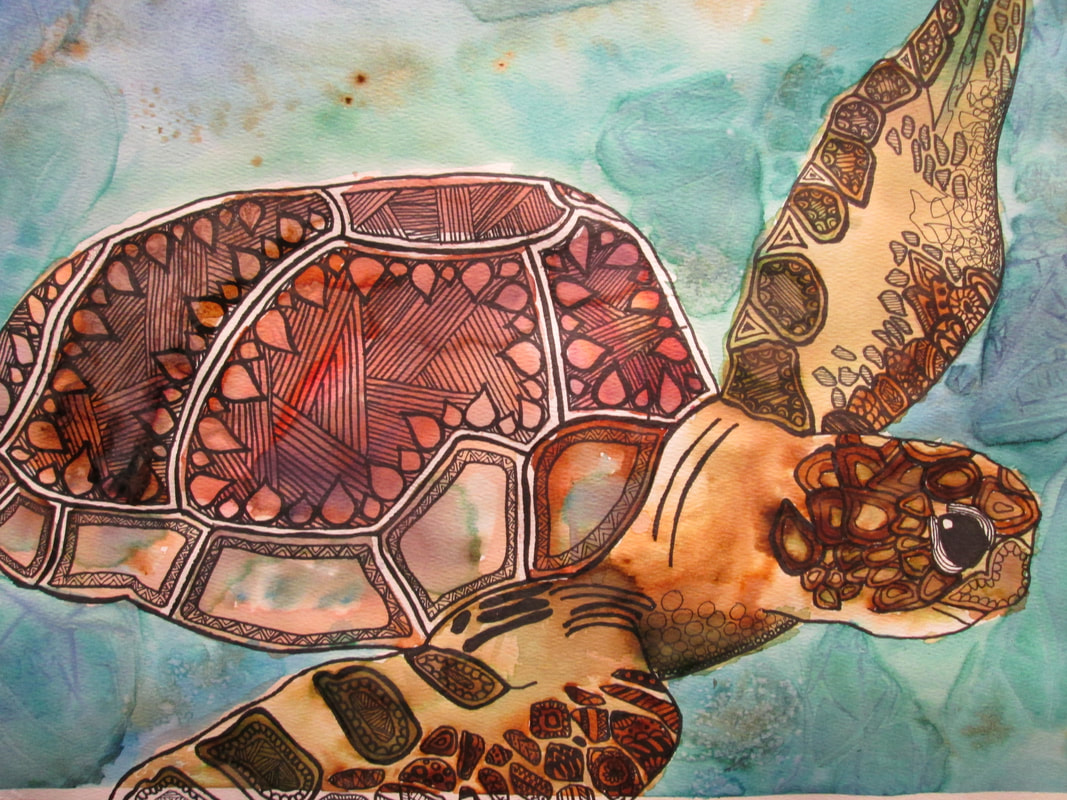
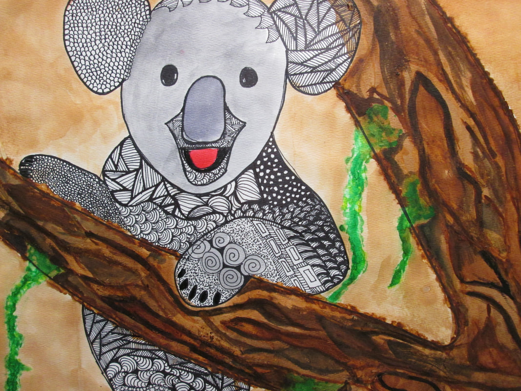
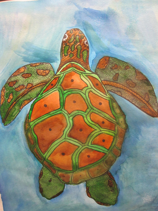
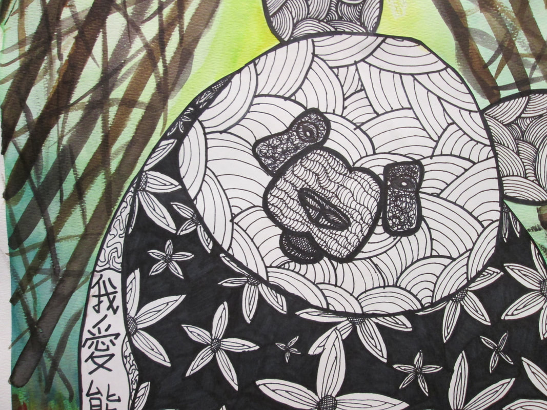
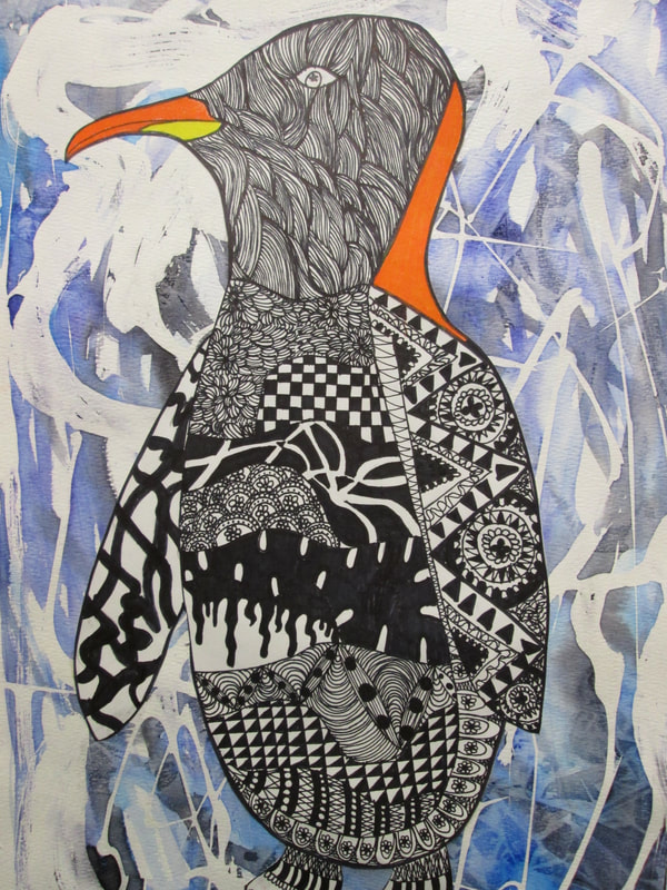
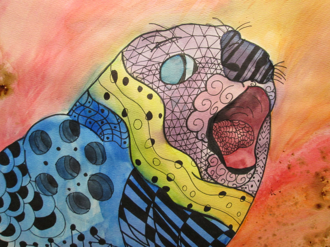
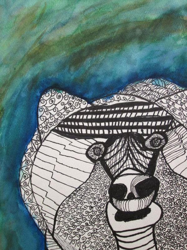
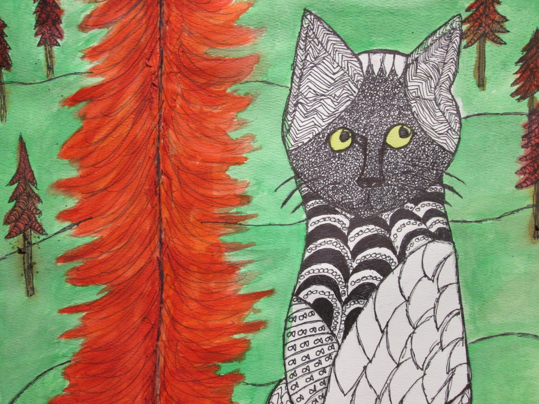
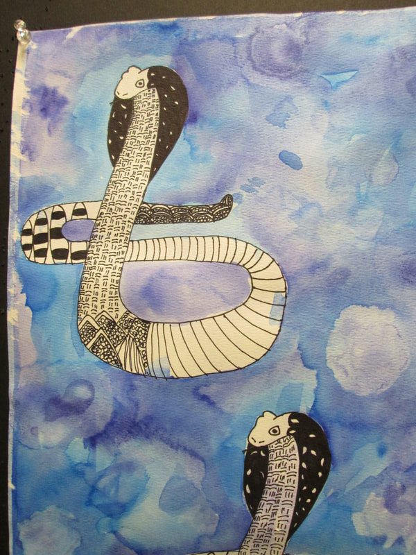
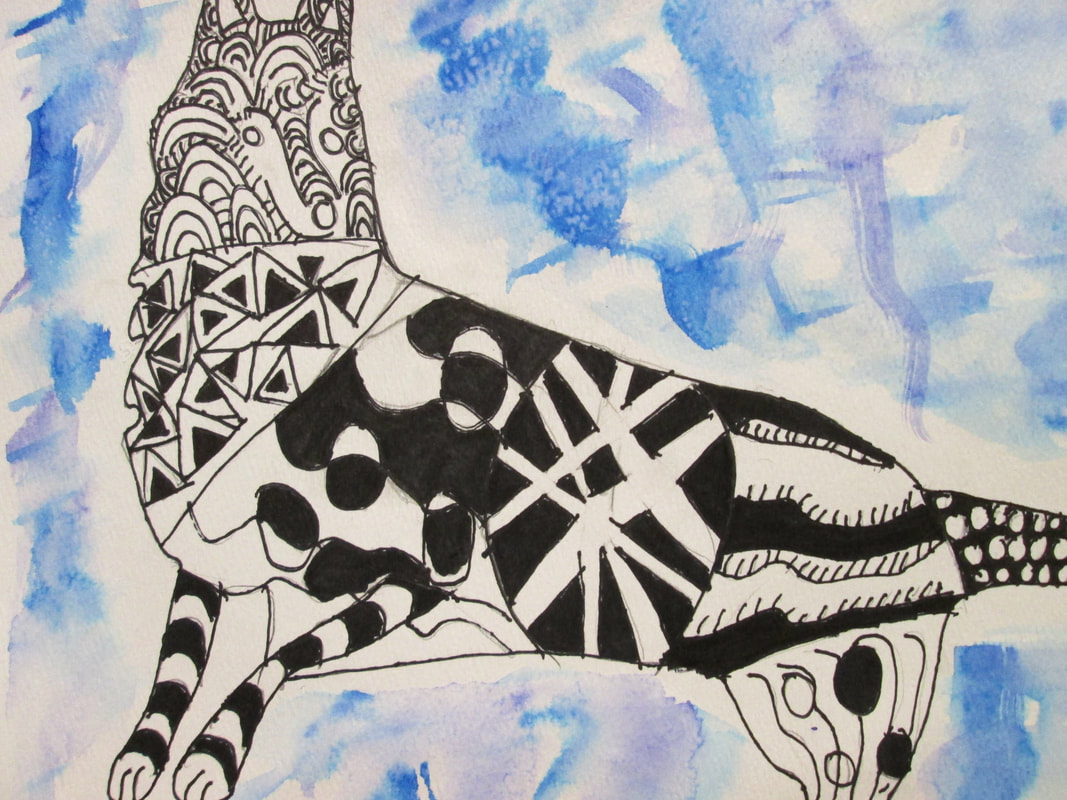
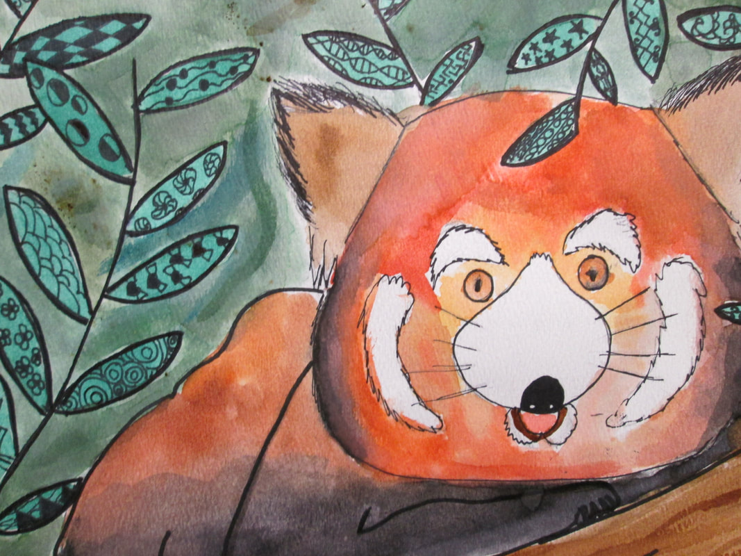
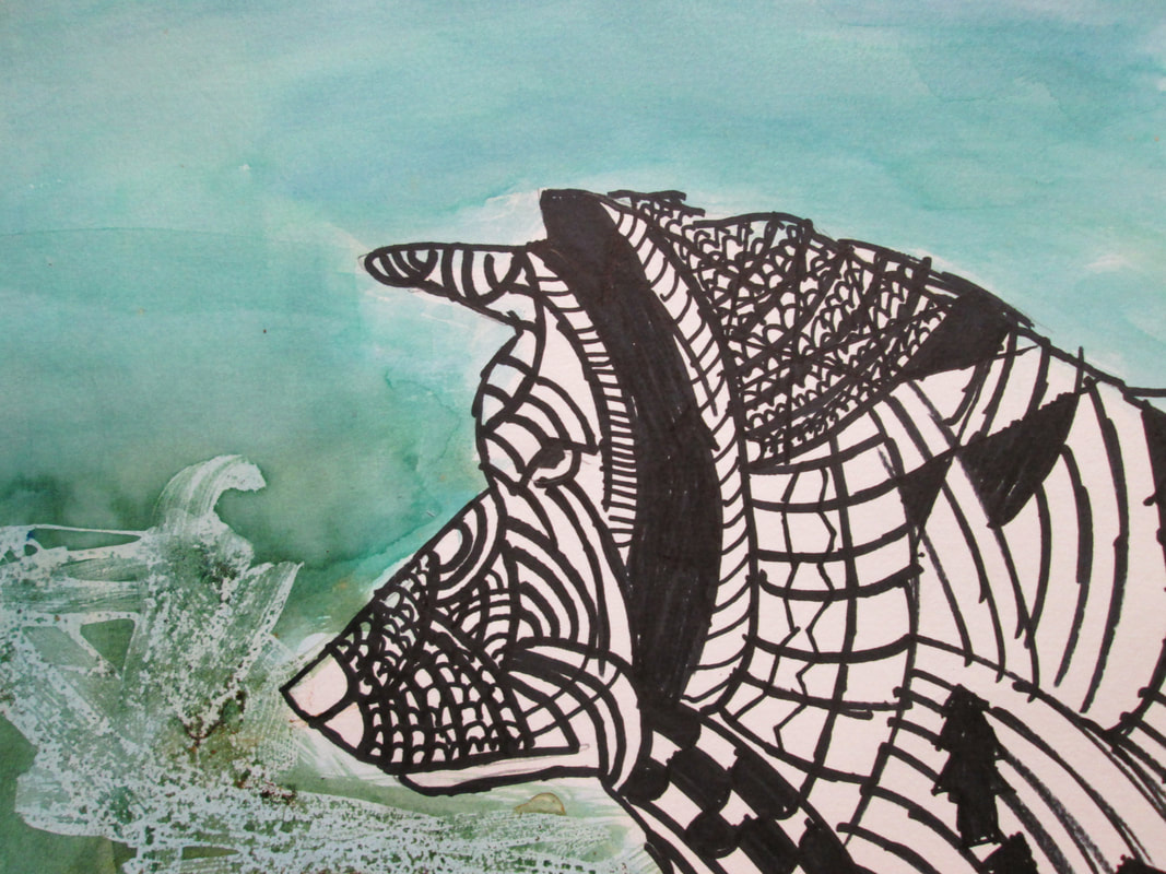
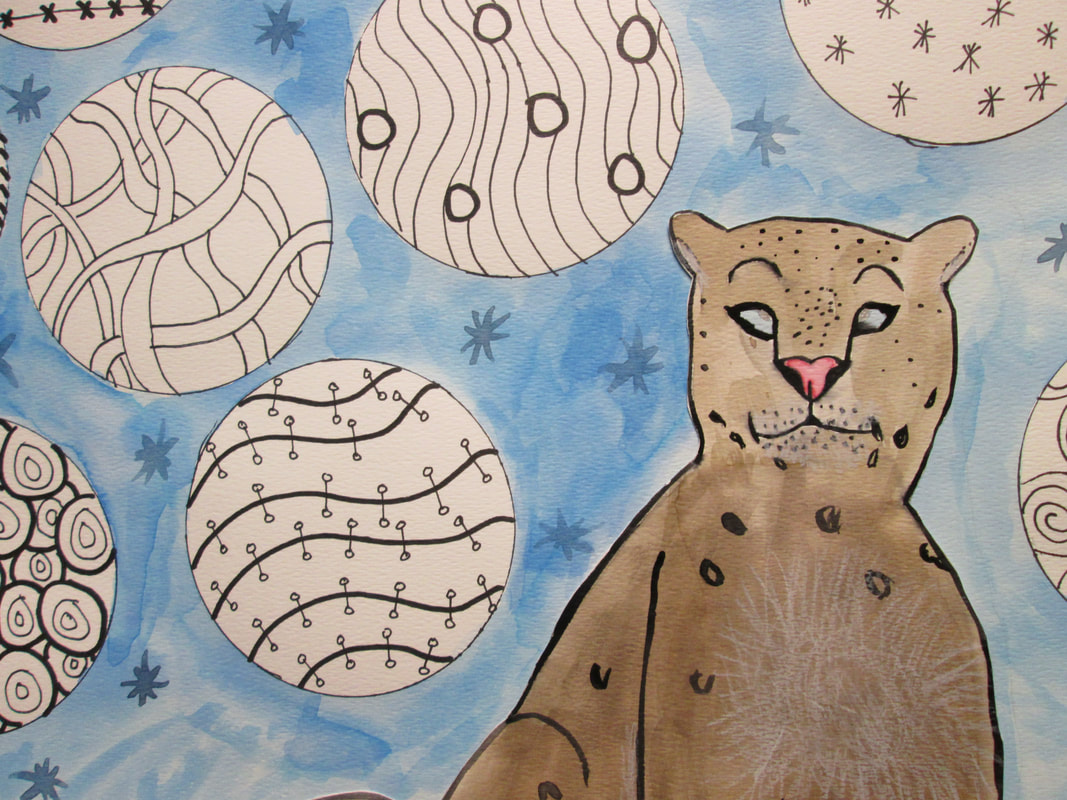
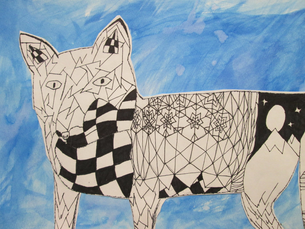
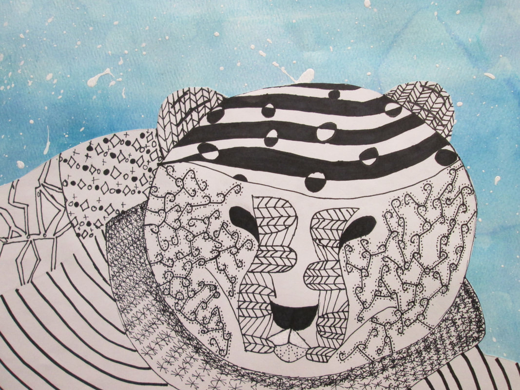
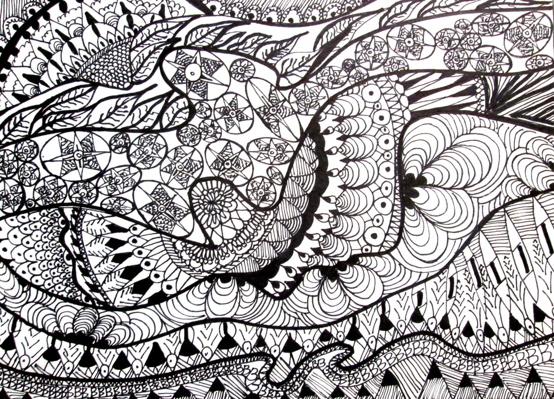
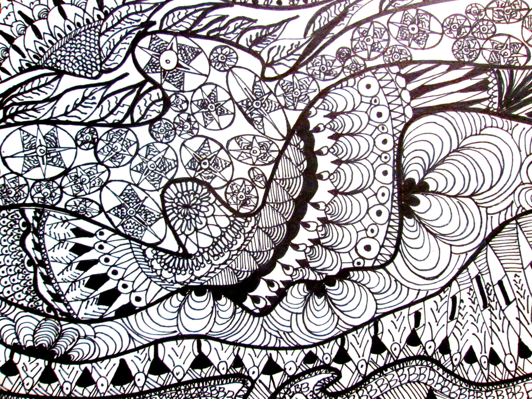
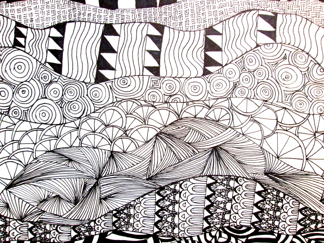
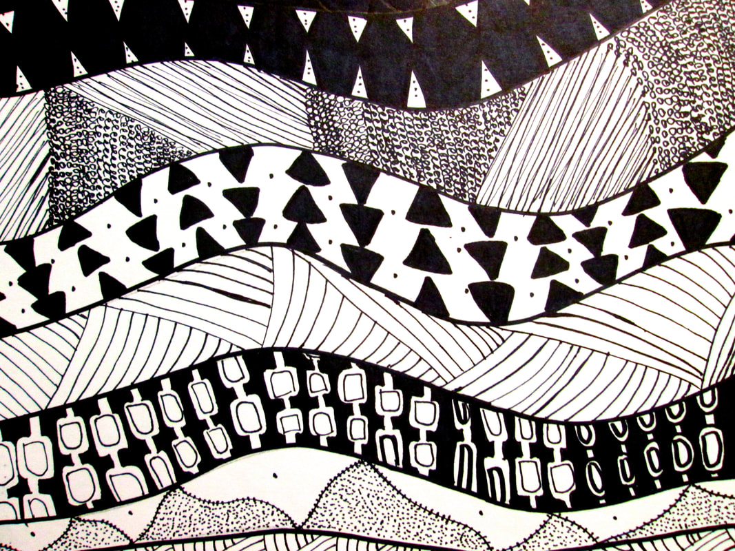
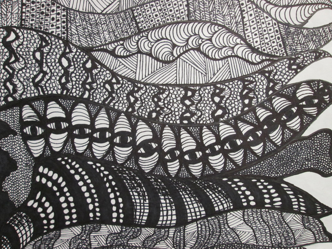
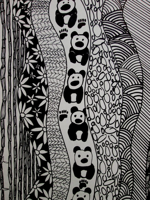
ZENIMALS
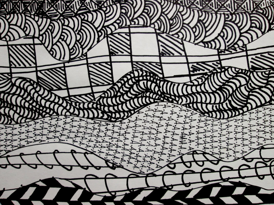
Line Dancing ? No.. Ink Line Designs
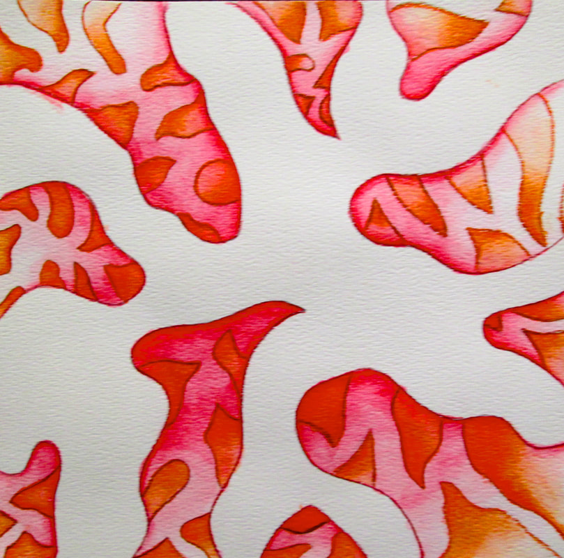
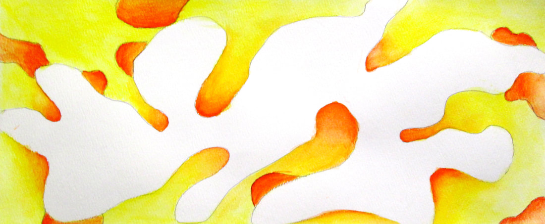
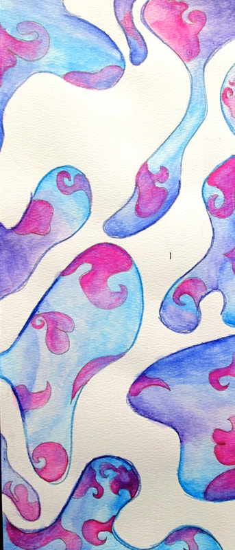
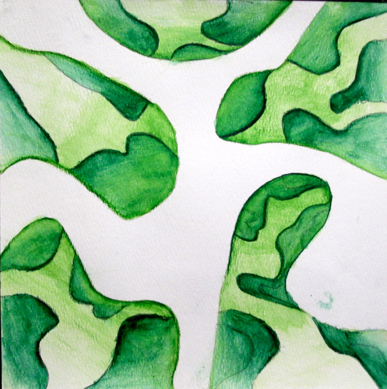
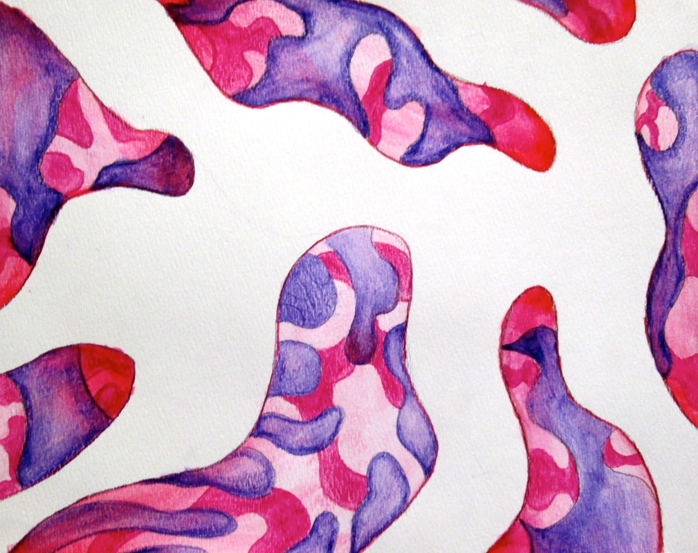
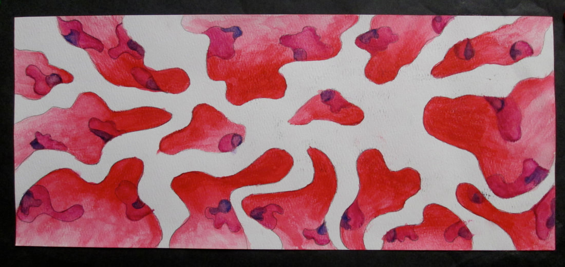
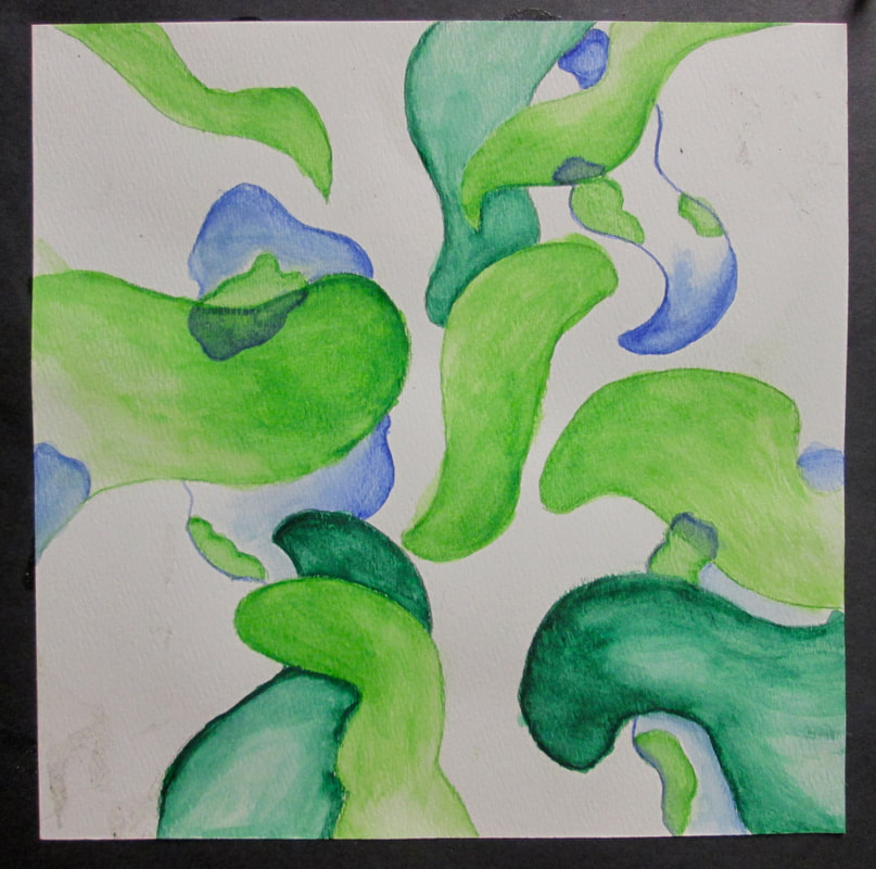
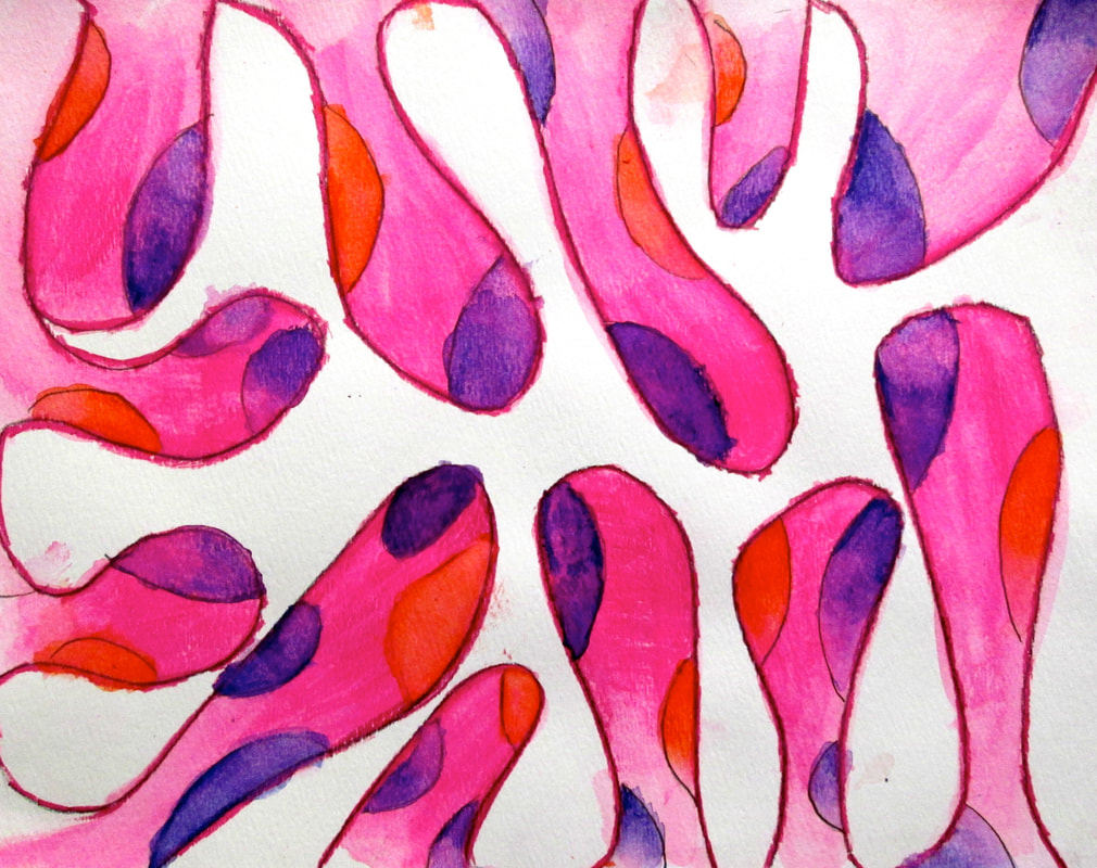
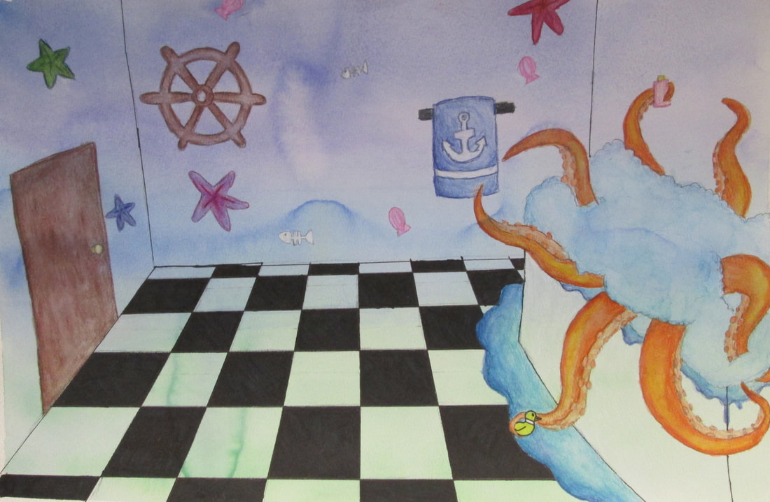
Watercolor Layered Vignettes...

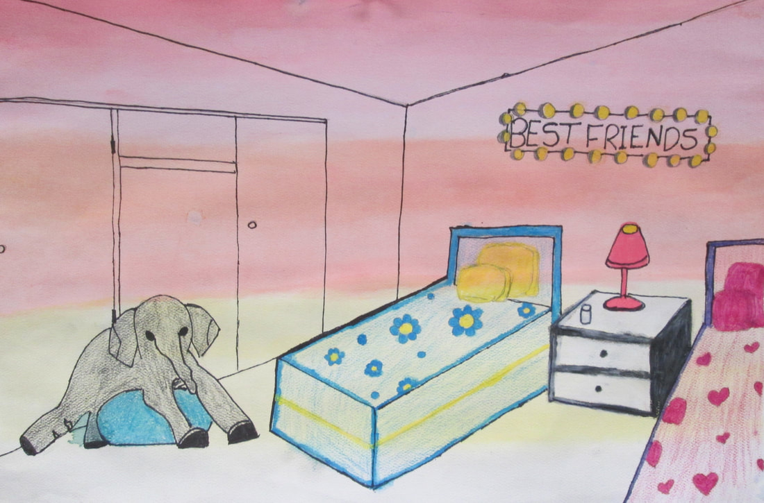
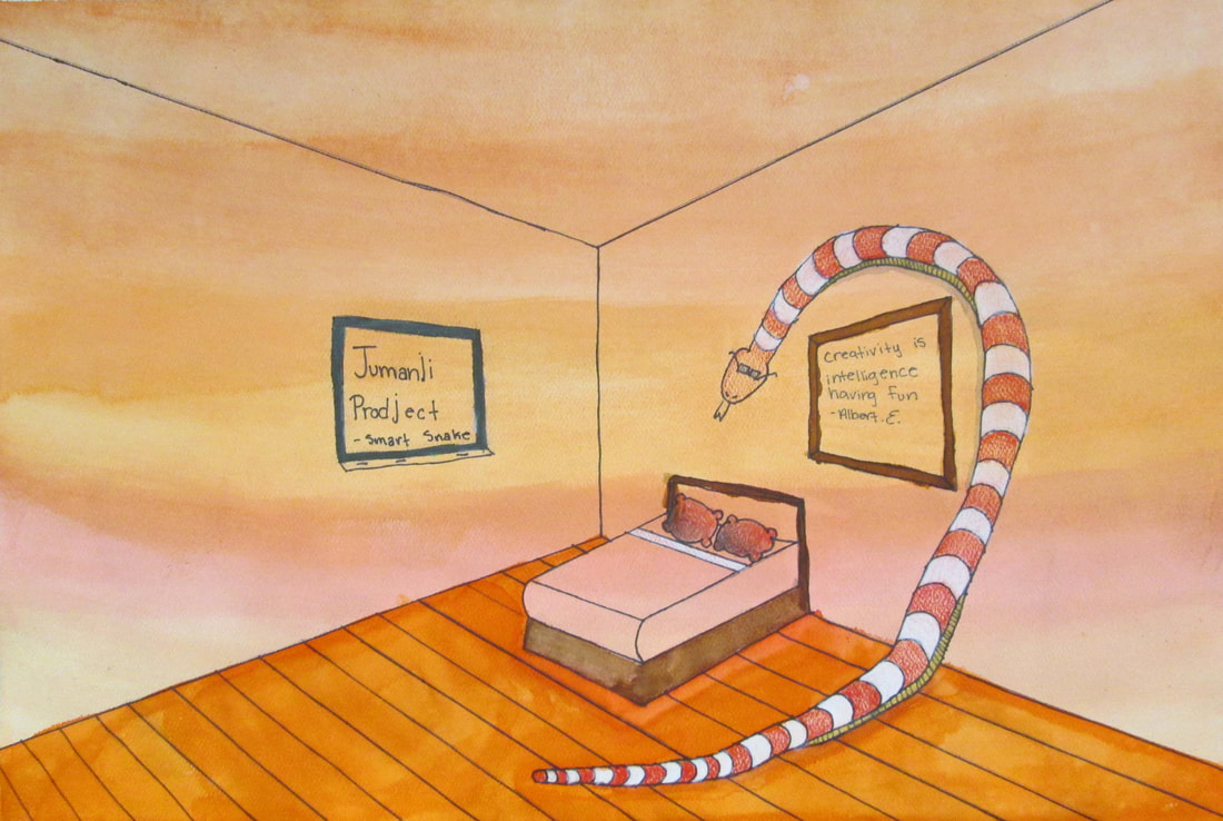
2017-18 Student Portfolio of Artwork
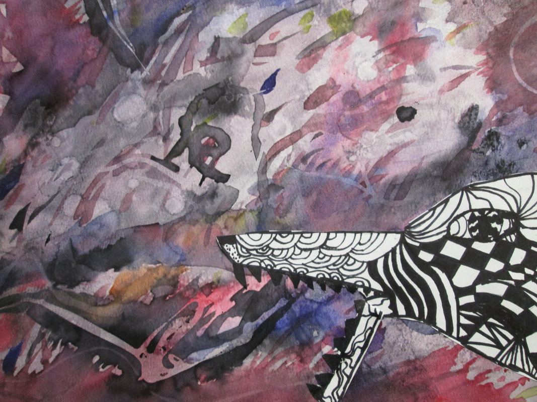
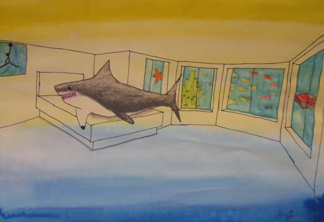
Jumanji
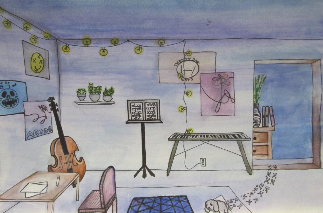
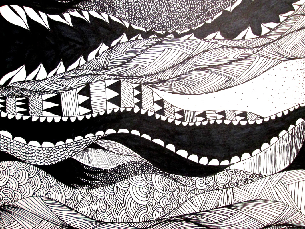
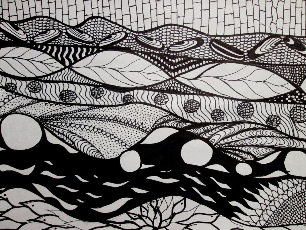
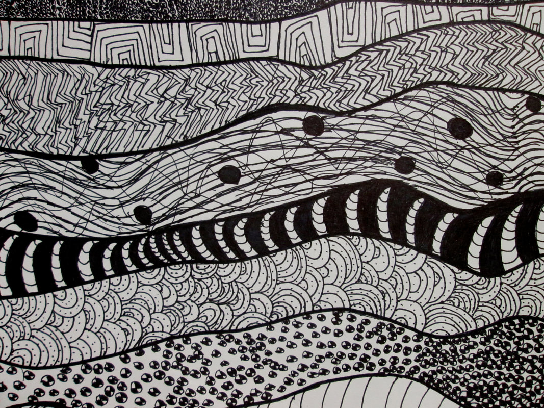
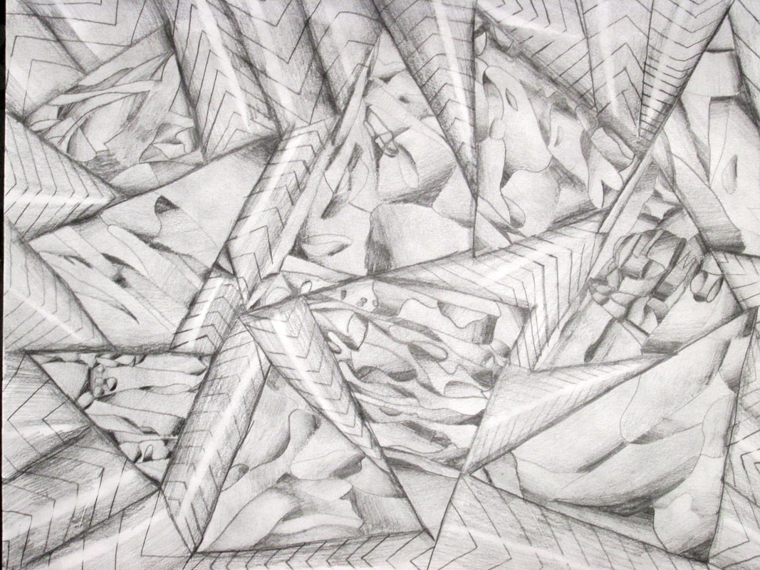
Monochromatic Layered- scapes
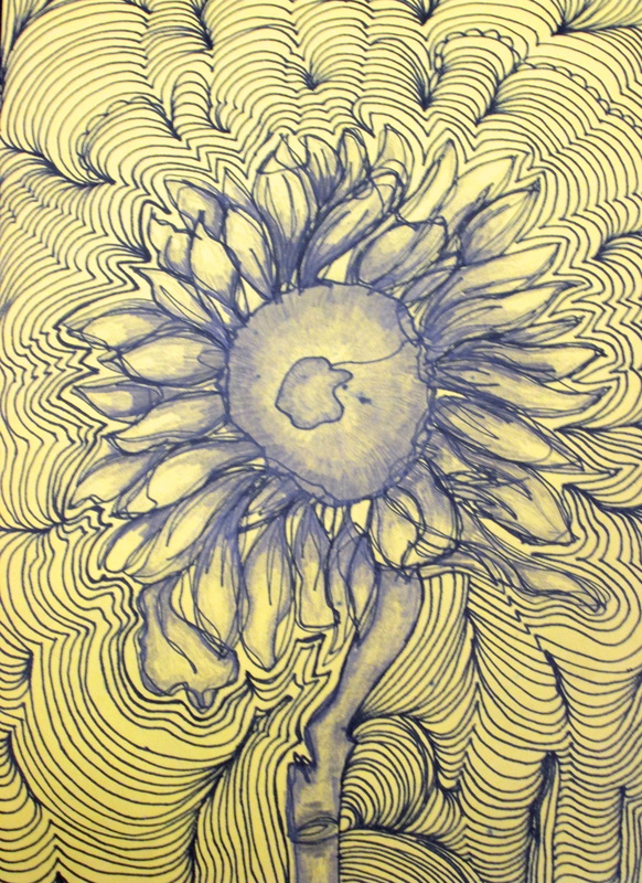
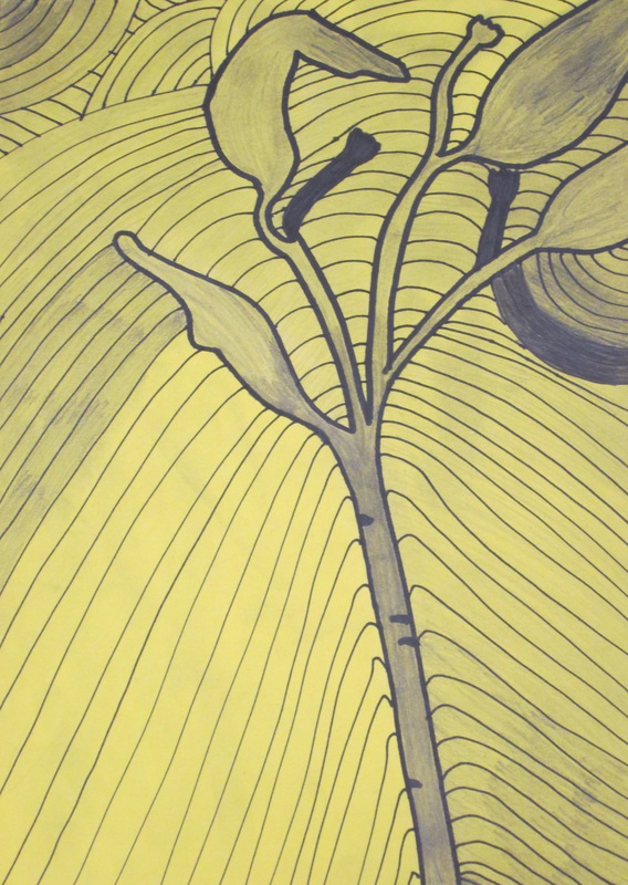
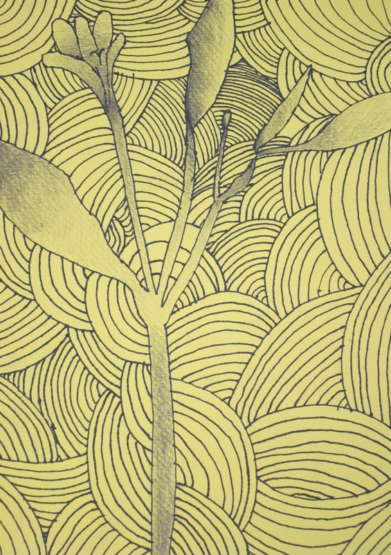
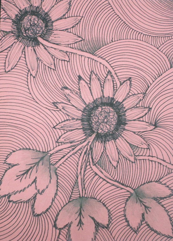
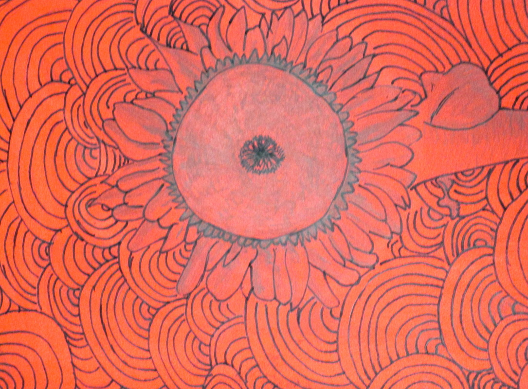
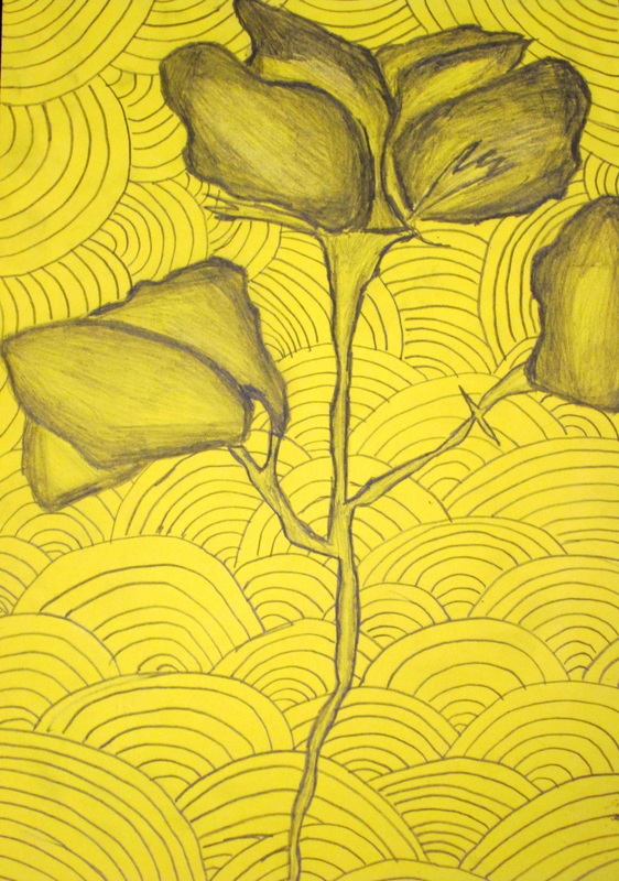
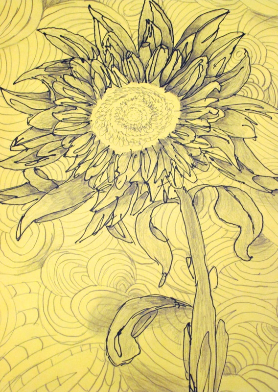
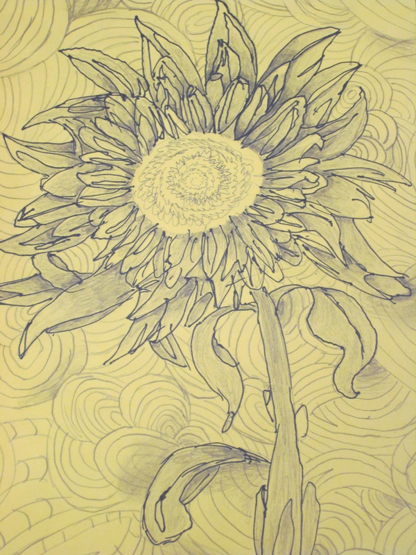
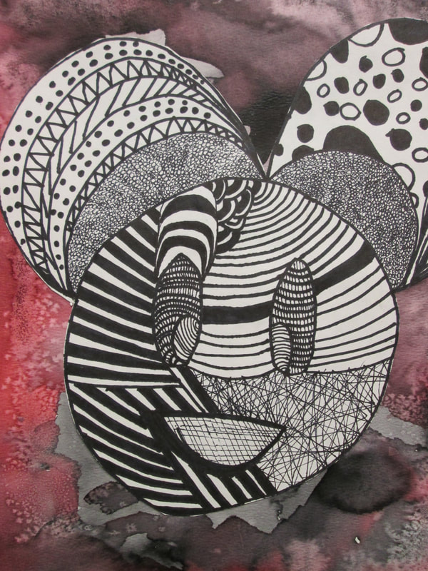
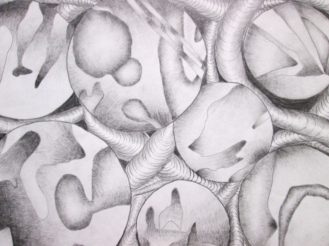
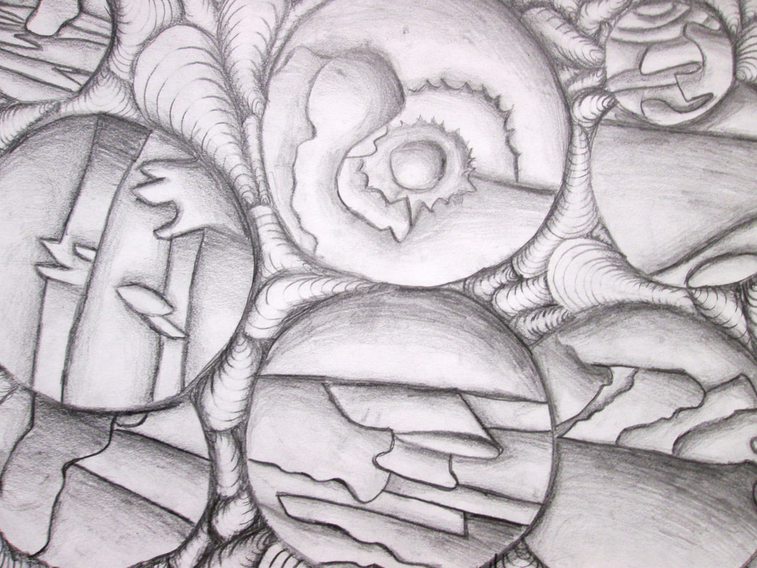
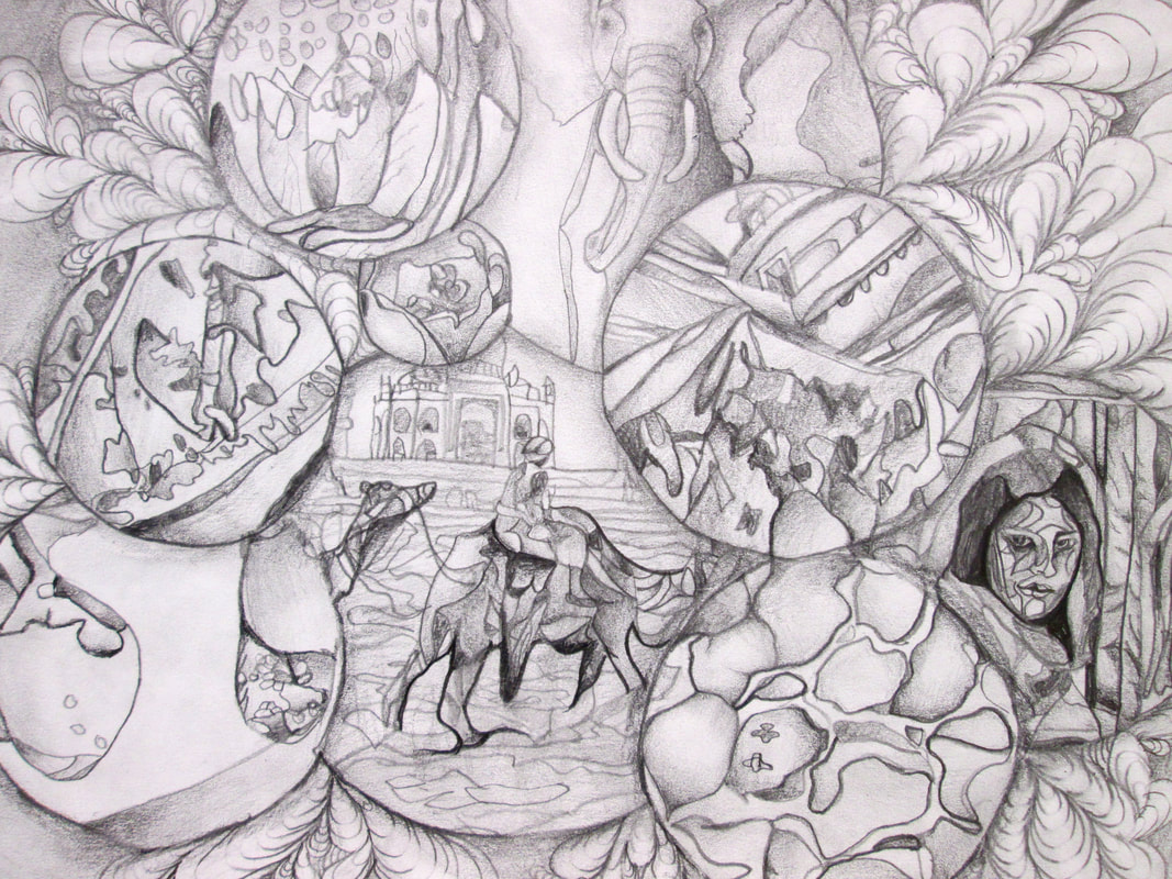
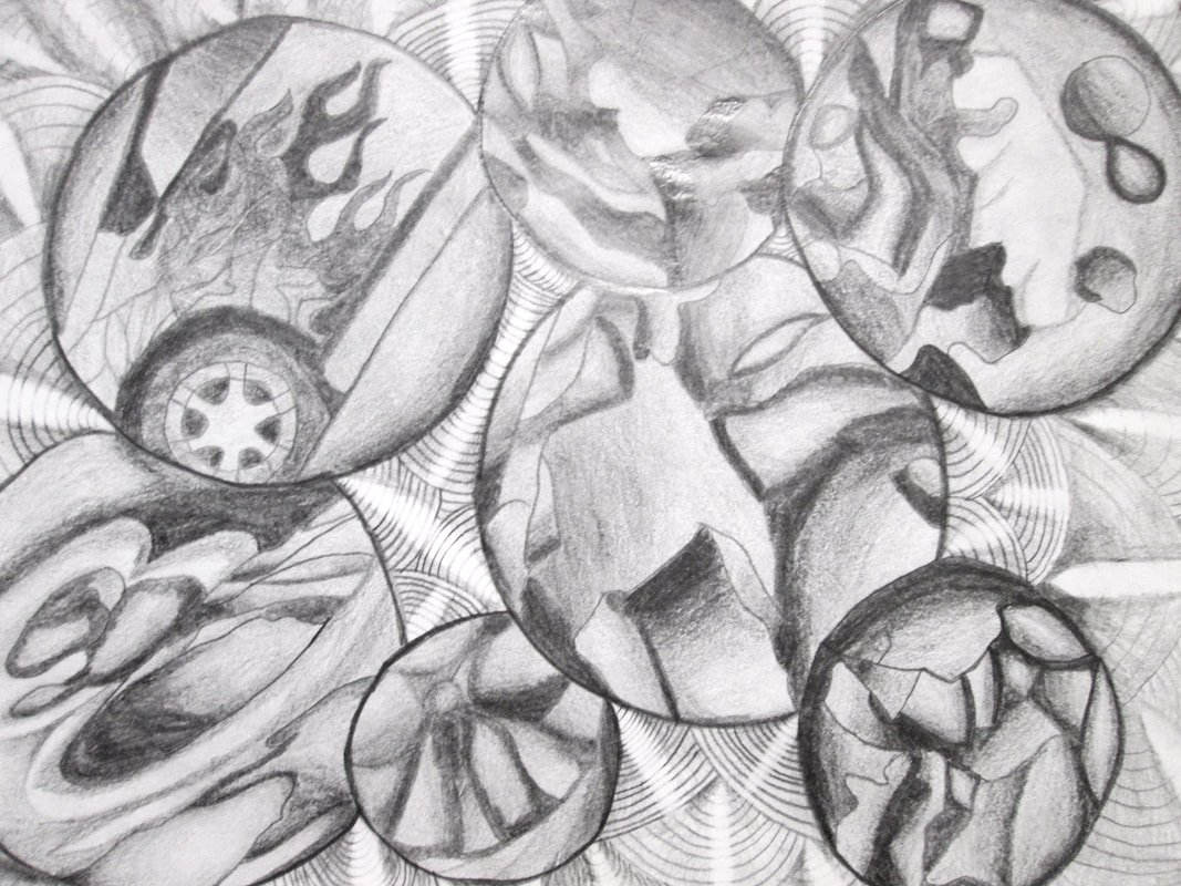
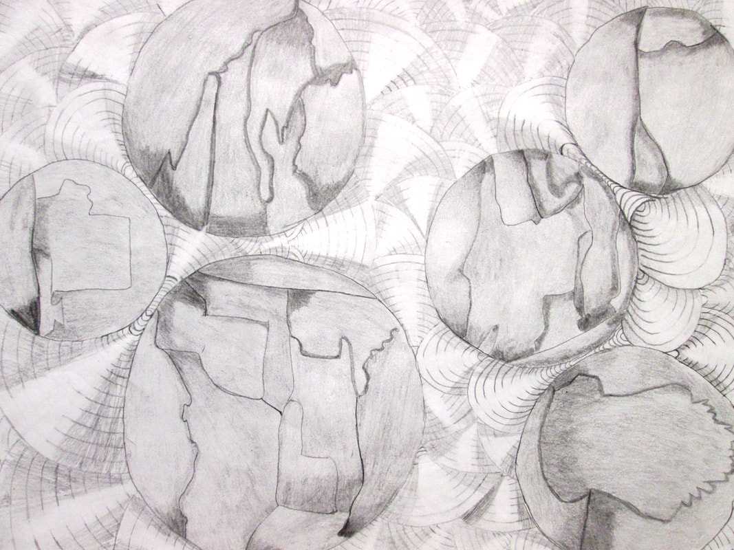
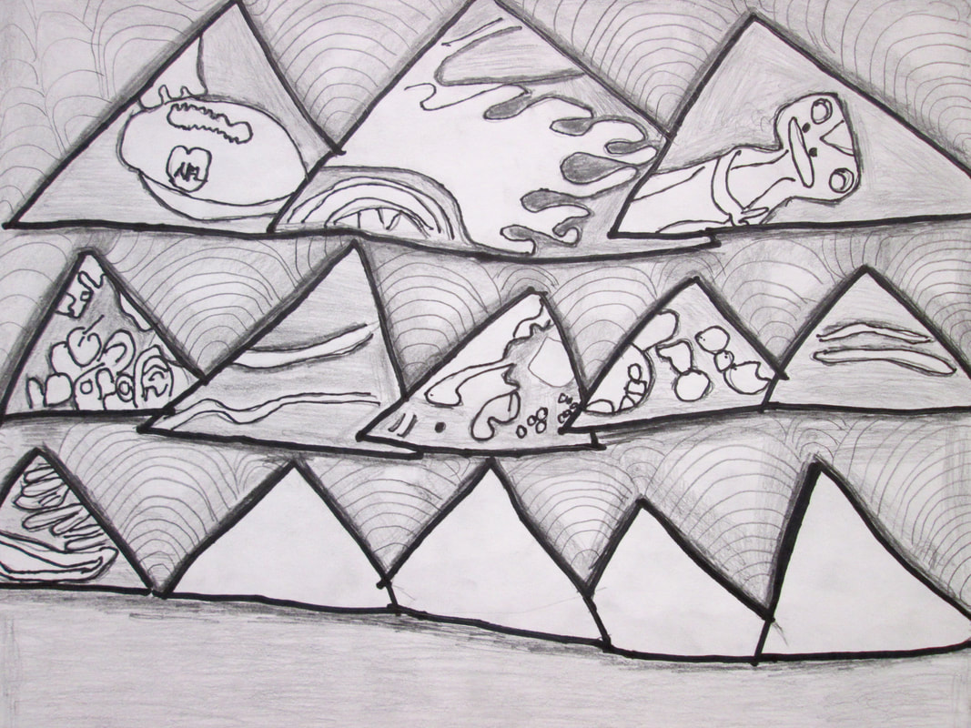
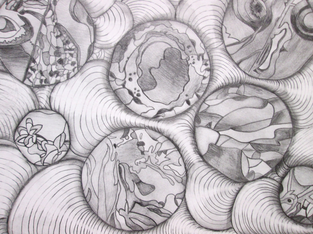
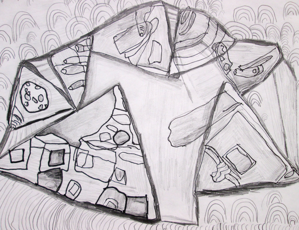
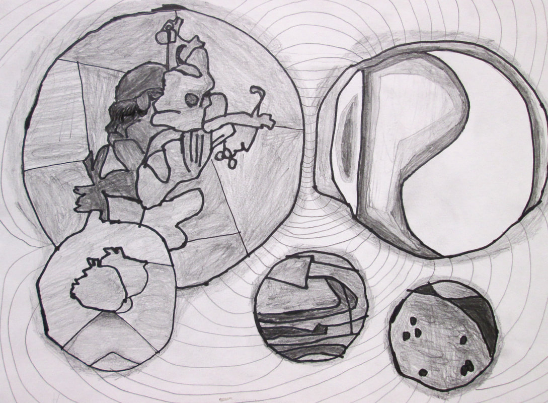
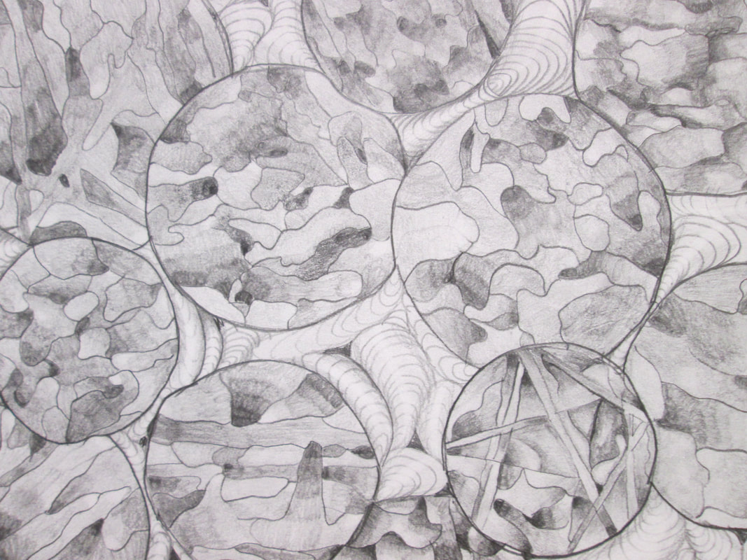
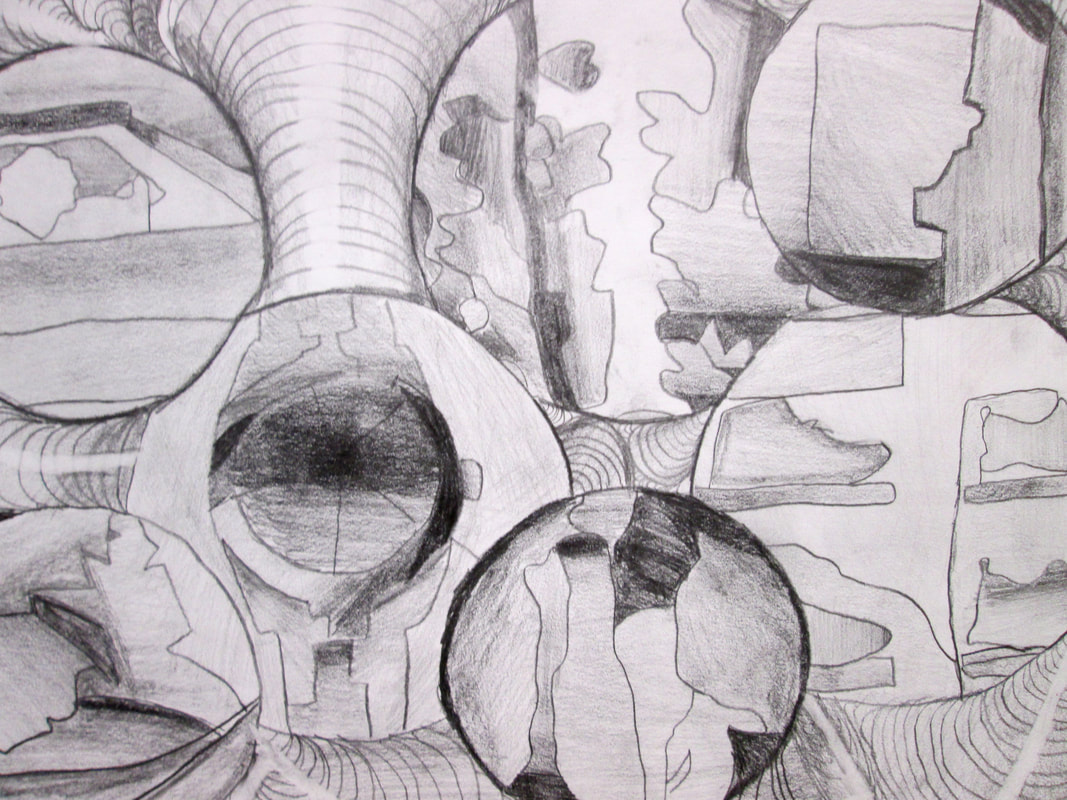
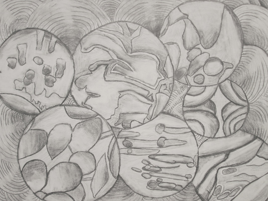
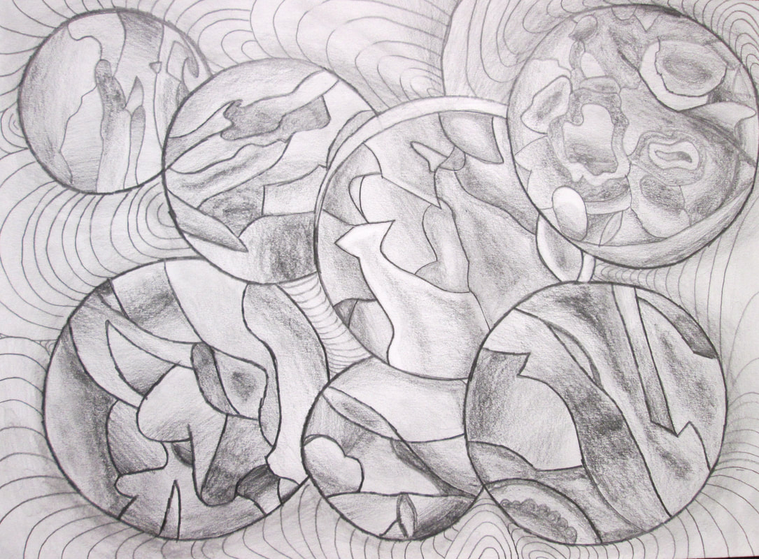
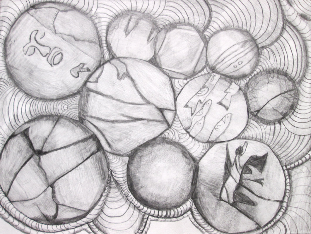
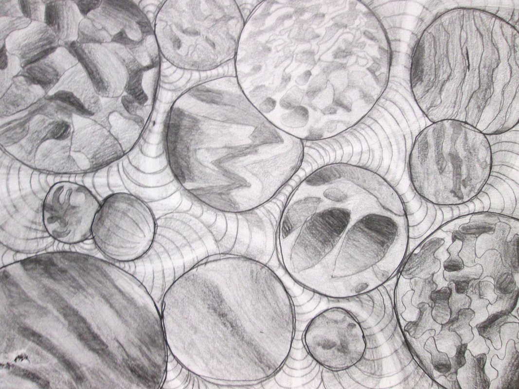
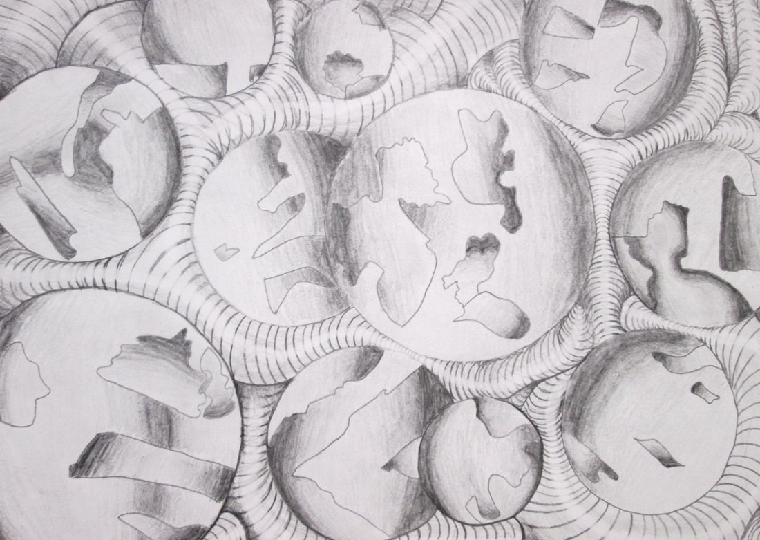
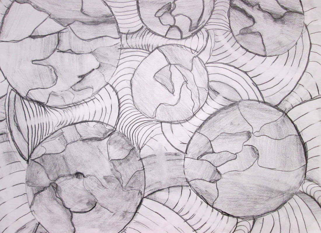
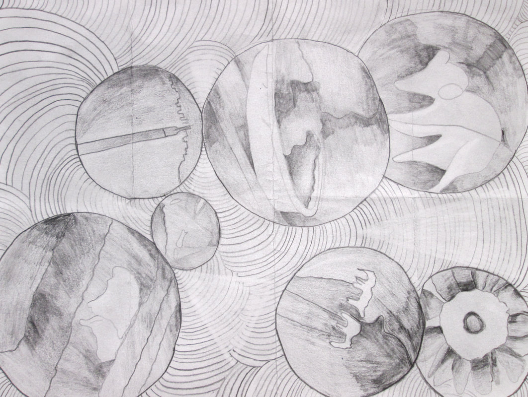
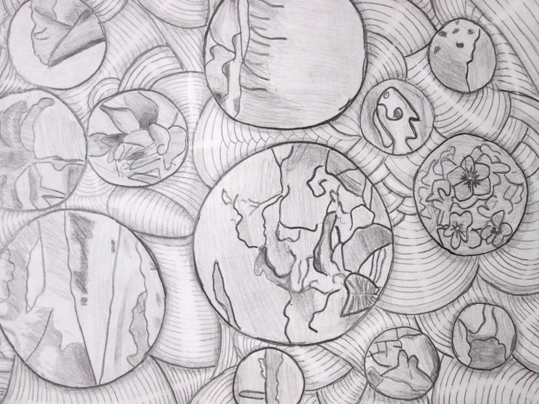
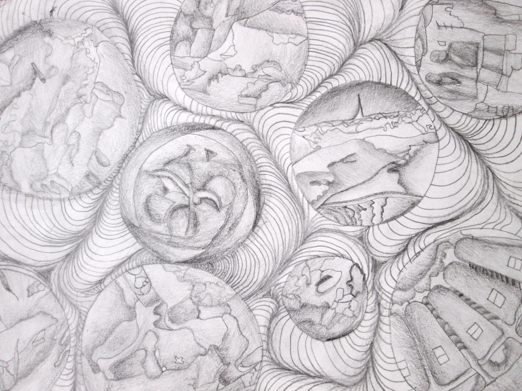
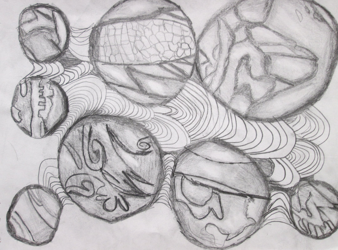
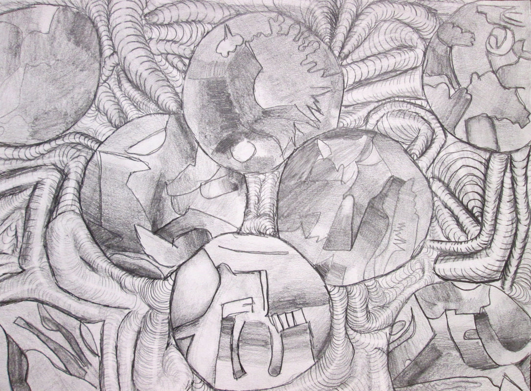
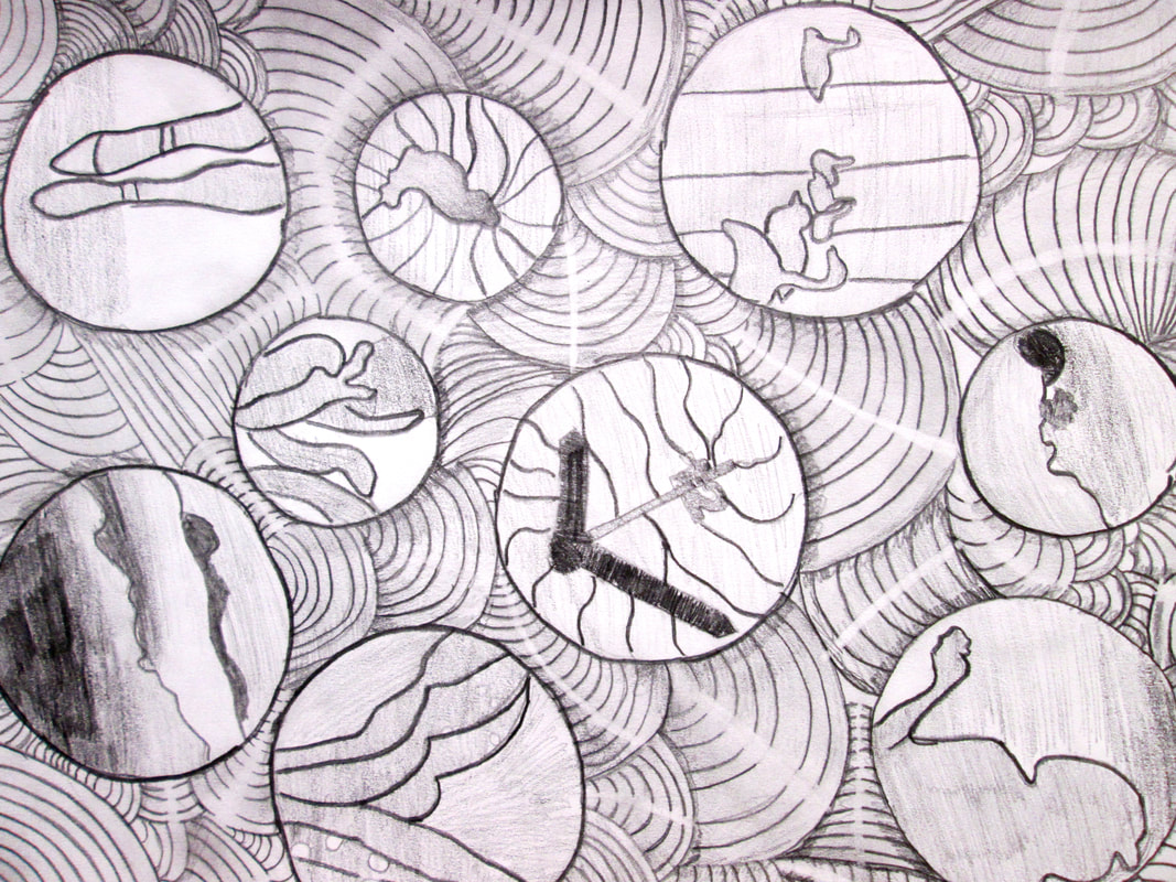
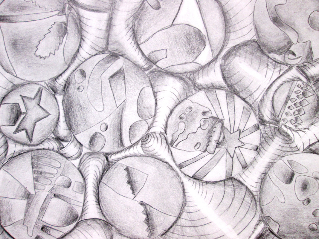
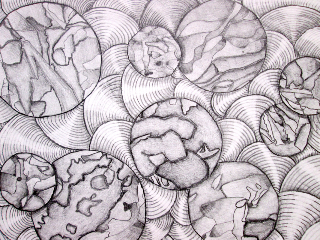
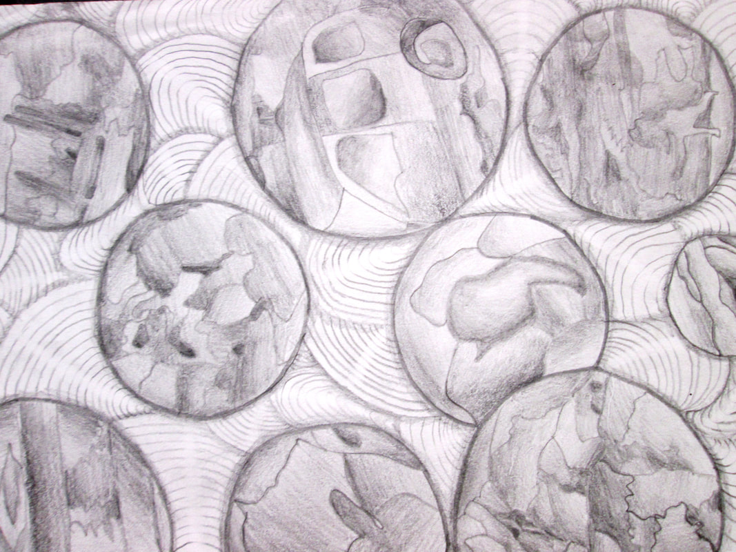
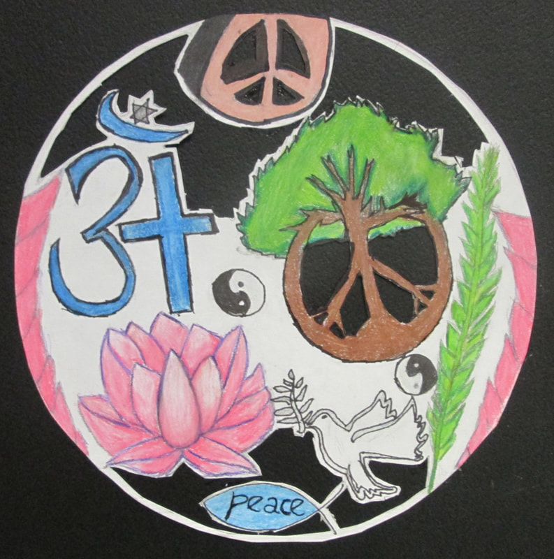
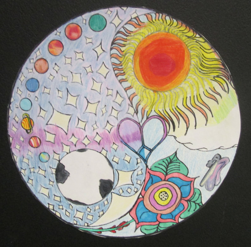
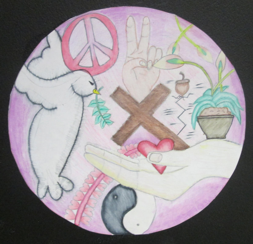
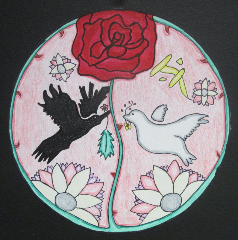
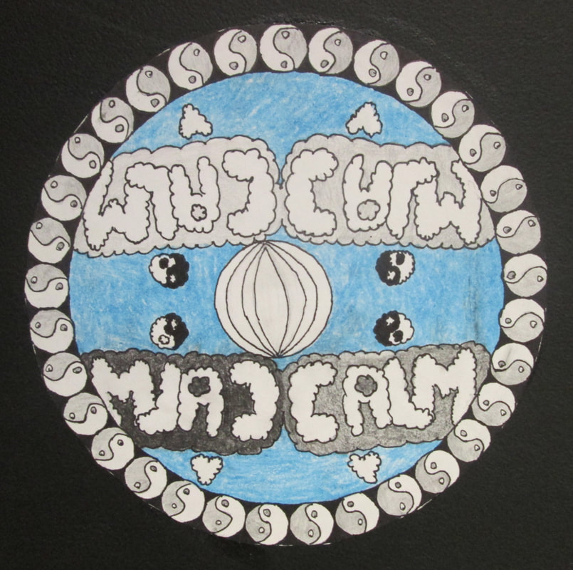
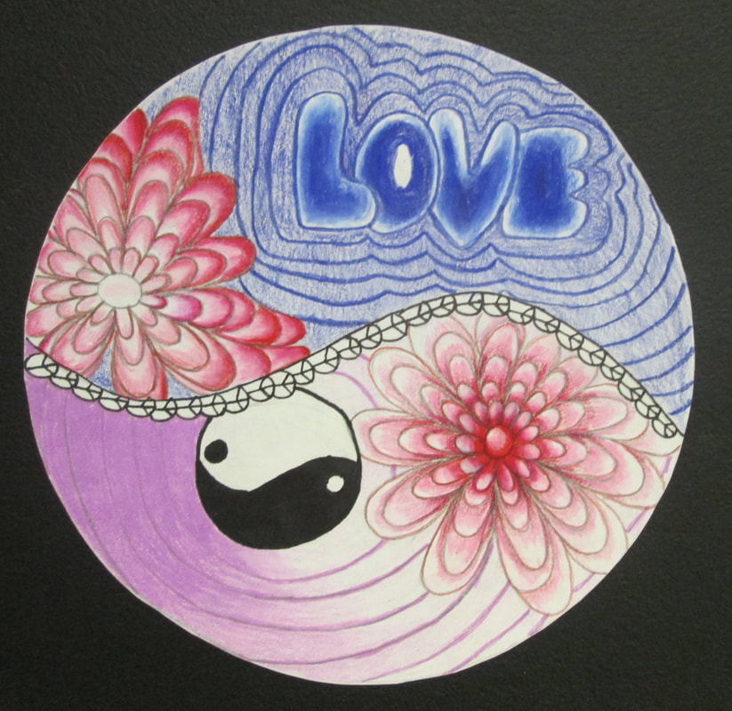
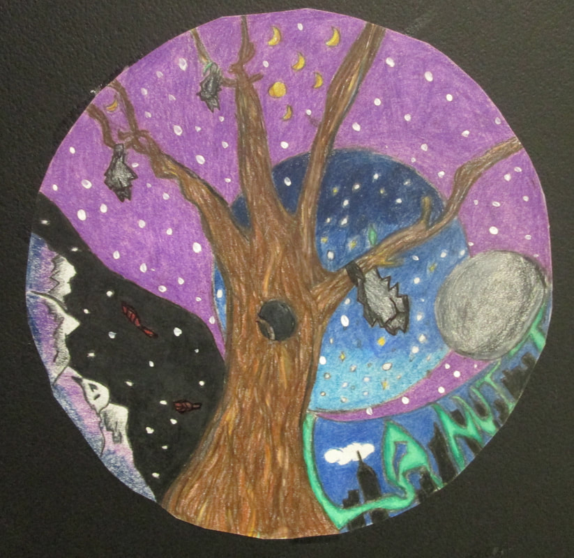
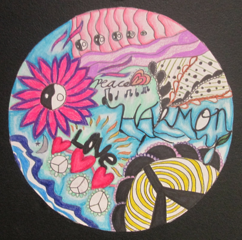
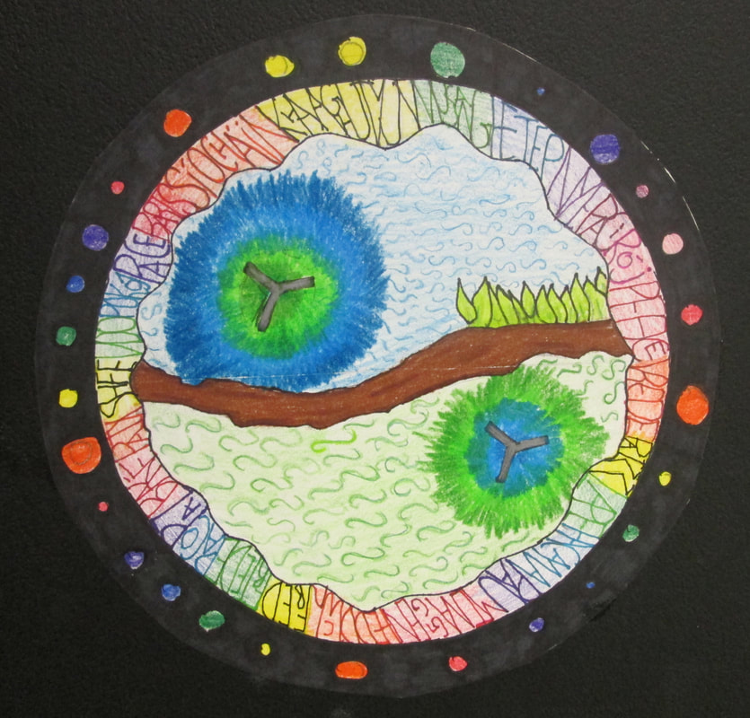
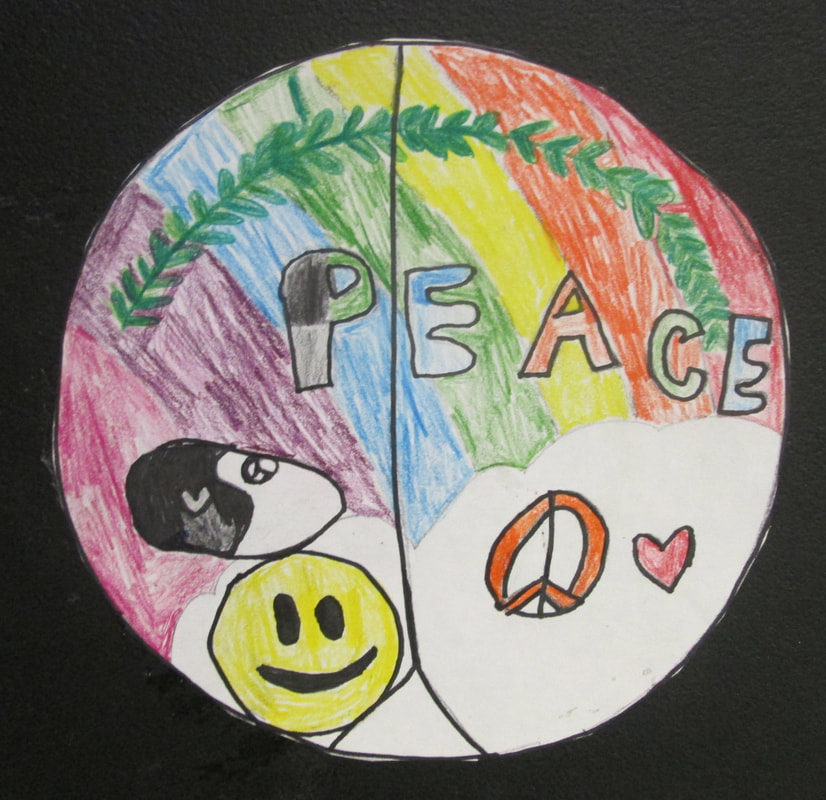
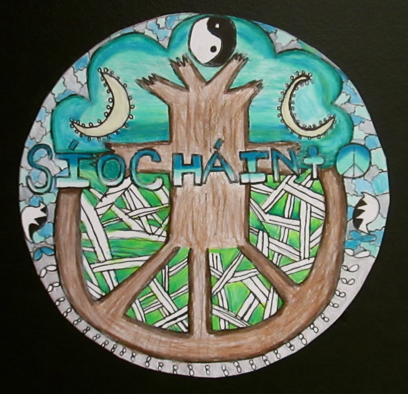
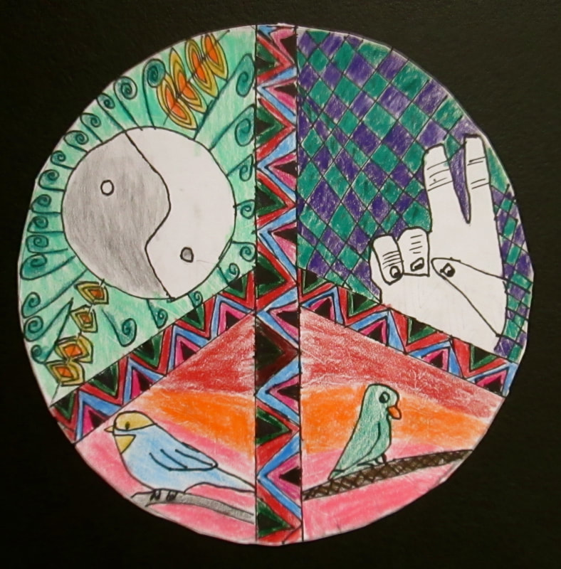
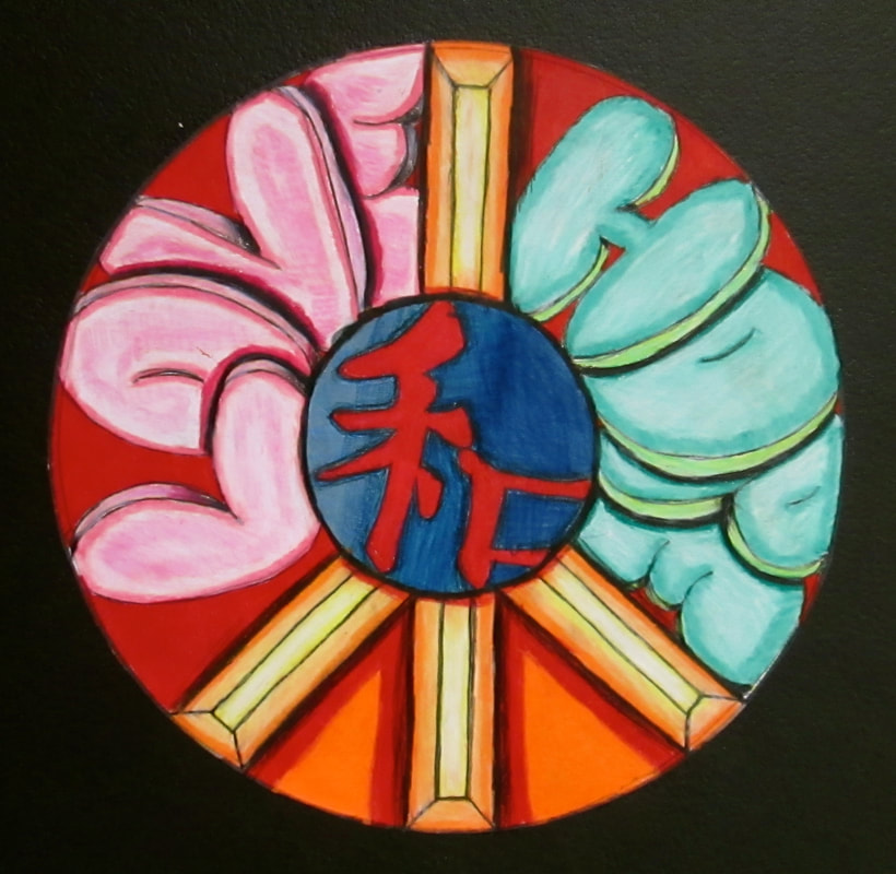
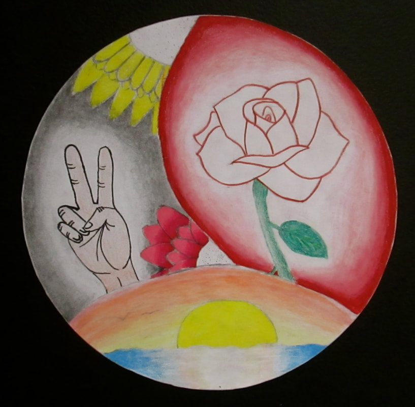
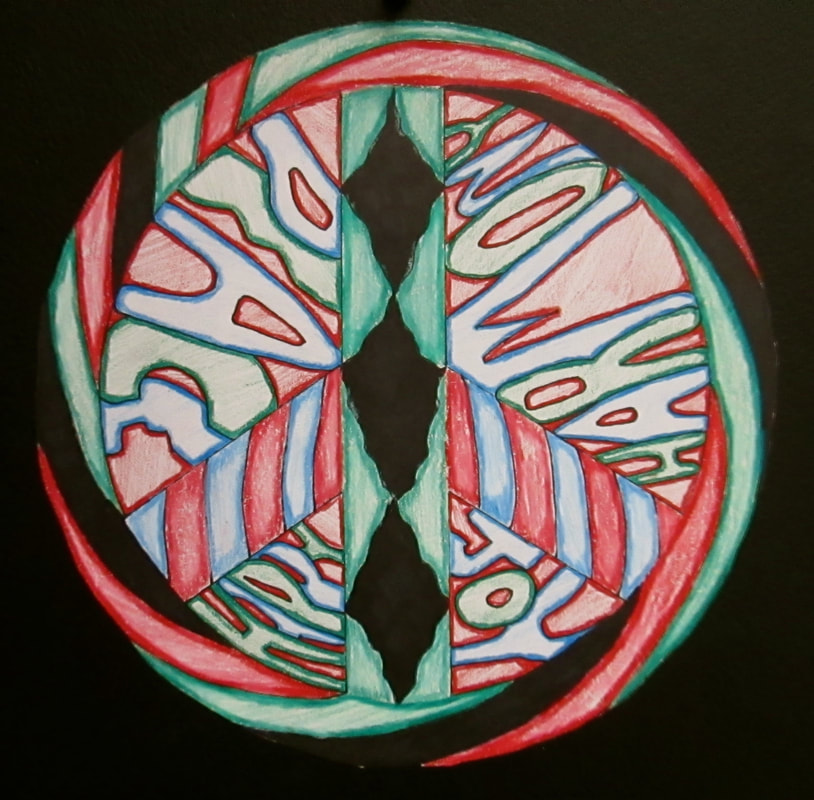
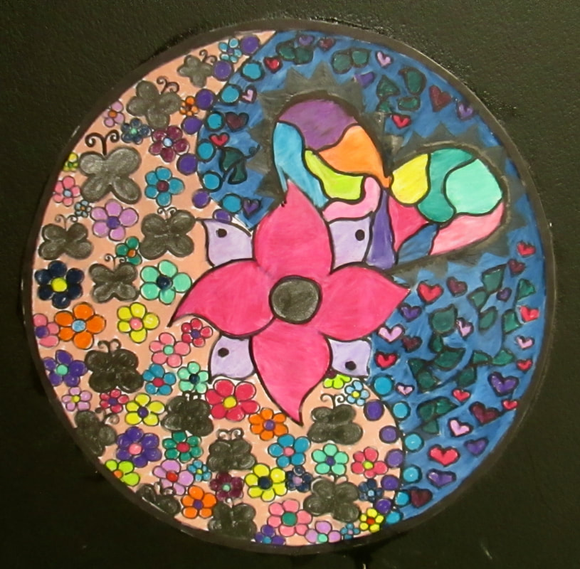
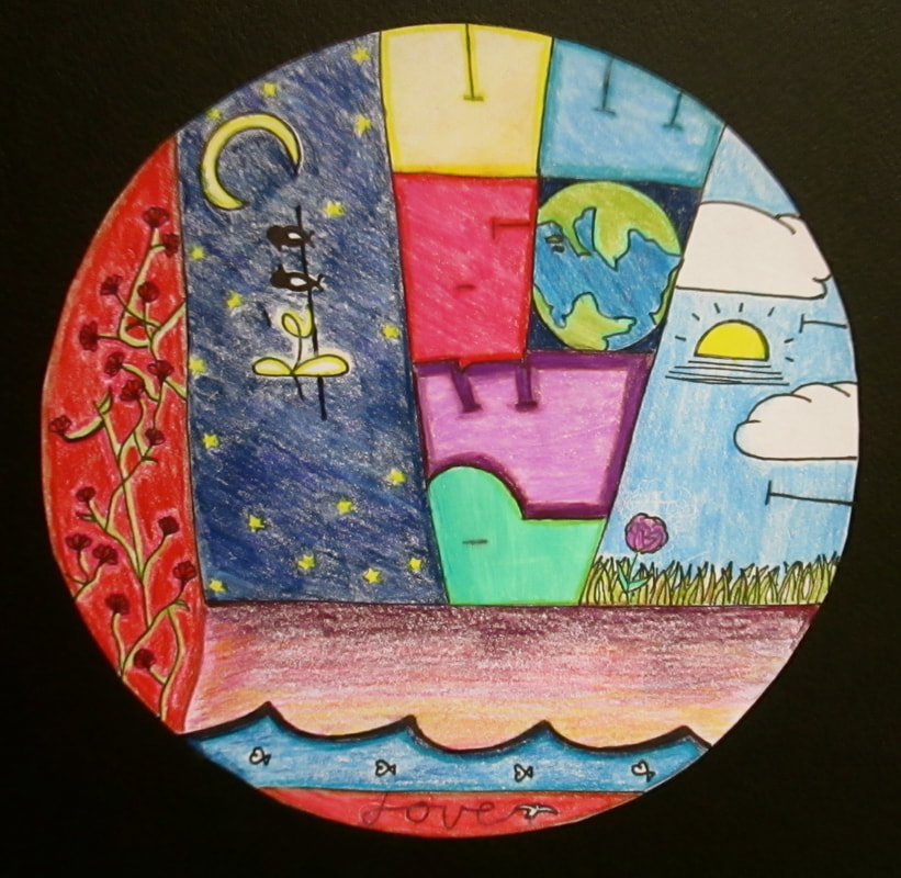
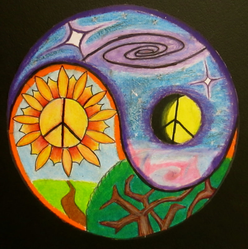
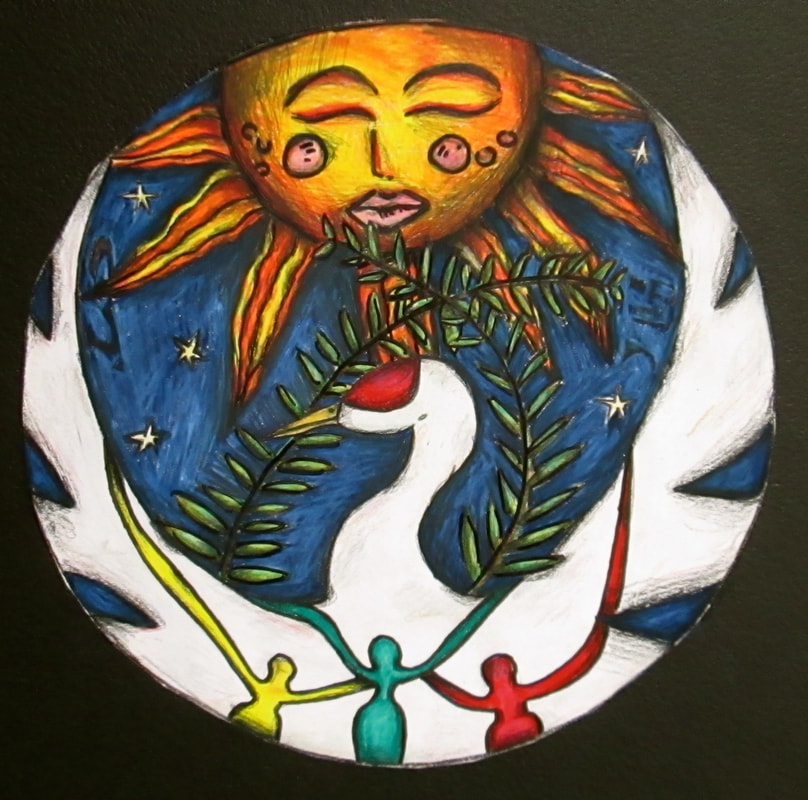
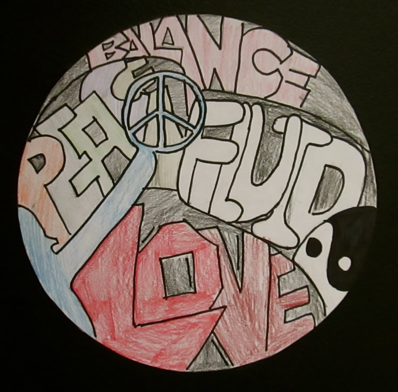
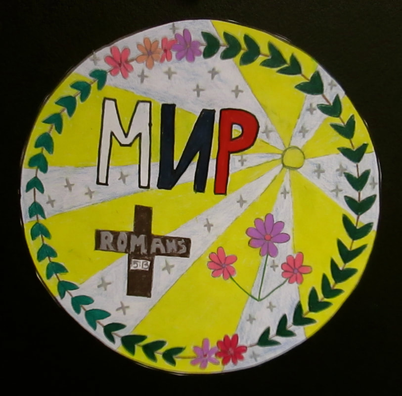
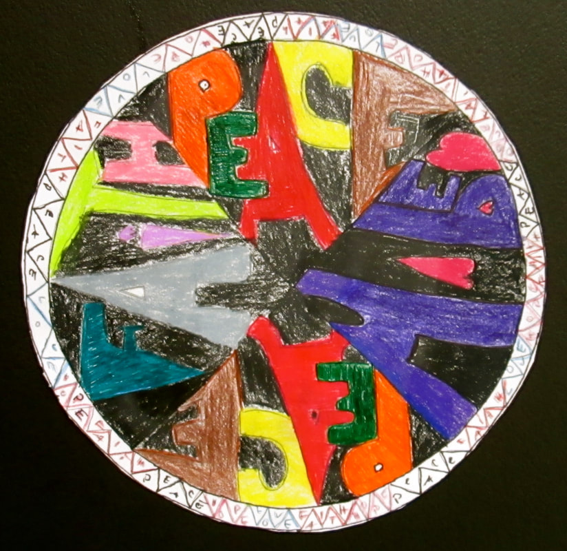
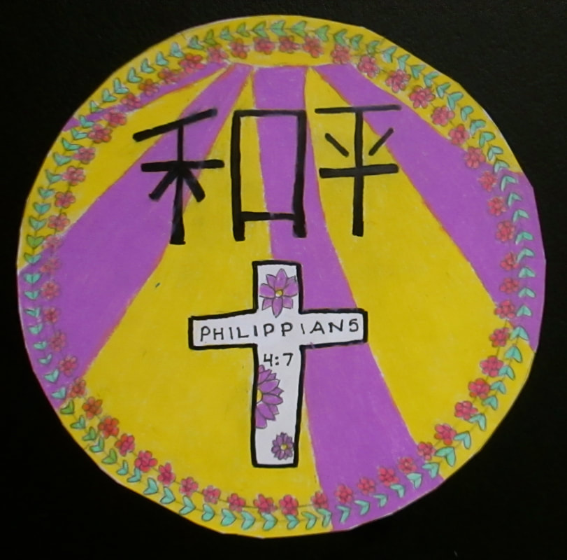
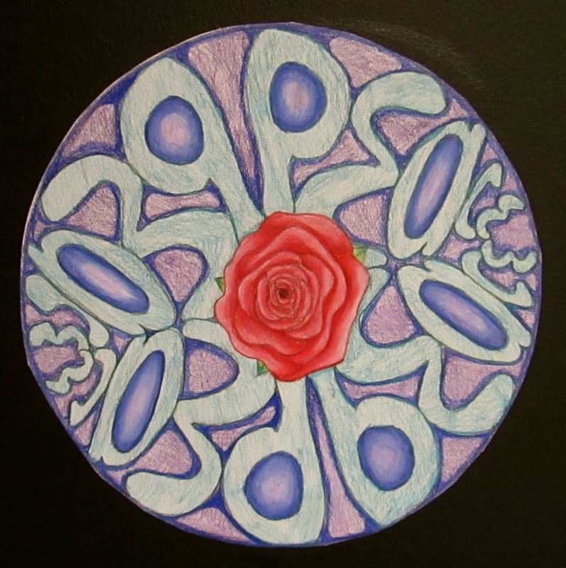
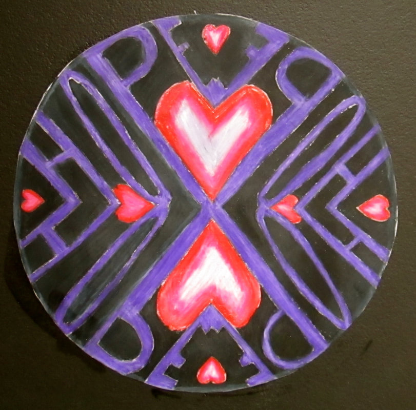
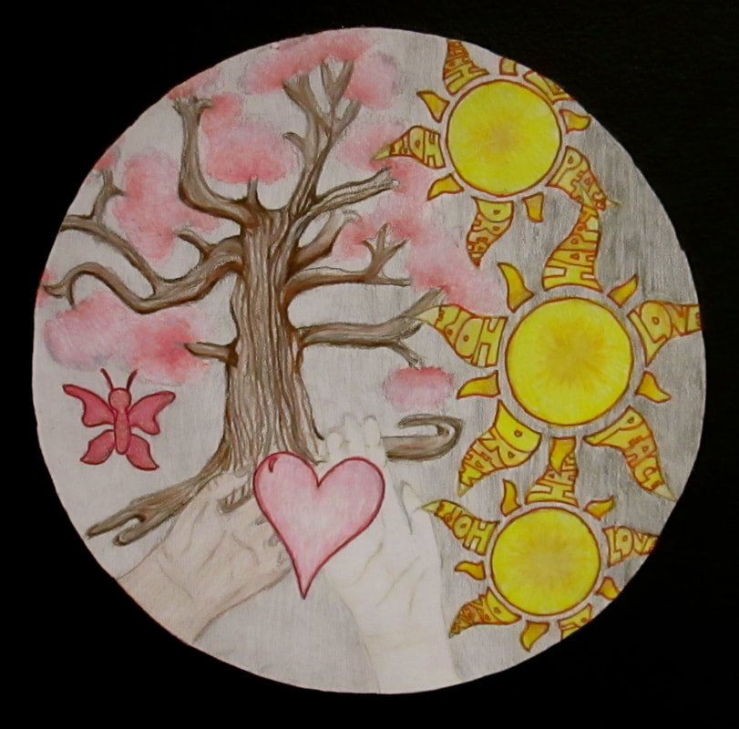
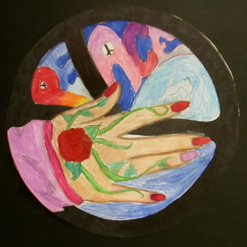
Circles of Peace
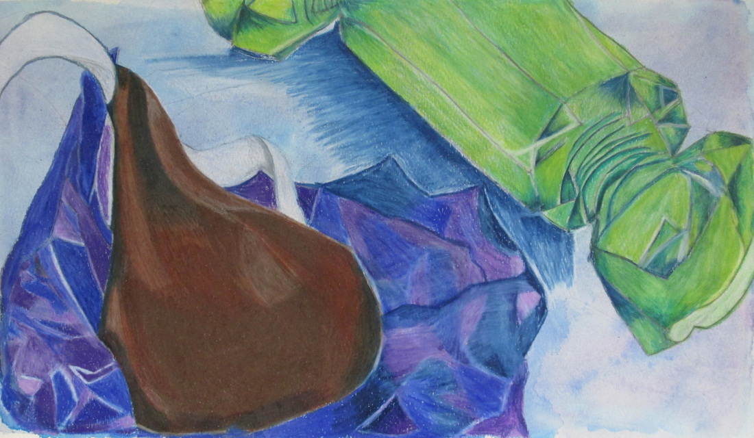
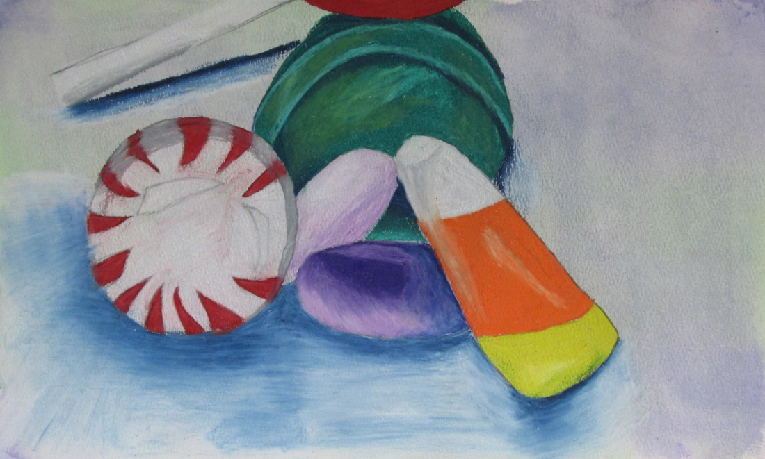
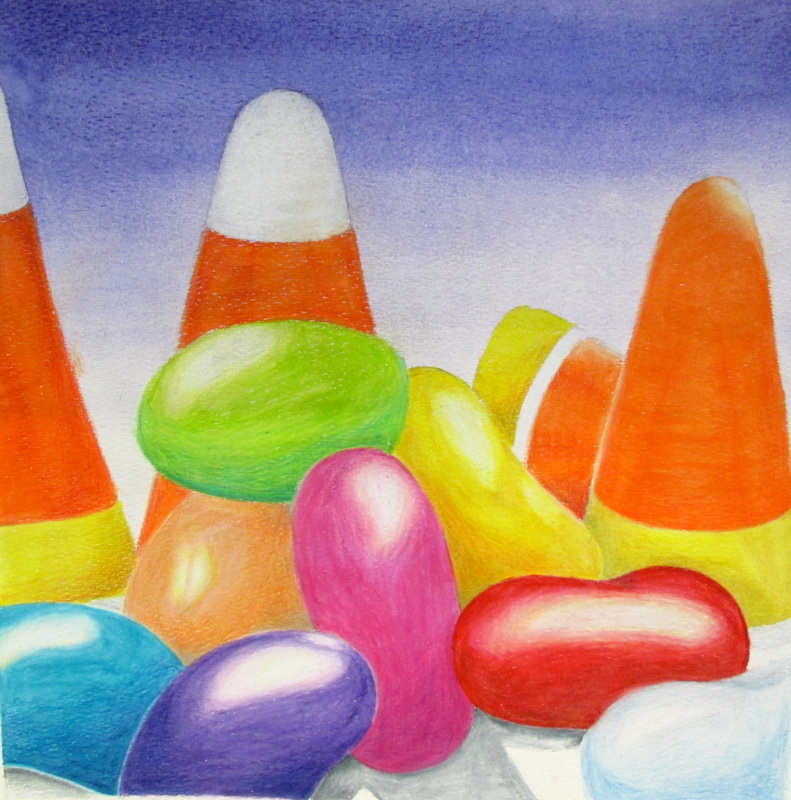
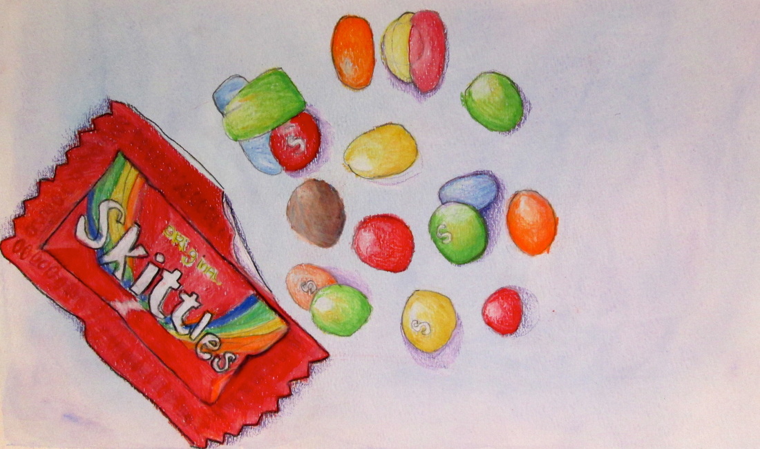
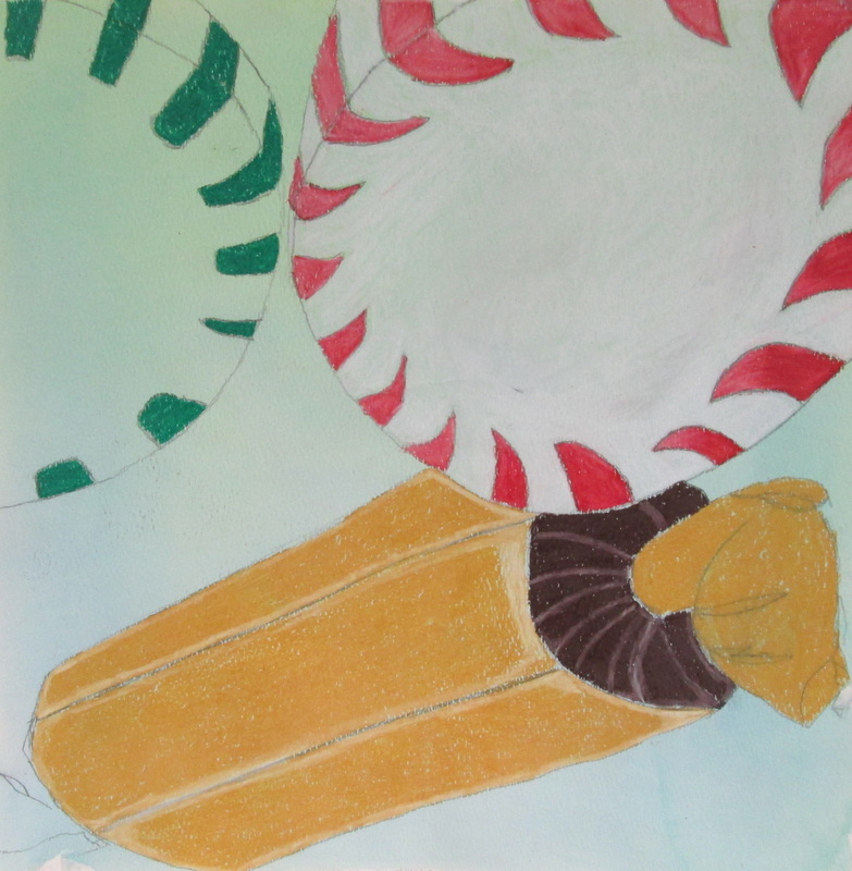
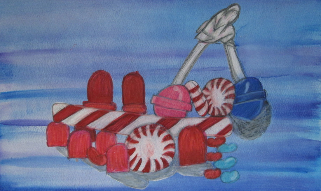
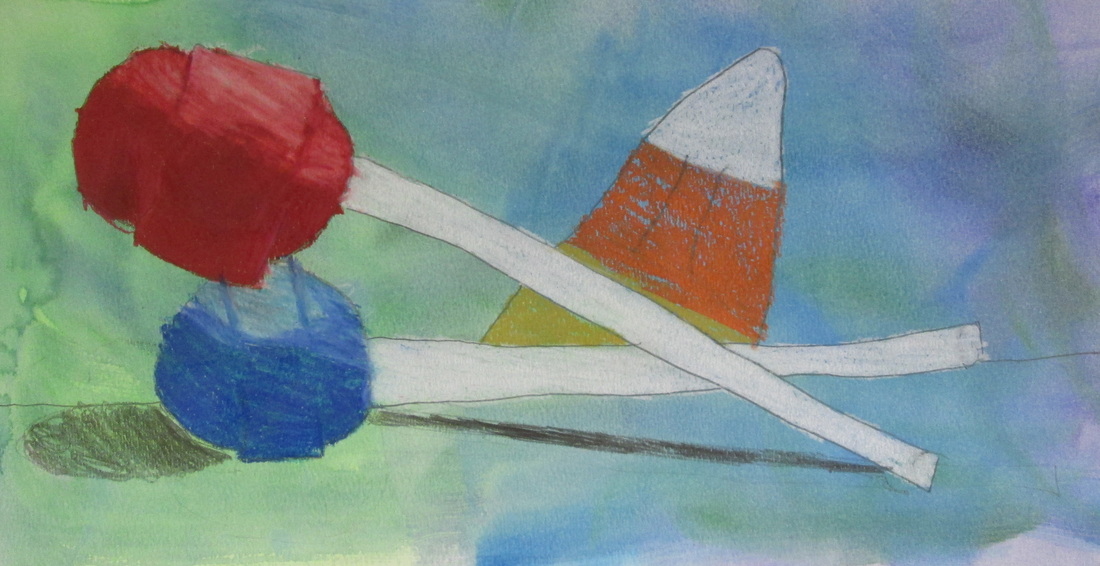
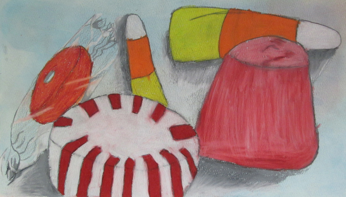
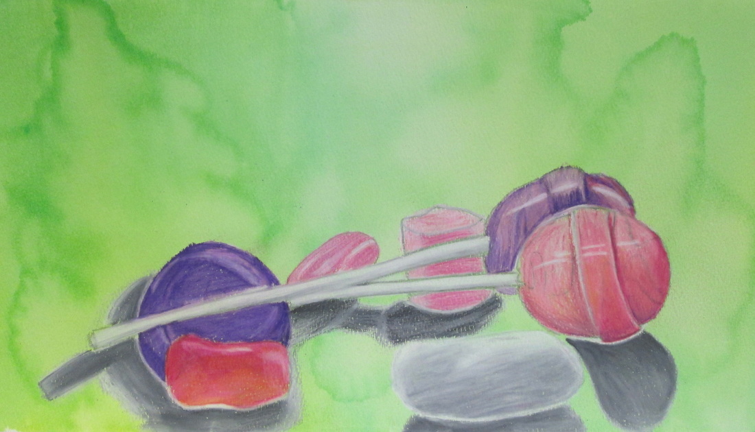
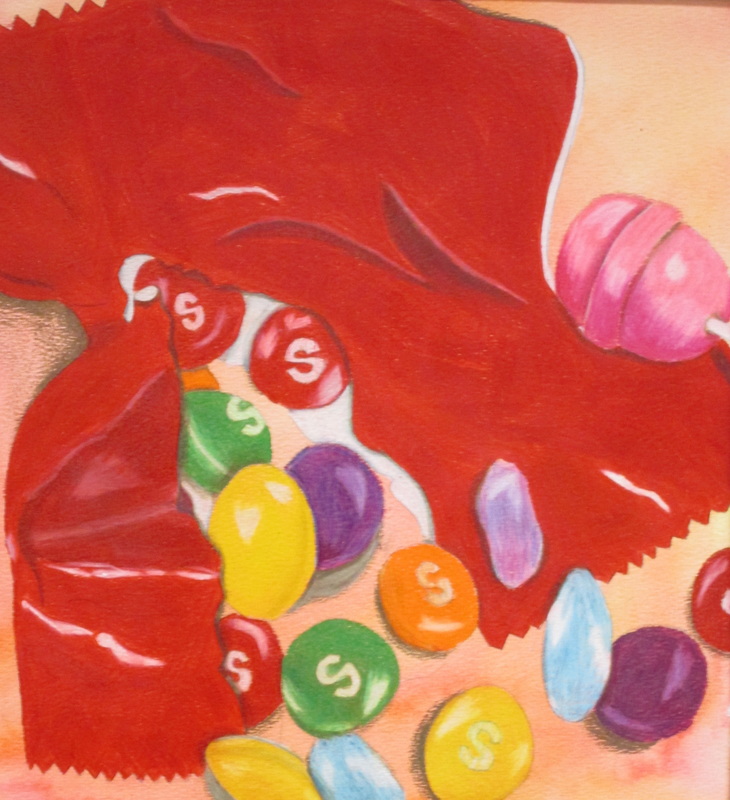
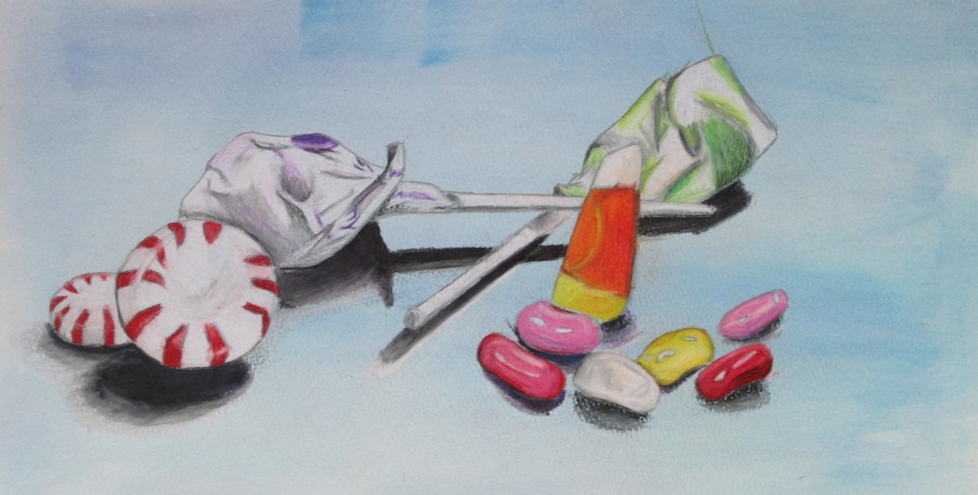
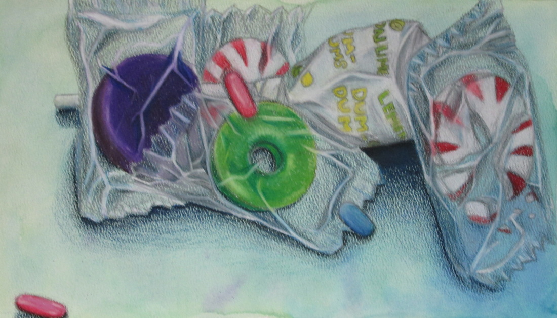
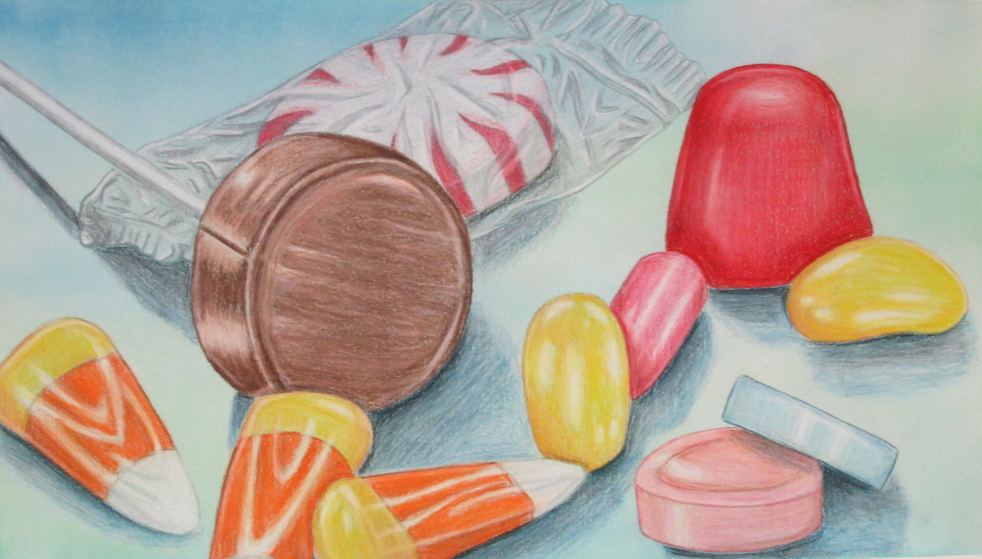
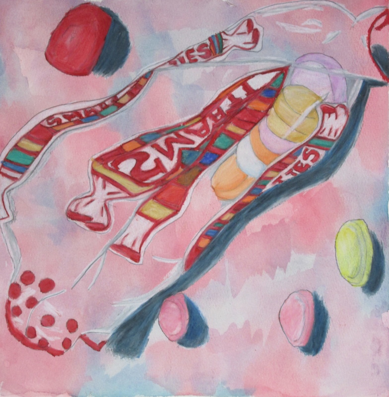
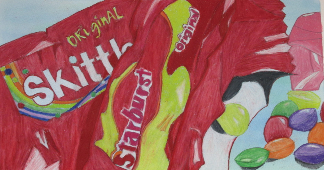
CANDY, CANDY, CANDY....
Drawing/Painting 1 students were given candy. They were asked to not eat all of it because we were going to draw candy stillifes!
They took the candy and created small arrangements that they hot glued down to a board. After which they made careful observational drawings, focusing on composition, overlap and shapes of light that they would transfer to value-meaning the light and dark areas on a surface.
Each artist then took their paper and did a soft watercolor wash on top of their paper. Then they transferred their drawings on to the painted surface and began using colored pencil to show colors and values. Some of the challenging parts of the assignment was dealing with wrappers, showing the cast shadows underneath and dealing with the overlapping and varying sizes. In addition students had to learn how show value with bright color.

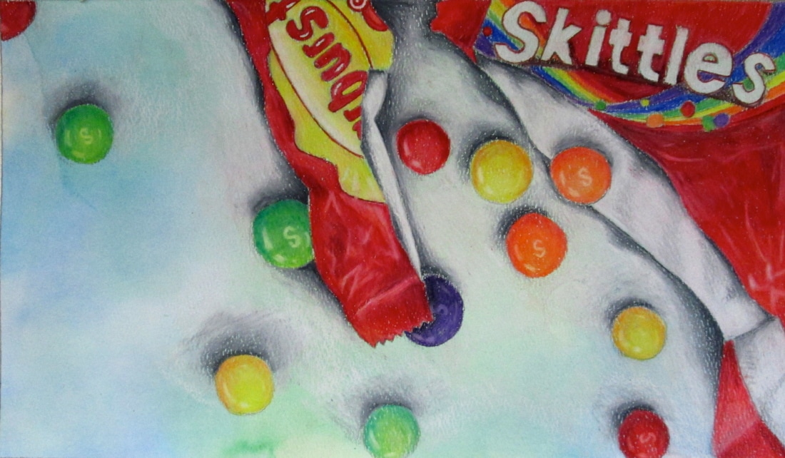
Image #1
How Did You Do it? For my candy still-life, I started out by gluing down pieces of candy onto a small square. I rotated it until I liked the perspective of it. I proceeded to do a couple of sketches in my sketchbook before moving onto the real paper. But before copying the sketch onto the paper, I used watercolor to paint the background. I chose green and blue because they’re both light colors. I left a frame of 2 inches around the border and applied tape before painting. Thereafter, I let it dry and then sketched my candy drawing onto the surface with a pencil. I made sure that the sketch wasn’t too dark. After tracing it down, I adjusted the sketch and erased anything that needed to be erased. When I started to color it with prismacolors, I firstly put down a single color as my base for each candy. After putting down the color, I continued to add different colors that were adjacent to it on the color wheel. For example, I added red, pink, and orange to my Dots™ candy. It adds more dimension to it and doesn’t make it look flat. I also focused on adding shade by applying a color that was darker than the main color of the candy. I blended all of it together using a white prismacolor pencil. I also made sure to add white on any places where light was reflecting against it. Reflection...The most challenging part for me was coloring the lollipop. I thought I knew how I’d make it look round and 3D, but it still turned out looking flat and ugly. The colors didn’t blend together well and I just screwed up on the whole thing. The only thing that came out looking okay on the lollipop was the stick. I guess I’m kind of happy with my results. On a scale of 1-10, I would rate my happiness as a 6. I definitely know I could improve in so many areas. I would say that I was also disappointed on my drawing. It didn’t turn out quite as I wished it would (like the lollipop). My advice to other students would be to look carefully at your candy still-life and make sure to observe all the colors and light that are on the candy instead of just “winging” it and thinking you know what you’re doing (because in most cases, you probably don’t). I do feel as if I gained from this project; I was able to have a lot of practice with coloring a sketch using colored pencils. I’ve feared of using colored pencils on my drawings, so I always tend to avoid it and leave it as it is. But, thanks to this project, I’m definitely going to try to color more of the sketches that I make. I also learned how to use a white prismacolor for blending. I think that’s a technique I will most definitely use in the future.
Image #2
How Did You Do it? The assignment was to create a candy still life and draw and color it from your perspective. So I measured out my borders on the paper and then I colored the background with water color lightly. I then transfered my sketch of the still life onto the watercolor background. I then started to color it with prisma colors and blended it to make it look as good as possible.to get the drawing ready I had to choose the candy that I wanted to draw and arrange it so it was overlapping and then I glued it to the board. Then I was able to sketch it and go from there. Reflection...The most challenging part was blending the colors and making the colors correctly using different colors. It was also hard to not have little holes in the color. I am very happy with my results.I think it looks good and you can easily tell what it is and I think it is accurate. Advice? my advice would be to do a good sketch beforehand and keep the colored pencils sharp so that it does not leave as many holes. I did get better because I learned and developed ways to color things accurately and do shadows and gradual blending with colors.

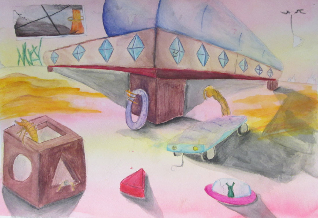
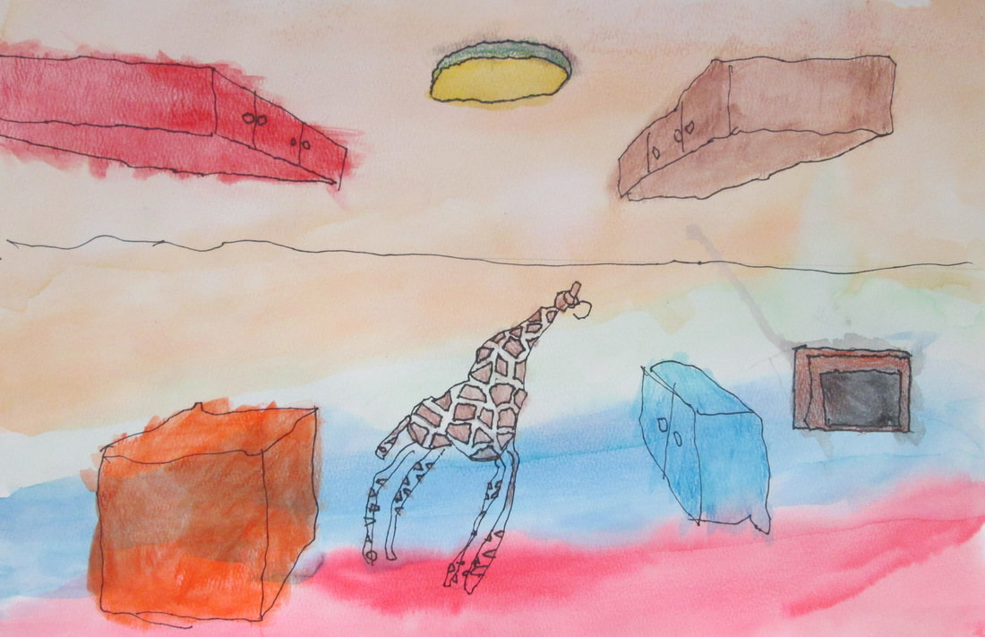
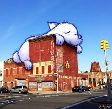
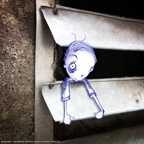
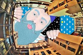
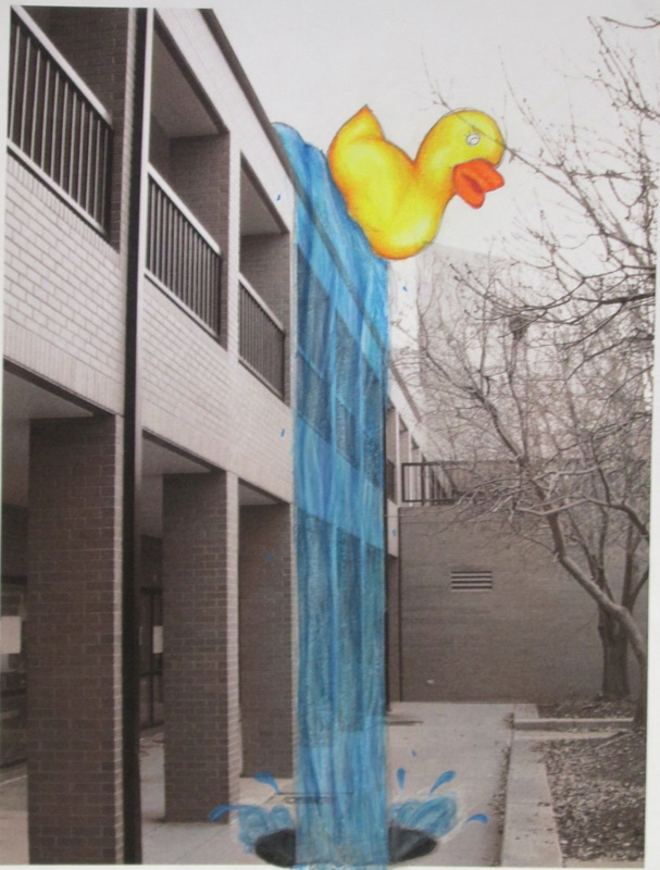
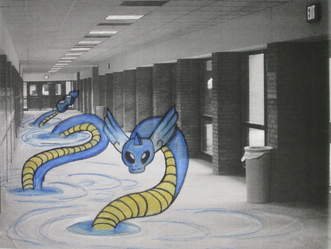
Draw/Paint 1 students worked in the style of contemporary artist, Thomas Lamadieu.
Lamadieu takes photographs and creates unexpected imagery to interact with the pictures he takes. His work is an example of clever use of "unoccupied space". Oftentimes his work features city or urban scenes and occasionally he will combine or flip them around. Below are a few snippets of his work.
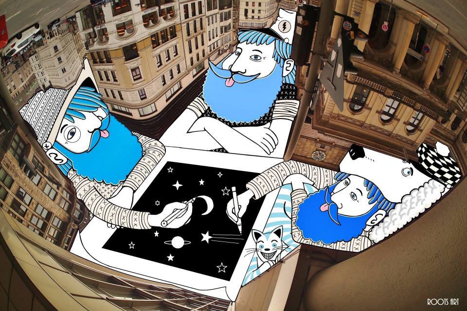
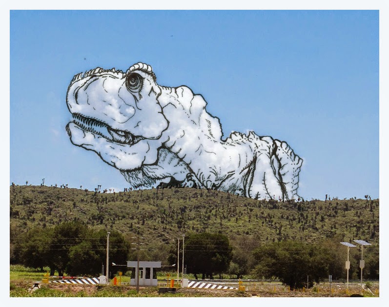
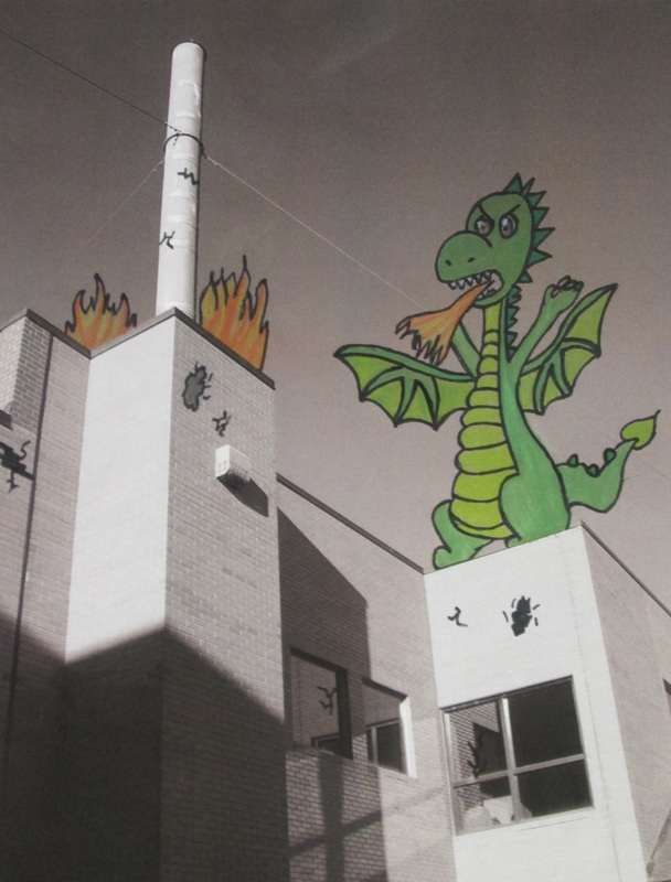
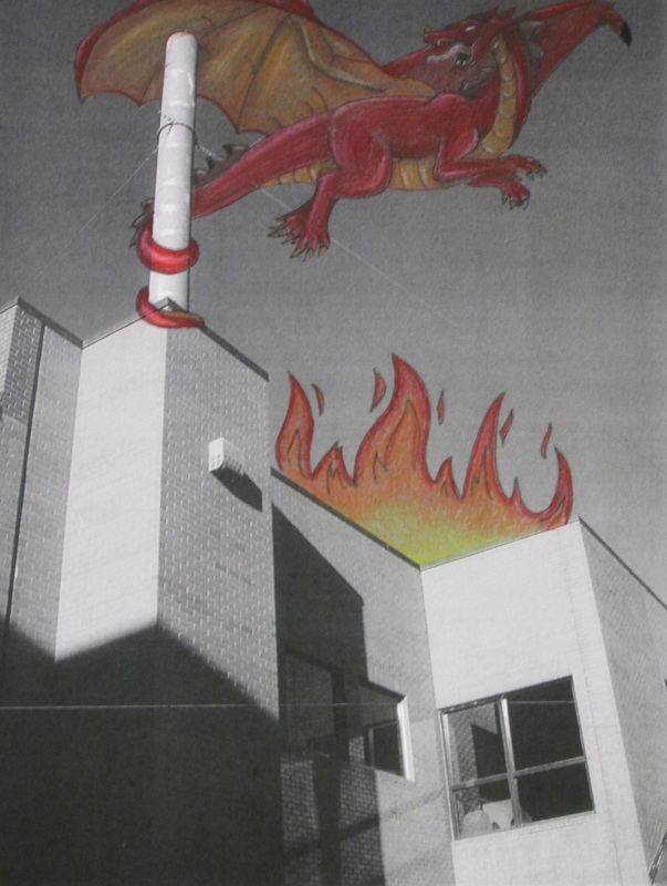
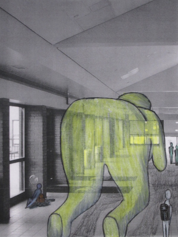
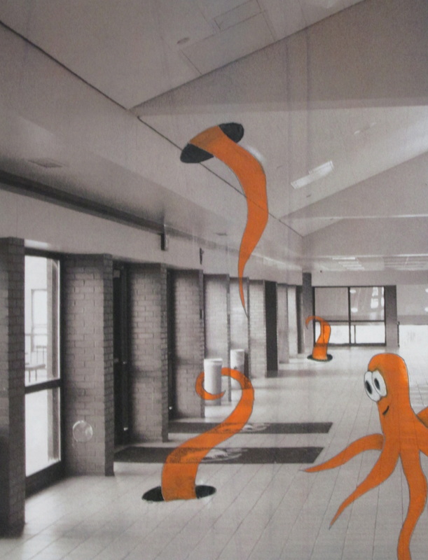
2016 Unusual sitings at EHS
in Lamadieu style...
2016-17 "SHADY" Characters found at EHS!
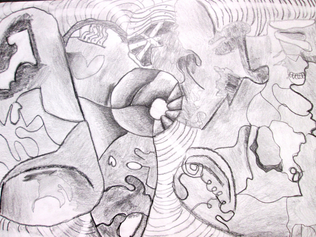
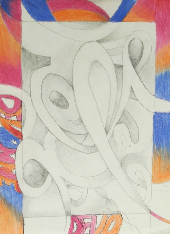
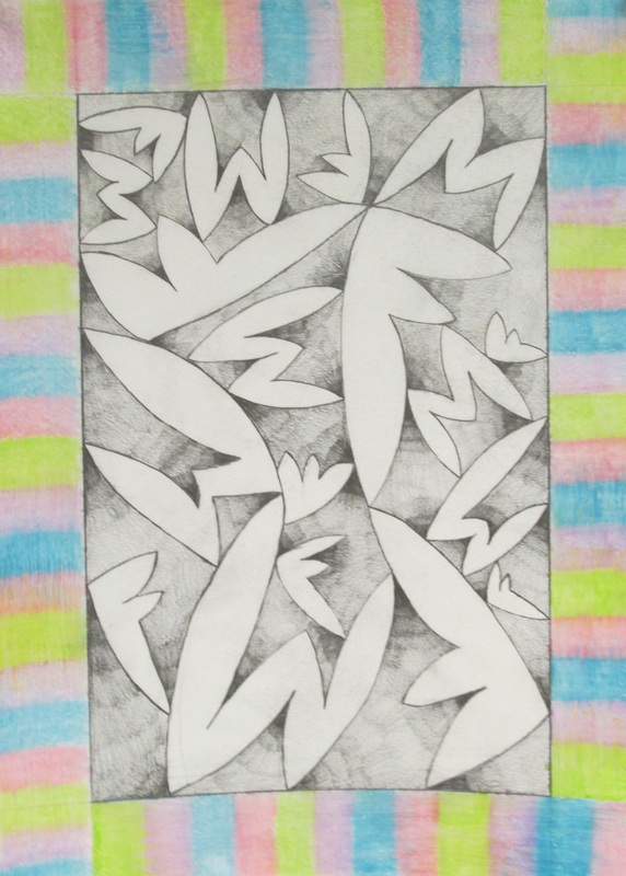
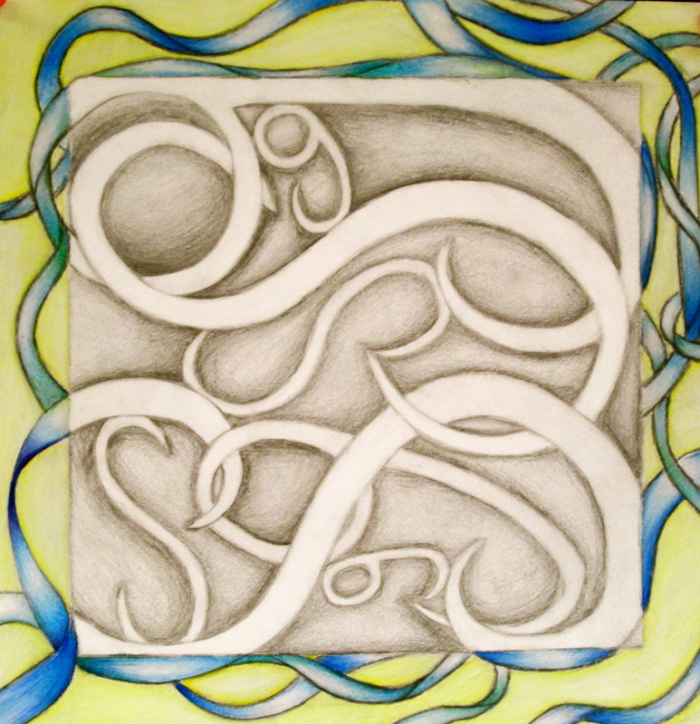
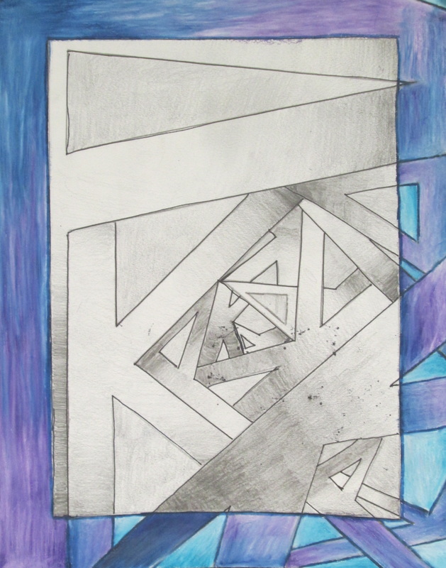
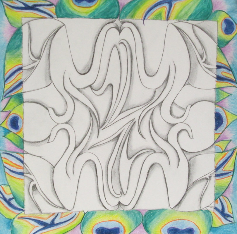
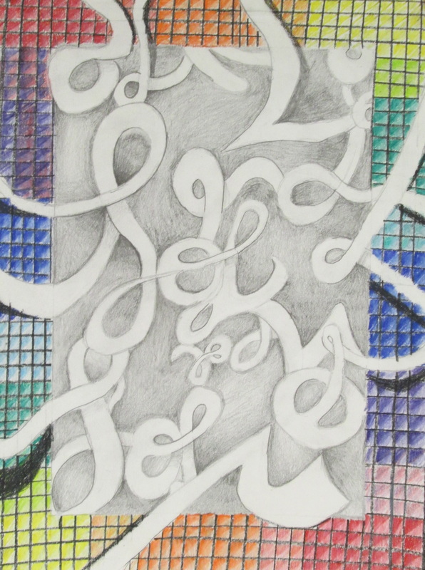
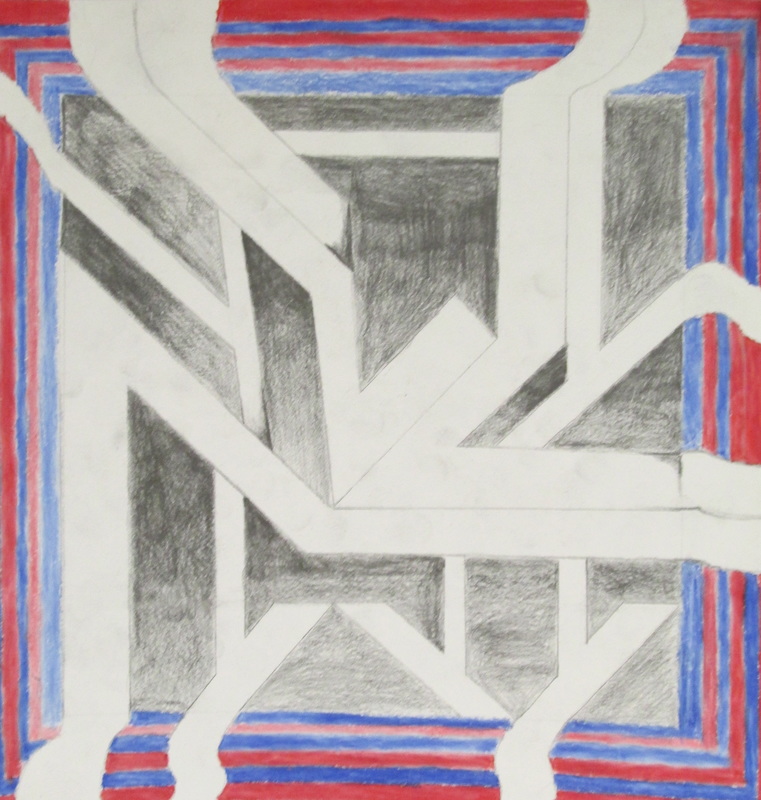
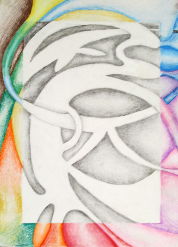
During the beginning of Draw/ Paint 1 students are introduced to " Shading". Gradual Blending ( going in a gentle circular gradations from light to dark or vice versa) with a pencil is one of the techniques an artist uses to show Value. Value is the amount of light & dark on an object/image. The class is asked to use their initials to inspire an original composition where they can practice controlling the pencil through pressure. We call these " Shady Characters". Below are this fall semester's batch of Shady Characters!
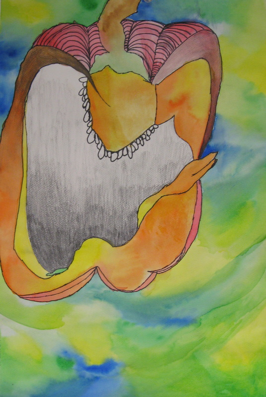
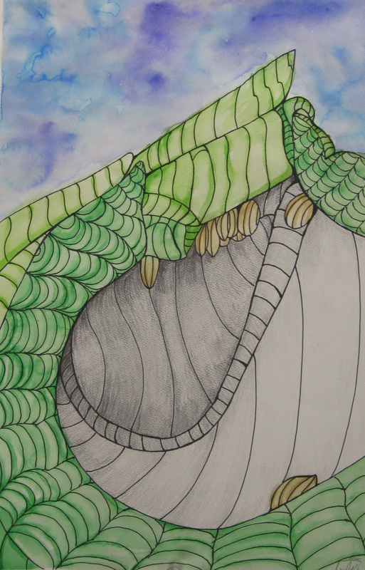
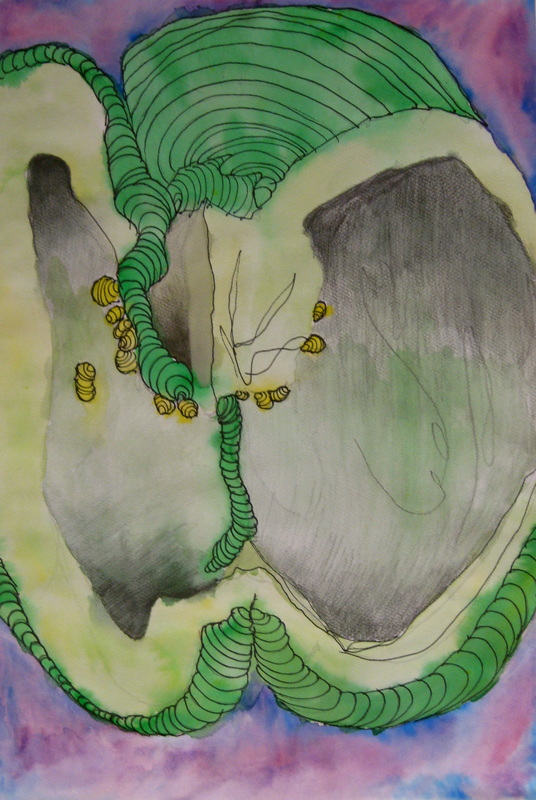
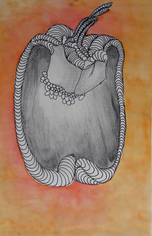
Level 1 students are taught how to create the "Illusion of form" using just line. We call this Cross Contour. The class is encouraged to keep practicing and for this short exercise we used a green pepper; students added lines to try to make the object look 3- dimensional with a curved application. Here were some of the results